
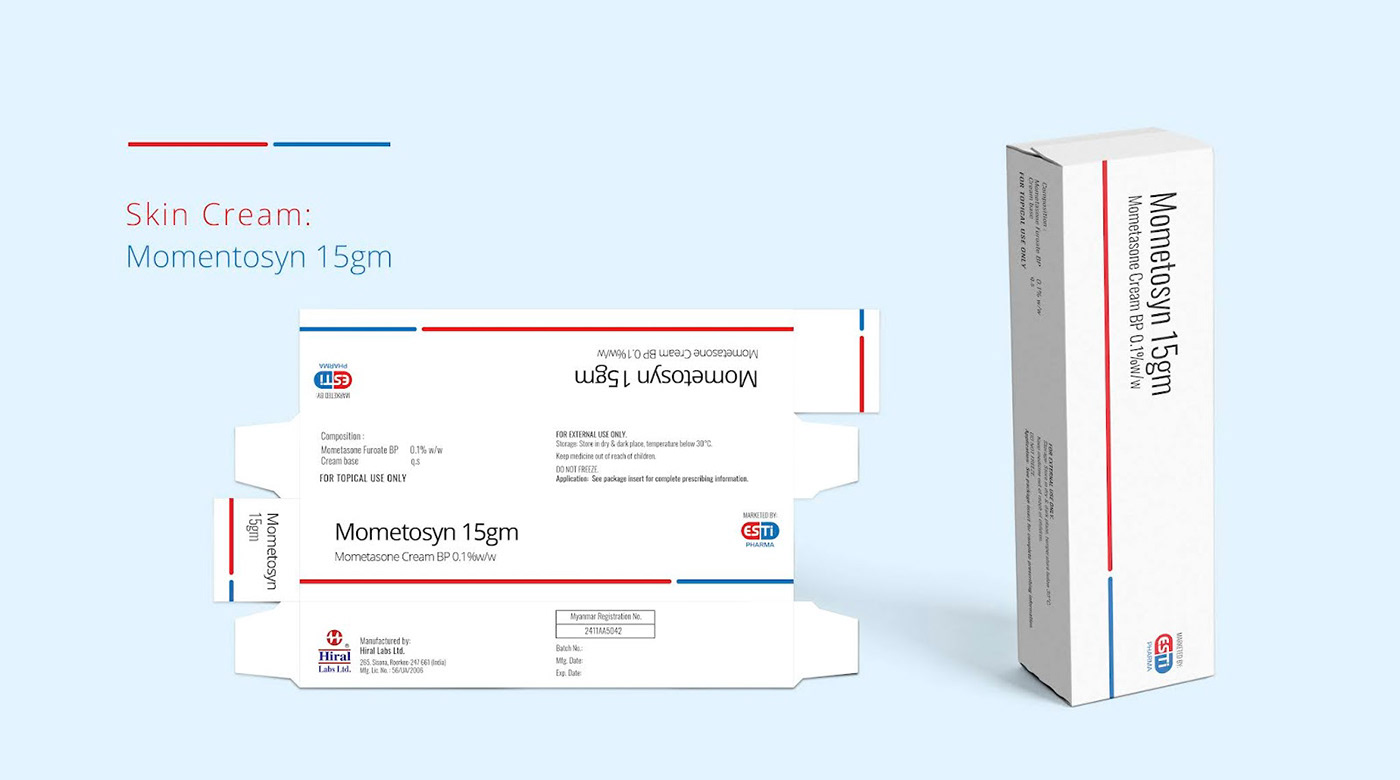
Esti Pharma Maynmar, came to us with the task of revamping their entire medicine packaging, create a clear, simple yet outstanding brand look and feel. We responded by creating unique colour codes and stand-alone icons for each category of medicines and nicely lay them out in the packaging with clear and strong branding for better shelf presence as well as recall value for consumers.
The Esti Pharma brand logo was our main inspiration for these icons. We established the vast range of categories the medicines are for, from heart to brain, from bones to gut, with SIMPLE, minimal graphics that are easy to decode for a regular consumer, simple and clutter-free. Each icon eases the placement and discovery of packaging on the shelf as well.
The Esti Pharma brand logo was our main inspiration for these icons. We established the vast range of categories the medicines are for, from heart to brain, from bones to gut, with SIMPLE, minimal graphics that are easy to decode for a regular consumer, simple and clutter-free. Each icon eases the placement and discovery of packaging on the shelf as well.


Design: STUDIO TEN | Location: Vietnam | Project Type: Produced | Client: Esti Pharma | Product Launch Location: Myanmar | Packaging Contents: Medicine | Packaging Substrate / Materials: Paper | Printing Process: Digital Printing, Foil Stamping
