
Towards the end of 2020 I was approached to create a new logo and branding for a national metal supplier's private line of decorative metal.
This line, Köenig Eisen, has been a staple in the metal industry for almost 30 years.
The old logo was a traditional gothic lion which fit the look and feel for this line of products. However, upon closer inspection, the lion has numerous little fine details, the line work is incredibly jagged and sharp in areas it should be curved, the word mark's letterforms are crooked and uneven, and the weight of the lion compared to the weight of the letters didn't match.

Since the gothic lion is a prestigious animal and look, I didn't want to steer too far away, but merely improve it for this new digital world.
I started with tracing over the current lion to get the basic shape down and then I could move forward in creating a new lion.
When I got the lion I desired, I took it into Adobe Illustrator and broke the lion down into manageable sections. Then, using circles, ovals and the shape builder tool, I started creating the new lion.
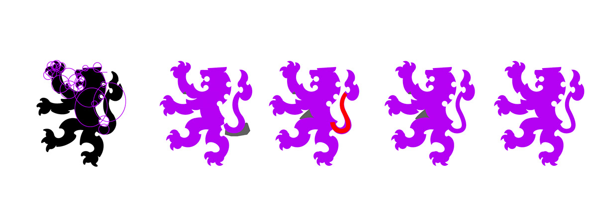
In the end, the new lion with a new typeface has better balance, better scalability and is easily identifiable as Köenig Eisen

An overlay of the old and the new logos


