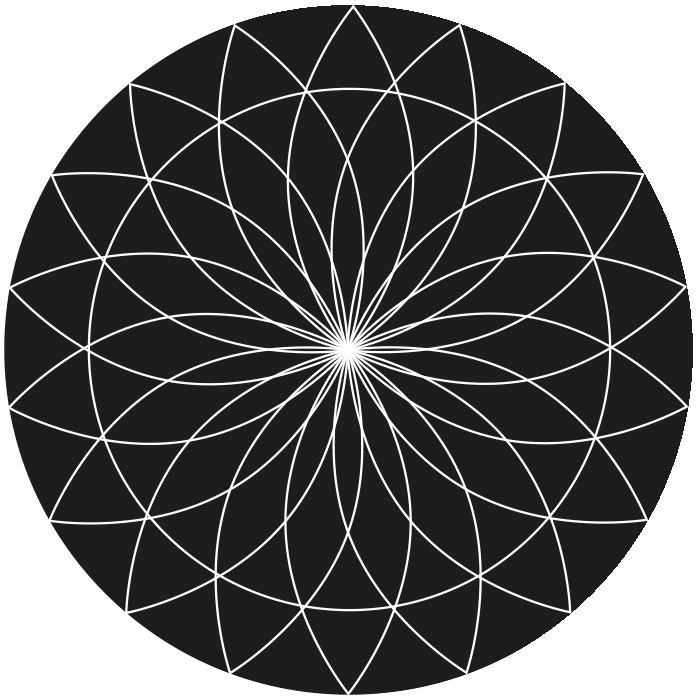
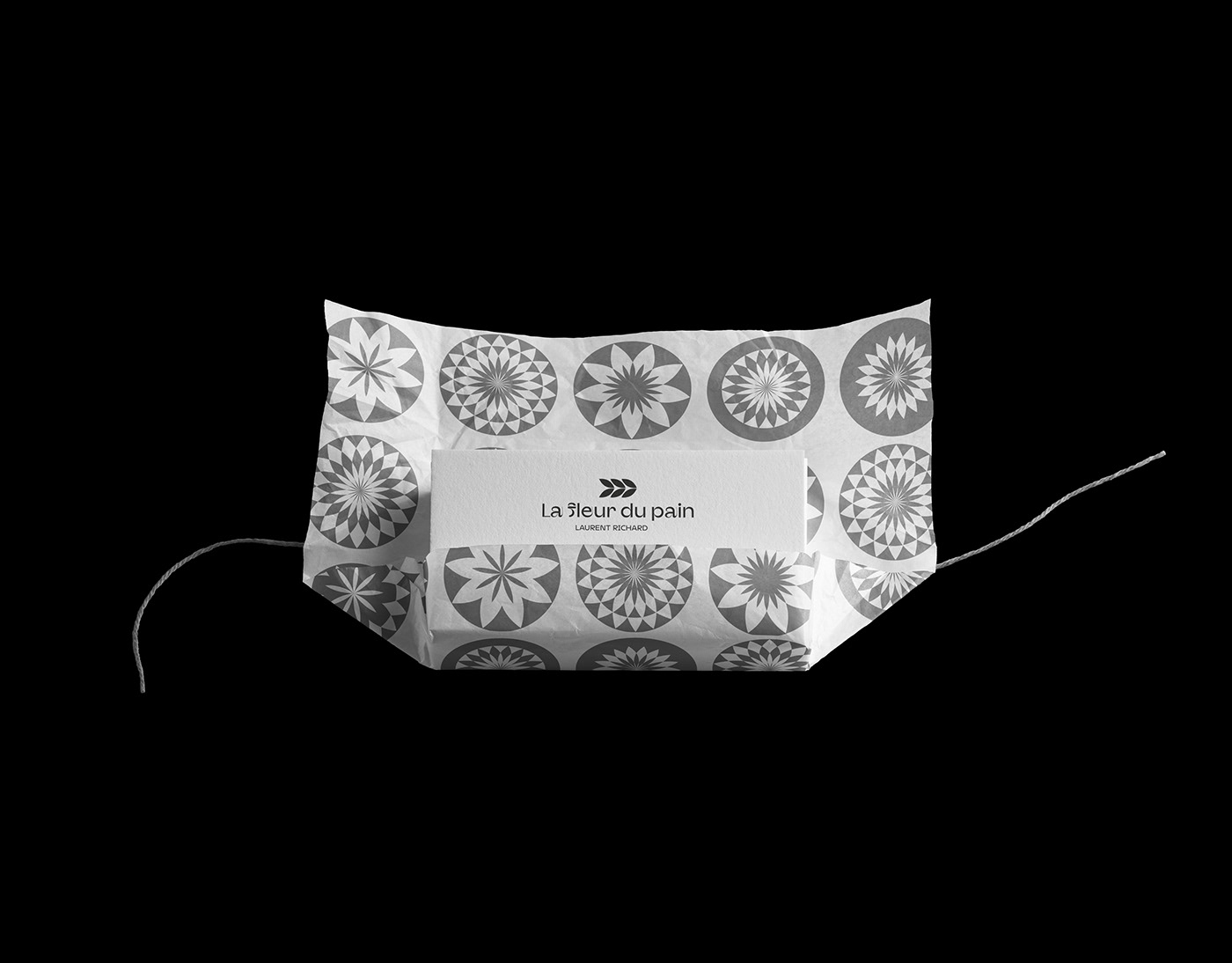
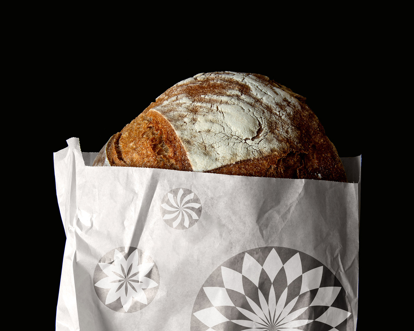
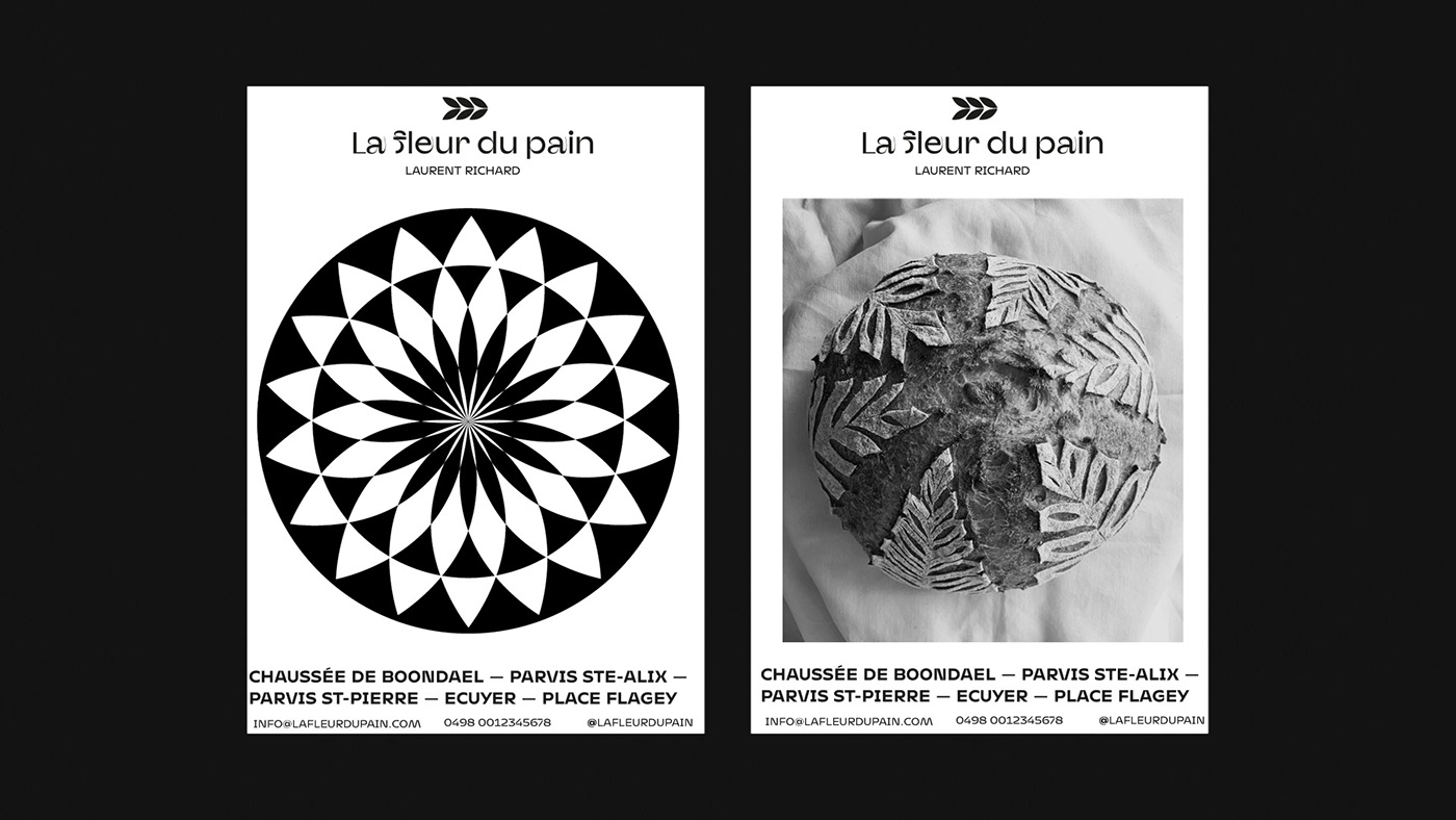
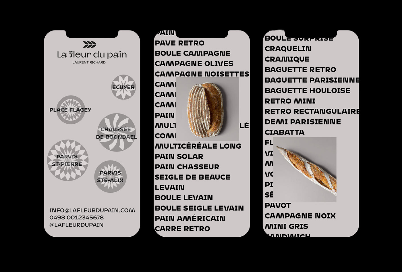
La fleur du pain - rebranding is a personal project of a famous boulangerie in Brussels. The main idea comes from the desire to play with geometric shapes between bread (pain) and flowers (fleur).
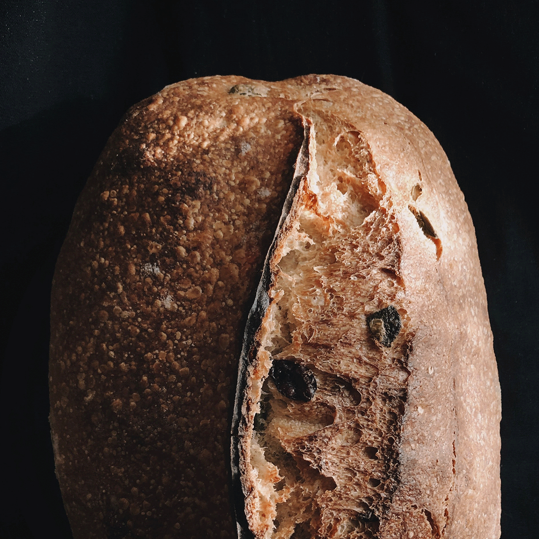
The starting shape resembles a petal and a bread at the same time. Hence the logo and the pattern. The pattern is based on a repetition on the grid that gives life to shapes that recall, in addition to flowers, the classic and recurring cuts that are made before baking the bread.
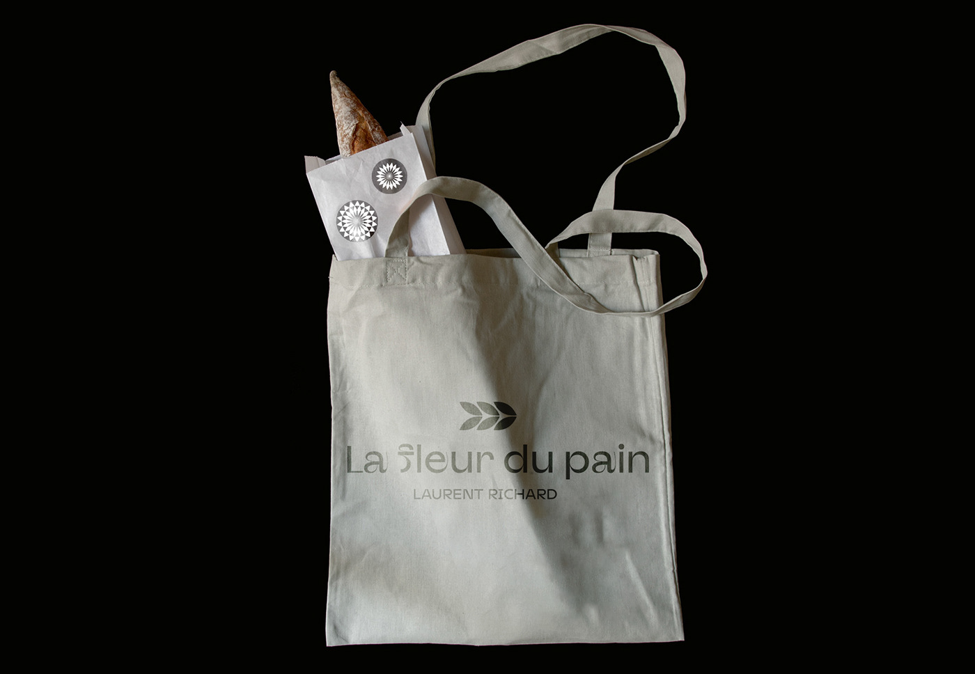
The craftsmanship of the products is enhanced by the pattern and the logotype.
The craftsmanship of the products is enhanced by the pattern and the logotype.
https://www.lafleurdupain.com/