
Case study: Designing a website for an ecommerce
UI/UX study of a fashion ecommerce
"Taken" is an enthralling emerging Colombian luxury fashion brand with a minimal yet trendy clothing line. I set out to design Taken's website, nonexistent at the moment, aiming to make it representative of Taken's identity
the challenge was standing Taken's ideology out while creating an easy to use and customer oriented website.
Timeline: 24hrs
Methods: Proto persona, Wire framing, UI design, Prototyping (it will be made after this project timeline)
Tools: Photoshop, Figma

Process Outline
1. Brand Identity Research
2. User Research (ecommerce personas)
3. Wireframing
4. UI design
Brand identity Research
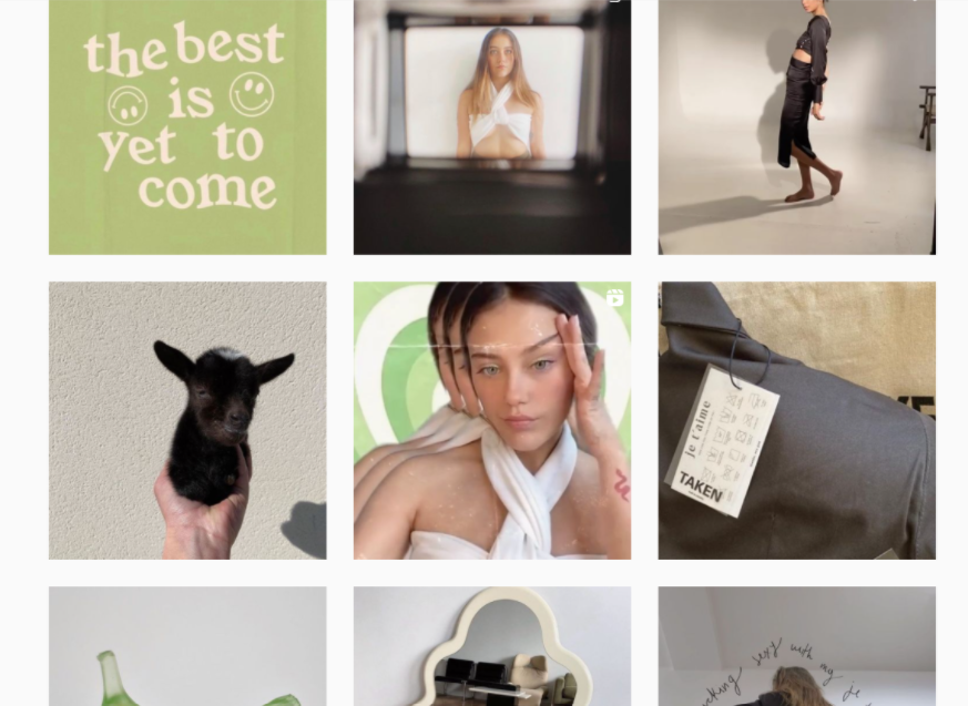
Since this is a Fictional project, I am prototyping a brand identity from the brand's social media. (Instagram)
What defines Taken?
* Contemporary, minimal yet disruptive.
* uses beige, white and black as its main colors, while using green as a color to accentuate.
* in Taken's Instagram posts, I found a strong retro inspo, mainly in its fonts, use of colors and filters.
User Research
From the identity research, I created a proto persona: A Latina young woman from an upper-media class in need to stand out in a semi casual date. She is used to social media and e-commerce brands.

In this article, we can enumerate 5 different e-commerce shoppers: Product focused, Browsers, Researchers, Bargain hunters & One-time shoppers. Since it is an upcoming ecommerce website, it is pretty accurate to use them to create a customer focused UI. One of the most important insights in there were the following:
* Listings of new, popular, and sale products.
* Easy-to-edit shopping carts that retain products between visits.
* Clear site navigation.
* Complete product descriptions.
Wireframing

Taking simplicity into consideration, I found the 6th land page prototype to be the most accurate.
UI Design

I created a simple yet retro website with the brand colors and aesthetics. I edited the land page image to match the aesthetics of the brand. Then, since the goal here was to make it the most clear navigation site as I could, I went for a very simplistic use of colors, using green for the call-to-action buttons only.
I added a wishlist page and an easy to edit shopping cart that foster revisit the webpage later and a description of clothes to make the brand more trustfully.

