

BACKGROUND
The packaging design of K.C Fortune Telling’s Incense Powder was done at VincDesign. The collection of incense powder has three selling points, which are the removal of negative energy, the expansion of financial power, and the facilitation of relationship development.
The Founder of K.C. Fortune Telling, Kasey Chiu, practiced and is certified in two of the four Sacred Mountains of Taoism, Mount Wudang and Mount Longhu. Kasey is one of the few certified female Taoists of the Orthodox Unity School of Tianshifu. She specialises in practices of feng shui and divination.
SOLUTION
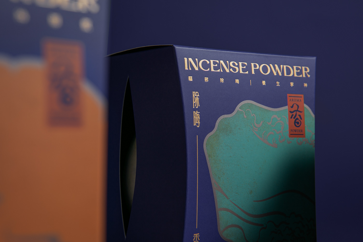
Considering the historical heritage of Taoism, VincDesign worked its magic on the packaging design of the Incense Powder to convey the Eastern classic antique beauty. The hazy mist illustrated on the packaging is inspired by the symbol of status in the Qing Dynasty, Chinese snuff bottles. The mist wishes to guide users exhausted by the daily hustle into a tranquil realm, connecting the urbanites with nature through a simple glint of the Incense Powder.
The leave-like die cut on the side of the packaging desires to highlight the natural herbal ingredients of the Incense Powder. The shape of the packaging referenced the traditional feminine body outline to represent products of Kasey Chiu, a rare female Taoist. As a final touch, the purple brand colour covering the packaging completed the elegance and feminine charisma of the Incense Powder.


Package design for K.C Fortune Telling
Client/Project: K.C Fortune Telling
Creative Director: Vince Cheung
Design and illustration: Koan Tse
Photography: Yin Ip @tinysotiny.co
Client/Project: K.C Fortune Telling
Creative Director: Vince Cheung
Design and illustration: Koan Tse
Photography: Yin Ip @tinysotiny.co


