


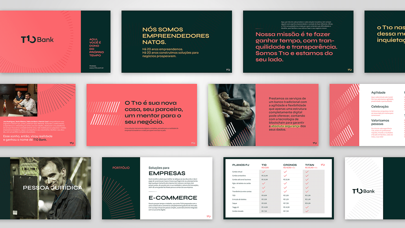
T10 Bank
T10 Bank appears within the extremely competitive market of digital banks. With the intention of reducing the bureaucracy involved in contracting financial services for the legal entity, the demand for the branding project arose from the need to position this new fintech.
Our goals with the project:
- Highlight T10 Bank from a competition that has been adopting a similar discourse for a long time now, and is advancing increasingly to serve legal entities as well
- Organize the brand's architecture and its service portfolio in a clear way, at all points of contact.
O T10 Bank surge dentro de um mercado extremamente competitivo: o dos bancos digitais. Com a intenção de diminuir a burocracia envolvida na contratação de serviços financeiros para a pessoa jurídica, a demanda pelo projeto de branding surgiu a partir da necessidade de posicionar essa nova fintech.
Nossos objetivos com o projeto: Destacar o T10 Bank de uma concorrência que já adota um discurso similar, há muito mais tempo, e avança cada vez mais para atender também pessoas jurídicas; Organizar a arquitetura da marca e o seu portfólio de serviços de forma clara, em todos os pontos de contato.
Nossos objetivos com o projeto: Destacar o T10 Bank de uma concorrência que já adota um discurso similar, há muito mais tempo, e avança cada vez mais para atender também pessoas jurídicas; Organizar a arquitetura da marca e o seu portfólio de serviços de forma clara, em todos os pontos de contato.


Strategy and brand voice
During the analysis of competitors, it was noticed that the discourses of "no bureaucracy" and "transparency" were already commonplace in the segment. To differentiate T10 Bank from the rest, we positioned the fintech as a business partner for the client and associated this with the attribute of saving time as the biggest gain. "T10 is a financial services platform for those who own their time." Thus, we place the client as the protagonist and T10 as a facilitator, a mentor, able to offer support whenever necessary, as it understands the challenges of running a business.
Estratégia e tom de voz
Durante a análise de concorrentes foi percebido que os discursos de "sem burocracia" e "transparência" já eram lugares comuns no segmento. Para diferenciar o T10 Bank dos demais, posicionamos a fintech como um parceiro de negócios para o cliente e associamos isso ao atributo de economia de tempo, como o maior ganho. "T10 é uma plataforma de serviços financeiros para quem é dono do próprio tempo". Assim, colocamos o cliente como protagonista e o T10 como um facilitador, um mentor, capaz de oferecer suporte sempre que necessário, pois entende os desafios de gerir uma empresa.


Visual identity
The entire verbal and visual universe of the T10 Bank brand was built from the concepts of leadership and time saving. Both the logo and the brand's elements reflect the dynamism of the digital service and the robustness needed to convey a message of reliability. The choice of the striking color seeks to highlight T10 within the segment.
Todo o universo verbal e visual da marca T10 Bank foi construído a partir dos conceitos de liderança e economia de tempo. Tanto o logotipo quanto os desdobramentos da marca refletem a dinamicidade do serviço digital e a robustez necessária para se passar uma mensagem de confiabilidade. A escolha da cor chamativa busca destacar o T10 dentro do segmento.


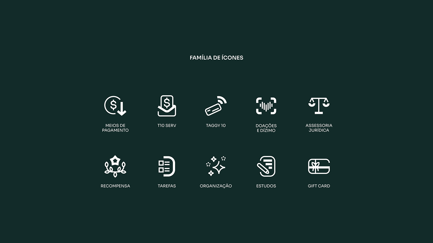


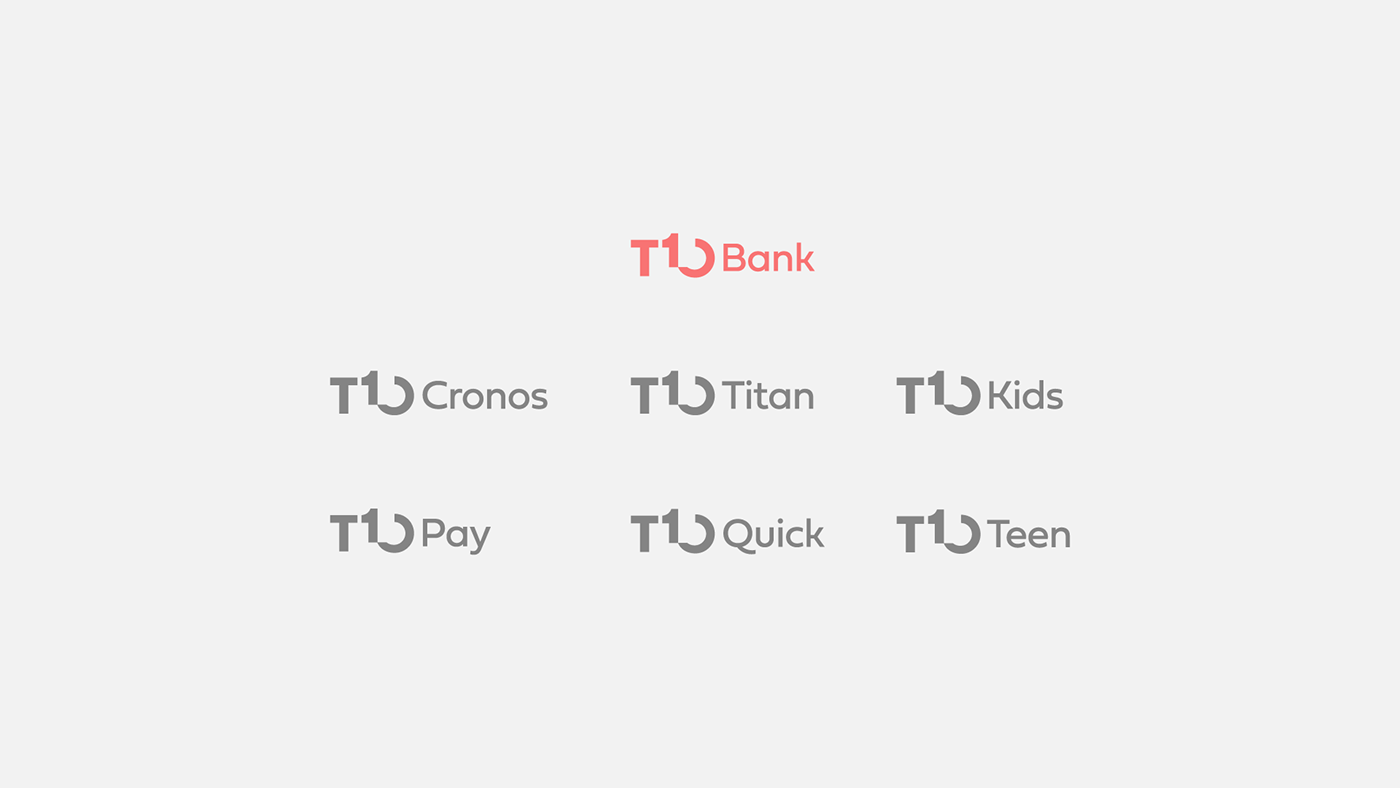
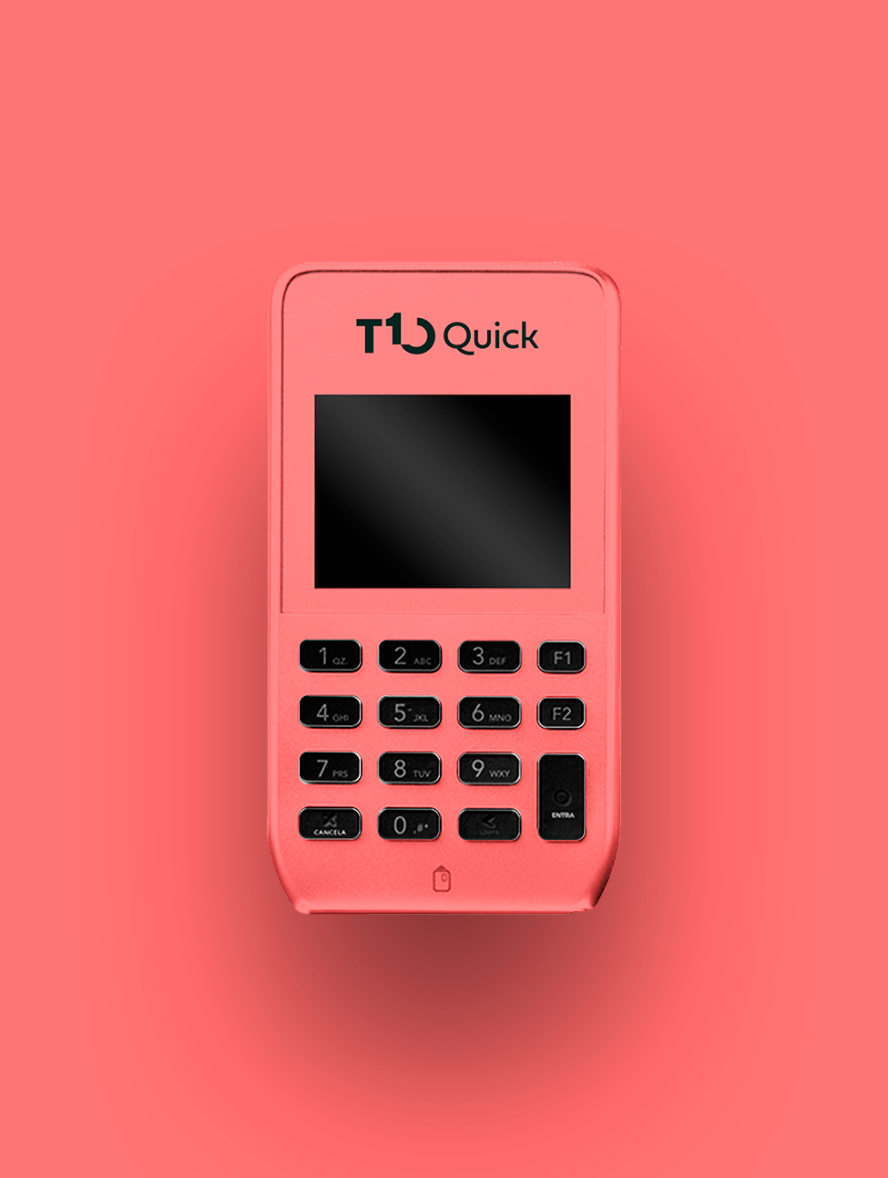
Brand Architecture
In addition to the main brand and colors, each credit card plan has its own colors and visual identity. The name of the plans reinforces the customer's immersion within the universe of the brand: "T10 Bank, T10 Cronos and T10 Titan" , and their color palettes convey the exclusivity of the service within the app.
Arquitetura da marca
Além da marca e cores principais, cada plano de cartão de crédito possui suas próprias cores e especificidades de identidade visual. O nome dos planos reforça a imersão do cliente dentro do universo da marca "T10 Bank, T10 Cronos e T10 Titan", e suas paletas de cor transmitem a exclusividade do serviço dentro do app.


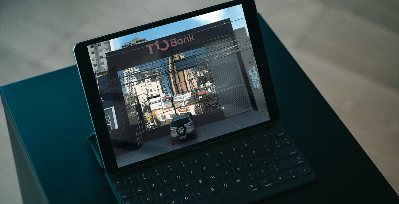
App and website
We were also responsible for the art direction of the entire UX project for the T10 website and app, in partnership with expert Ruhan Moreira. We ensured that every single detail of the interface spoke with the communication system we created.
PT
Também fomos responsáveis pela direção de arte de todo o projeto de UX para o site e aplicativo do T10, em parceria com o especialista Ruhan Moreira. Garantimos que cada mínimo detalhe da interface conversasse com o sistema de comunicação que criamos.


Branding, visual identity and iconography: Motora
Strategic Direction: Luize Araújo
Strategy and writing: Luize Araújo, Juliana Argollo
Art Direction: Júlia Lago, Luize Araújo
Designers: Júlia Lago, Luíze Araújo and Juliana Argollo.
UI, app and app iconography: Ruhan Moreira