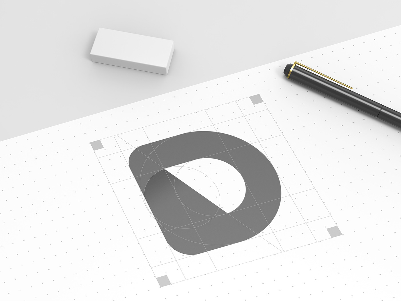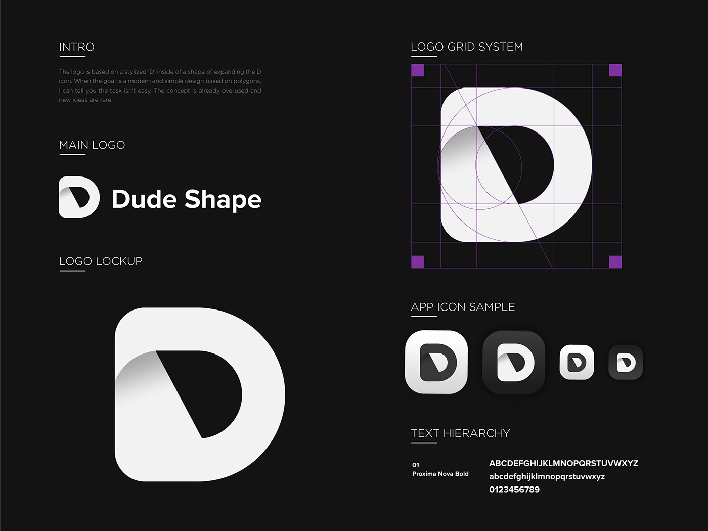
The logo is based on a stylized 'D' inside of a shape of expanding the D icon. When the goal is a modern and simple design based on polygons, I can tell you the task isn't easy. The concept is already overused and new ideas are rare.
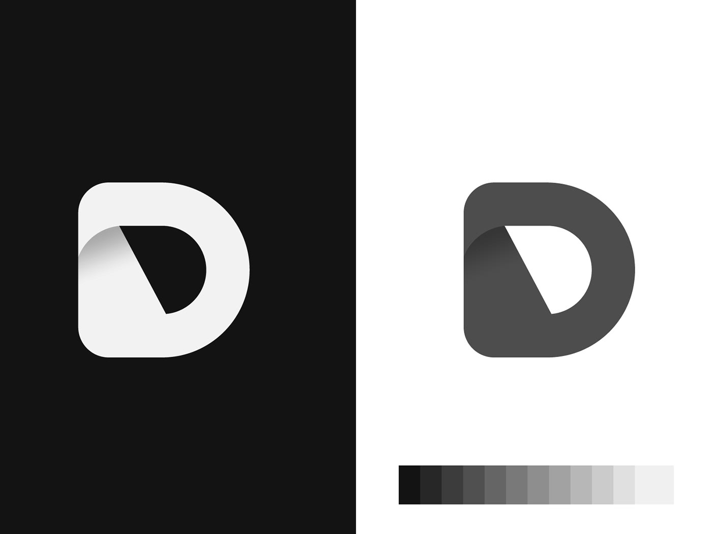
Branding begins with understanding what a brand is, how it works, and what it means to a business owner. Below, I've created logos that I've been able to craft throughout 2021. Yes, we know that it is more interesting to view brands working on layouts or stationeries related to specific contexts - but my goal here is to showcase just the general monochromatic structure of the brand.
It's our pleasure to share them with you, and we hope you will appreciate them! Hope these logos get you thinking about any new ideas you have.
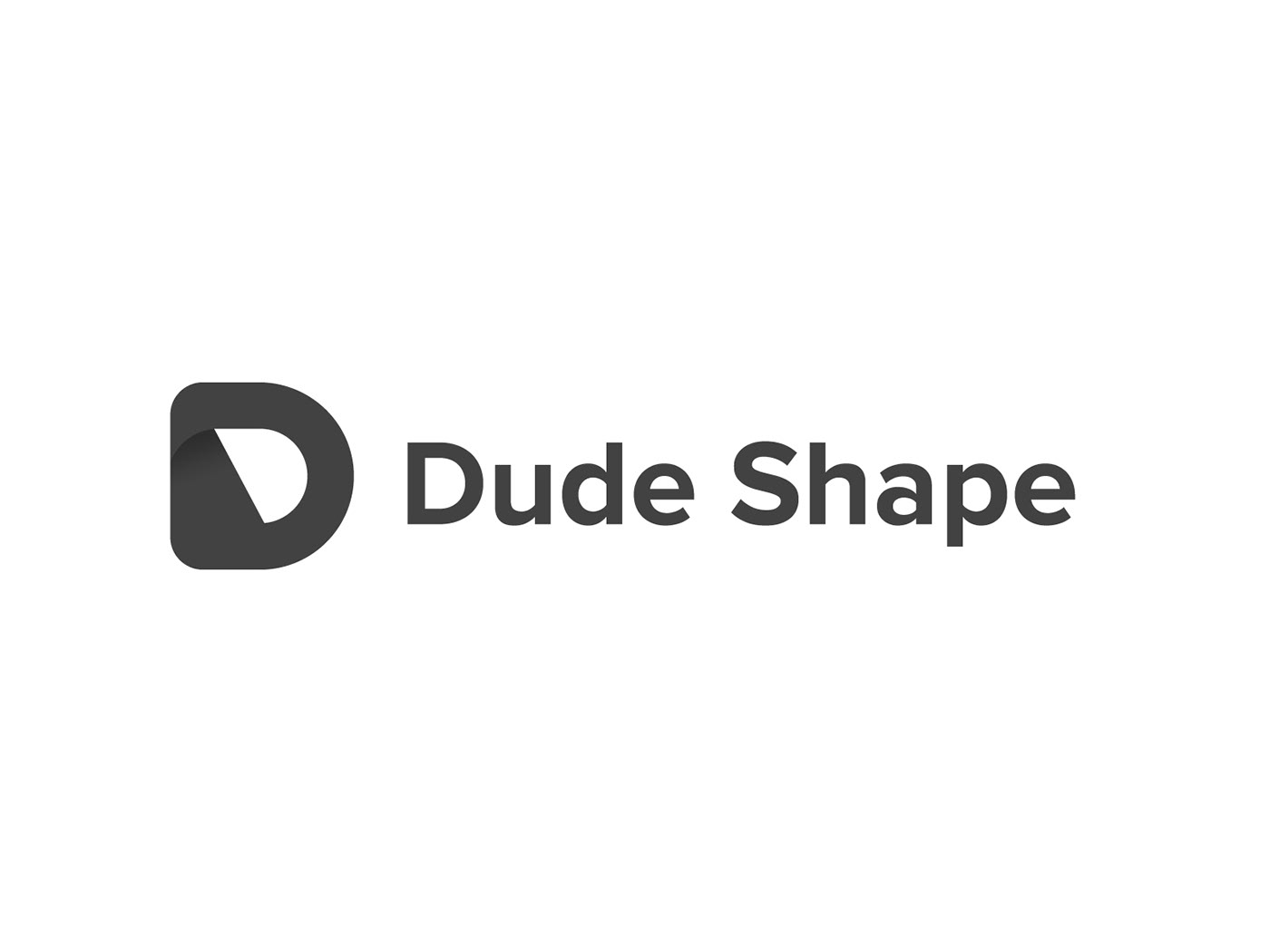
As a team, we worked closely with the founder Dude Shape° to create a logotype and identity that makes the brand stand out from competitors. The logomark is built of shapes inspired by client services and marketing goals. Giving it a bold, clean, and simple feel that works across a wide range of applications in print and digital.
The typeface CLOUD was selected for its sharp curves and boldness to be consistent with the branding, but stand out for communication over long distances.