

LBDO — An intimacy brand that’s actually in touch.
Visual identity, Verbal identity, Motion design, Packaging design, Art direction
Generally speaking, the sexual intimacy and pleasure product space is far from intimate or pleasurable. It’s a landscape of tacky, gendered, outdated design and noise. LBDO challenged us to design a visual and verbal brand experience as neutral and beautiful as their products, that would ignite a respectful and open conversation around pleasure and sexual wellness.
What's all this then?
LBDO is a digital-first sexual wellness brand built on the ethos that pleasure should be discussed and accessed openly, comfortably and safely by everyone. They create and sell products that are as beautiful as they are functional while providing an educational piece that helps break down taboos and stigmas around sex and masturbation and empower their audience to explore pleasure.
Any insights?
It’s no secret that the majority of sex products are tacky, overtly phallic and not inclusive. The industry is also largely seen as seedy, so there’s no brand loyalty or sense of mainstream community. It became apparent that this very normal thing still had an alienating consumer experience — there was room to make sexual wellness as much a part of everyday discourse as skincare and thread counts.
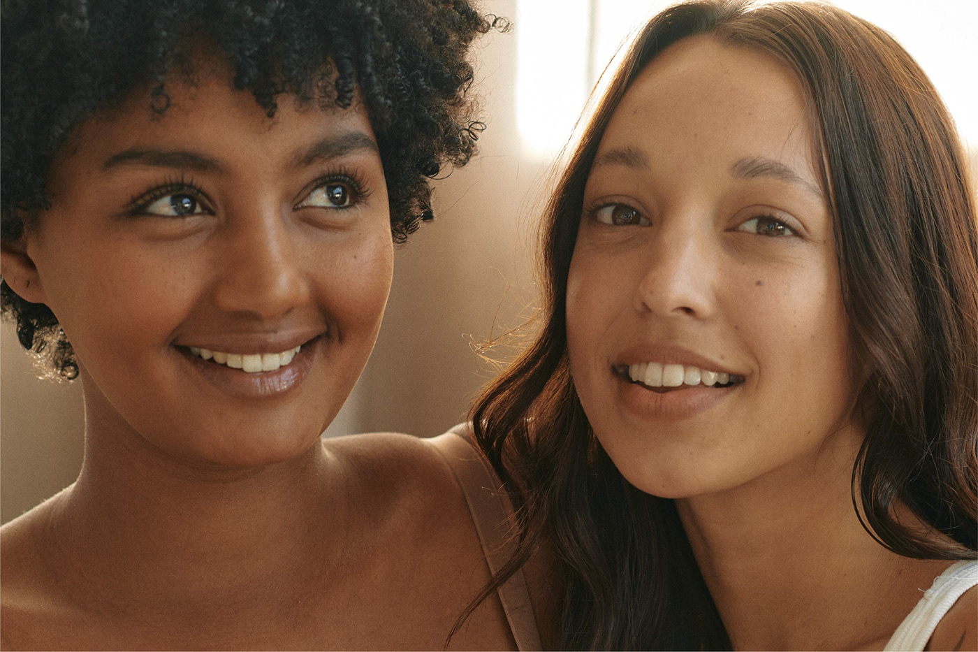
And just as there are countless types of sexual pleasure, there are so many types of people. Most sexual wellness brands speak specifically to a certain body, ignoring and marginalising anyone outside that “norm”. Regardless of age, sex, gender, sexuality, regardless of the size, colour, shape or ability of their body — the client wanted to create a community people feel included in and can learn from.
A body of type for all types of bodies
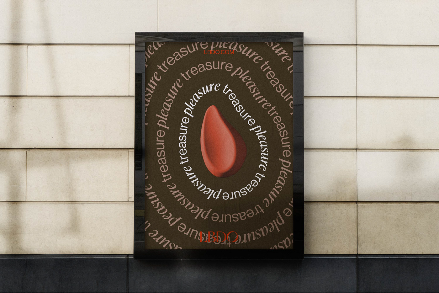
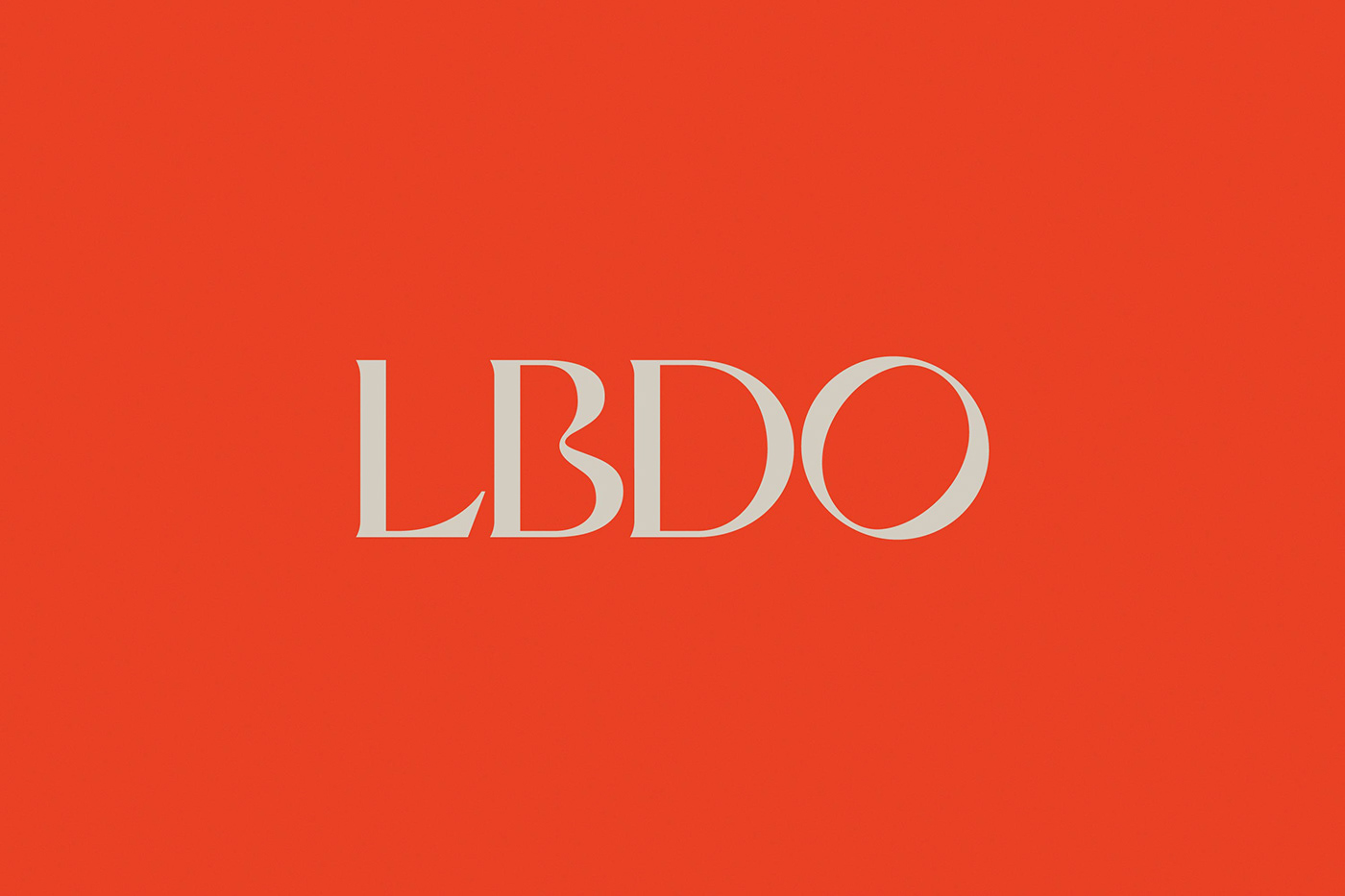
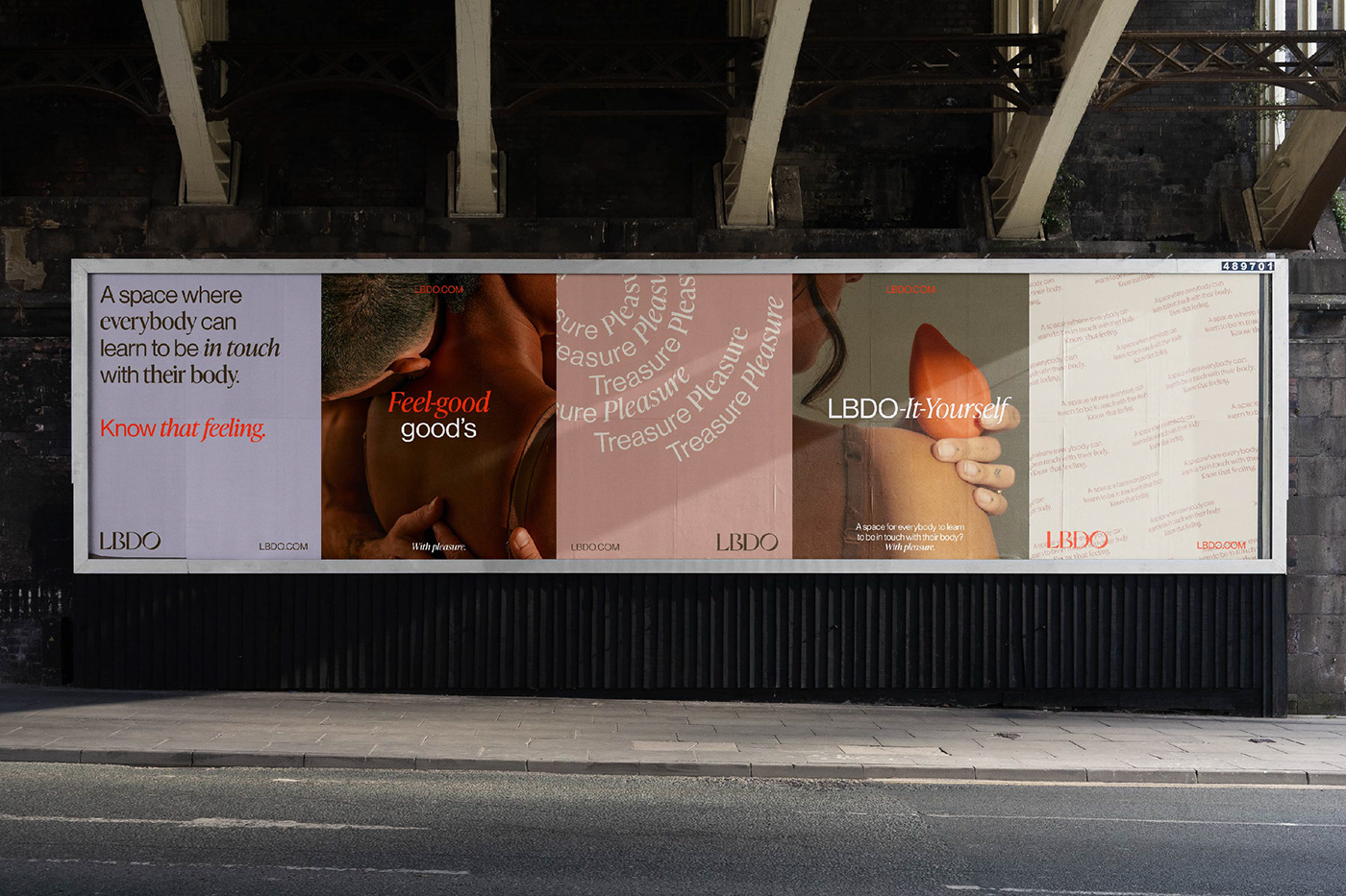
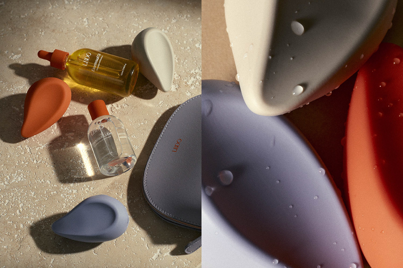
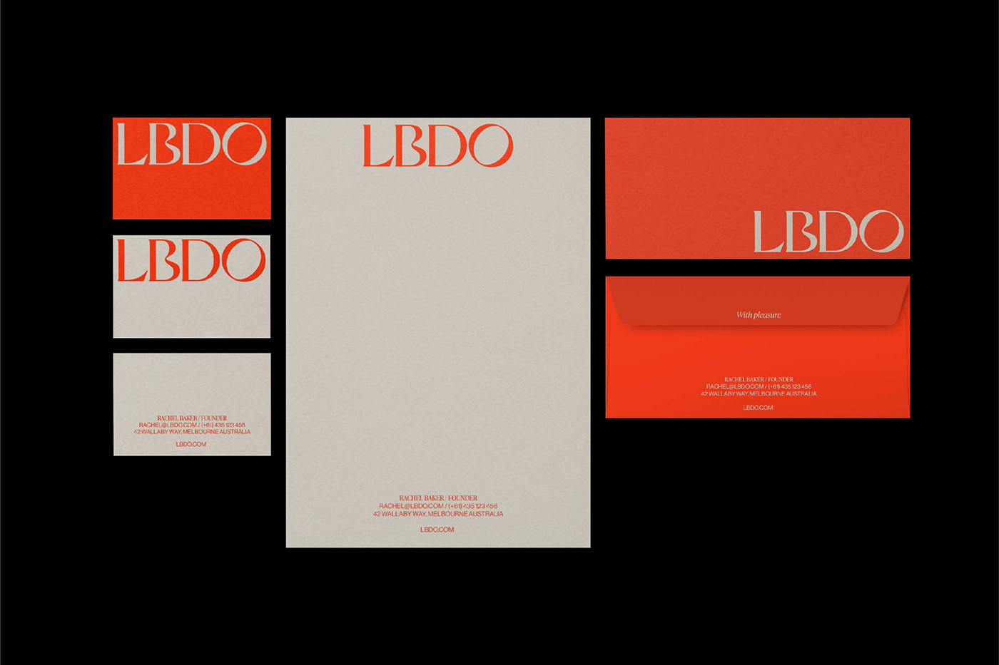
A nod to the ethos that LBDO is for every body type, the logo is a marriage of soft curves and hard lines — an idea carried through our typeface pairing of Ivy Presto and Neue Haas Grotesk, our gender-neutral palette of mellow sands and greys with a passionate red highlight.
Once again working with copywriter Cat Wall, we developed an inclusive, relatable tone of voice and suite of messaging that stands out from its competitors in a distinctly grounded way. This was key to the overall design system, where typography and copy entangle to play a significant role across three different motion expressions (murmurations, ripples and interactive overlays) to create a sense of fluidity and sensuality.
Art Direction
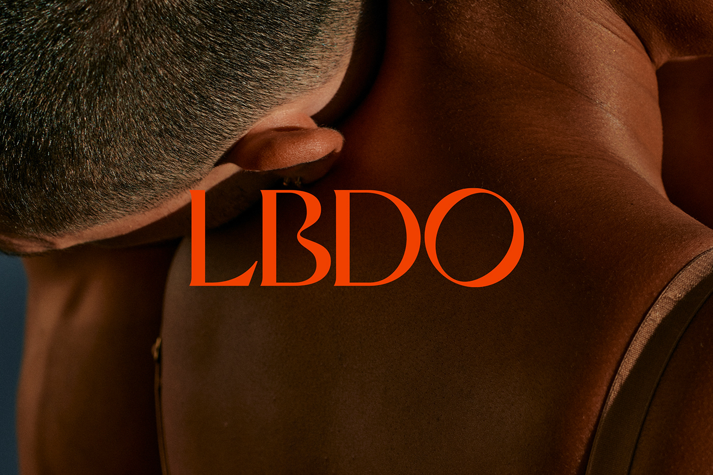
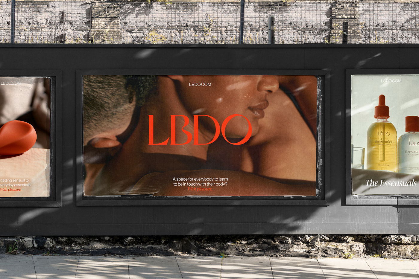
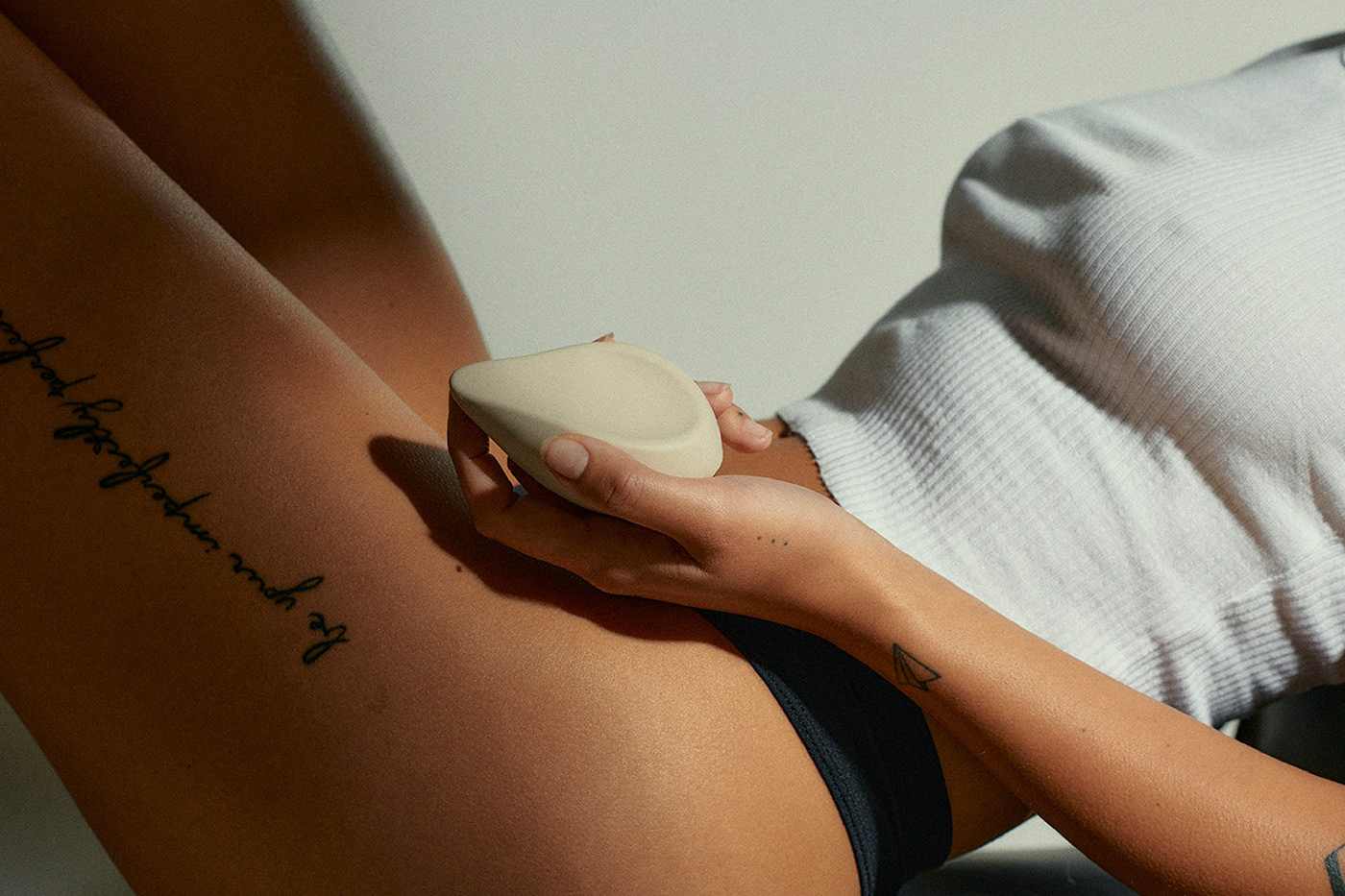
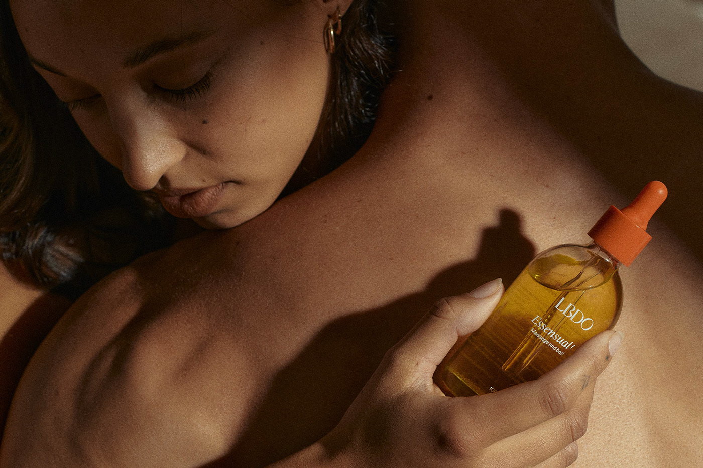
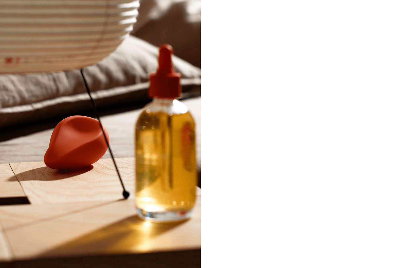
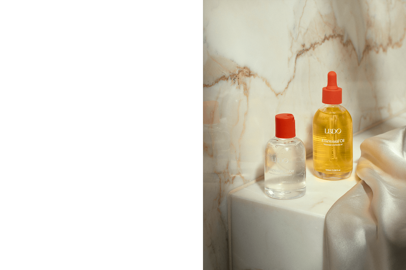
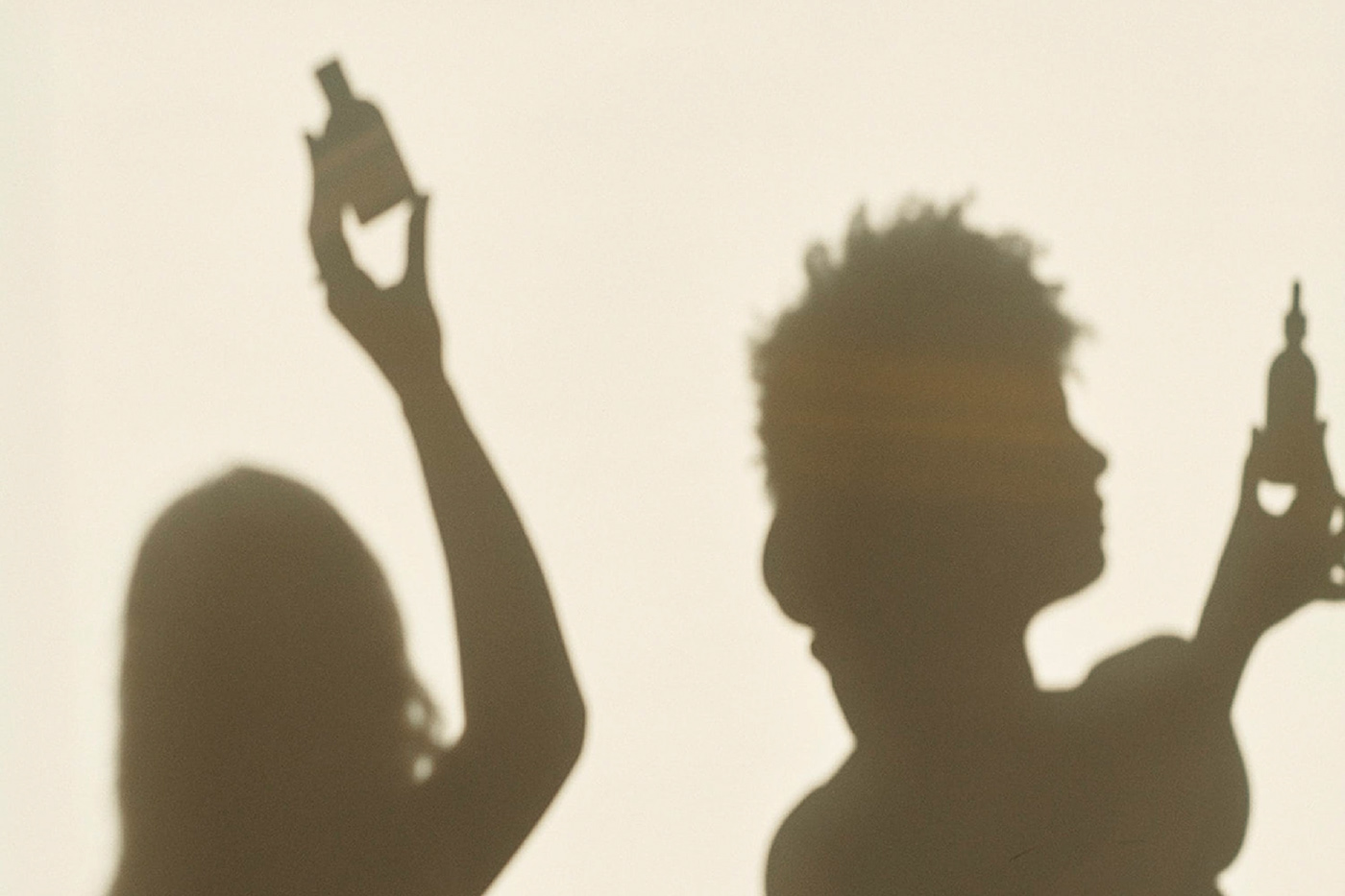
Photography played a key role in the branding. We helped with the initial art direction, setting up a style that is warm and inviting and that would hero sexuality. The photography direction (executed by Lauren Bamford and styled by Nat Turnbull) plays with warm light and shadows and utilises close-ups and detail shots to emphasise the sensual feeling of the brand.
Photography played a key role in the branding. We helped with the initial art direction, setting up a style that is warm and inviting and that would hero sexuality. The photography direction (executed by Lauren Bamford and styled by Nat Turnbull) plays with warm light and shadows and utilises close-ups and detail shots to emphasise the sensual feeling of the brand.


A pleasurable packaging experience
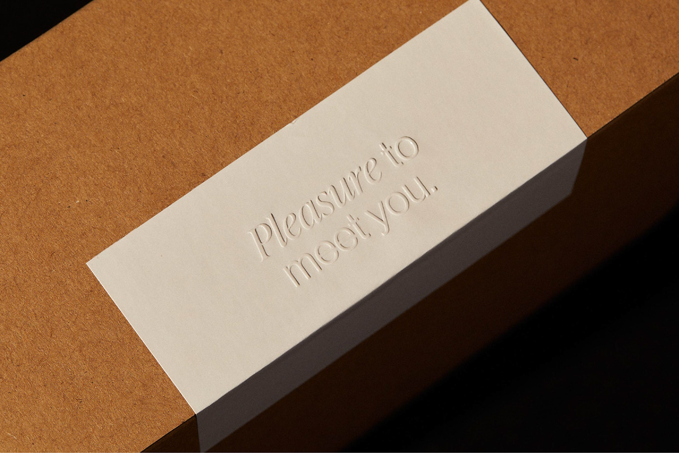
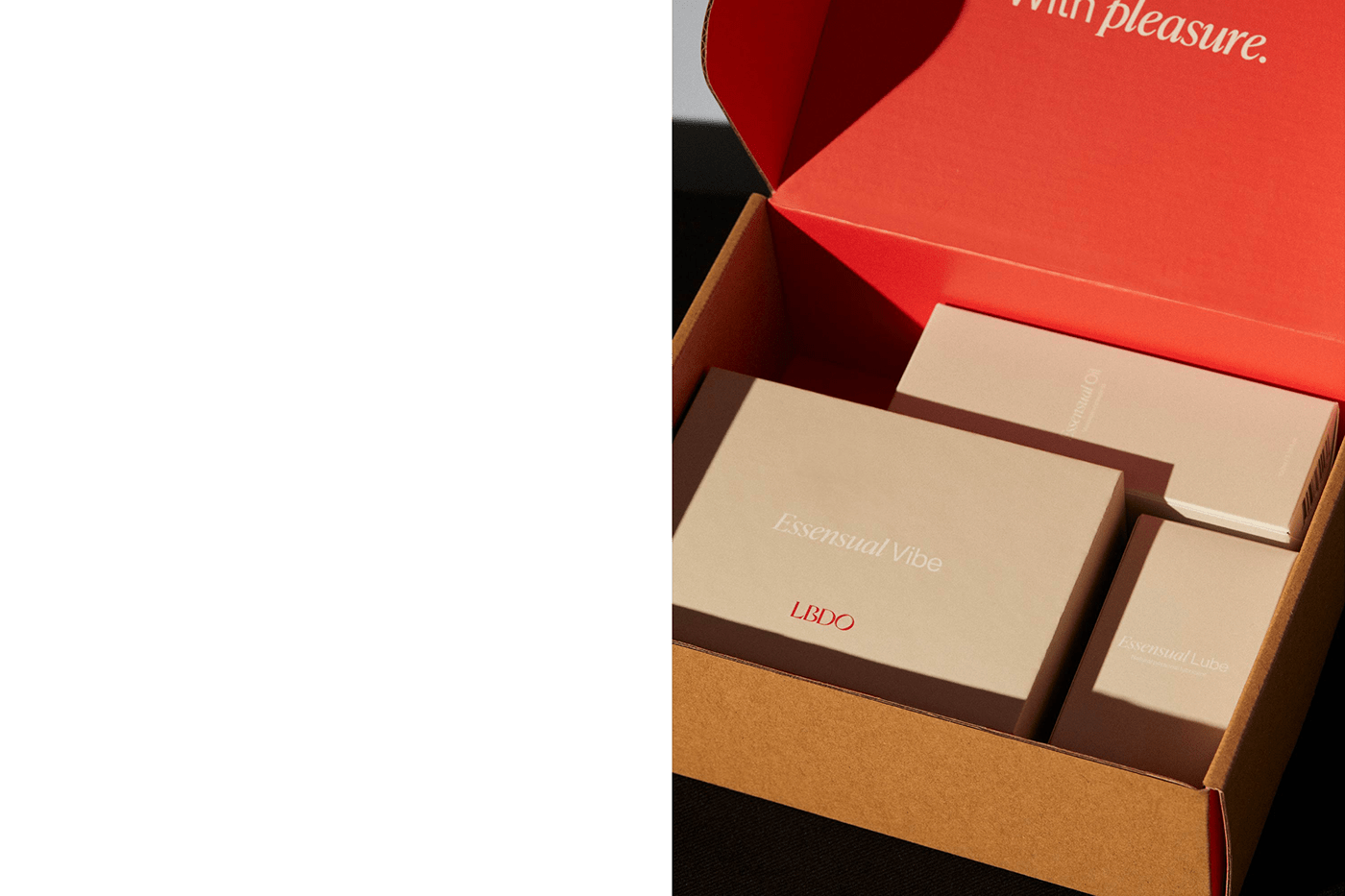
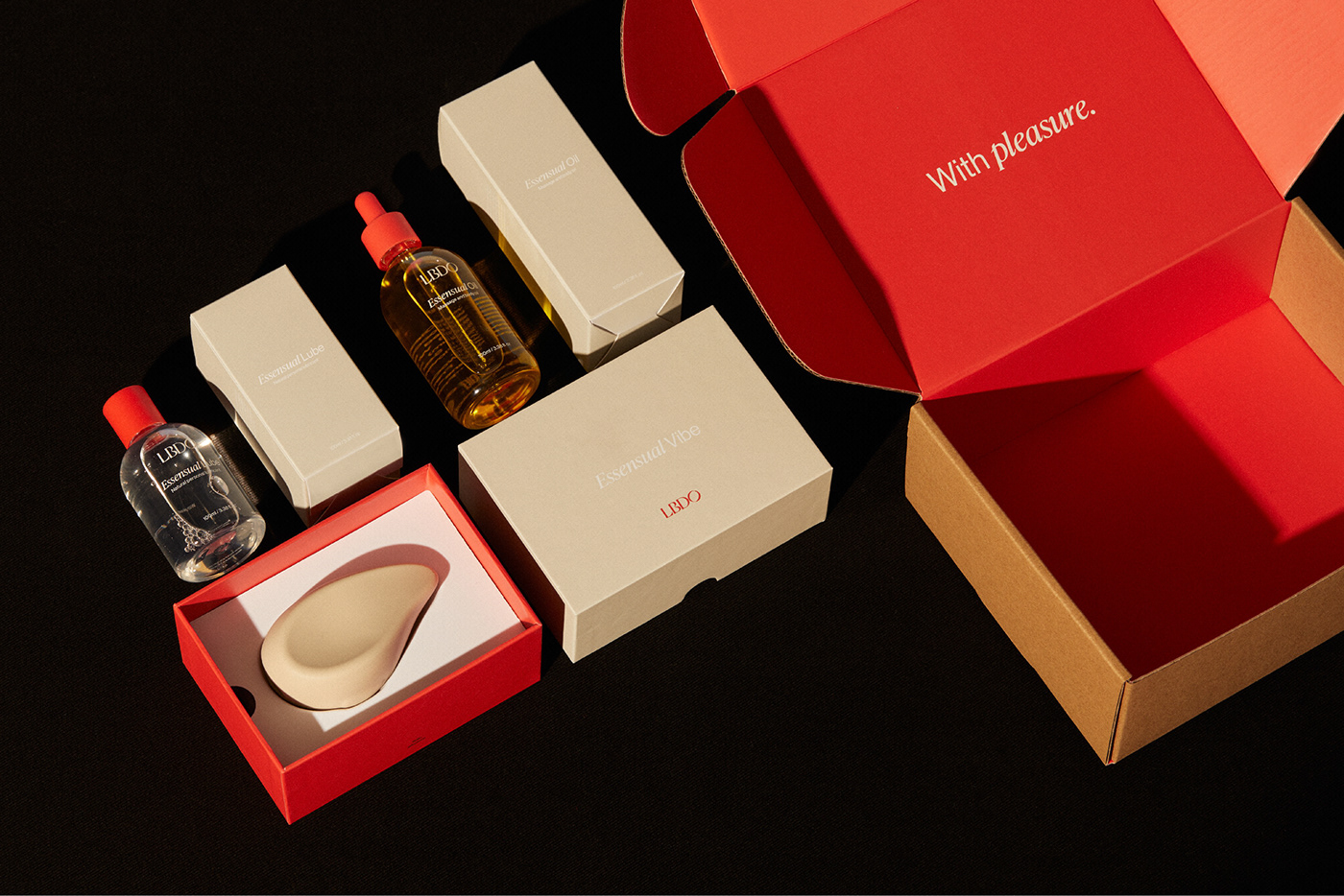
Like the product itself, we created a suite of packaging that would be beautiful enough to sit on your bedside table — not to be shamefully tucked away. The mailer box is discrete and logo-less (so the consumer can be comfortable having it delivered to any location), simply sealed with a sticker embossed with the brand line “pleasure to meet you” — a subtle insight to what’s inside for an in-the-know receiver. Once open, you’re greeted with a big hit of LBDO red, bringing the brand back to attention and helping the internal packaging stand out.
Like the product itself, we created a suite of packaging that would be beautiful enough to sit on your bedside table — not to be shamefully tucked away. The mailer box is discrete and logo-less (so the consumer can be comfortable having it delivered to any location), simply sealed with a sticker embossed with the brand line “pleasure to meet you” — a subtle insight to what’s inside for an in-the-know receiver. Once open, you’re greeted with a big hit of LBDO red, bringing the brand back to attention and helping the internal packaging stand out.
The Essensual Vibe sits in a two-piece box, though both pieces come together to sync with each other. Chargers and cables are hidden underneath a plinth that puts the product (and therefore pleasure) on the pedestal it deserves. The packaging for the brand’s complementary products — a massage oil and a lubricant — echo perfume bottles, with the screen-printed label keeping the design subtle, without blaring logos or messaging to distract from the products’ intention.


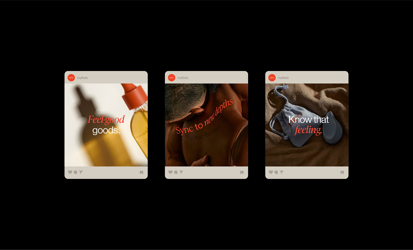
Digital made sensual
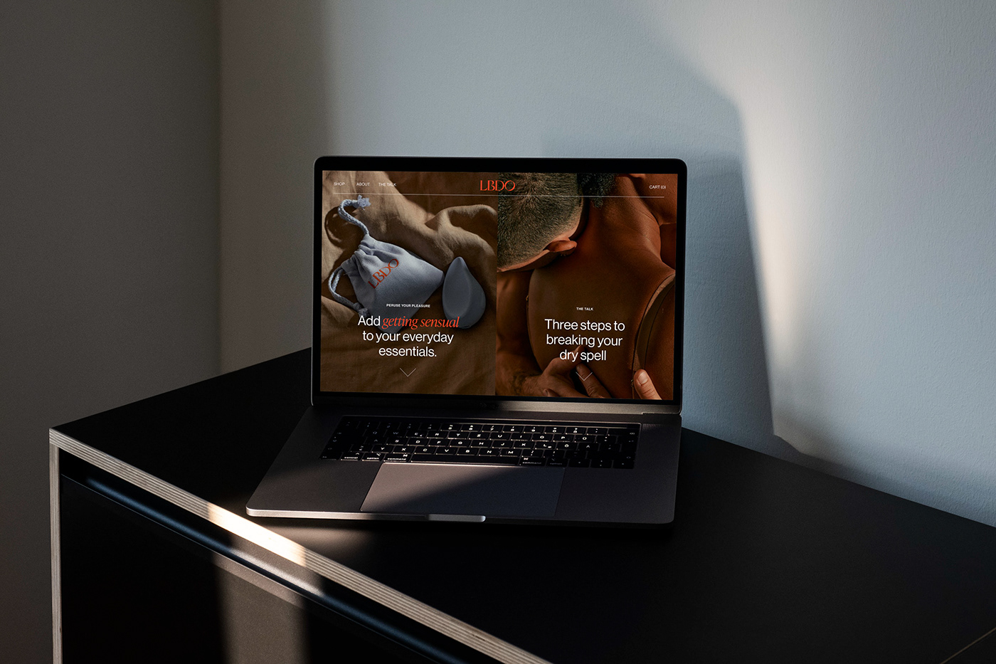
Much like the rest of the rollout, we wanted to create a distinct feel for the brand in the digital space — something easy to understand that would speak to normalising the conversation around sexual pleasure. From type to colour to copy to photography, every element of the design system comes together in the social media rollout. The brand’s digital-native and Very Online audience is able to take in the full visual experience in a single Instagram grid. Given the brand’s educational skew, social also became an incredibly important platform to share longer content that moved LBDO away from the category norms and into its own space.
And the end result?
Being in sync is about connecting with ourselves on an intimate level. It’s a relationship shaped by pleasure, joy, vulnerability, self-love and expression that gives us a deeper understanding of our body and mind. LBDO empowers everybody to embrace this relationship and it was our absolute pleasure to create the beautiful and inclusive brand experience around it.
Being in sync is about connecting with ourselves on an intimate level. It’s a relationship shaped by pleasure, joy, vulnerability, self-love and expression that gives us a deeper understanding of our body and mind. LBDO empowers everybody to embrace this relationship and it was our absolute pleasure to create the beautiful and inclusive brand experience around it.