
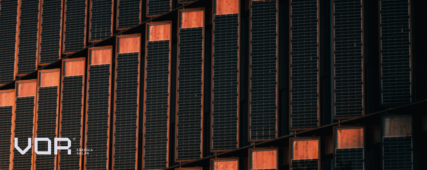
VOR® Energia Solar
Cliente: Henrique Maia | Ano: 2022
Cliente: Henrique Maia | Ano: 2022
ENG
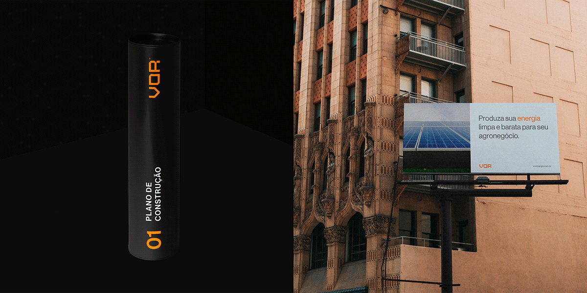
VOR is a Brazilian engineering, energy, and consulting company based in the city of Florianópolis. Its main focus is to empower its clients through the use of solar energy, a clean and renewable energy source.
Founded in 2018, VOR is dedicated to offering complete engineering services, from project analysis to equipment selection and installation of solar energy systems. In addition, the company also provides cost-saving estimates for its clients, demonstrating the potential electricity savings that can be achieved through the use of solar energy.
The VOR team is composed of highly skilled professionals who are always up-to-date with the latest technologies in the market. They work together with their clients to ensure the best solution for each project, taking into consideration their specific needs.
PT-BR
A VOR é uma empresa brasileira de engenharia, energia e consultoria, sediada na cidade de Florianópolis. Seu foco principal é capacitar seus clientes através do uso da energia solar, uma fonte de energia limpa e renovável.
Fundada em 2018, a VOR se dedica a oferecer serviços completos de engenharia, desde a análise do projeto até a seleção dos equipamentos e instalação dos sistemas de energia solar. Além disso, a empresa também realiza estimativas de economia para seus clientes, mostrando a economia de energia elétrica que pode ser alcançada através da utilização da energia solar.
A equipe da VOR é composta por profissionais altamente capacitados, que estão sempre atualizados com as tecnologias mais recentes do mercado. Eles trabalham em conjunto com seus clientes para garantir a melhor solução para cada projeto, levando em consideração suas necessidades específicas.
TEAM
Creative Direction: Bernardo Nascimento
Design: Bernardo Nascimento
Creative Direction: Bernardo Nascimento
Design: Bernardo Nascimento
DELIVERABLES
Brand Identity, Graphic Design, Art Direction

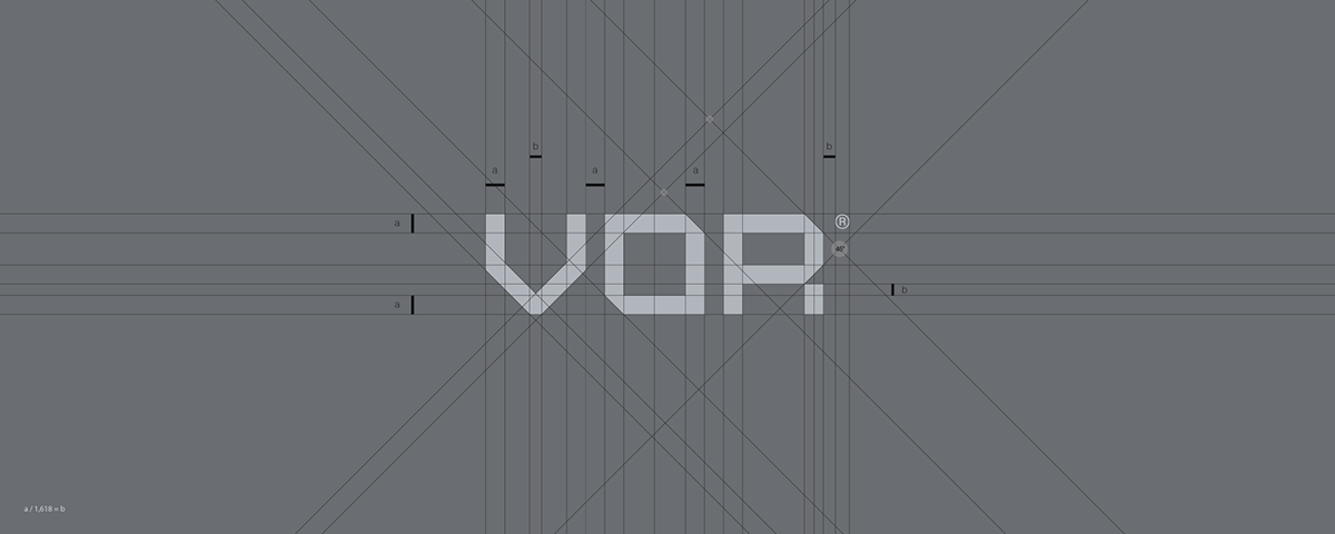
LOGO GRID & CONSTRUCTION
The goal of the logo construction and shape is to produce the similarity to the square and hexagonal shapes of solar plates and to bring a more modern and concise look.
The goal of the logo construction and shape is to produce the similarity to the square and hexagonal shapes of solar plates and to bring a more modern and concise look.
The logo grid was constructed with square shapes and 45° lines to bring a modern feel and represent the seriousness of the company in a strong logo.
GRID E CONSTRUÇÃO DA LOGO
O objetivo da construção e forma do logótipo é produzir a semelhança com as formas quadradas e hexagonais das placas solares e trazer um aspecto mais moderno e conciso.
O grid do logótipo foi construída com formas quadradas e linhas de 90° e 45° para trazer um toque moderno e representar a seriedade da empresa num logótipo forte.


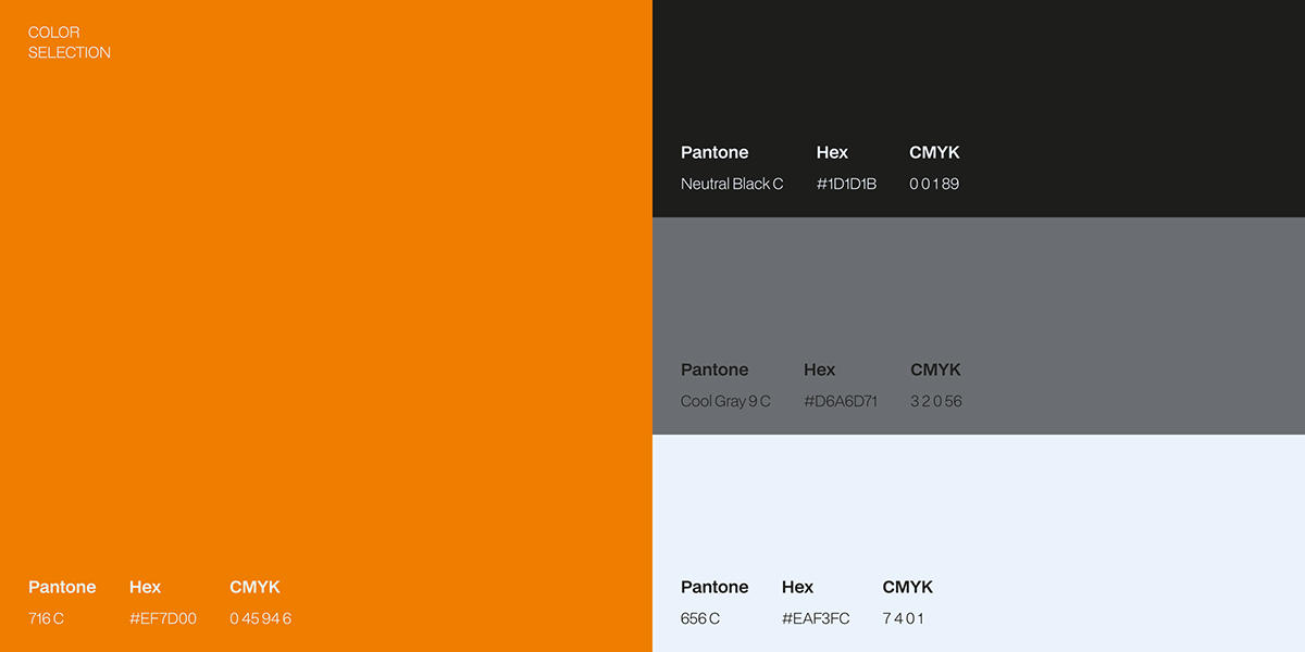
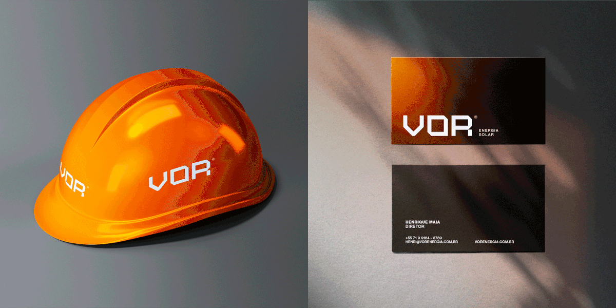
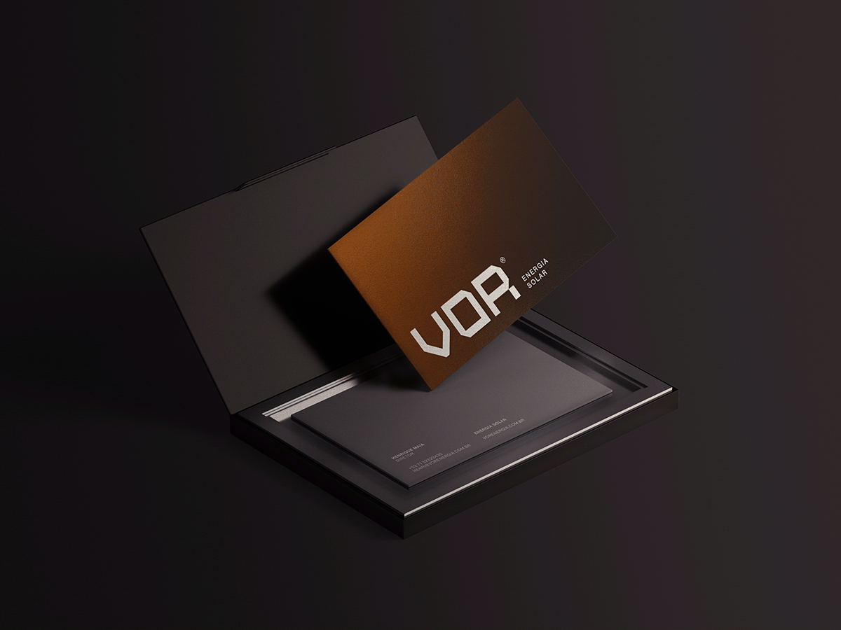
COLOR PALETTE
The palette in question was chosen to represent the industrial idea in general in we chose colors with cooler tones like gray but also to represent the sun that is key behind the company we chose the sunset orange color that together with the gray tones are the predominant colors of the brand.
The palette in question was chosen to represent the industrial idea in general in we chose colors with cooler tones like gray but also to represent the sun that is key behind the company we chose the sunset orange color that together with the gray tones are the predominant colors of the brand.
PALETA DE CORES
A paleta em questão foi escolhida para representar o a ideia industrial em geral em escolhemos cores com tonalidades mais frias como o cinza mas também para representar o sol que é chave por trás da empresa escolhemos a cor laranja pôr do sol que junto com os tons de cinza são as cores predominantes da marca.