
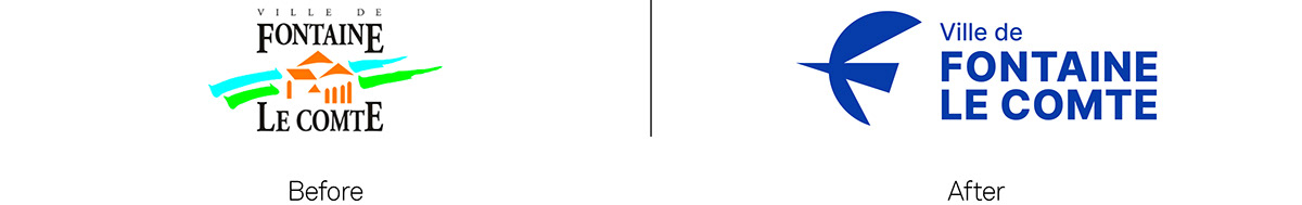
City of Fontaine-le-Comte
Liberté, égalité, et beaucoup d'air frais
Liberty, equality, and a lot of fresh air
Fontaine-le-Comte is a citizen's commune, committed and engaging, located in the urban community of Grand Poitiers. Its population has been growing steadily over the years. This growth is an argument in favour of the quality of life that exists within the commune. Fontaine is a charming green setting with a historical heritage thanks to its Augustine abbey, with local shops and an ideal geographical position. It has many assets to delight its inhabitants and attract new ones.
It is in this context that Graphéine was commissioned to rethink the visual identity of the city. The objective was to breathe new energy into the city to mark its reawakening and to belie the fate of the "dormitory town" promised by the urban expansion of the large conurbations. It is therefore a simple, gentle, green and creative quality of life that is promoted in this project.


Concept
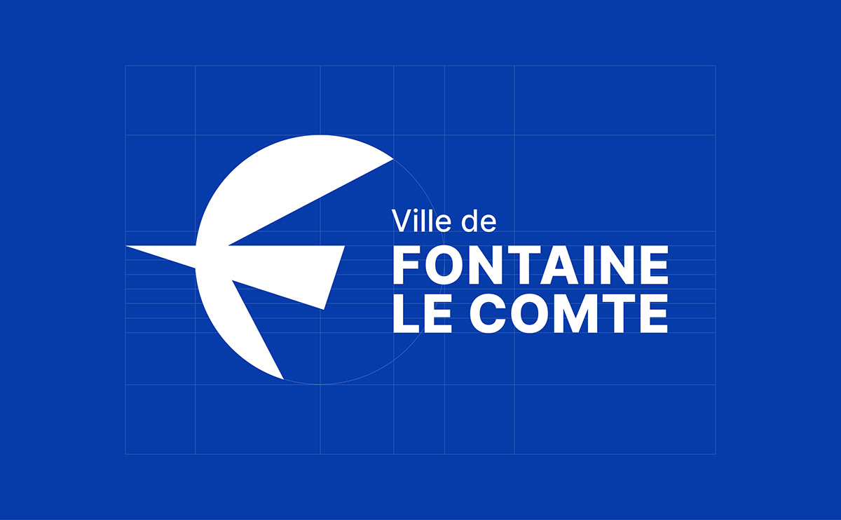
This new logo is inspired by the swallows that return to Fontaine-le-Comte every spring to nest in their hundreds. This new logo is the poetry and freshness of a swallow in flight, it is a real promise of escape, vitality and serenity.

A big "F"
This logo is primarily an "F" letter. The fact of enlarging and decorating the first letter of a name makes it possible to bring singularity while benefiting from the visual effect of the lettering which invites us to enter the reading of a text or a message.
LIBERTY
The bird is the symbol of Liberty. The swallow is a promise of escape, vitality and serenity. It is the bird that heralds spring and brings good omens.
NATURE
Fontaine-le-Comte's natural heritage makes it a real green haven, ideal for anyone who wants to recharge their batteries and reconnect with nature without giving up the comforts of the city.
CULTURE
Art and culture are to become increasingly central to the town. This ambition is reflected in the new identity through the influence of the work of Henri Matisse.


A RESPONSIVE DESIGN
The composition of the logotype can be adapted according to usage.
The composition of the logotype can be adapted according to usage.

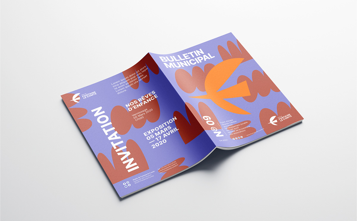
Illustrative universe


Illustrative Charter
To accompany the logo, we have developed a range of shapes and pictograms, in the spirit of "paper-cutting". The idea is to use this visual language throughout the compositions.


Paper-cut Workshop
In order to enrich the illustrative universe, we embarked on a paper-cut workshop. A way of leaving the screen to return to a form of craft and sensitive graphics. This led to welcome a young intern from the 3rd year of secondary school and create an ephemeral work of street art on the walls of the neighbourhood.
Obviously, we had in mind the work of Matisse and his fabulous cut paper works. The history of art has always been crossed by a conflict between drawing and colour. At the end of his life, Matisse overcomes this old quarrel. With a pair of scissors, he drew directly into the colour and brought paint and line together.


Graphic universe


Special thanks:
Thanks to Sylvie Aubert, Mayor of Fontaine-le-Comte, Simon Coutant, Director General of Services and Océane Di Mascio, Communications Officer, for their confidence, perseverance and energy. And thanks to Cowbell studio for their work on the motion design of the new logo reveal clip.
See more:


