

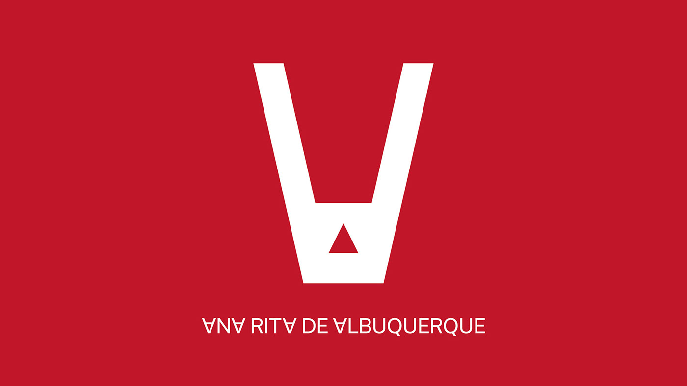
ANA RITA DE ALBUQUERQUE — LOGOTYPE
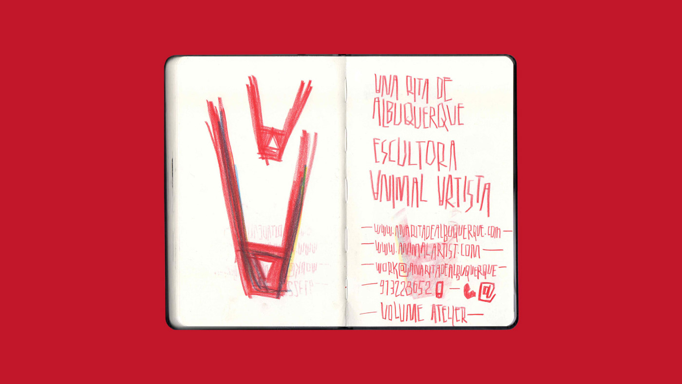
(PT) No meu processo de trabalho comecei por explorar a caligrafia e tentei desenhar um elemento que sintetizasse a assinatura “Animal Artista”. O “A” invertido tem como referência essa ideia e remete figurativamente para a aparência animal, muitas vezes representada no trabalho da Ana Rita. Quisemos desde cedo desenhar um logótipo simples, que não roubasse o palco à obra que representa e que permitisse ser facilmente replicado nos suportes em que normalmente trabalha.
(ENG) In my process, I started by exploring calligraphy and experimented with some drawings representing the "Artist Animal". The inverted "A" reflects this idea and represents a beast's head, a theme in part of Ana Rita's work. It was our idea to design a simple logo, something that wouldn't overshadow her art. We also wanted something easy to use on felted wool, her media of choice.
—
Graphic Design: Miguel Moreira
Sketches: Miguel Moreira
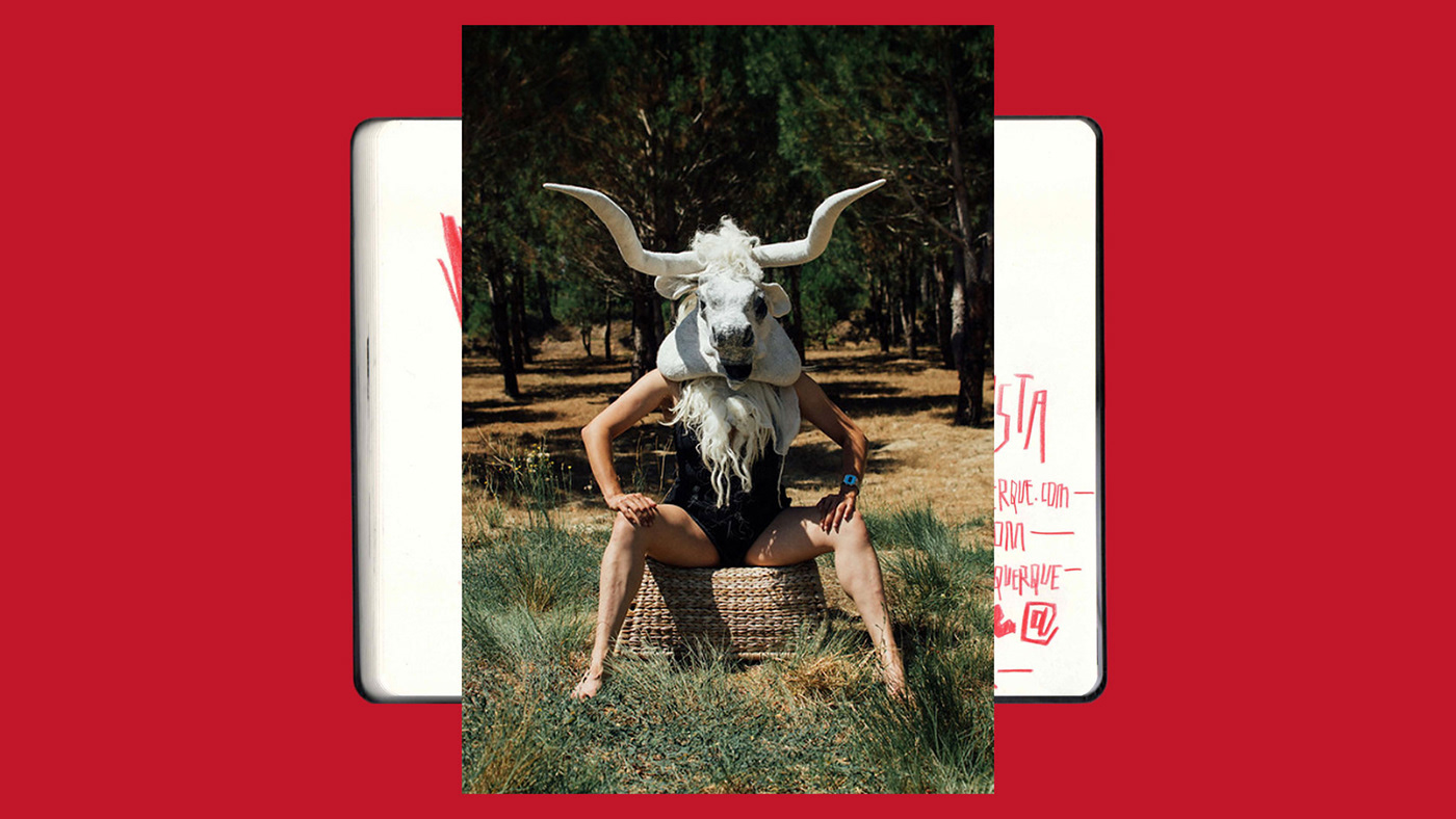
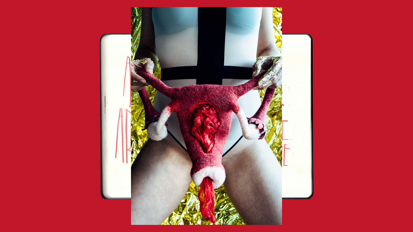
Photography / Consulting: Miguel Barbot (Ofício)
Photography / Consulting: Miguel Barbot (Ofício)
Client: Ana Rita de Albuquerque
—

