

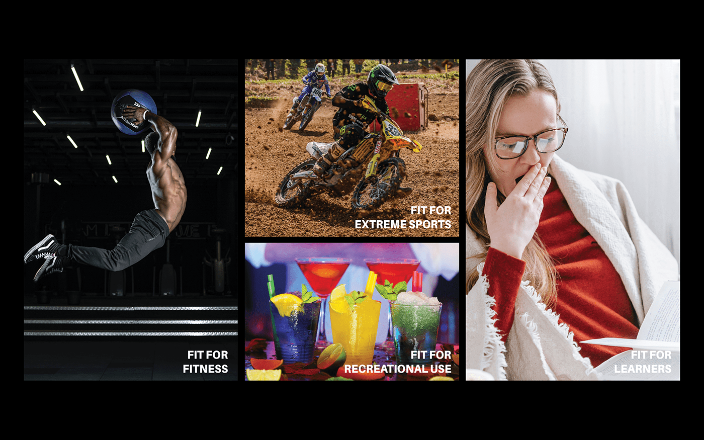
Product Field of use
Brand Logos (Current versus Proposed Versions)
The current logo, I felt that it had the representation of bursting and high energy but I felt that as a whole with the packaging design (It wasn't eye catching enough for me)

Logo Rationale

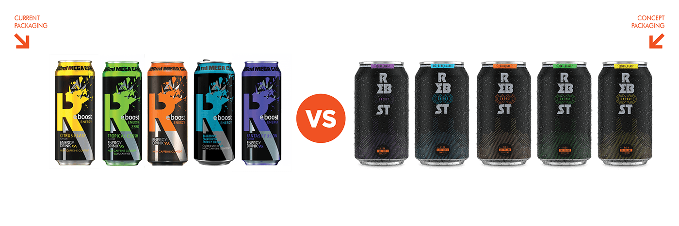
Flavours of Reboost (Old versus New)
In my version I felt it necessary to simplify the naming of the of flavours to suit the taste associated with it. The current flavours have a hint as to what the main ingredients are, but I felt that with my proposed theme (Blast would be accompanied with the fruit/flavour of the drink)


Logo Layouts as Portrait or Landscape
The colours used within the current branding will not be changed, as I wanted to work within the same parameters but solve some of the problems that I felt had to be rectified.
As not to stray too much from the current packaging, I decided to keep one element which was the 3 lines represented as the circles enclosed by the word energy. These lines were located next to the current packaging's, flavour names. So not to completely scrap the old identity, it served as a continuation of the current packaging.

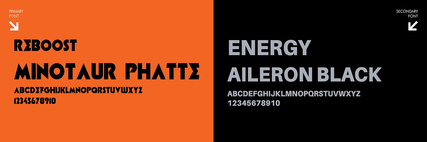
Fonts Used
The font used within this new proposal works well as it represents a bold, space and galactic and sci-fi vision. Where the consumer of the product will get a taste absolute delicious flavours which elevate and assist in high energy and improved concerntation.
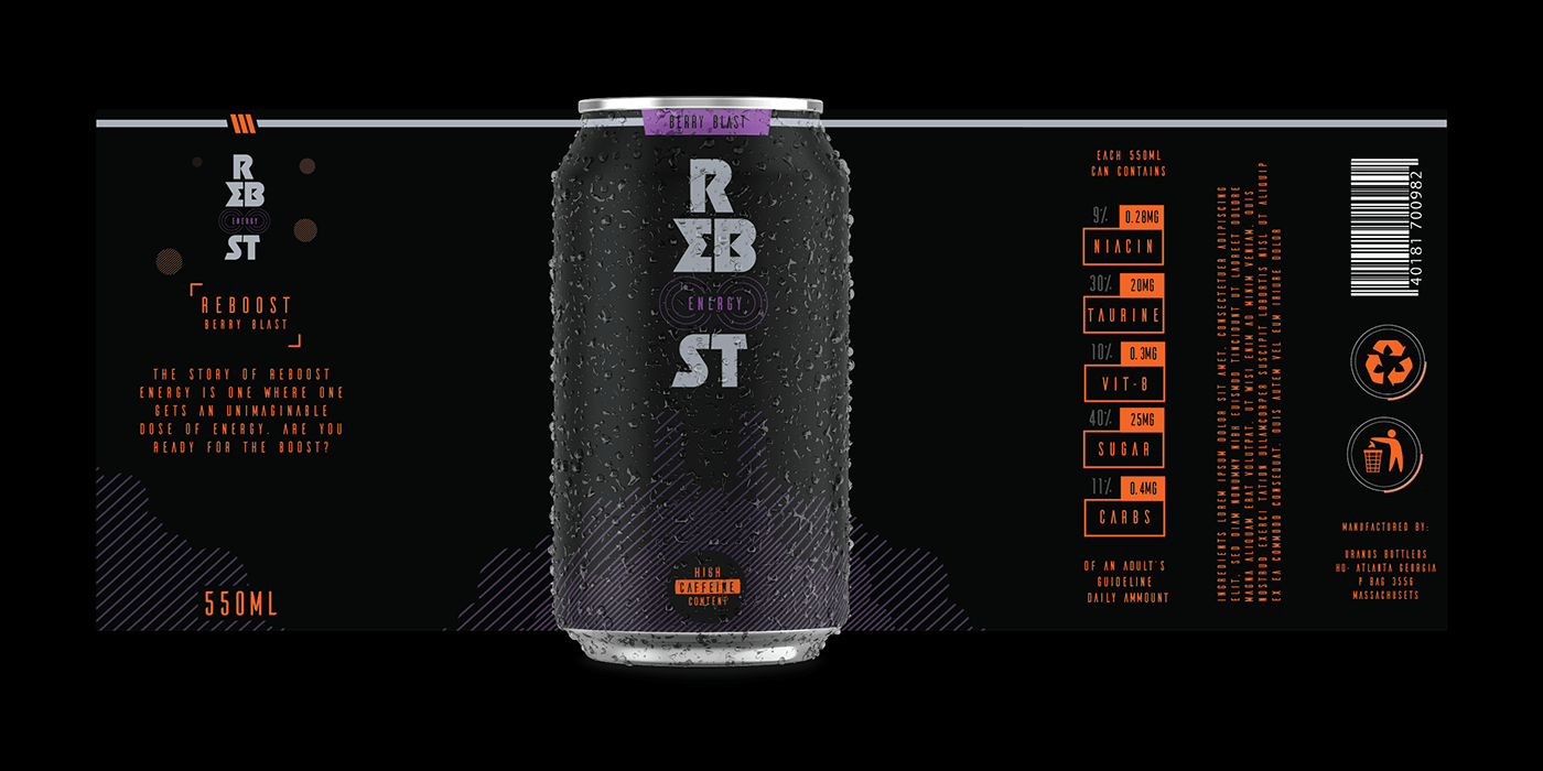
Packaging
The packaging features less information compared to the current packaging and gives the design and design elements much needed breathing space. Highlighting elements such as the striking logo, ingredients and the representation of a rocket blasting off (the logo) into space and by the illustrated smoke created by the repeated lines.
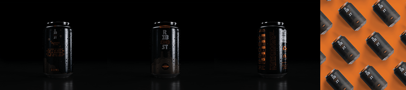
Mockups
Representing the Front, Side and Back of the can design
Proposed Advertising to promote the Energy Drink
The image shows the representation of a consumer within their physical activity releasing the newfound energy brought upon the Reboost Energy Drink. The immediate rush of energy sees him almost flying through the air and the speed has shown a massive boost in confidence and task capability.
The AD encourages consumers to never give up and never stop striving to achieve their best at all times.


