


Wayfinding system – The City of Sopot
client ⟶ City of Sopot
art director ⟶ Adam Świerżewski
design ⟶ Adam Świerżewski, Anastasia Vrublevská, Adam Ignaciuk, Marek Kruczkowski, Ada Pawlikowska
business ⟶ Marcin Fijołek, Adam Świerżewski
⟶
Excuse me, how can I get to the beach?
Is it the right way to the railway station? How can I get to the theatre?
These are the most frequently asked questions by tourists coming to Sopot. The city, which is one of the most beautiful and iconic resort in Poland.
⟶
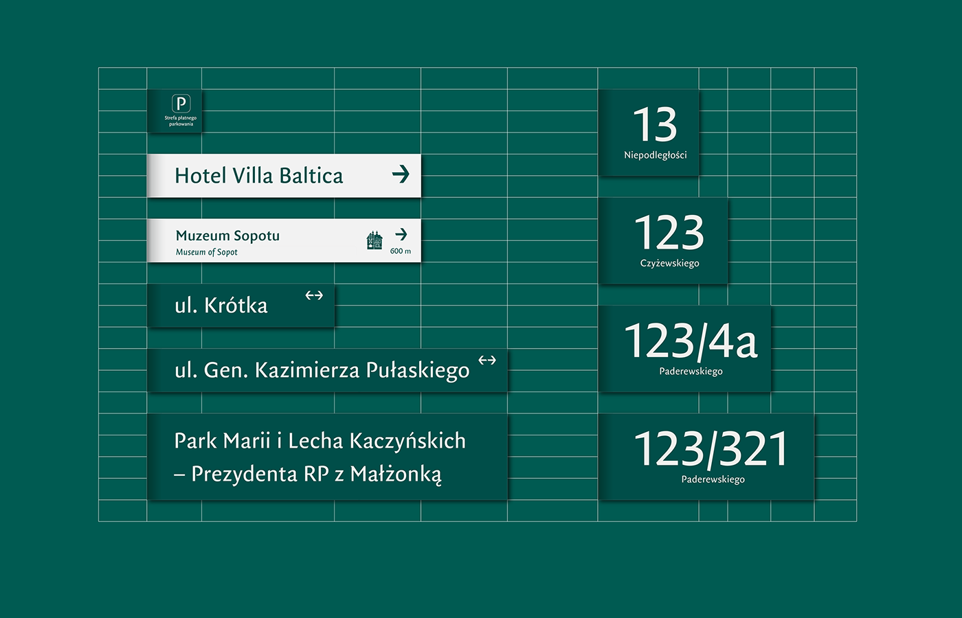
We were asked by The City of Sopot to help the tourists (and the inhabitants) find themselves in the urban space. And we have designed a relevant, unique and homogeneous visual system so that the recipients can identify it and associate it in the right way. The goal was to create visible and not imposing wayfinding system, adhering to the principle of the advantage of communication over persuasion.

⟶ Colours
The colours we have chosen are based and inspired by the Baltic Sea. The set of 7 colors fully meets the needs of the system.

⟶ Typography
The selection of the typographic set has been preceded by careful analysis of typefaces used in similar systems in the neighbouring cities, but also by the analysis of lettering systems used in Sopot’s signboards and facades buildings, Sopot’s newspapers of the 19th and 20th centuries.
Based on this research, it can be assumed that Sopot has not developed a uniform method of typographic indication of the city. For the main typeface we chose FF Quadraat Sans designed by Fred Smeijers.

Characteristics of a typeface FF Quadraat Sans:
- modern and simplified, but with a traditional antiqua structure;
- humanistic, fitting the eclectic character and architecture of Sopot;
- expressive and easy to remember, but not decorative;
- contains correctly prepared Polish diacritics;
- universal, has many varieties.

⟶ Icons, maps
We designed a set of icons designated to the specific landmarks and elements of Sopot. The design was inspired by shapes derived from the way of plotting assigned to the typography system.


⟶ Form
Our team was also responsible for developing the form of the signage boards. The main inspiration for the design was wind, as an inherent element of the seaside and The City of Sopot. All wayfinding elements have consistent form combined with the unique nature of the project dedicated to Sopot.


⟶ Manual, standards
To ensure proper implementation of the new wayfinding system for The City of Sopot, we designed a comprehensive set of rules and guidelines.


photographic documentation: Marcin Wojtkiewicz


