

OAK + FORT - Brand Research & Typesets
In preparation to design a 50-page brand book for Oak +Fort, I set out to gather research about the brand. Oak + Fort is a luxury Canadian clothing and lifestyle brand. They value versatility, minimalism and functionality in all their products designs. Their products aim to be clean, simple and thus timeless. Minimalism is a key element in Oak + Fort's visual identity.
Client: Oak + Fort
Service: Editorial Design and Branding
Year: 2020
Role: Graphic Designer
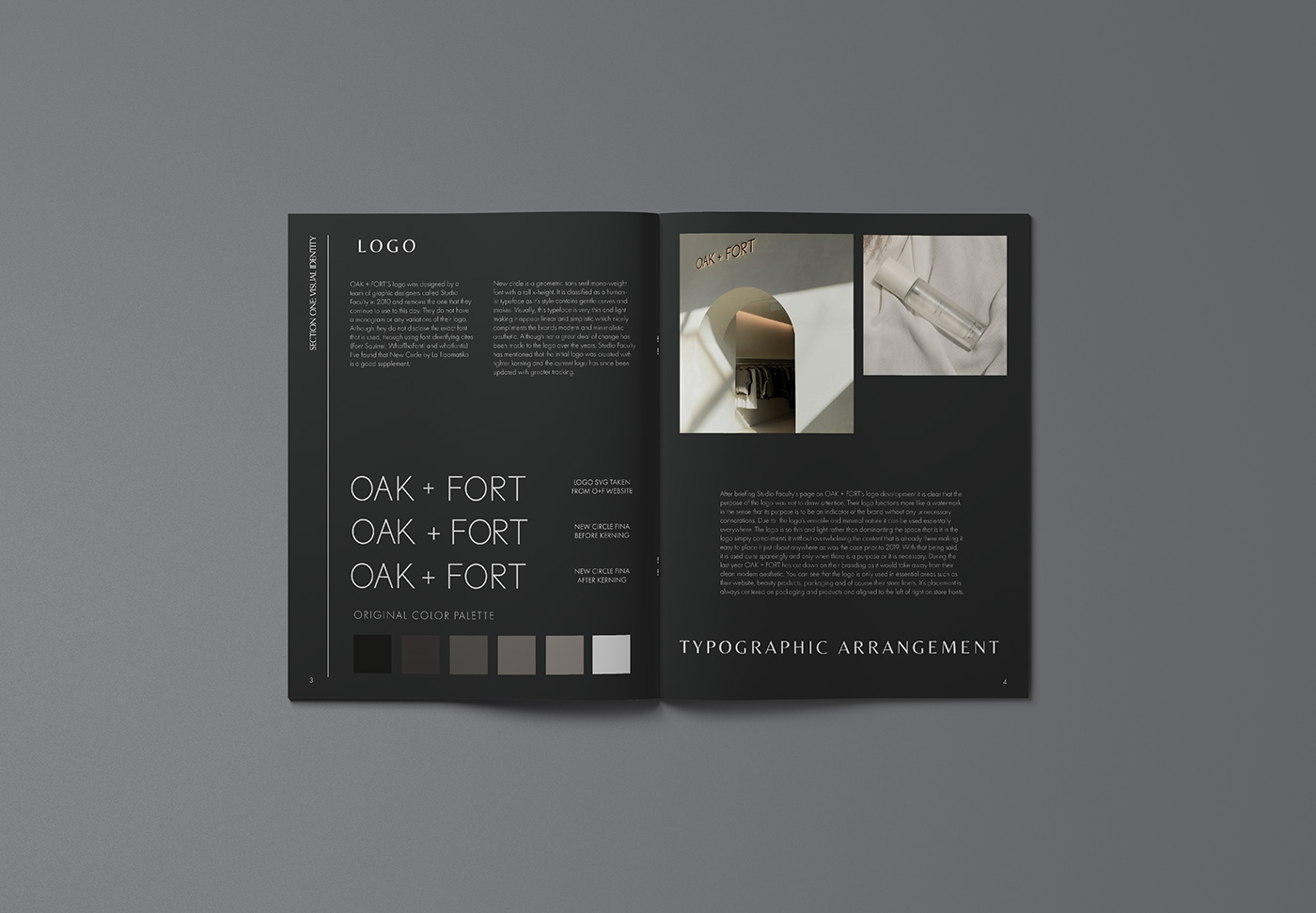
To begin, an analysis of their visual identity such as logo design and typographic arrangement decisions was done.
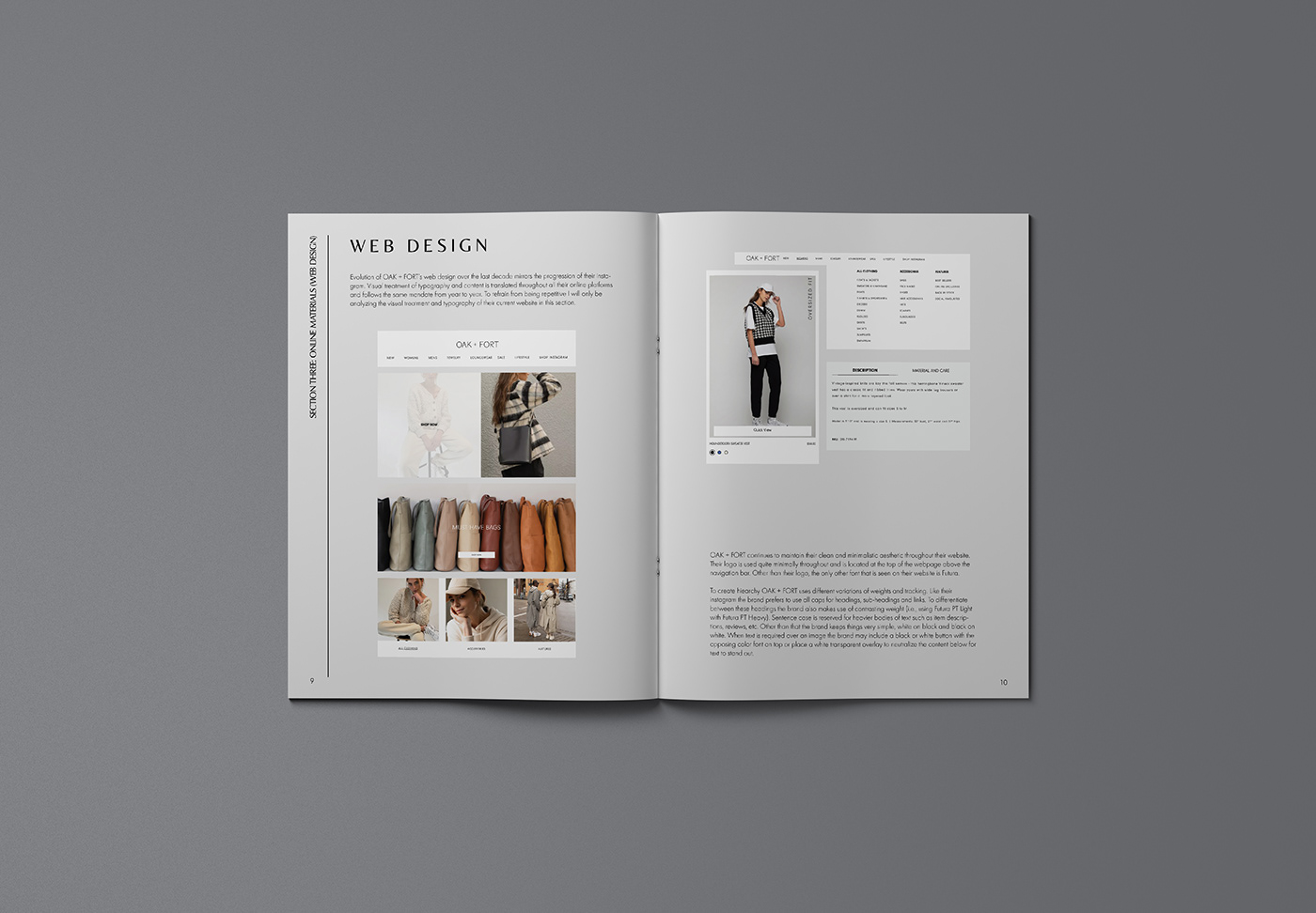
I then moved on to examine print materials such as packaging and labels and online materials such as their Instagram and web design.


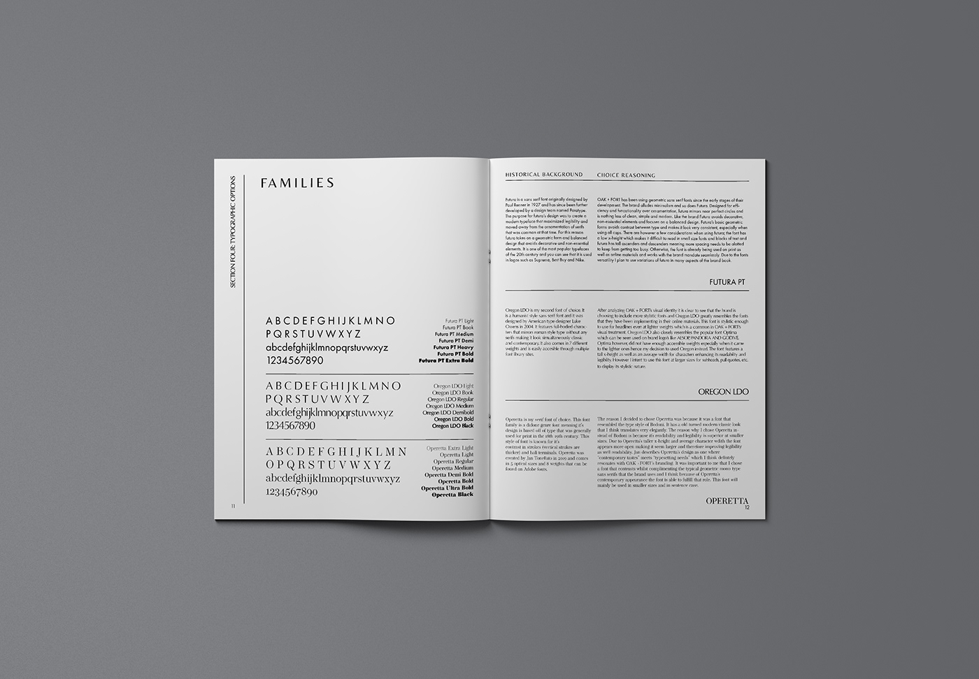
Gathering this research allowed me to choose 3 suitable font families to represent my typographic options for the final brand book.
After reviewing and finalizing my typesets, I was finally able to narrow down a typeset that would be used in Oak + Fort's final brand book.


Thanks for visiting :)


