

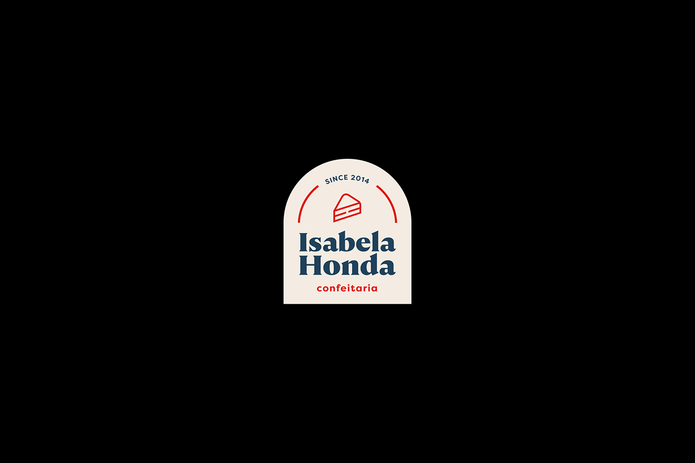

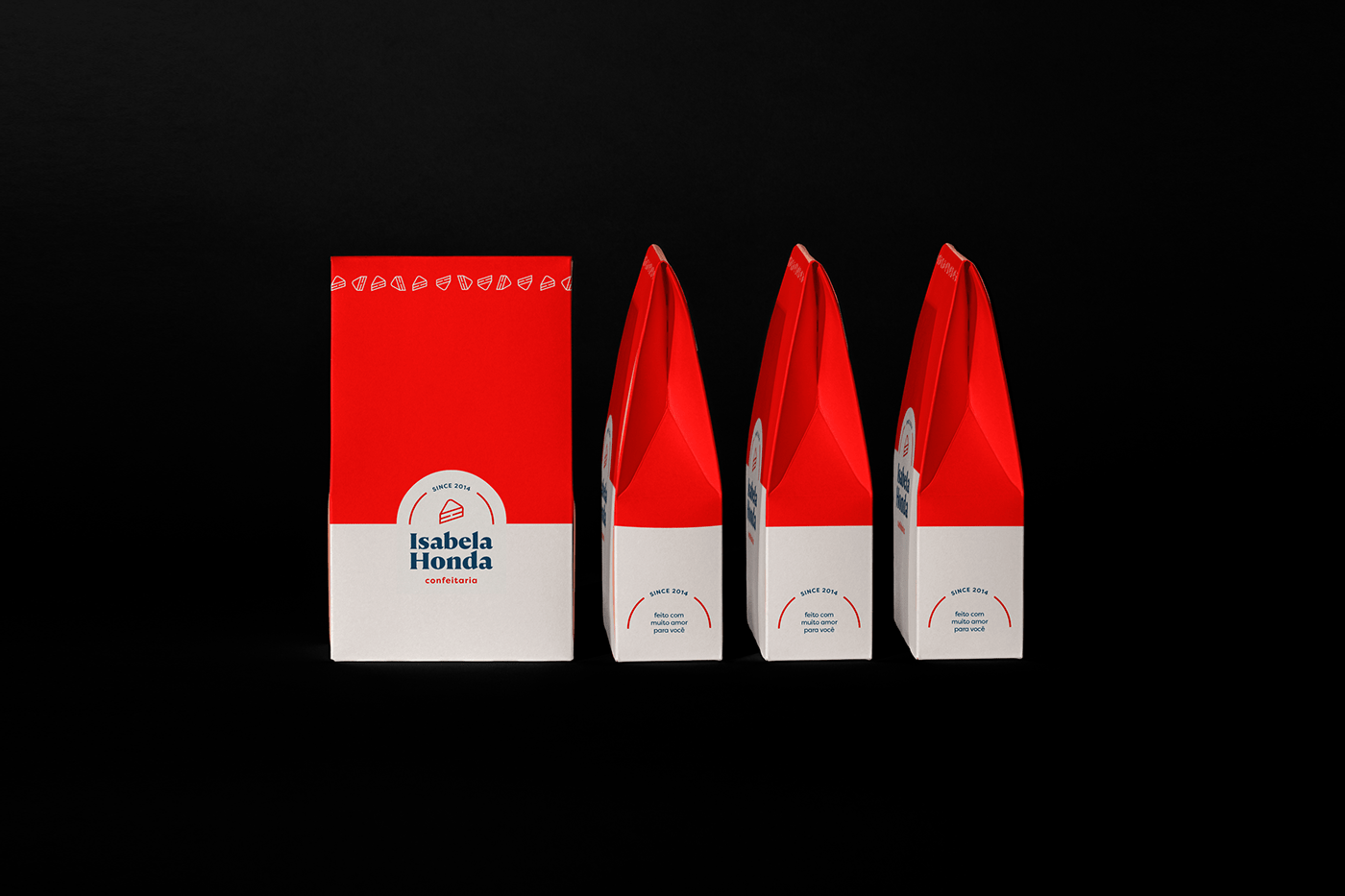
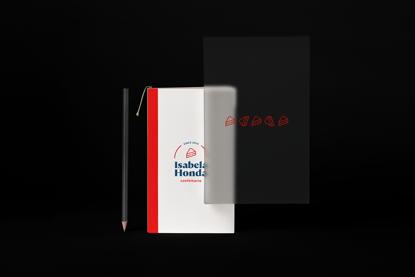
PT-BR Isabela Honda Confeitaria fornece doces equilibrados com os melhores ingredientes desde 2014. Com o intuito de trazer modernidade e apelo visual para à marca, criamos uma nova identidade visual. Com cores bem contrastadas e tipografia marcante, a nova identidade abraça o nome da proprietária da marca, Isabela Honda, e traz a letra "H" em sua forma horizontal no ícone do pedaço de bolo.
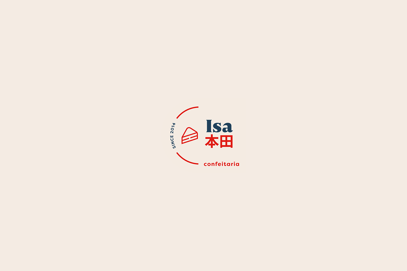
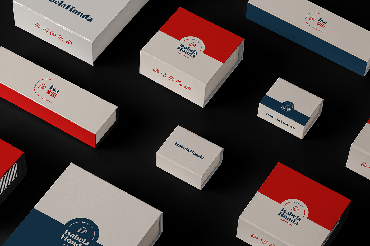
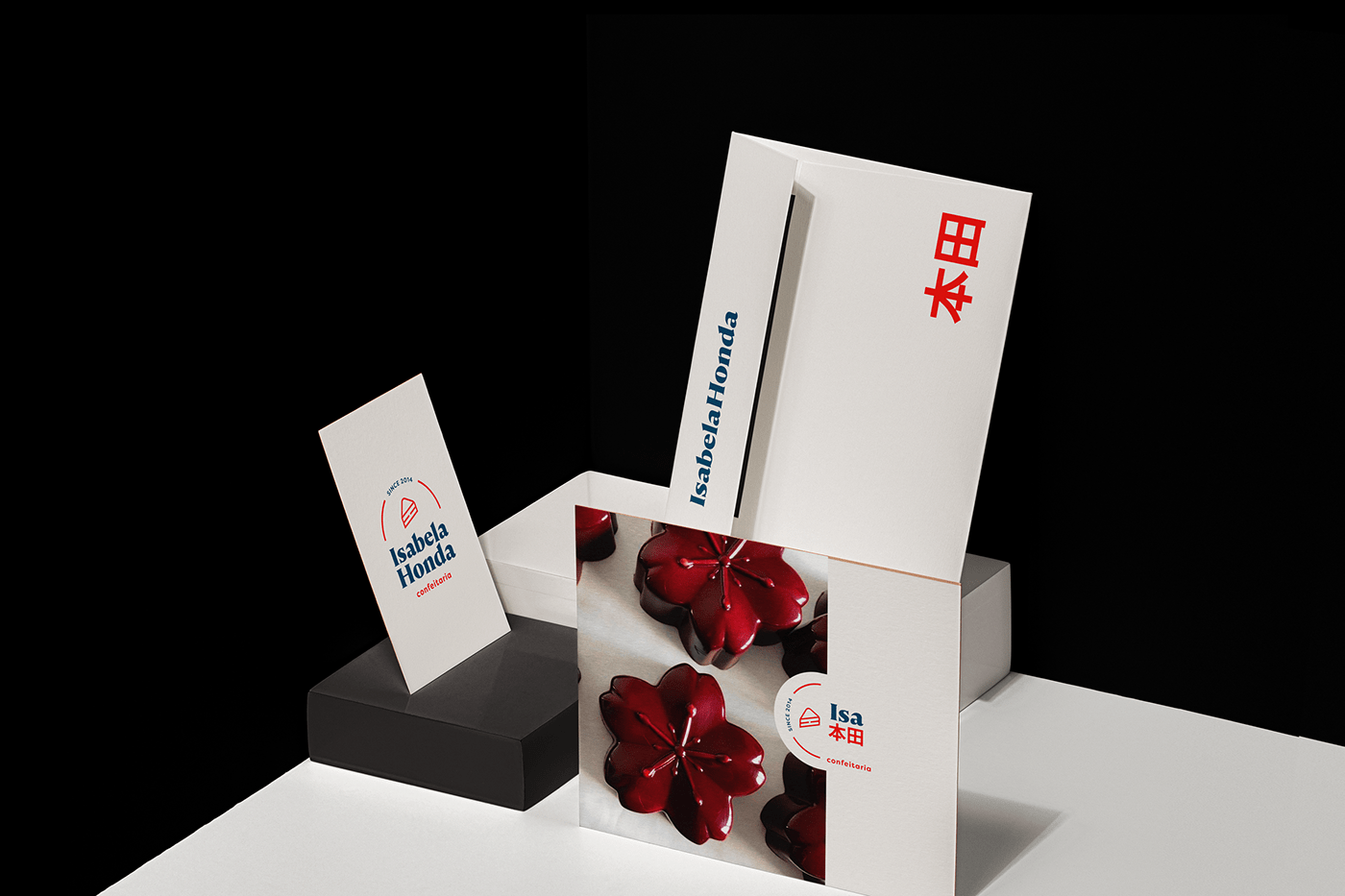
O logotipo possui duas versões: vertical e horizontal. Em sua versão horizontal, trazemos a redução do nome "Isabela" para "Isa" e colocamos o sobrenome "Honda" em kanji (linguagem japonesa), remetendo à ascendência da proprietária.
EN Isabela Honda Confeitaria has been supplying balanced sweets with the best ingredients since 2014. In order to bring modernity and visual appeal to the brand, we created a new visual identity. With contrasted colors and striking typography, the new identity embraces the name of the brand's owner, Isabela Honda, and brings the letter "H" (in its horizontal shape) in the cake icon.
The logo has two versions: vertical and horizontal. In its horizontal version, we bring the reduction of the name "Isabela" to "Isa" and put the surname "Honda" in kanji (Japanese language), referring to the owner's ancestry.


Thank you for watching
Muito obrigada
Bru Hirano @ Agosto/2021
Muito obrigada
Bru Hirano @ Agosto/2021


