Personal Branding Throughout the Years
I get a kick out of looking at my past work. Sometimes it reminds me of exactly where I was physically and emotionally when I made it. Sometimes I get flashbacks of the places I used the design or the feedback I got from it. Sometimes I just cringe, but use it as a measure of how much I've grown.
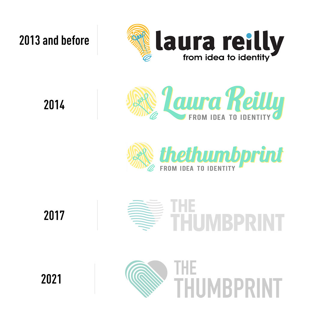
My personal branding for my graphic design and illustration business has grown up with me throughout the years and, as such, the logos have evolved as well. I thought of "thethumbprint" as a cool business name for corporate identity around 2001. I thought the whole idea of an individual identifier, like a thumbprint, would be perfect for a company involved in unique visual marks. Around 2001 I suppose is where I came up with the first logo rendition. This rendition that was sadly lost when my first external hard drive overheated and I had no backup. In a weird way, I'm so glad I learned that mistake young! (Always backup your backups!)
Around 2007 or so is when I came up with the "2013 and before" logo below. "from idea to identity" was the tagline. I wanted to convey that my interest wasn't just in the final product, but the whole process, from conception of the idea to final product to how that could be applied elsewhere and evolve over time. The mark was a mashup of a "big idea" light bulb and a fingerprint pattern. In the lost earlier rendition, the dot above the "i" was actually an outlet for the light bulb, but it didn't convey when the logo was shrunk, so I removed it for this later version, leaving it a different color than the rest of the text as a nod to the previous version.
In 2014 minimalism, flat design, and app logos were hot and I wanted an updated design so I went this trendy route. In retrospect, I cringe at the Lobster font I chose that quickly became overused that year. I simplified the shape of the light bulb into more round shapes. The colored tittle of the "i" was removed to unify the type as one unit a little better. I also made two versions -- one with my name and one with the company name, "thethumbprint". I ended up using the company name one far more.
In 2017 I only made the company name version. I also got rid of a lot of the "trendy" features and opted for something muted, classic, and that could grow with me over time. The tagline got a backseat so the idea of the light bulb was no longer relevant, thus it was removed. I put a space between "The" and "Thumbprint" and stacked the words because I kept running into an issue where people were misreading the name when it all appeared on a single line as one word.
In 2021 there were more subtle updates to the logo. A little darker on the gray and fewer thin detailed lines in the thumbprint pattern meant it would be easier to read in smaller areas and on white (which it is placed on often). It has the same look and feel as the 2017 version, but it's now it's easier to read.
I hope you like the journey I'm taking with my branding evolution (that would be a cool book name, right? Branding Evolution.) and I can't wait to see where I go with it in another few years.
You can check out some of my work on my portfolio site at http://www.thethumbprint.com or if you want to see my day-to-day artwork, please come follow me on my IG @thethumbprint.
Thanks for stopping by!