


Overview
디지털 프로덕트 에이전시 TOKTOKHAN.DEV(똑똑한개발자)의 리브랜딩 과정과 BX 가이드를 소개합니다.
똑똑하다는 것은 단순히 '지능이 높은 것'이 아닌, '문제를 제기하고 해결하는 기술'을 의미합니다. 열린 시각으로 문제를 찾고 해결하는, 주체적인 태도를 말하죠. 우리는 이러한 ‘똑똑한 태도’를 바탕으로 생각을 더하고 연결하며, 우리 모두가 하나의 프로덕트 개발자 Developer 라는 생각으로 가치있는 경험을 주는 프로덕트를 만들어갑니다.
TOKTOKHAN.DEV is a digital product agency. From May 2021, we proceeded brand renewal redefine the meaning of ‘Toktokhan’ and 'Dev’.
‘Tok-tok-han’ is a same sound that means ‘smart’ in Korean. Being smart isn't just about being intelligent, it's more about pose a question and problem-solving. It refers to an attitude of growth by looking at problems with an open perspective and presenting solutions with unique ideas.
Design
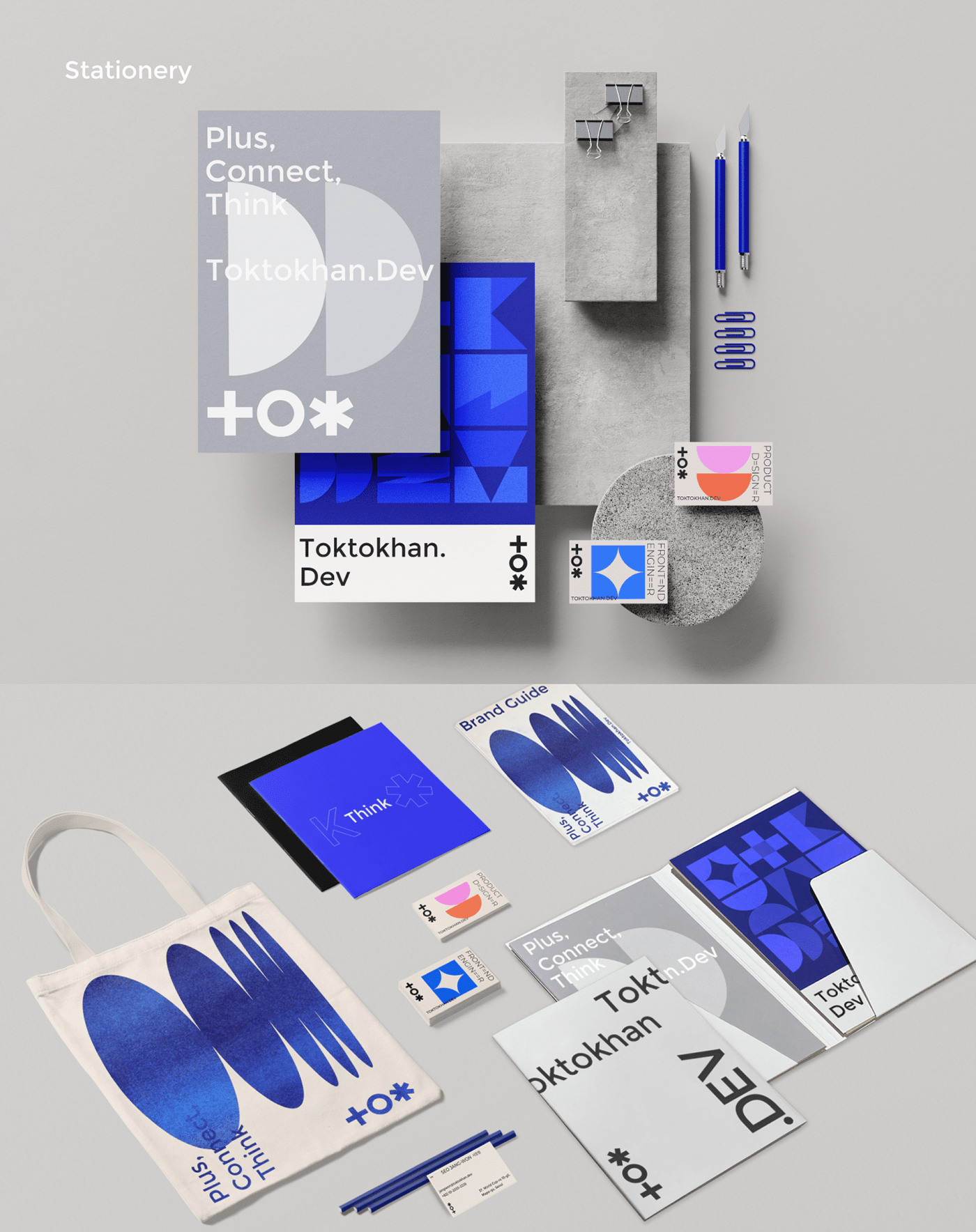
BX Design, Graphic/Motion Design, UXUI Design, Interaction Prototype, Figma, Aftereffect, Lottie
Development
Interactive Web, Responsible Web
Reddot Winner 2021 - Brand design


TOKTOKHAN.DEV가 추구하는 '똑똑한 태도'를 영문명 TOKTOKHAN의 각 알파벳 앞글자 T, O, K 에서 뽑아, Plus(+), cOnnect, thinK 라는 세가지 단어와 키워드를 선정했습니다.
We created a brand slogan and logo of “Plus(+), cOnnect, thinK” using this attitude and the first letters T, O, K of the Korean pronunciation of ‘Tok-tok-han’ as keywords.


T는 Plus를 의미합니다. 두 선이 겹쳐져 + 모양의 모티프를 구성함과 동시에, 디자인과 개발을 넘어 다양한 방식으로 가능성을 더해가는 TOKTOKHAN.DEV의 접근 방식을 나타냅니다. O 는 융합하며 또 다른 원을 이루는 모티프 안에서 Connect를 의미합니다. 기술과 이미지를 통해 디지털 화면 안에서 사람과 사람, 세상을 연결하는 우리의 지향점을 담았습니다. K 는 Think로, 제품에 이야기를 담고 가치있는 경험을 위해 생각을 이어가는 우리의 태도를 이야기합니다.
Plus, Connect, Think. 똑똑한개발자가 제품을 이해하는 방식이자, 제품을 통해 전하고자 하는 브랜드 미션입니다.
Plus, Connect, Think. 똑똑한개발자가 제품을 이해하는 방식이자, 제품을 통해 전하고자 하는 브랜드 미션입니다.
T stands for Plus, It represents TOKTOKHAN.DEV’s approach, which adds possibilities in various ways beyond design and development, and overlaps two lines to from a + shaped motif. The O stands for Connect within the motif that fuses and forms another circle. it contains our goal of connecting people to people, people to the world in a digital screen through technology and images. K stands for Think, and we talk about our attitude to telling a story in our products and continuing to think for a valuable experience.
Plus, Connect, Think. It is the way TOKTOKHAN.DEV understand the product, and the brand mission we want to convey through the product.


똑똑한개발자는 팀원 모두가 직무가 아닌, 하나의 제품을 만드는 공동체로서 목표점을 공유하고 소통합니다. 디자이너, 개발자와 같은 직무로서 우리 스스로를 칭하기보다, 모두가 각자의 자리에서 프로덕트를 만들어가는 개발자 Developer 라고 생각합니다.
이처럼 똑똑하게, 그리고 TOKTOK하게.
한계를 한정짓지 않고 경험을 공유하고 성장하는, 우리는 TOKTOKHAN.DEV입니다.
‘.DEV’ in ‘TOKTOKHAN.DEV’ reveal meaning that not division a designer or engineer, but we're all developer team where we all work together to develop one product. We think that everyone is a developer who makes products in their own place.


Typography Graphic Module
26자의 알파벳 모션 타이포그래피를 디자인했습니다.
Accordingly, we designed a 26-character alphabet motion typography in the shape of which simple figure motifs are connected and combined with each other.
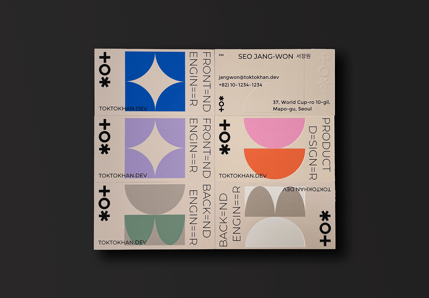
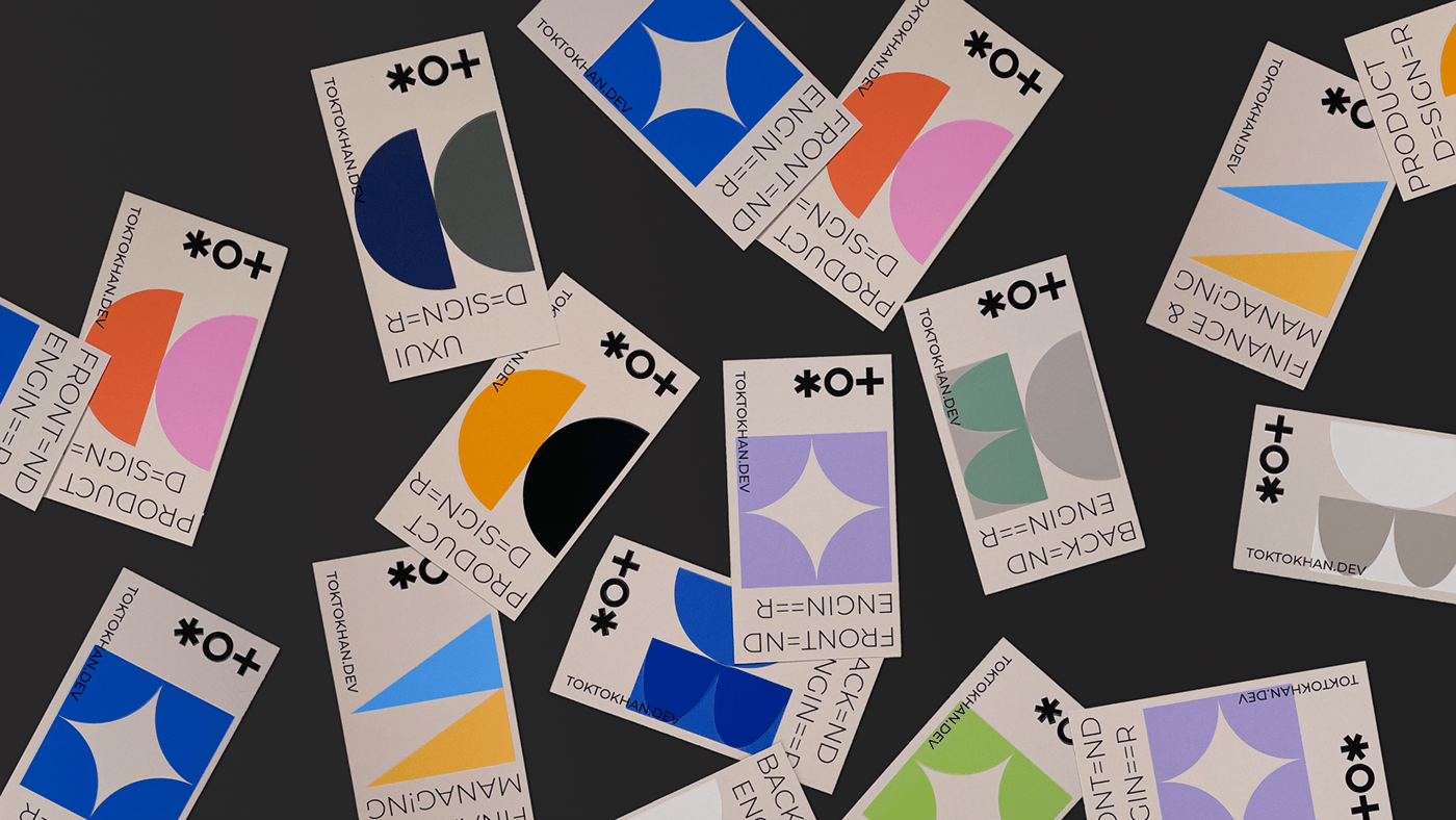

26자의 각 타이포 모듈은 다양한 형태로 명함, 웹사이트 등에 활용되며 이미지 및 Lottie 애니메이션 조합으로 사용할 수 있습니다.
26 character Each Motion typography has visual flexibility and is used in various ways, such as business cards and websites, along with logos or each typography elements.
We wanted to capture the brand identity of TOKTOKHAN.DEV, which creates synergy with each other through interactive graphic images.

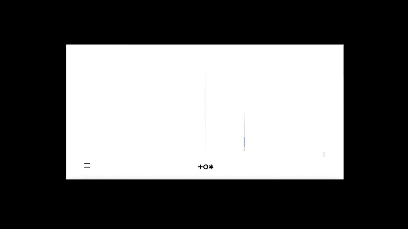
인터랙티브한 요소와 그래픽 모티프 이미지를 활용한 반응형 웹사이트로, 브랜드 방향성을 전달하고 몰입감을 제공합니다.
It is a responsive website using interactive elements and graphic motif images, conveying brand direction and providing a sense of immersion.

Credits
BX Design. Park Suji, Lee Jimin
Graphic Design. Park Suji, Lee Jimin
UXUI / Interaction Design. Park Suji
Motion Design. Park Suji
Frontend Engineer. Seo Jangwon, Ahn Yein
Project Manager. Seo Jangwon, Yeon Kyusung
The project started in April 2021 and finished in June 2021
TOKTOKHAN.DEV is a digital product agency that conducts branding, UX/UI design, platform/software development, and consulting based on digital products and services.
ⓒ 2021 TOKTOKHAN.DEV All Right Reserved.


