


The 30th anniversary visual identity style for Berendey Cultural Center.
(http://dkberendey.ru/) This is the unique cultural center, located near the Serebryany Bor Island (Silver Forest) on the Northwest of Moscow which turns 300 on 2021
(http://dkberendey.ru/) This is the unique cultural center, located near the Serebryany Bor Island (Silver Forest) on the Northwest of Moscow which turns 300 on 2021
There was already a developed style, including logo, graphic elements, fonts, mascot, patterns, etc. The CC Berendey CEO and creative director have set the task to modify the visual identity of the multifunctional center to celebrate the anniversary.
Firstly we needed an anniversary logo based on the main one.

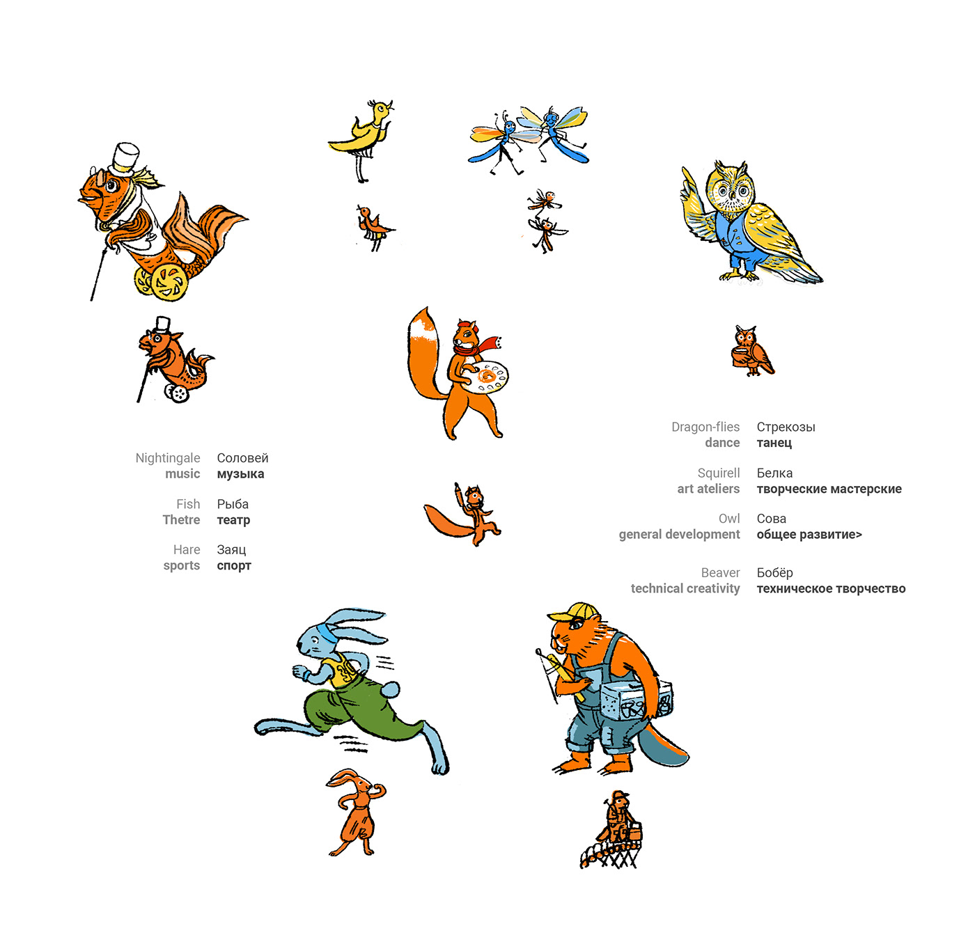
Then the set of characters according to main areas of activities (theatre, sports, art, etc)
It was the collective brainstorming to find best characters team which would refer the location and represent the activity in a kind of hilarious way.
It was the collective brainstorming to find best characters team which would refer the location and represent the activity in a kind of hilarious way.
So far, here is what we have chosen!
One of most important parts was the development of entrance photozone to give the festival atmosphere to all the guests.


And here are some variations of logo for diverse usage:

Thank you for watching!


