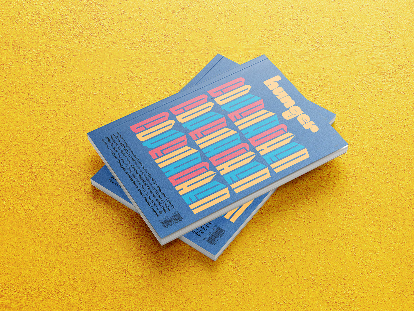
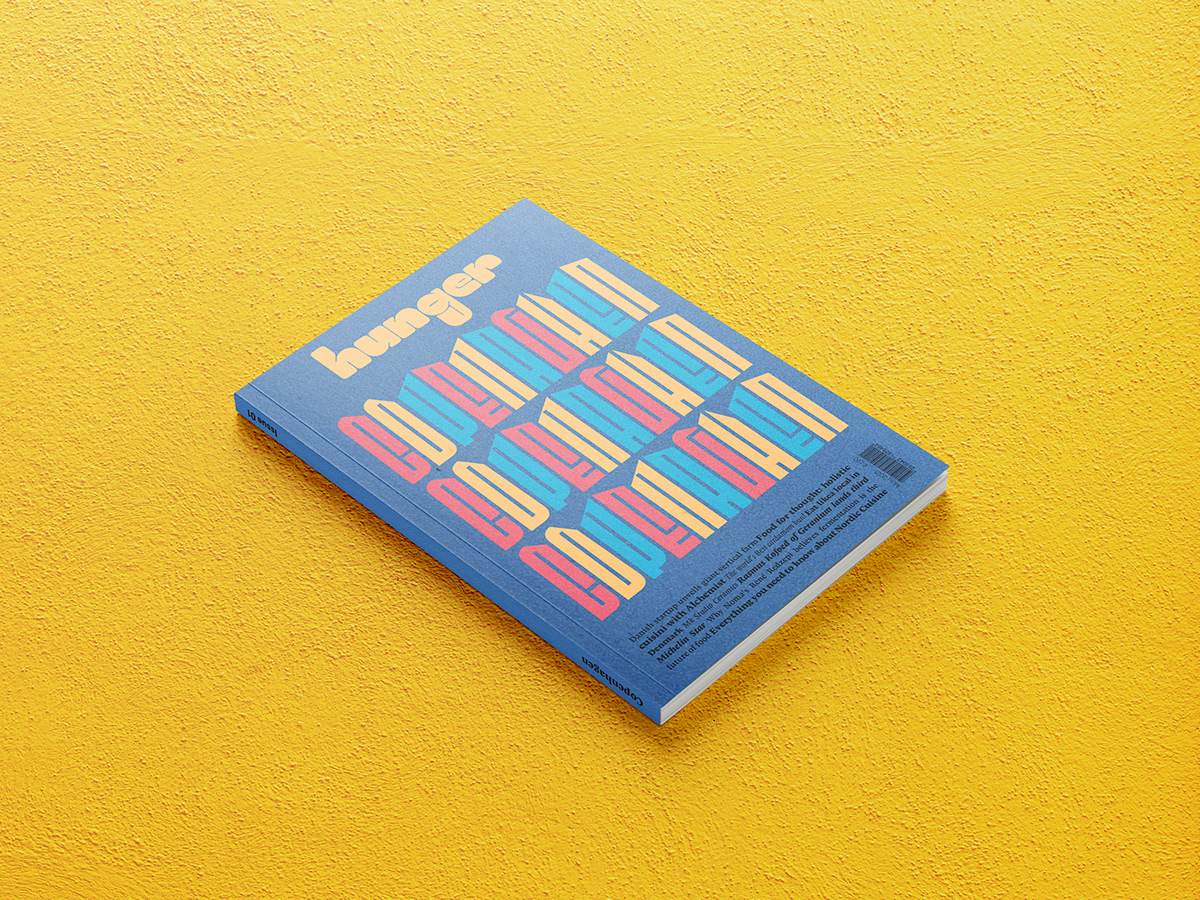
Hunger was realized for a course in typography. The main requirement of the course was the realization of a magazine and of its masthead. As regards the masthead, it was designed in view of the subject and contents of the magazine, and the typeface was realized on Glyphs. The main idea behind "Hunger" was to design a magazine about food and travel. Each issue of the magazine is devoted to a specific city in the world, to its food and to the link between the food and its local culture.
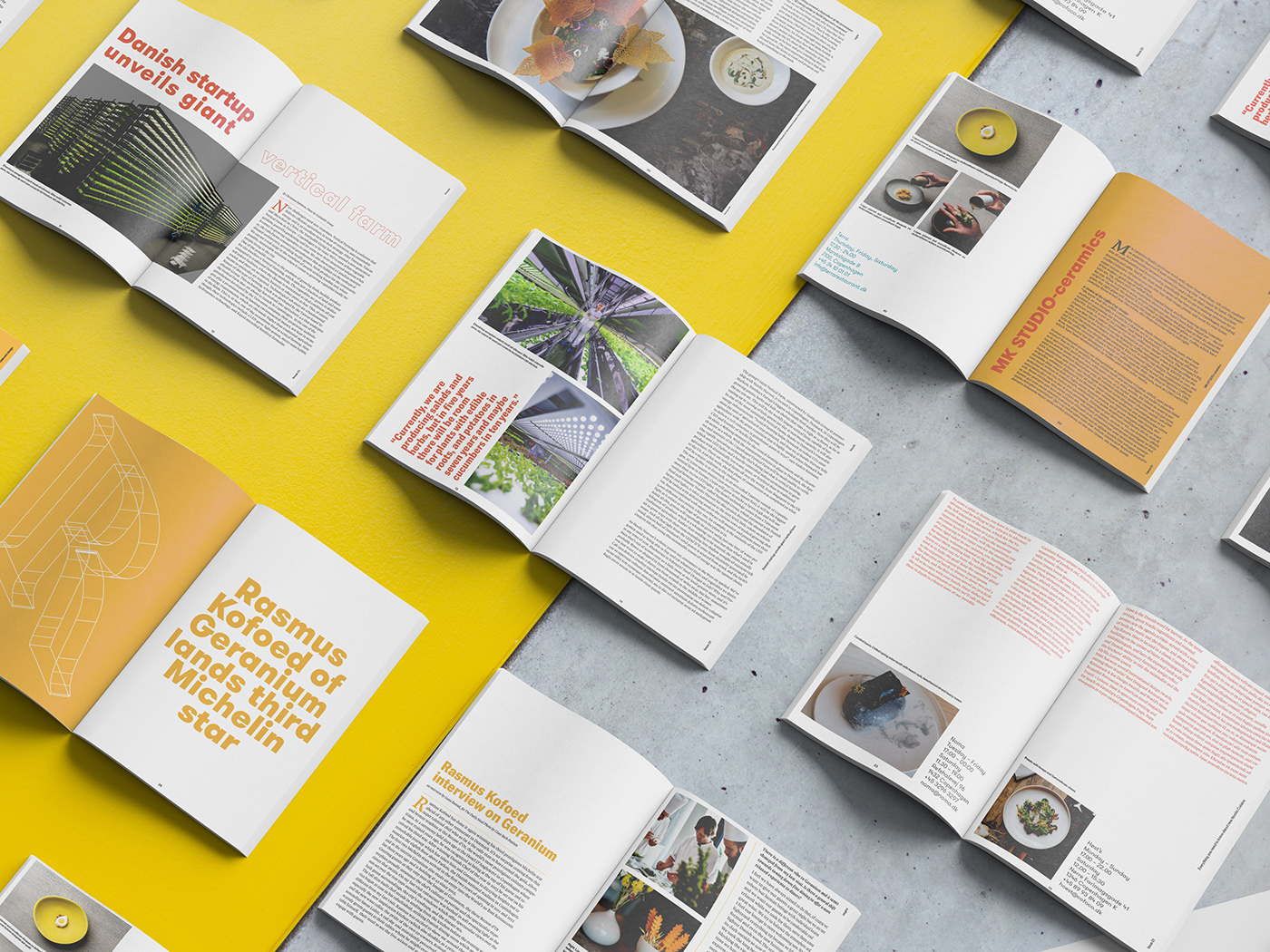
The magazine covers local street food as well as Michelin stars restaurant. The contents of the magazine were organized following a flat plan divided in 5 sections as 5 are the human senses. Each one of the senses covers one aspect related to the food (smell=street food, sight=Michelin stars restaurants, taste=local food, etc.). The target of the magazine is young and curious audience.
The magazine covers local street food as well as Michelin stars restaurant. The contents of the magazine were organized following a flat plan divided in 5 sections as 5 are the human senses. Each one of the senses covers one aspect related to the food (smell=street food, sight=Michelin stars restaurants, taste=local food, etc.). The target of the magazine is young and curious audience.
As regards the typeface, the intent was to create something that was in contrast with the actual meaning of the word "hunger".
That's why I decided to create a typeface that is excessively bold. At the same time, the choice of the word "hunger" emphasizes the connection between food and culture , as if the magazine was created in order to satisfy people's "hunger for culture".


Thanks for watching!