About the client
American provider of direct healthcare which applies AI to optimize the decision-making process.
Target audience
– Employees of big companies who are entitled to compensation from medical insurance, and their family members
– Employers
– Other US residents, who require medical services
Challenges
To reduce typical healthcare bureaucracy in the USA.
Creating practical and easy workflow of finding doctors, getting service, and giving feedback.
And most important – dividing treatment expenses between the patient's costs, his private and job insurances.
Result
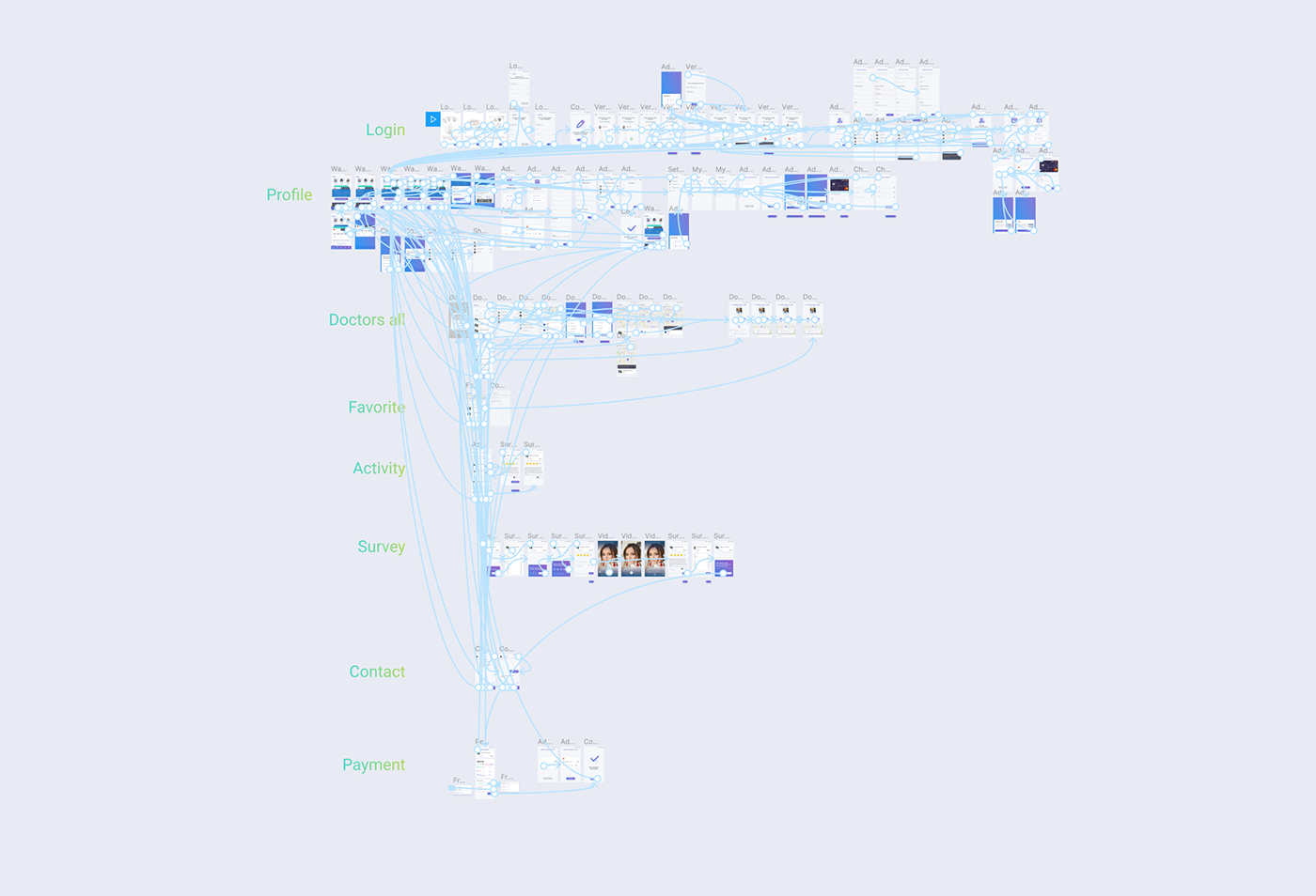
Mobile app with a database of all the doctors, clear UX flow of choosing the doctor, giving reviews, and easy way to cover expenses with few different accounts.

Customer's interviews
We conducted series of interviews
Insights:
– When people search for doctors, they find reviews beneficial.
– When looking for doctors, people use insurance companies' official websites and program ZocDoc.
– When they renew their insurance package, people tend to stay with the same doctors. Even if it means higher costs.
– When looking for doctors, people use insurance companies' official websites and program ZocDoc.
– When they renew their insurance package, people tend to stay with the same doctors. Even if it means higher costs.

Conclusions
– We learned what kind of services are popular with clients: which features attract them and which don't.
– We gained an understanding of which information is essential when looking for a doctor.
– We discovered how people choose their insurance program and what aspects are crucial during this process.

Clients differentiation
Through user testing, we were able to determine pains, gains, and fears that are both important and common for the majority of clients. Also, the results of those test laid a foundation for personas' development. Later we used those personas to select people for interviews.

Testing hypothesis
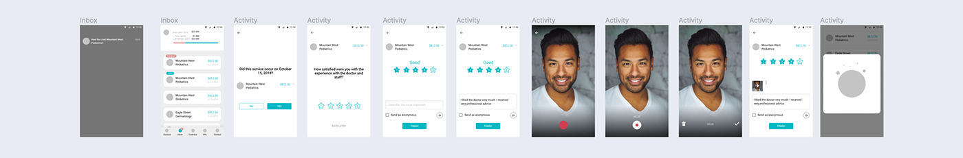
In the first version, for each step, there was a separate screen. After each action, to get to the next screen, user had to use navigation. We suggested that this approach was more straightforward but will take more time to complete.
The idea of the second version was to provide additional questions on the same screen immediately after a user answered the first one. We suggested that the second version will be less time-consuming, but could bring more cognitive pressure to the user.
Conclusions
After testing both versions, we proved our hypothesis about the time-consumption of the first version. In average, users needed ten more seconds to complete the flow. The hypothesis about overloading the user with information was not confirmed. Tests showed that second flow was clear and comfortable for users.
Version 1
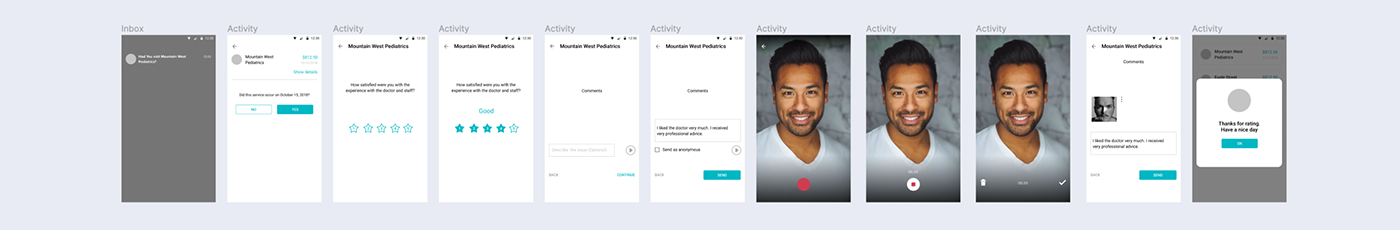
Version 2
The visual part of the interface
We aimed to create an unconventional design of the mobile application. But we still had to utilize standard and familiar patterns so users were able to navigate the product comfortably.
After we tested the first versions of the design, we simplified some of the elements and made them more convenient for users.

Add payment functionality
While developing the interface, we had to change and improve some of the app's features. To illustrate this process, here is the case of how users pay for medical services.
A patient has several payment options:
– make a one-time payment using employer's money and choose the number of instalments in which they will repay it;
– cover expenses in halves, using employer's funds and personal credit card.
– cover expenses in halves, using employer's funds and personal credit card.
Version 1
In the first version, it wasn't apparent to some users that they were able to change a sum. Also, for users, it wasn't immediately obvious how to pay a portion of the sum from
their card.

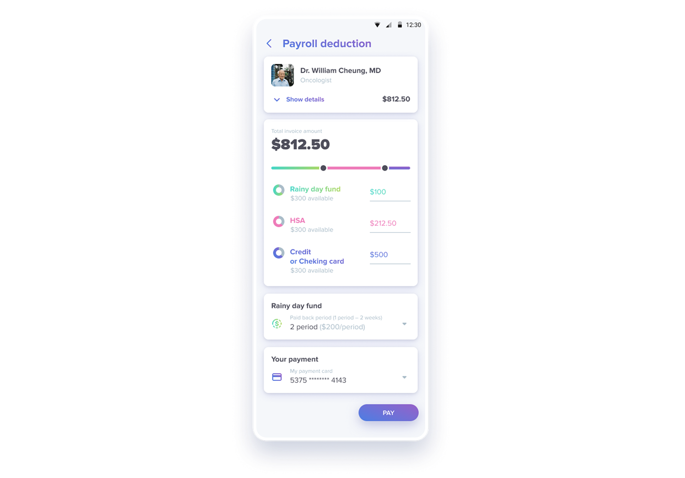
Version 2
With the second version, we placed all the information on one card and added two separate input fields for two sums and a slider. Thus infographics made it more evident how much should the employer pay and what portion should be covered by the user.
This helped to simplify the interface for the user and shortened time needed to complete this action.
Users were able to navigate through the interface more rapidly and accomplished the task.

Version 3
Later on, we added yet another payment method. With it, we only changed the first screen and added an option to choose payment methods.

Version 4
In the previous version, users were only able to turn HSA payment on or off without an option of editing the amount.
After some time, the client requested such a feature.
So we decided to get rid of the payment options screen and chose to display all the information on one screen. This change helped us to reduce the number of clicks and screens without diminishing usability.
Through iterative testing and observation of how users interact with the design, we managed to validate our decisions, remove UX issues and came up with the final design.