


Brand Identity for Puro
About the brand
Puro is an innovative plant based kitchen with a strong focus on healthy and creatively clean food that advocates homegrown produce. We are a dairy free, gluten free restaurant opting to reduce our carbon footprint, one step at a time.
Puro wants to break the stereotype that vegan food is boring and make it accessible. Puro is Spanish for pure/unadulterated.
Puro sources their produce from their farm and local harvesters which guarantees no chemical fertilisers, no GMO and no funny business.
Project Scope
— Brand Discovery
— Identity System
— Brand Guidelines
— Typography & Color
— Social Media Templates
— Brand Assets
Designed on Adobe Live
I was really grateful to be invited as a guest on Adobe Live where I designed the brand identity of Puro. My amazing host Alex Lazaris was really supportive and made the experience seamless! During the 2 day livestream, I created the logo custom type from scratch, created the colorways and typography system and dived into some brand assets as well. Scroll down to watch the replays!

Puro's brand values
1. Natural
Puro believes in all natural produce. The raw materials are sourced from their own farm and their trusted local harvesters which guarantees no chemical fertilisers and no funny business.
2. Local
Puro believes in community. The use of local homegrown produce highlights the fresh community and helps reduce the monumental waste of raw materials each year.
3. Unique
Puro is inspired by their travels across the world. They want to break the stereotype that vegan food is boring and bring life to it.
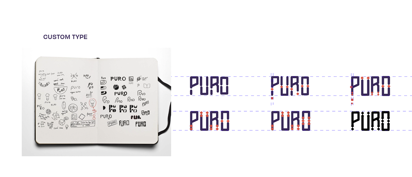
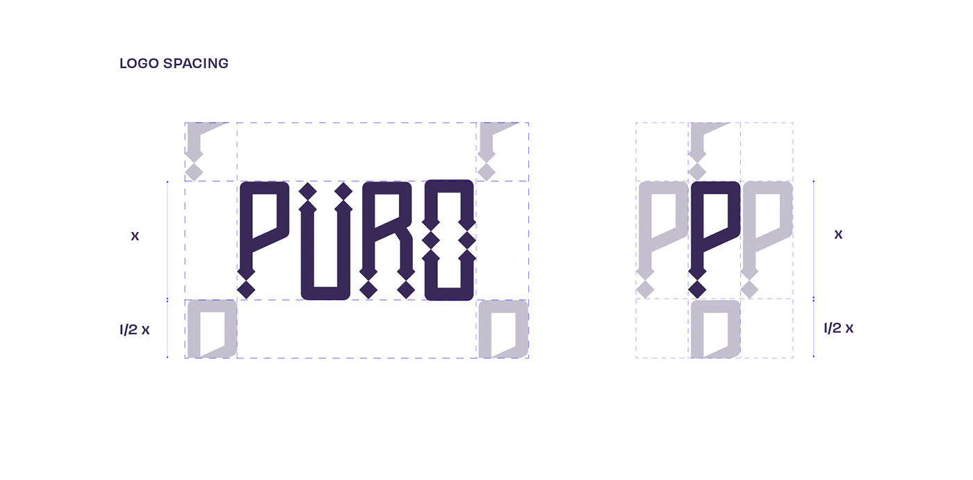
The logo mark consists of the name of the restaurant, Puro. It is a custom type inspired by the mexican symbols and aztec patterns. Bold form and repeated usage of a square to form a custom font resulted into this fun, playful logo.
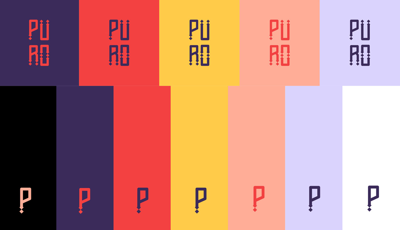

The idea was to use fun, bold colors to attract the customers to the brand. Witty and quirky one liners as accompaniments made for a perfect compliment to the brand's visual identity.


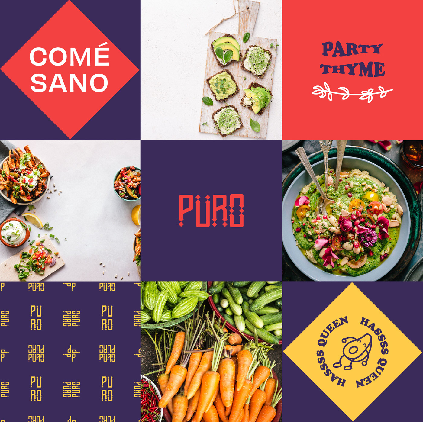
The type choice is a lively, fun choice to depict the approachability of the restaurant. We wanted to convey the humbleness of the brand. We used a minimal sans serif typeface 'Obviously' by OH no type co for the secondary type along with a rounded 'Cooper Std Black'.


The Adobe Live replays here -
I livestream on Behance every Friday and Saturday at 08:30 AM EDT!
Disclaimer: This work was created to showcase the designer's skill, expertise and talent and may not be used for commercial purposes. All rights reserved. All art, images, designs, and material are copyright of Anika Aggarwal and may not be resold, added to design or any other unauthorized form of distribution or reproduction without express written permission.