GREEN VILLAGE
___
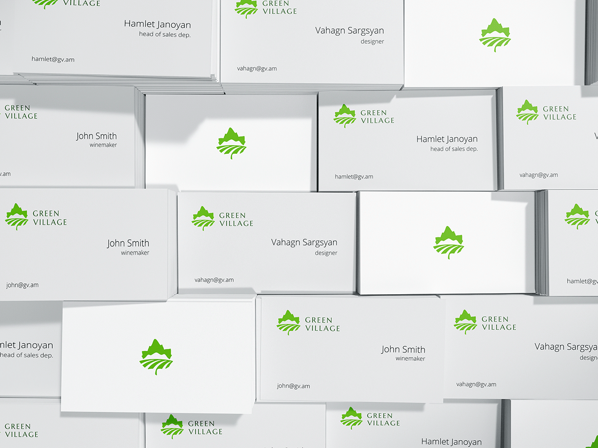
A logotype was designed for a startup wine company nestled in Armenia, within the picturesque confines of a small, sun-kissed village known as “Kochba” affectionately nicknamed “Green” due to its lush natural surroundings. The primary concept behind the logo was to harmoniously blend the region's distinctive elements into the form of a grape leaf.
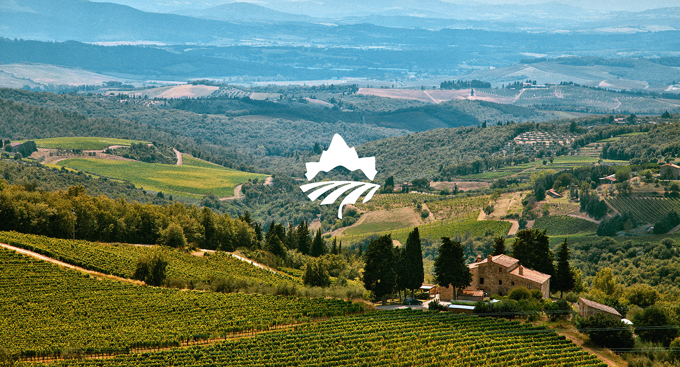
This design ingeniously incorporates the presence of three distinct winery buildings. They are gracefully depicted within the logo, with the majestic mountains standing slightly in the background, serving as a backdrop to the lush vineyards. This symbolism not only captures the essence of the winery but also conveys the serene and beautiful landscape that surrounds it. As a final touch, the winery aptly carries the name “Green Village”. This name encapsulates the spirit of the vineyard and the tranquil, nature-rich setting it calls home. It's a name that resonates with the abundant greenery that envelopes the village and the exceptional wines that are nurtured and crafted there.
The logotype elegantly unites all these elements into a symbol that represents the essence of this Armenian winery, inviting all to explore its unique charm and exquisite wines.
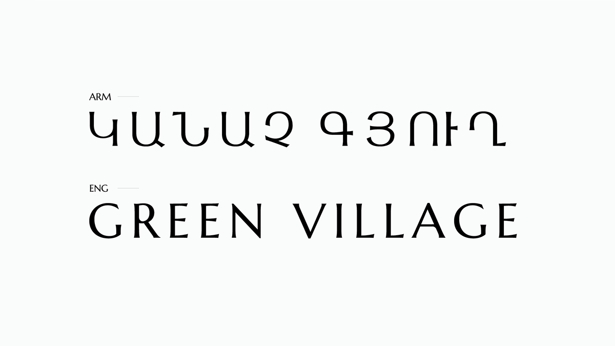
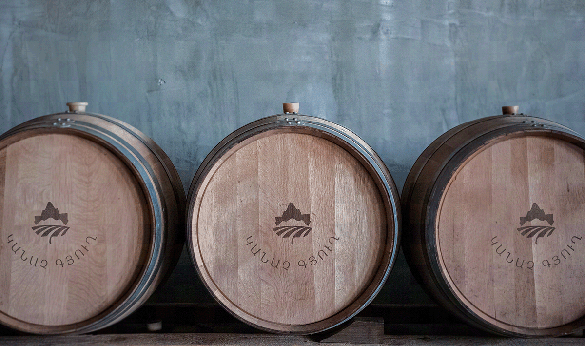
The main option / ARM

The main and secondary options / ENG
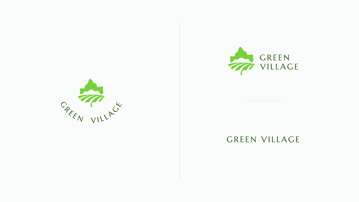
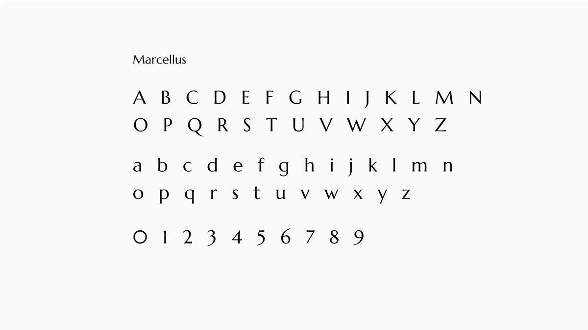
Marcellus font was used in the logotype, so Armenian version was built up
using elements and letters from the English version.