


NYC Folder Design
Creating a single design that well-represents the whole university was a bit of a challenge. I began this design with the idea of using type as a pattern element, it worked out nicely that NYC happened to be part of the pattern since all CUNY schools are in New York City.
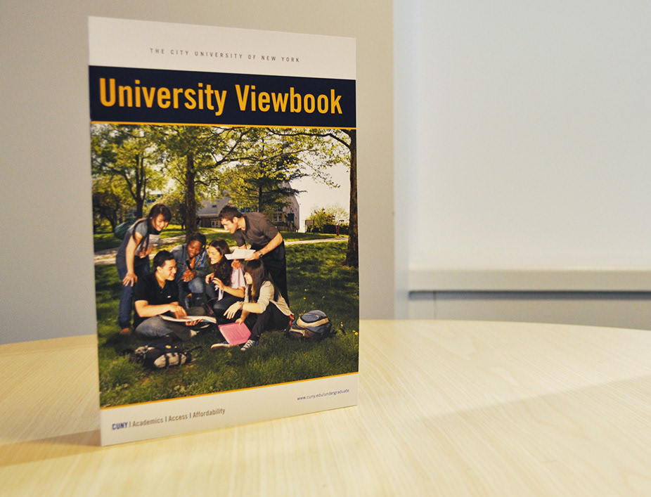
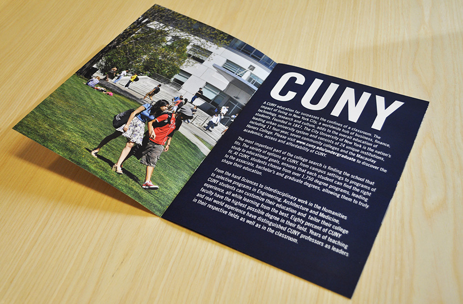
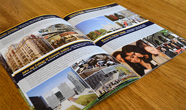
University Viewbook Design
One of the first impressions a student has of a school is the campus. The University Viewbook is meant to give prospective students a quick glance at the many diverse campus environments throughout all five boroughs of New York City. I took both of the photos on the outside and inside cover on the beautiful Queens College campus. The inside content provides photos of each campus with a summary of what makes the school unique.
One of the first impressions a student has of a school is the campus. The University Viewbook is meant to give prospective students a quick glance at the many diverse campus environments throughout all five boroughs of New York City. I took both of the photos on the outside and inside cover on the beautiful Queens College campus. The inside content provides photos of each campus with a summary of what makes the school unique.
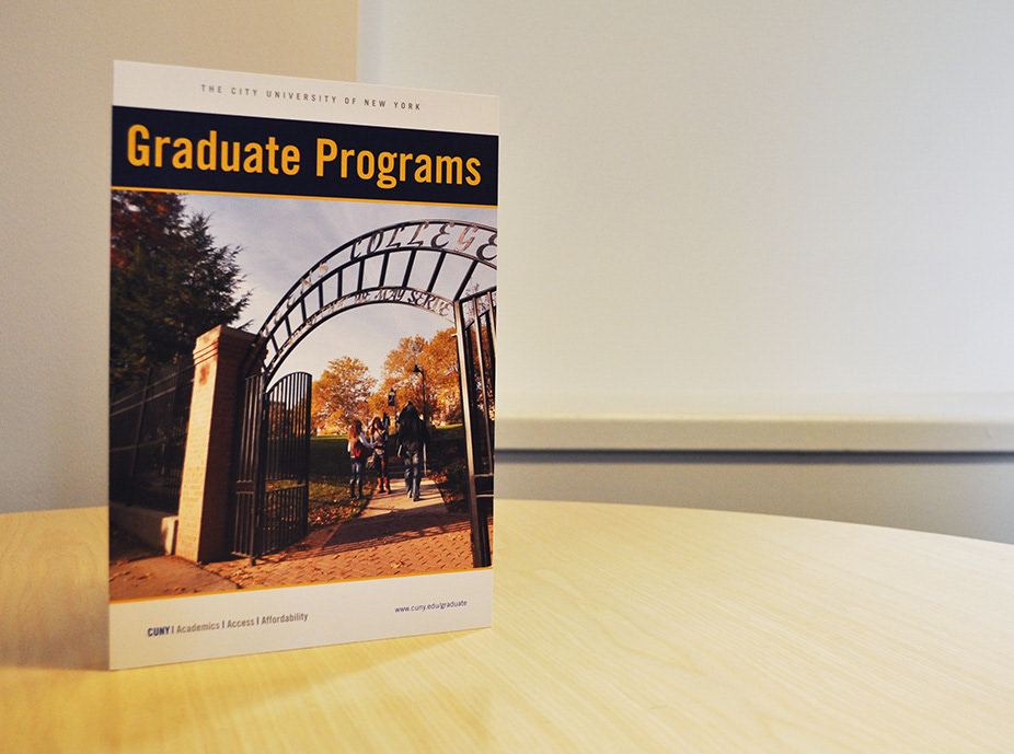
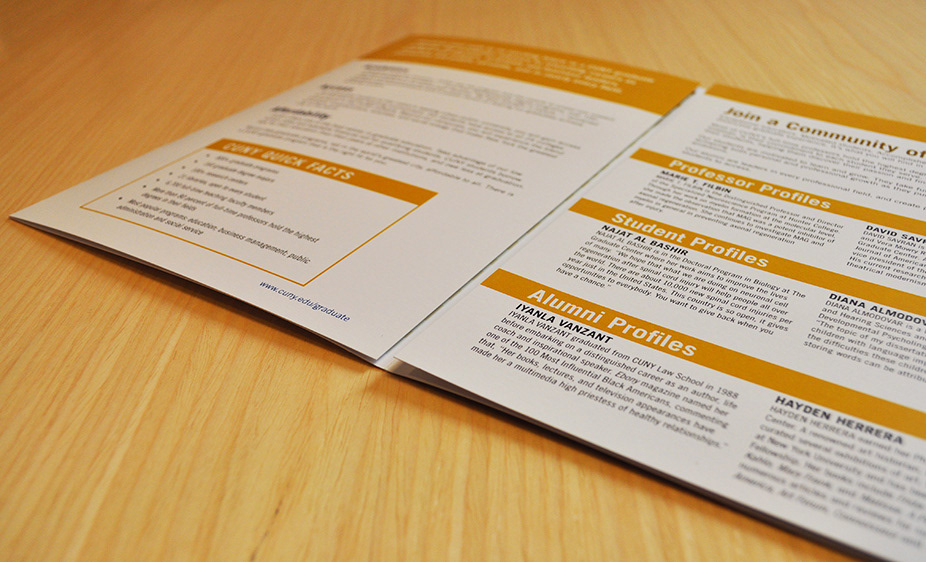
Graduate Brochure Design
Designing this proved to be a big undertaking because of how information heavy the piece is. It included all of the information a prospective graduate student may need including a huge grid of offered programs and schools where they are available. The photo on the front cover was taken at Queens College. I think this photo matches the CUNY brand well and it also shows the diversity of our campus locations; it's hard to believe this was taken in the middle of Queens.
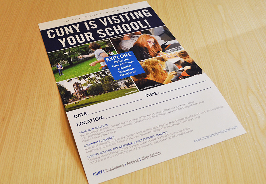
Poster Design
Getting the attention of your average high schooler isn't easy. My hope with this design is that the vivid photographs and the bright blue box in the center of the collage would turn some heads. Also, the photo I selected for the upper left (where most viewers naturally look first because of how we read) is a photo of students playing on campus.
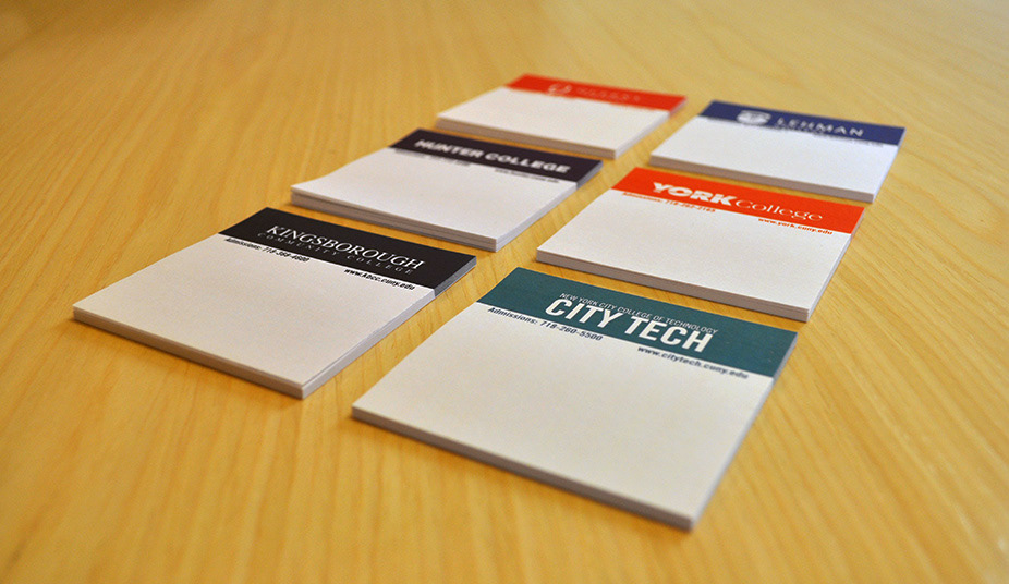
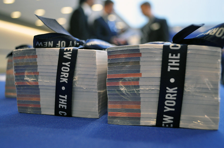
Post-It Note - College Logo Project
Working with 18 different logos that all look very different and all use different colors was the challenge of this project. My solution was to make the logos all white and place them on the specific Pantone color associated with each college. This created a unified look for the bundle. The design was finished off with a dark blue ribbon with the university name in white, much like the logos inside. The Post-It Notes were handed out to counselors from high schools throughtout the New York City area at conferences.
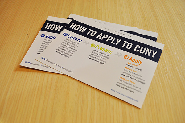
How To Apply Card
Applying to college can be overwhelming. I helped re-design the CUNY How To Apply Card to include different colored icons to help guide students visually while presenting short, to-the-point content. This design also matches the branding we used for the new website design so everything matches nicely.


