
500+ Phobias
This is a redesign of an app that contains a list of phobias, after browsing five of them, you have to pay to read more. But the app is still relativly useful, so I wanted to give it a new iOS 7 look. To do this, I had to look at hundreds of app interfaces and icon designs. So what interfaces are considered the "in thing"? and what makes a good icon? Well iOS 7 is known for being flat and no skeumorphic textures.
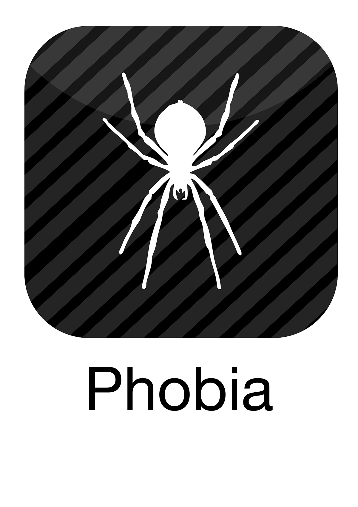
So I had to keep it to a minimum, but also keep the visual language very obvious. This would involve the right use of colours (fear - dark perhaps?) the right font (traditional halloween fonts? No.) and an icon that is a good symbol for phobias or anything creepy (clowns, spiders or sharks?)
------------------------------------------------------------------------------------------------------------------------------------------------------
Icon Design
------------------------------------------------------------------------------------------------------------------------------------------------------
Homescreen Preview

------------------------------------------------------------------------------------------------------------------------------------------------------
iPhone 5 Interface Screen Preview

------------------------------------------------------------------------------------------------------------------------------------------------------
App Store Preview


------------------------------------------------------------------------------------------------------------------------------------------------------
Banner Design

------------------------------------------------------------------------------------------------------------------------------------------------------
Infographic Poster

Follow Me:
Pinterest: http://www.pinterest.com/karlbembridge
Flickr: https://www.flickr.com/photos/kbembridge
Instagram: http://instagram.com/karlbembridge


