

“Adventure Illustration” has been a thread woven deep into the fabric of the illustration work I do through Orlin Culture Shop. It is what I grew up loving and what I enjoy creating most in my work. As an illustrator, I’ve had the unique opportunity to bring this theme to a range of different clients, from books to billboards and more.
One of the latest opportunities I had was to bring that theme of adventure illustration into a collection of illustrations for Land Rover through Spark 44. The idea was to create a series of ‘family adventure’ illustrations, each showcasing the Discovery in a unique environment to creates a modern take on classic adventure novel covers from the past. This ‘modern classic’ adventure look was the guiding force behind all 4 illustrations and was used by Spark 44 to create a really nice collection of marketing materials.
To see how all these pieces came together, let’s dive into the creation process!
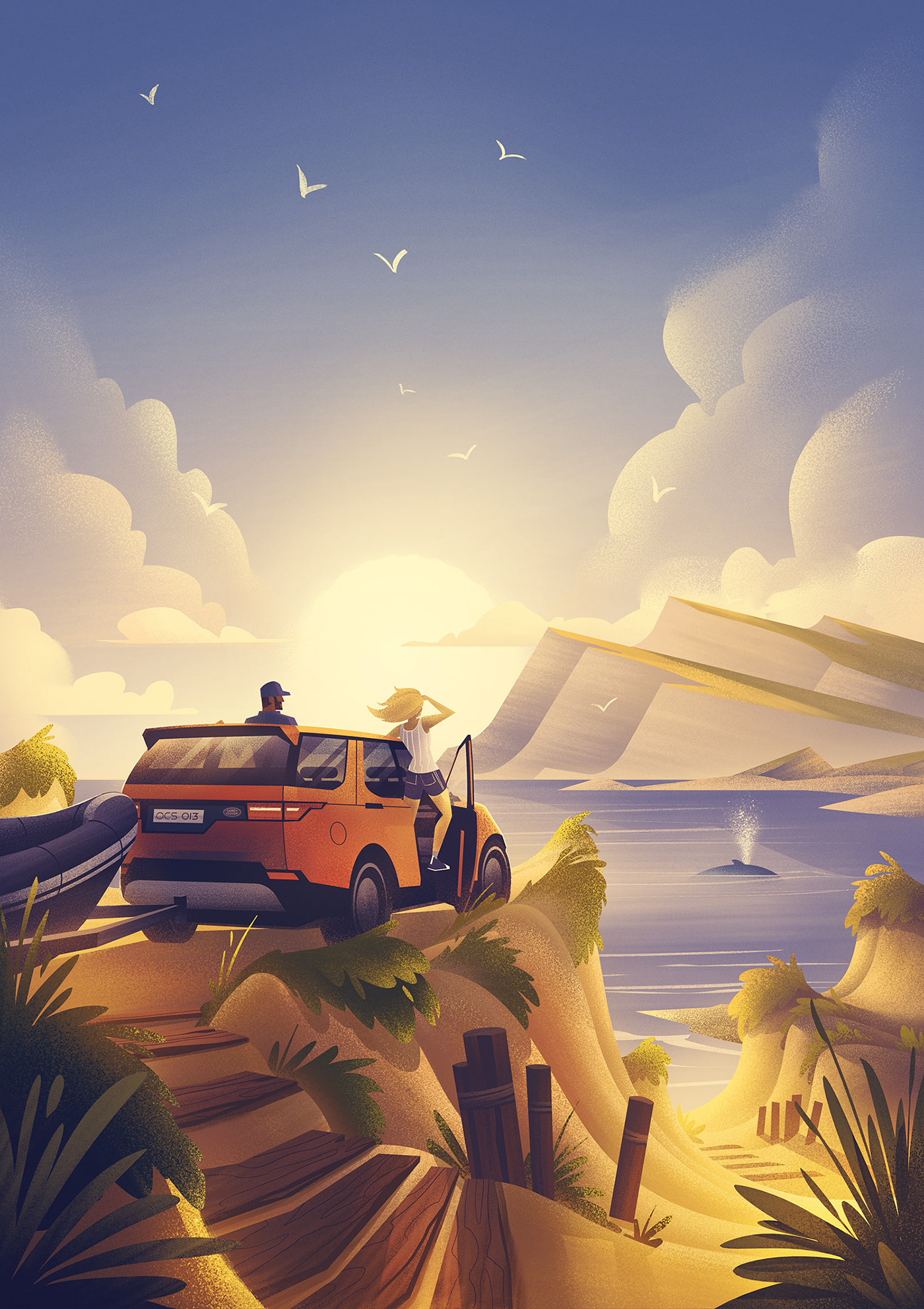
Beach Adventure
The Beach Adventure was the first piece created in this series and remains one of my favorites in the set. One of the most fun aspects of creating a set of illustrations is setting the tone and mood with this first piece. It’s important to hit just the right feel with this first one to set as a measuring stick for the subsequent illustrations.
The narrative in the brief on this piece stipulated we would see a couple arriving at a beach looking into the distance and spotting a whale. This meant the composition had to not only show the vehicle, but also show a bit of the landscape up close and in the distance so we could see what the couple was looking at.
I began with sketches on my iPad Pro in Procreate using the Apple Pencil. Sketching in Procreate enables me to sketch anywhere - from my desk to the couch to anyplace outside the office - and it often helps to get outside to see where inspiration will strike.

Exploring color early in the sketches was definitely useful. There was a very specific quality of light and color we wanted to bring to these pieces that brought just the right mood to the illustration.
Once the color rough was approved, I refined some of the details in the sketch to make sure I had a good base to work from. With the sketch in place, I began crafting the shapes, forms, textures, and lighting of the full size illustration in black and white.

Once the black and white version of the illustration was created, it was simply a matter of bringing the colors I established earlier in the sketch into the final piece.
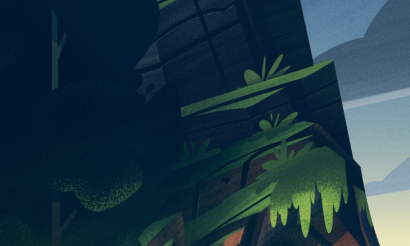
Here are a few detail shots:


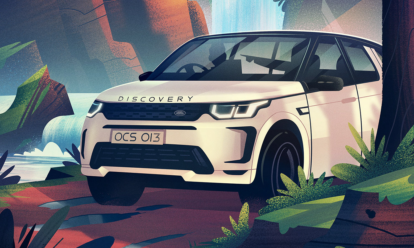
Mountain Adventure
The next piece in the series brings us to a cave entrance off a dirt road as a family finds their dog leading to something…
I began sketching and once I had the initial composition worked out, explored rough color options to try landing the right quality of light. I wanted to be able to illuminate the dog and cave entrance with the headlights of the vehicle without making it a full on night scene.
Here are the color directions I came up with:

With the color rough approved, I tightened up the sketch and once again worked in black and white to develop the base for the final illustration.

Process Tip: I don’t always work in black and white before going to color, but often I find it is helpful to build my shapes, textures, and lighting. To create my shapes, I use a handful of different tools such as hard round brushes, lasso tools (polygonal and the regular lasso), the pen tool, and vector shapes within Photoshop. I utilize flat shapes wherever I’m able and look for places I can stylize the forms of the objects I’m drawing.
For texturing, I use a set of pressure sensitive brushes and am able to paint them on (rather than using texture overlays) using my Wacom Cintiq.
Once the black and white version of the full sized illustration was done, I moved on to integrating color to bring the piece to the finish line:

How do I know when a piece is finished?
This is a question I’ve had before and I think every illustrator has their own answer for it. I am not one who can make endless tweaks and changes to an illustration. For me, there is a very clear moment when everything I’ve wanted to address in the illustration has been addressed. I look up and realize ‘ah! I’m done!’ and that’s when I call it. Endlessly tweaking things on a piece has a bad effect on these kinds of pieces as it ends up creating muddy results that never look better.
This is a question I’ve had before and I think every illustrator has their own answer for it. I am not one who can make endless tweaks and changes to an illustration. For me, there is a very clear moment when everything I’ve wanted to address in the illustration has been addressed. I look up and realize ‘ah! I’m done!’ and that’s when I call it. Endlessly tweaking things on a piece has a bad effect on these kinds of pieces as it ends up creating muddy results that never look better.
Throw the illustration down, throw it with as much confidence as you can muster, and once you’ve addressed all aspects of the illustration, end it and move onto the next one.
Here are a few detail shots of the Mountain Adventure scene:


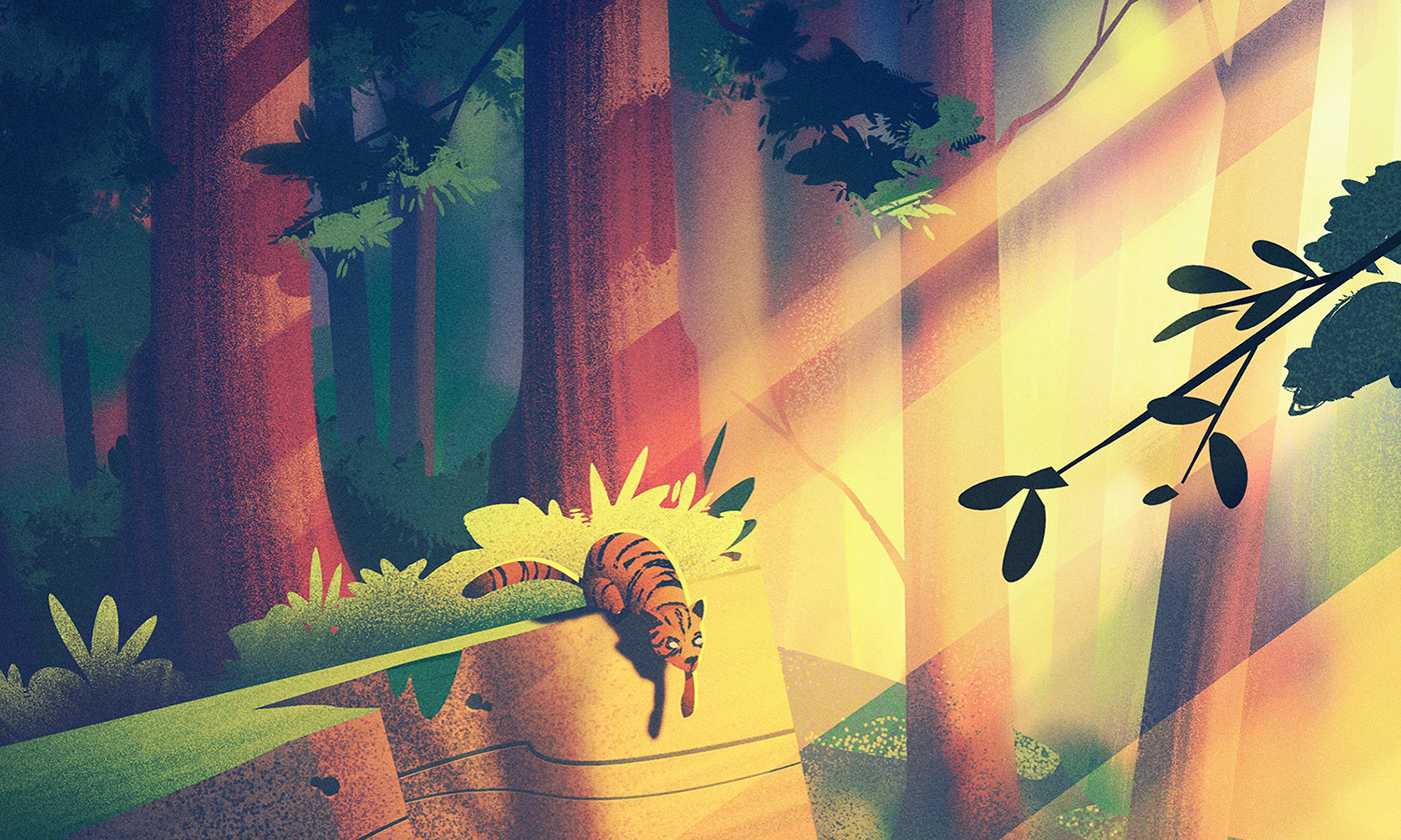
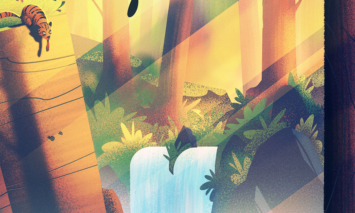
Forest Adventure
The next piece in our series takes us into a forest where we see a road running along a stream as a family looks to see a cat on a ledge.
The composition of this one was a challenge to figure out, but I knew I wanted to have rays of light streaking through the trees to create pockets of light and shadow. Here are some of the sketches I came up with as I thrashed around on the canvas working out the composition:

There was some discussion with the client around having the cat look as if it was about to drop onto the top of the vehicle vs having the cat further in the distance. Ultimate, they opted to push the cat into the distance and this is the composition we went with:

For this piece, I opted not to work in black and white and tried a slightly different approach. I took the color version of my sketch, blew it up to the full size of the illustration, and began creating my forms on top of the sketch, tightening and sharpening different aspects of the illustration until it landed on the final. It’s a different method of painting than I typically use but as long as the end result looks consistent with the rest of the set, there is lots of latitude in the working method.
Here are a few detail shots:


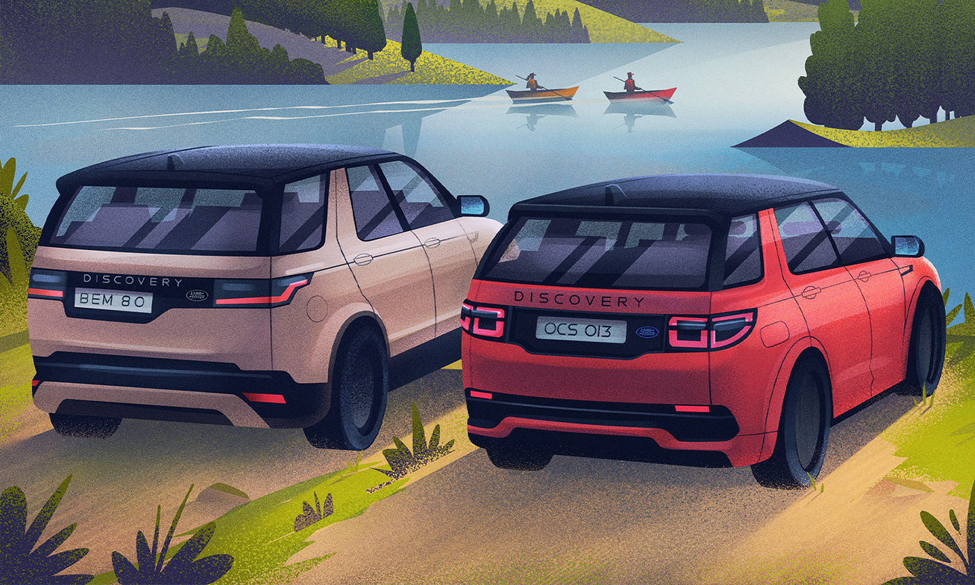
Countryside Adventure
The final piece in this series takes place in a countryside and we see two of the Land Rover vehicles in front of a lake with rolling hills in the distance. This was one of the most peaceful scenes to paint and turned out to be one of my favorites.
I tried a handful of different compositions to find the best solution to showcase both vehicles as well as the other elements in the scene.

Once I figured out the composition, I dove into rough colors to see how I could light the scene to create just the right mood. When I landed on results I liked, I took to painting the final, this time in color as opposed to in black and white first.

Here are a few of the detail shots for this one:


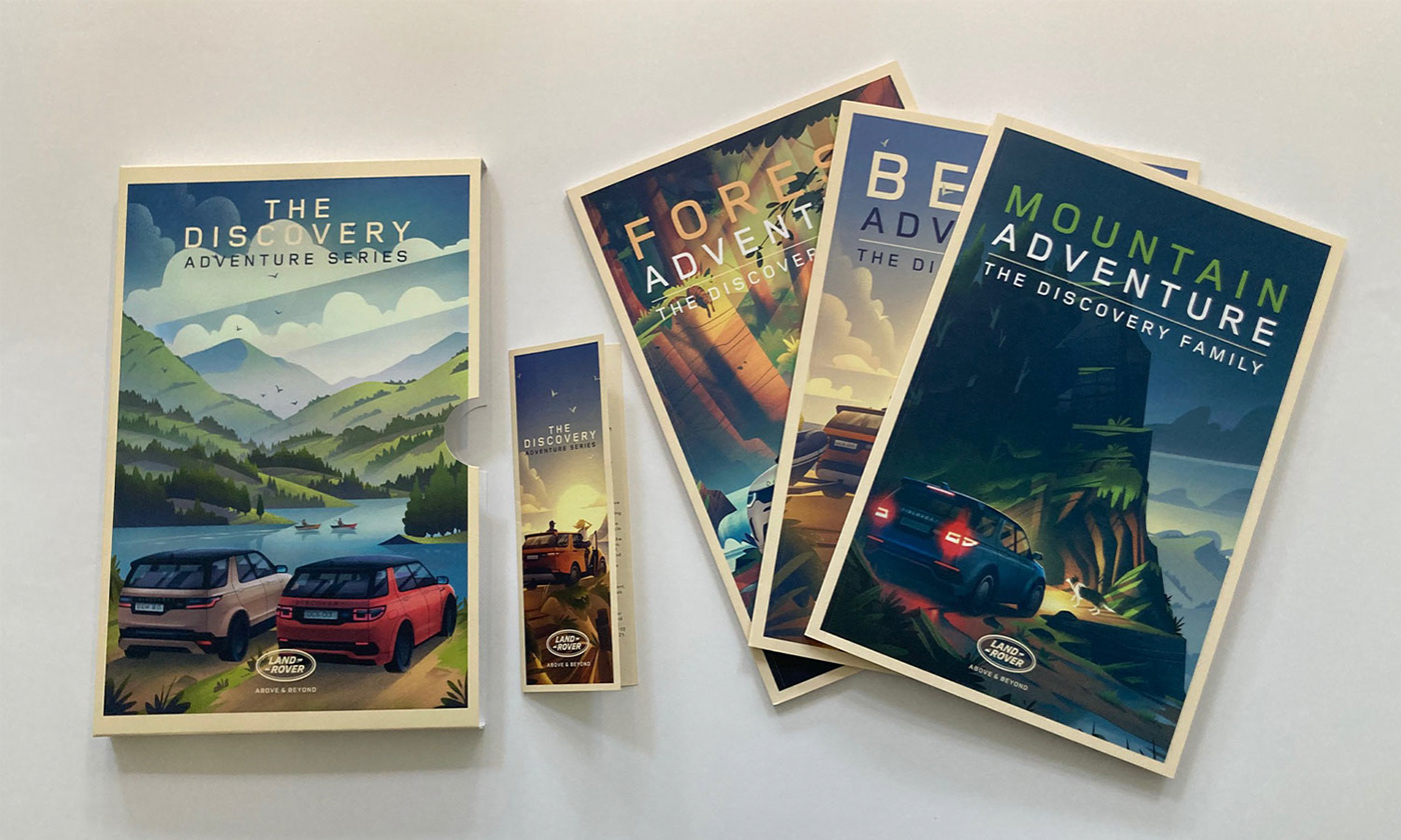
Spark 44 was kind enough to send me some photos of the marketing materials they created using these illustrations. It’s always fun seeing how my illustrations are used, especially when they’re done well!

With that, we bring this series to a close!
Big thanks fo the folks at Spark 44 for the opportunity to work with them on such a fun set of illustrations for Land Rover. Adventure illustration is something I love creating and I am incredibly thankful to be able to create illustrations like these for fun clients.
And thank YOU for reading my rambling process posts, for following along, and for all the likes, comments, and shares. I hope you found the post helpful and will use it to create adventure illustrations of your own!


