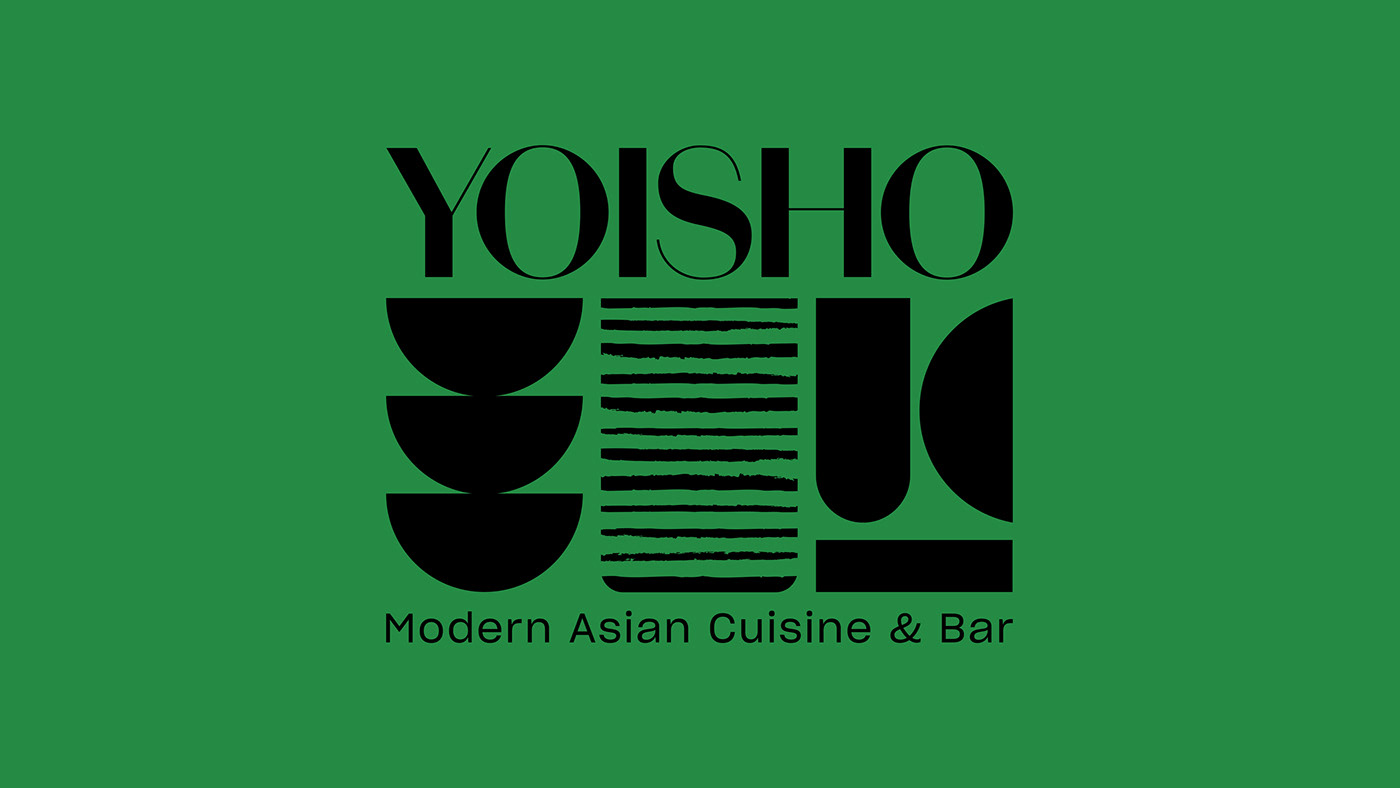
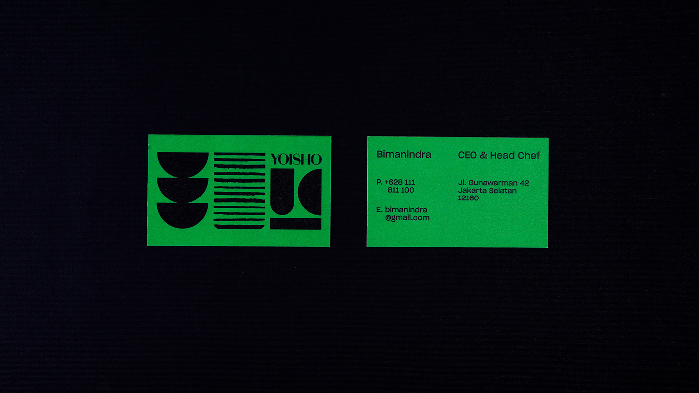
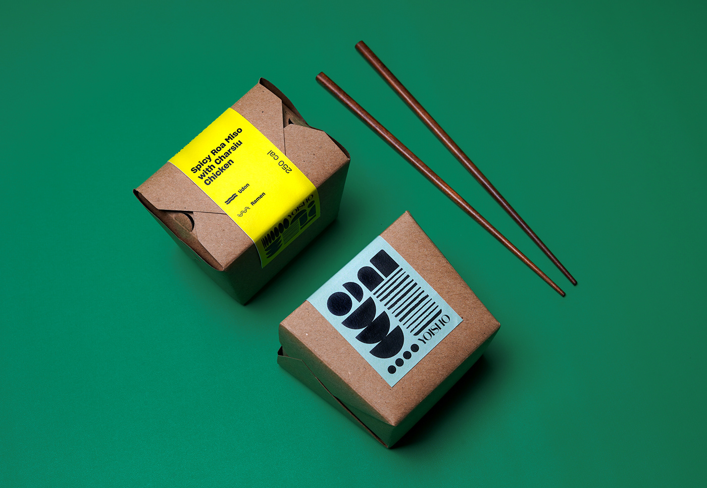
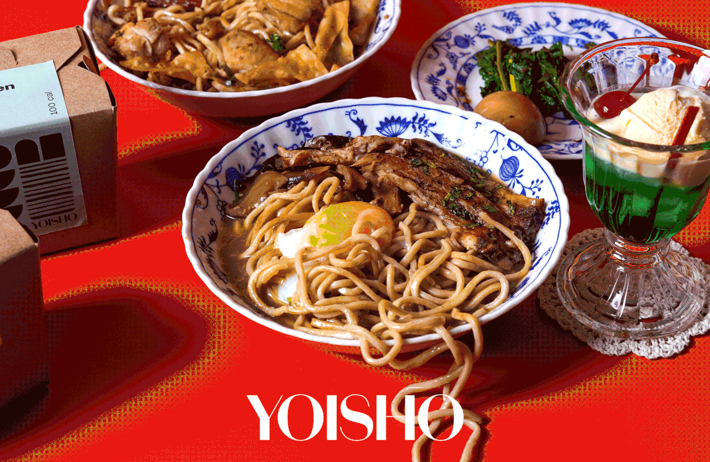
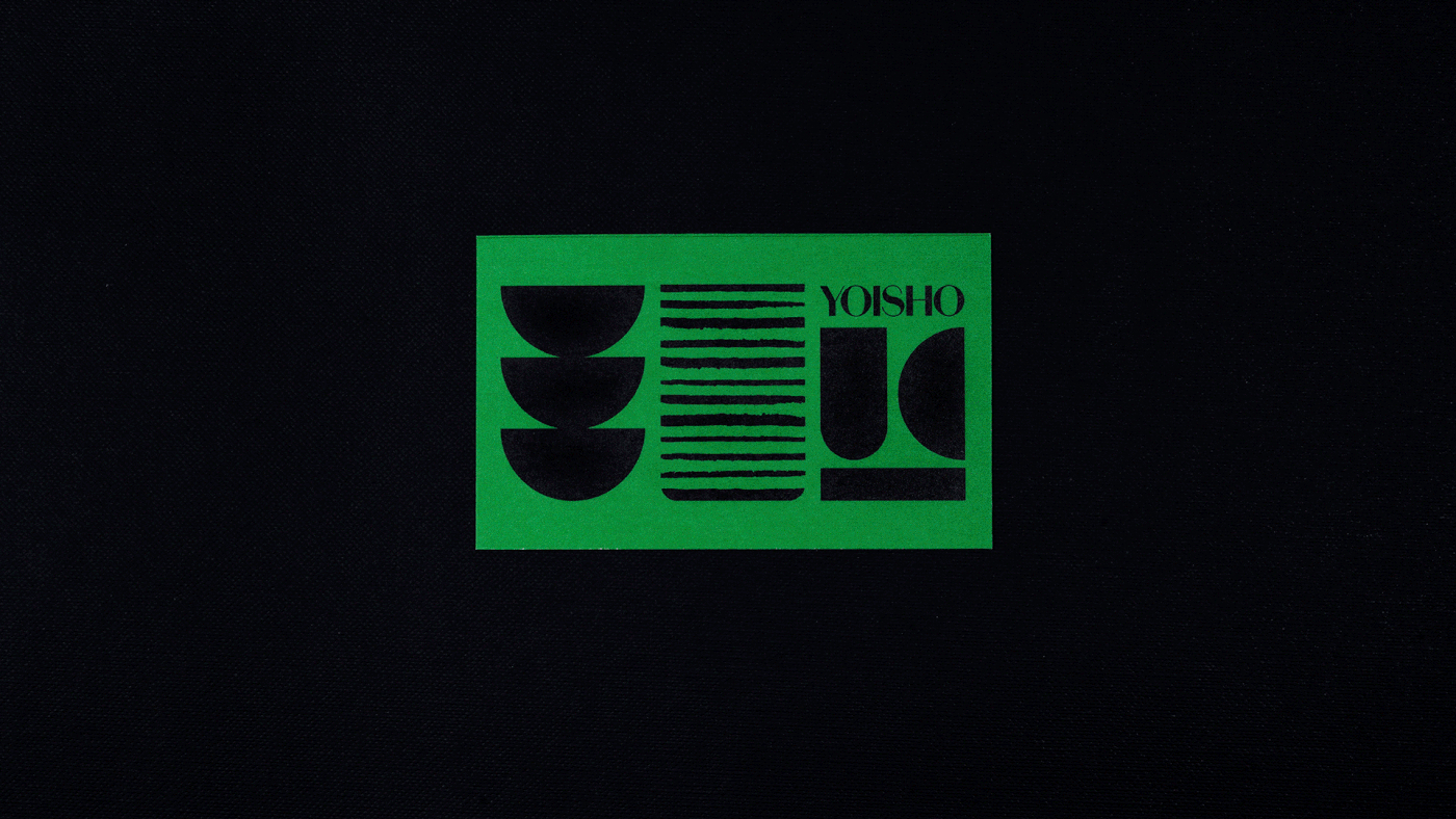
Yoisho has been around for quite sometime but this time the restaurant will be rebooted with fresh new direction. Along with that of course a logo redesign is needed but we think to refresh a concept means to really take another look at how the brand is communicated.
It is important to note the location of the restaurant and the people who frequent this area.
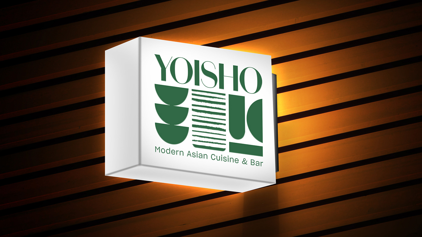
Senopati itself is proximate to business area but the low-rise buildings lent a laid back vibe in the area. It’s equal parts stylish and casual.
Senopati itself is proximate to business area but the low-rise buildings lent a laid back vibe in the area. It’s equal parts stylish and casual.
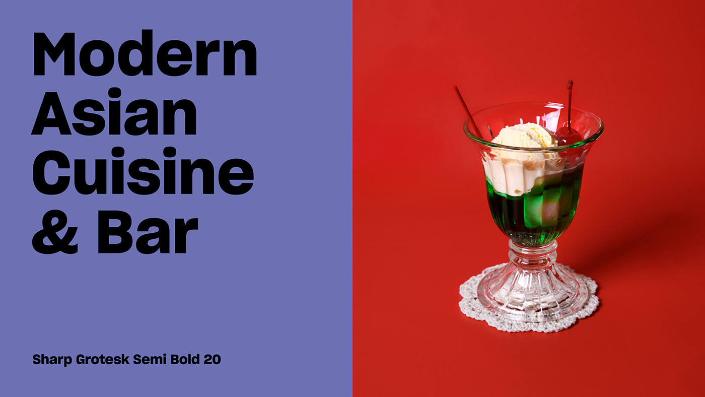
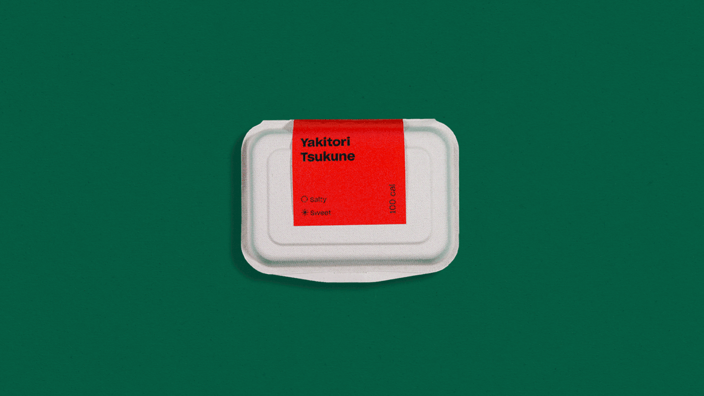
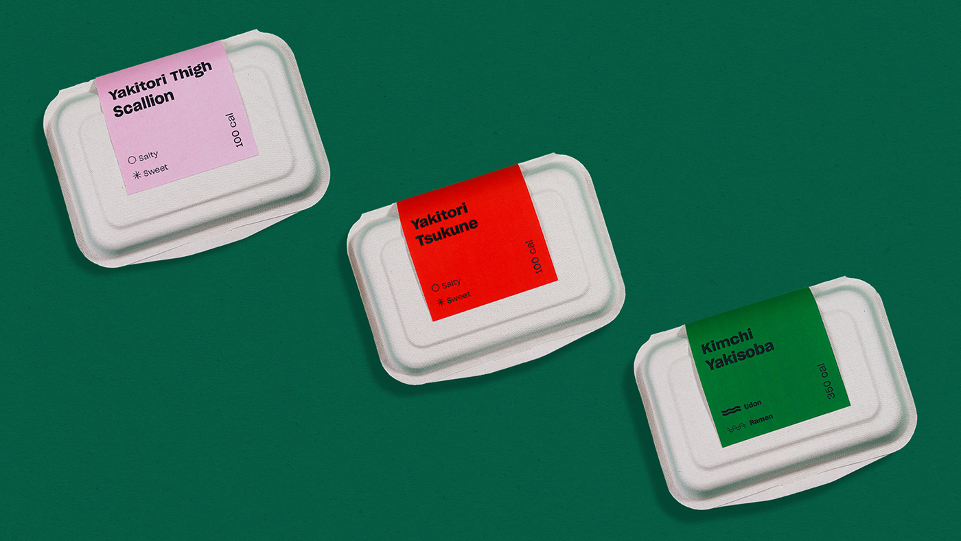
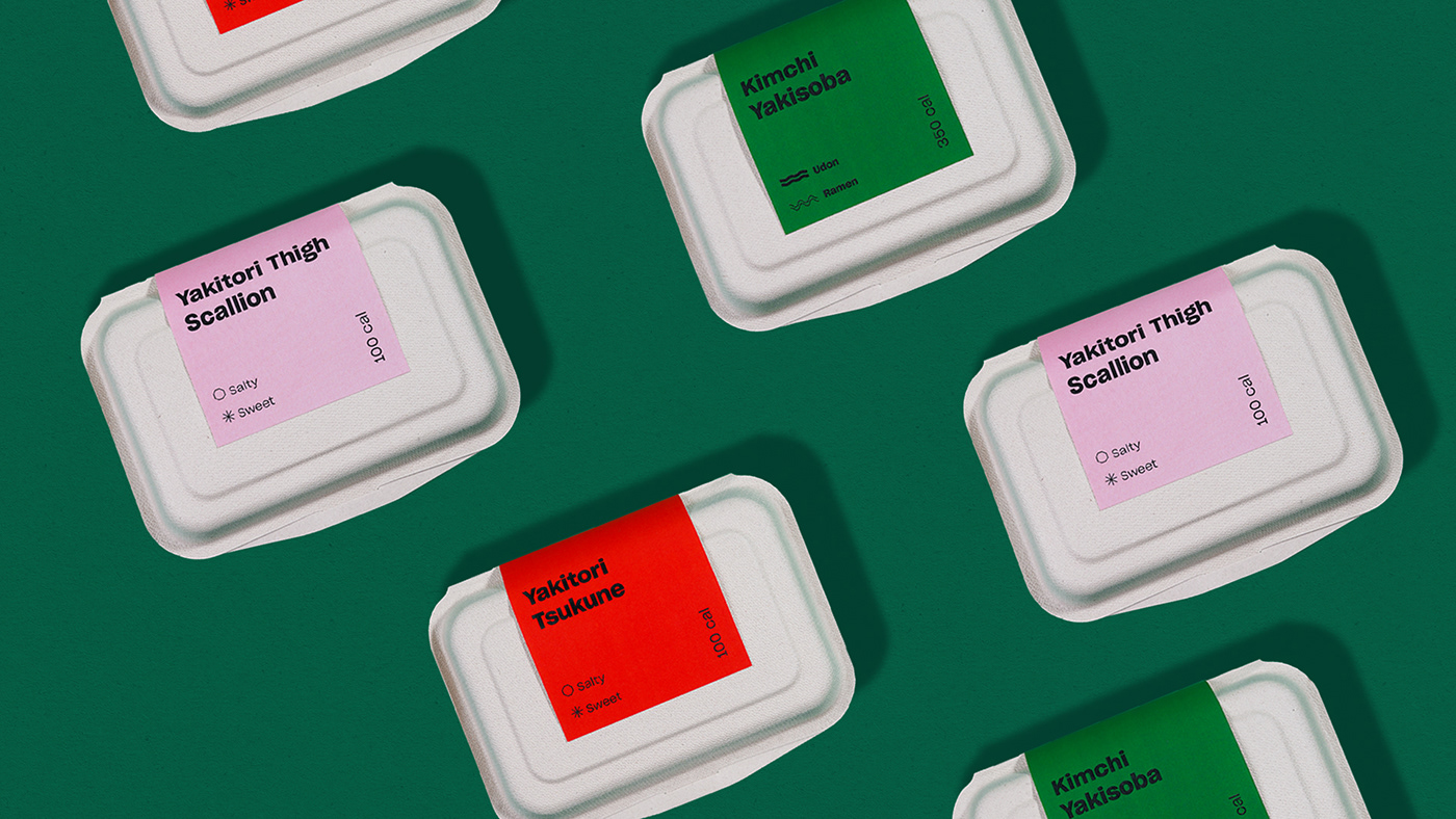
There has always been generalization of how Asian food is represented. But Yoisho is not a traditional joint, it's focusing more on fusion food that emphasizes on exploration of taste and ingredients. Since we are more on the contemporary side, we want to avoid that sort of stereotyping by developing visuals that responds well to the expectations of Senopati’s crowds.