
About Neringa
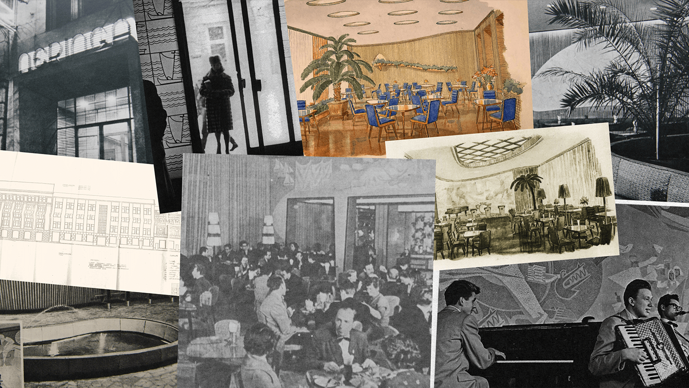
Neringa restaurant was considered to be one of the best and most fashionable restaurants in the Soviet Union. Famous for its great food, bohemian atmosphere and live music, Neringa was not only popular among well-known Lithuanian artists, but also among various celebrities from abroad.
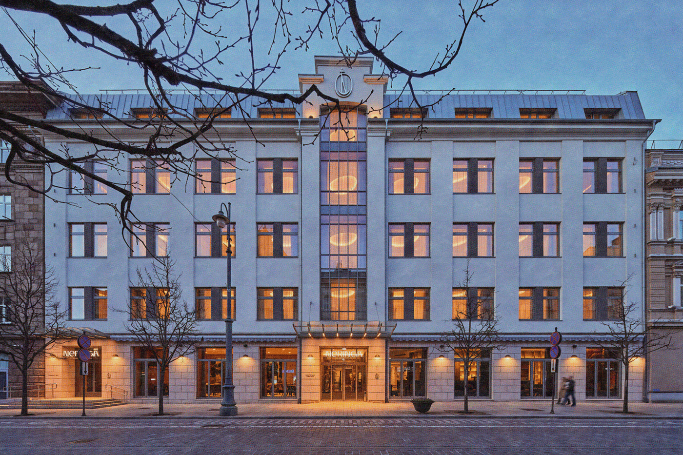
Back in the day, Neringa was associated only with the restaurant, however, today it combines a hotel, three different bars and the legendary, yet renewed restaurant.
Situation
Neringa experienced a major transformation, as not only the service portfolio was renewed and expanded, but also the whole building was reconstructed. As a result, there was a need to update the identity of this brand and create a full visual identity system, uniting all the products and services related to Neringa brand.
Insight
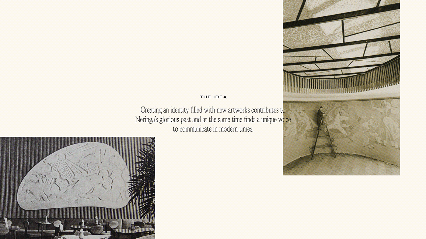
The basis for the visual identity creation was the historical context. The greatest discovery were sketches and variations of the old Neringa logotype. The author of these sketches was Feliksas Daukantas, who was not only the founder of the design school in Lithuania, but he also brought the whole new level of design perception to Soviet Lithuania. His work became the starting point for us and brought a lot of excitement to the creation process.
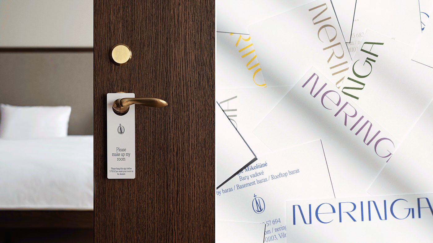
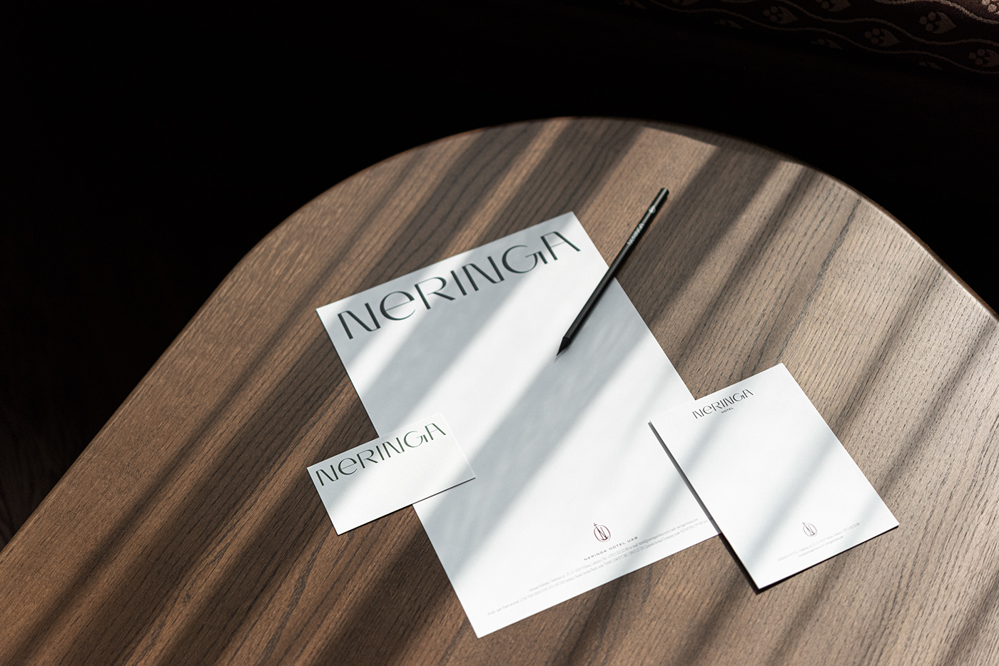
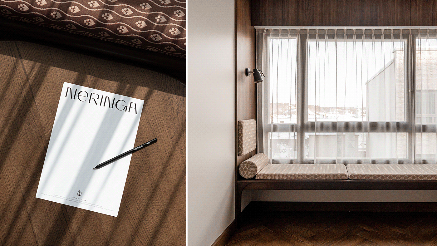
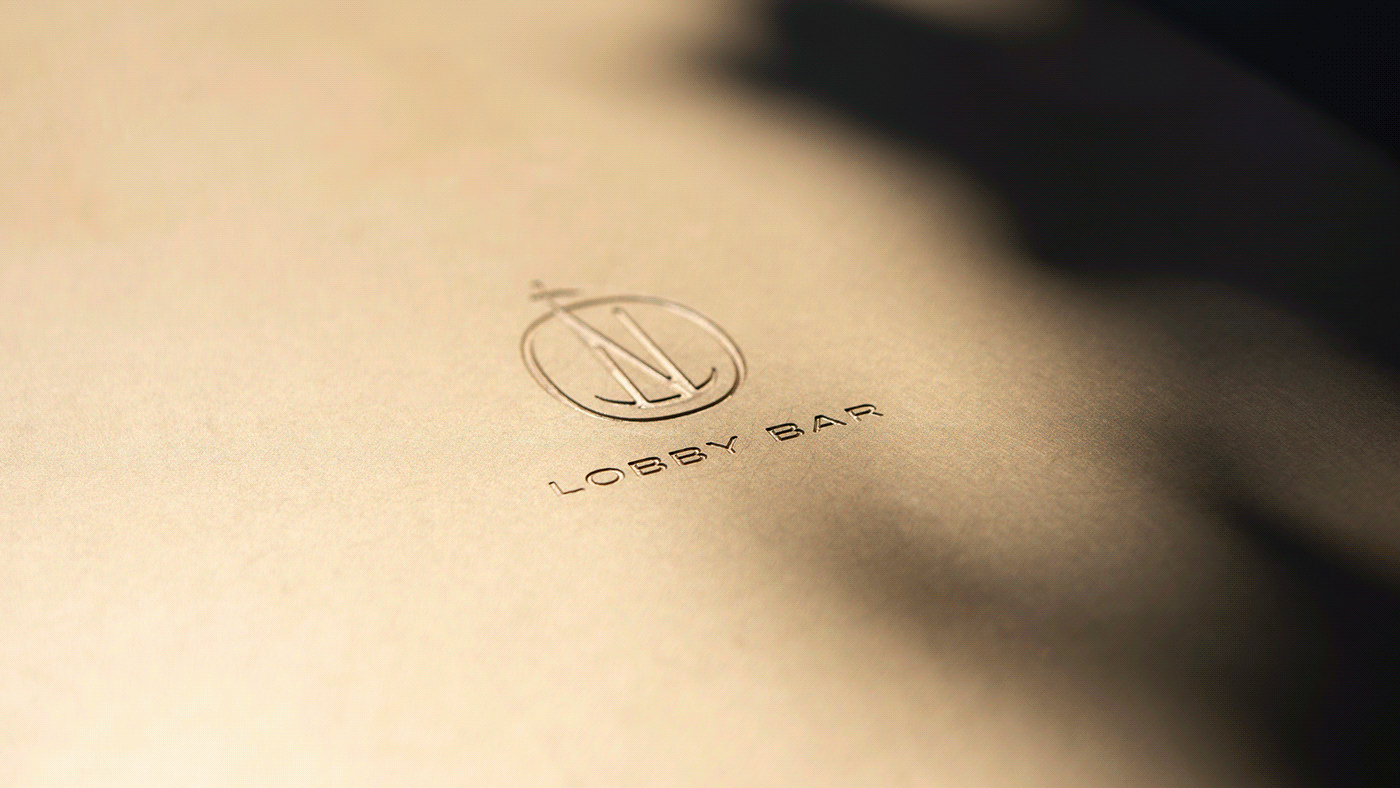
Logotype
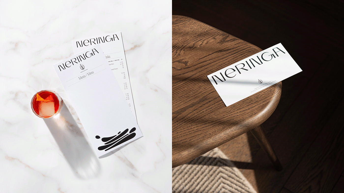
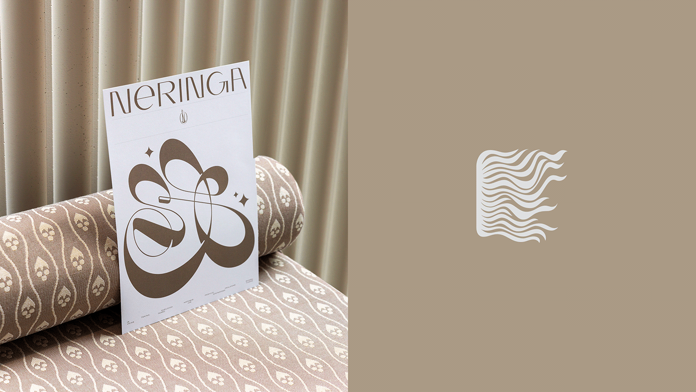
We created a completely new logotype for Neringa, which consists of two parts: the symbol and typography. The symbol was created based on the sketches of Feliksas Daukantas, and the typographic part was inspired by the fairytale about Neringa and the style of the 60's, which was discovered in magazines of that time. The letters of the new logo are unique and have been created specifically for this case.


The goal
Neringa seeks to maintain its image, historical context and aura that has surrounded the place for decades, at the same time representing a modern and prestigious complex in the capital of Lithuania, perfectly adapted to the 21st century.
Visual identity
The general mood of visual identity is related to the trends of the 60s. Not only was Neringa opened during that year, but the whole design perception in Lithuania was at its peak during the 60s.
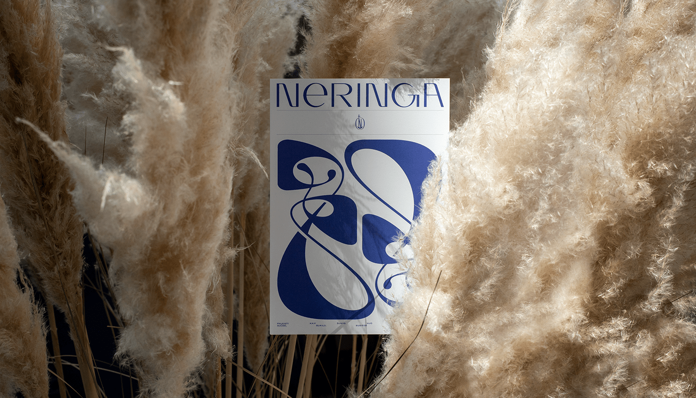
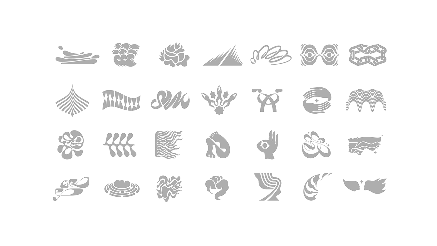
Neringa has maintained its identity because of the already existing artwork. These pieces are the only tangible objects that have returned to their places after years of reconstruction. We decided to reflect this original artwork in all communication channels, adding some new illustrations on top. To create meaningful illustrations, we used a fairytale about a magic land near the Baltic Sea called Neringa, which was written by Eduardas Mieželaitis.


Client: Neringa
Illustrations: Paulius Budrikis
Photography: Kernius Pauliukonis / Gerda Baltrūnaitė
Year: 2021


