

About the project
In the production of products under the Altayskaya Collection brand, only raw materials of the highest quality from the purest regions of Siberia are used.
Ekomilk cares about the environment and the climate with its innovative Pure Pak sense packaging. It helps to reduce CO2 emissions from cardboard production.
A task
The Altayskaya Collection brand was created as a brand of natural dairy products from Siberia in the portfolio of Ekomilk. However, the existing packaging was invisible on the supermarket shelf: the category was not readable and it was difficult to immediately understand what was inside. We already had a successful experience of cooperation with Ekomilk, so we were instructed to redesign the Altayskaya Collection brand. The design of the line was supposed to reflect the positioning - the dairy brand No. 1 in Siberia.
Decision
We start any redesign with an audit "Three Layers of Efficiency", thanks to which you can immediately see in which of the layers (visual, contextual, conversion) there is a failure.
The audit showed that it is necessary to refine all layers: the new design should have a powerful, noticeable and memorable logo that reflects positioning and demonstrates belonging to Altai. There is also a need to enhance the design with a mouth-watering food zone, maintain a large product category name, and add consumer benefits to the purchase.
All of these actions together should improve the efficiency of the redesign and increase the frequency of purchasing the product at the point of sale.
Using our “Platforms of Growth” methodology, we identified the core of the target audience (intellectuals and traditionalists) and identified consumer insight:
“I try to choose the best for myself and my family. It seems to me that the closer the dairy products are made, the better. After all, we have really clean, reserved places. I trust well-known, well-known brands less - it seems that I overpay for advertising. But among local brands it is also difficult for me to understand who makes a quality product, and who cheats. "
Brand is positioned primarily on the territory of Comfort, as environmentally friendly and natural, associated with nature. Auxiliary territory - "Belonging", expressed in belonging to Siberia, Altay, pride and love for the native land and origin.
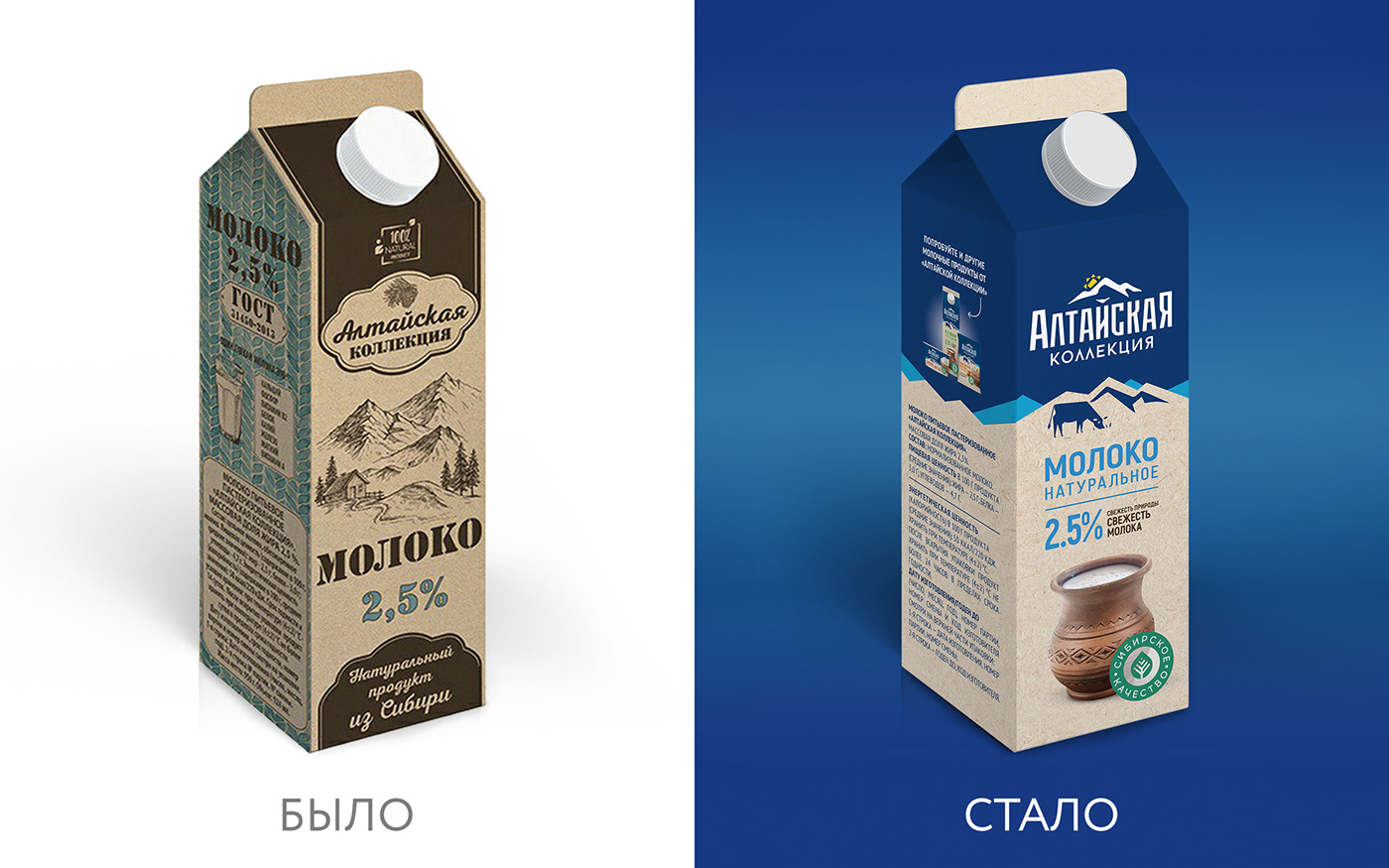
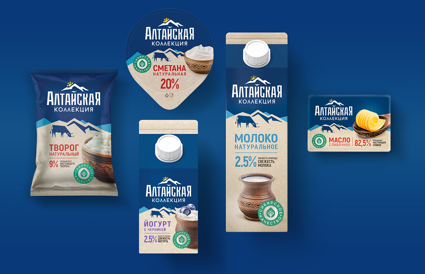
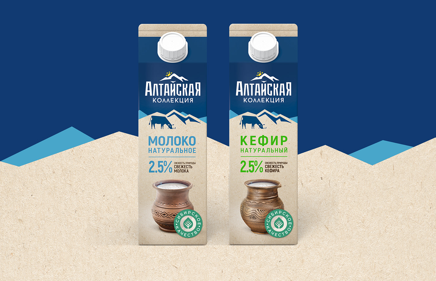
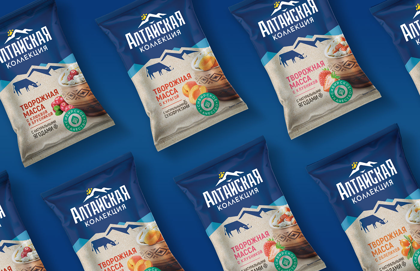
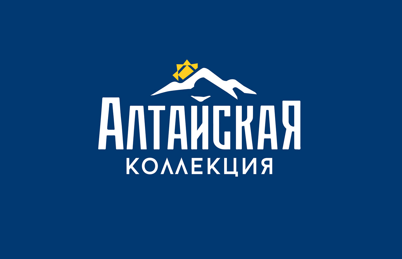
The new design is made in a contrasting color scheme. The dark blue top of the package gives a feeling of freshness to the product and this color is specific for the milk category. The large logo is made in different fonts: the focus is on the word "Altayskaya", which is symbolically crowned from above with the Altay mountains and the rising sun, made in ethnic style.
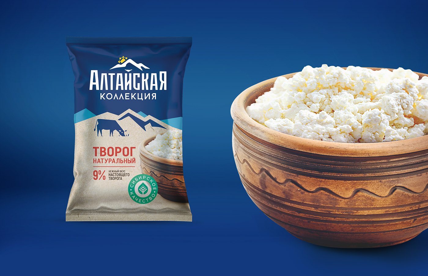
For the lower part of the package, we chose a calmer beige color and depicted the foothills of the mountains with grazing cows. They indicated the product category and the fat percentage in large size. On each package, depending on the type of product, there is either a jug (if it is a drinkable product), or a bowl, or a carved wooden spoon in the style of Altay folk crafts and stamps with the inscription "Siberian quality".
The collection turned out to be very solid, noticeable and original for the milk shelf. It cannot be confused with other brands, it has its own unique style


