This project contains an analysis and comparison of two pens from a semiotic point of view.
On the basis of Jean-Marie Floch's previous works, I was able to investigate the reasons why two apparently similar objects could have certain formal and functional characteristics, and therefore what kind of valorization they are given by their users.
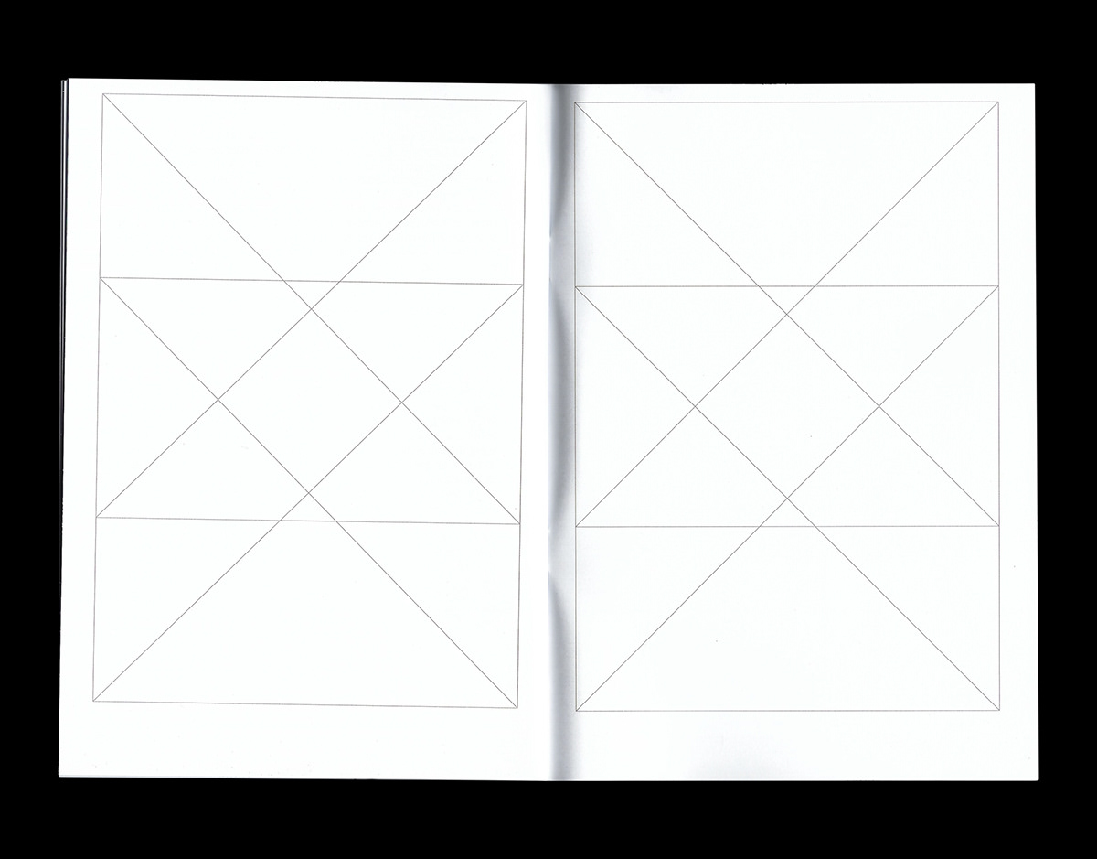
The two partially overlapping semiotic squares printed on the cover portray the similarities and the differences spotted between the two analysed products.
The book was designed during the third year (2st semester) of the BSc in Product Design at Politecnico Di Milano.
The two partially overlapping semiotic squares printed on the cover portray the similarities and the differences spotted between the two analysed products.
The book was designed during the third year (2st semester) of the BSc in Product Design at Politecnico Di Milano.
Format: A5
Typefaces: Inter, Roboto Mono
Pages: 32
Typefaces: Inter, Roboto Mono
Pages: 32


