About
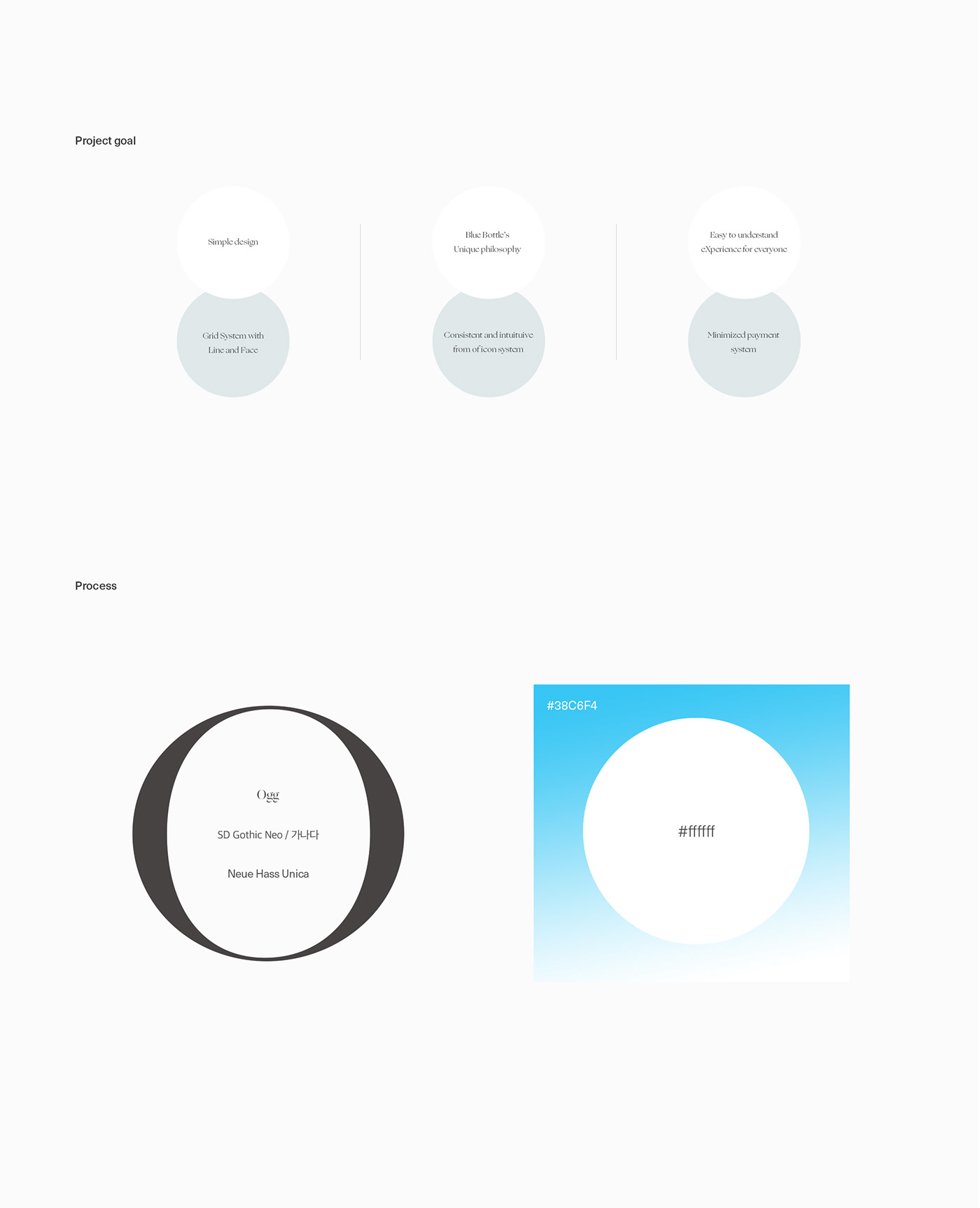
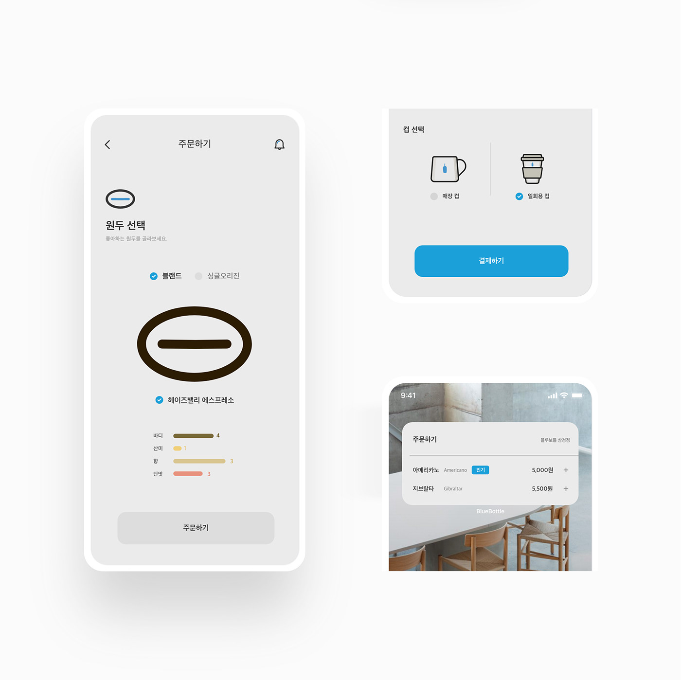
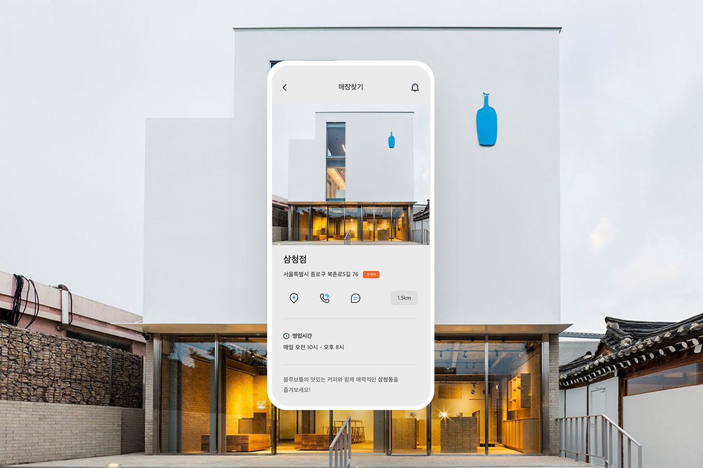
Blue Bottle continues its clean and consistent brand identity, creating a third wave in the United States and earning the nickname "Apple in the coffee world." White, blue, and wooden colors are added to make the atmosphere of the store and package cleaner. I planned a new app for Blue Bottle based on this color and brand's simple and stagnant characteristics. We designed an app that added practicality while keeping their colors and design positions intact.
블루보틀은 미국에서 제3의 물결을 일으키며 ‘커피계의 애플 ‘이라는 별칭을 얻을 정도로 자신들만의 깔끔하고 일관적인 브랜드 아이덴티티를 이어나가고 있습니다. 화이트와 블루, 거기에 원목 컬러까지 더해져 매장과 패키지의 분위기를 더욱 깔끔하게 디자인하였습니다. 저는 이 컬러와 브랜드의 심플하고 정체된 특징을 모티브로 얻어 블루 보틀의 새로운 앱을 기획하였습니다. 그들이 가진 컬러와 디자인 포지션을 그대로 지켜나가면서 실용성을 더한 앱을 디자인하였습니다.