


Rebranding of IDDIS — sanitary ware manufacturer
IDDIS is a bathroom and kitchen sanitary ware brand owned by SKL Group. New product strategy, moving to a higher price segment, expansion of the Internet presence and plans to enter international markets — these are just a small part of the reasons for IDDIS brand refresh.
We decided to move step by step and during the first stage we set out to actualize the benefits of the brand, its values, character, and essence. And then to create an identity reflecting the renewed brand values.

IDDIS: Personalization
The brand personality is built around the Sage archetype. A practical, action-oriented brand, where it is not so much important for it to excel in the market, but to be useful and needed by people.
IDDIS is an expert brand with a human face, someone you can rely on. A true master of his craft, who does not tolerate dilettantism in any matters. Does not promise too much and inspires confidence. Not indifferent to people, able to listen and show care and support.
We also moved away from the product essence of the brand, talking about reliability, to a human formulation — human-center (in focus — a person).


The point is the beginning
The client decided not to change the logo cardinally, so our font designer fixed the letters and corrected the position of the registration icon.
The changes affected two features of the logo — the dots above the letters i. In the new version, they remind of the heads of people facing each other. In this way, the logo carefully reflects the empathy and humanity that have become the main messages of the brand.


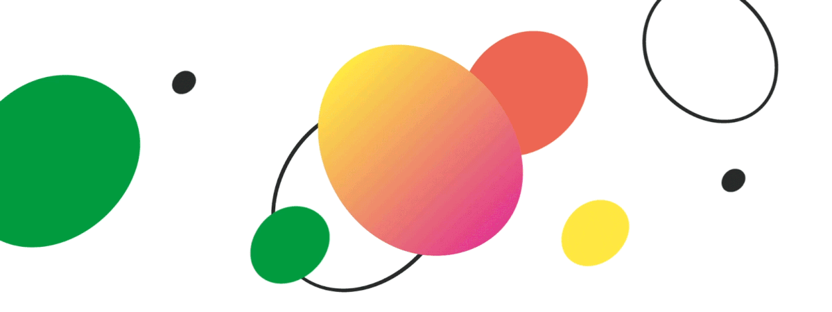
Colors and shapes of personality
DEZA designers have developed two color palettes — primary and secondary. The primary colors are intended for the design of printing, souvenirs, signboards, booklets, and other external communications.
Additional colors are useful for creating visual accents, as well as will be used in internal communications: in the design of office space, design of motivational posters, training materials.
Additional colors formed the basis of the signature gradients that the designers developed for the digital environment. The use of gradient elements will help IDDIS create the right brand feel on the electronic shelf.

The new IDDIS identity consists of two levels.
The first level is used for product layouts, and the second, which extends and complements the visual communication, is used in image layouts. The design team completed its work on the identity with recommendations on photostyle. Thus, in image communication, it is important to focus on people and select lively photos that convey a sense of attention and care.


Conclusion
As a result, IDDIS has the benefits for different audiences, values, character and essence, a refreshed logo and brand identity. The updated emotional component will help the brand form a strong bond with its audience.

Creative team
Strategist: Irina Mokrousova
Art Director: Irina Shmidt, Sergey Samofalov
Designer: Sergey Samofalov
Project Managers: Marta Bekker, Anna Artemova


