


Liftago started out as a taxi app in 2013, but it has gradually shifted focus towards a bigger idea - to be a technological platform and logistics solution that enables the demand for transport of both people and things in a city to be satisfied in the most effective way by the free capacity of commercial drivers. Though it had been functioning for 6 years, and had an established and functional logo, the brand lacked any sort of visual identity to work with for external communication, as well as internal use and digital applications.
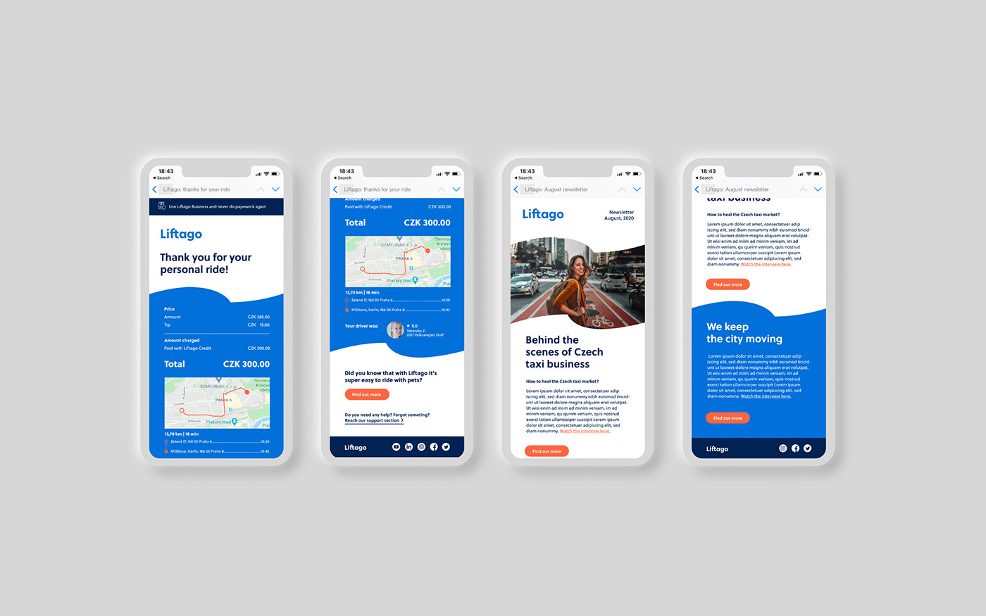
Starting from a very strong existing logo, we developed a flexible and complex layout system based on Liftago's most recognisable asset - the flag. This becomes the main element within the brand's visual identity and shifts from usage within the logo to defining areas for communication or being a holding device for photography. In this way, instead of applying the same logo on every material, which becomes repetitive and overwhelming, we maintain a strong usage of assets, while introducing variation and dynamism.
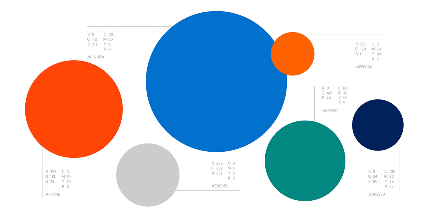
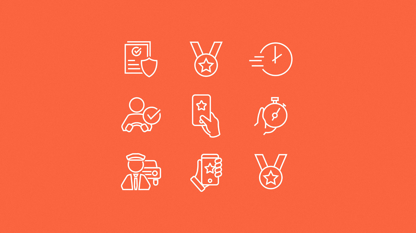
The collaboration on this project started with defining the brand strategy together with the client and continued with building a complex visual identity guildelines document which included a new color palette, new typography, layout system, photography and iconography style. Afterwards all this got applied to all the brand's communication: flyers, email templates, app store visuals, website and stationery.
The collaboration on this project started with defining the brand strategy together with the client and continued with building a complex visual identity guildelines document which included a new color palette, new typography, layout system, photography and iconography style. Afterwards all this got applied to all the brand's communication: flyers, email templates, app store visuals, website and stationery.


While the flag logo remained in its original form on some of the applications, the biggest challenge was building a layout system that doesn't abuse the logo and become repetitive and tiring to the consumer. On the car branding and certain official documents, the primary flag logo remains but on most other applications, the flag becomes a fluid, flexible shape that creates a visual language in itself and allows the brand to remain fresh and dynamic.


The output of the project was a comprehensive visual identity guidelines document, together with a number of materials already applying the new system. The resulting visual identity was then beautifully translated into web design by Biceps Digital.
Overall, it was a wonderful collaboration and a great example of how foundations can still be built on and refreshed, without losing brand assets and recognition.
Client contact: Jan Kotara
Logo design: Lumir Kajnar
Junior designer: Natália Švabeková
Motion design: Martin Egrt
Logo design: Lumir Kajnar
Junior designer: Natália Švabeková
Motion design: Martin Egrt


