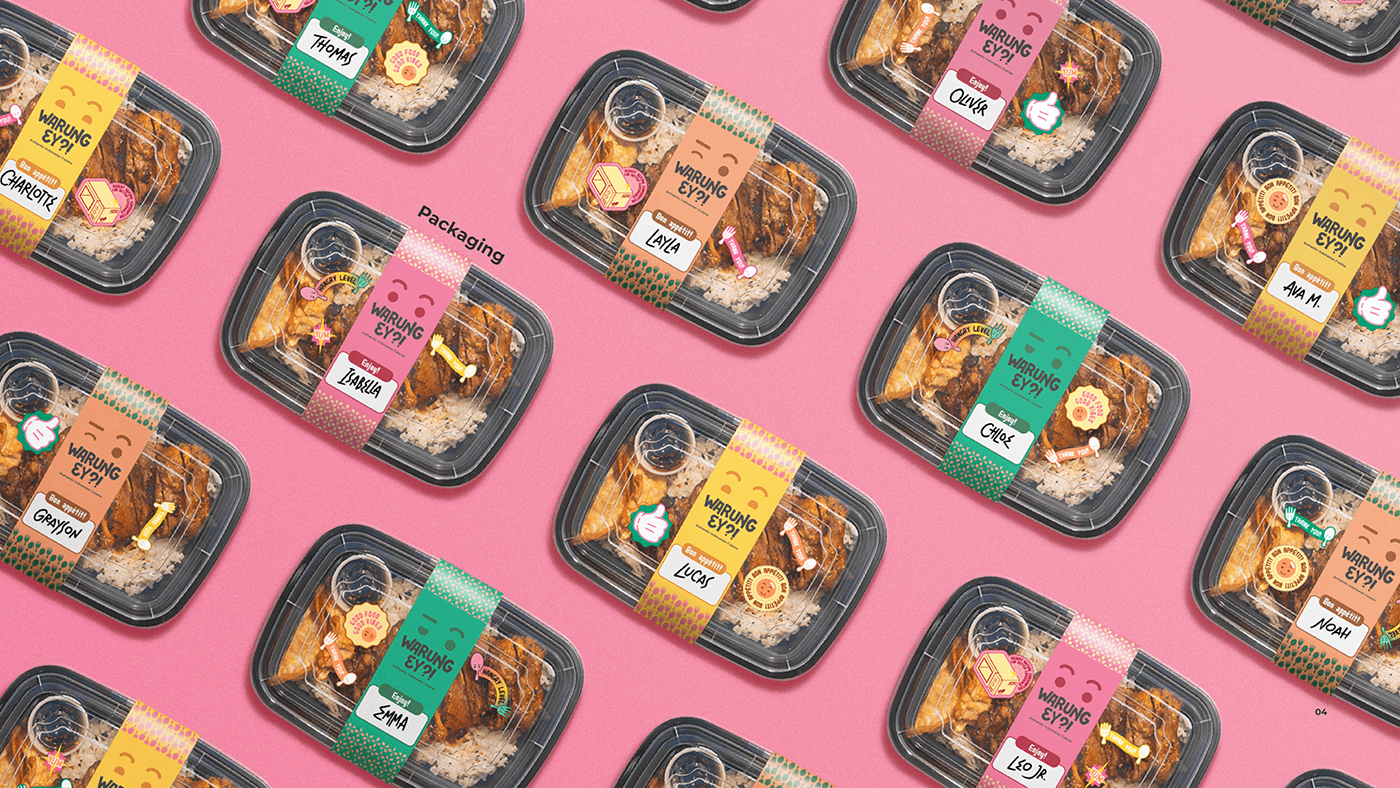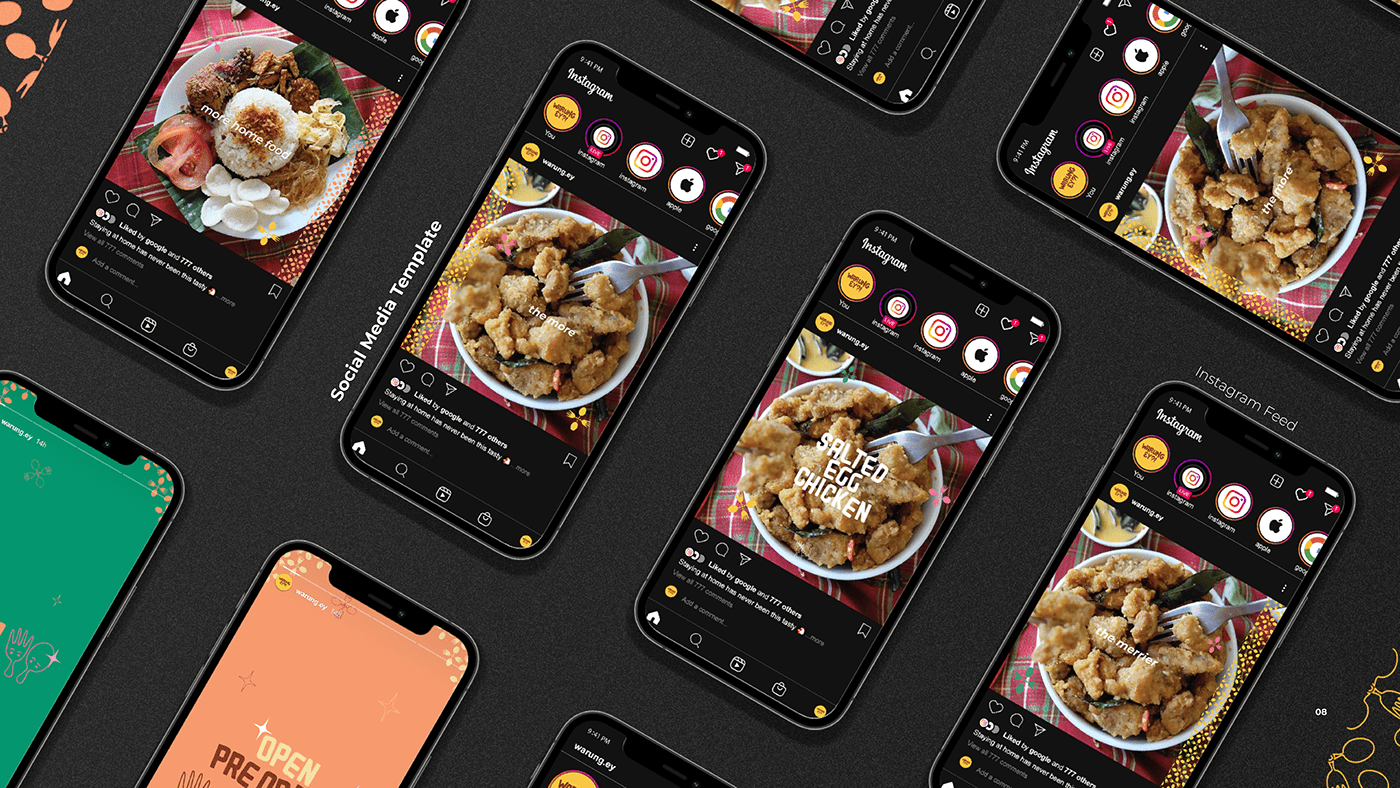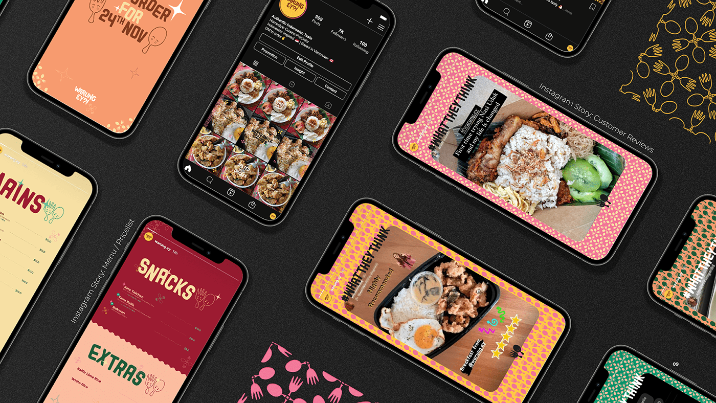
Warung Ey?! is a Vancouver-based Indonesian F&B small business that started in 2020. Both of the founders are Indonesian women, Ellysia & Yvonne. The name Warung Ey?! is a combination of two words: Warung, which means a small restaurant in Indonesian & Ey, which is a play on the very common Canadian interjection "eh" so that it becomes the initial letters of both of the founder's names
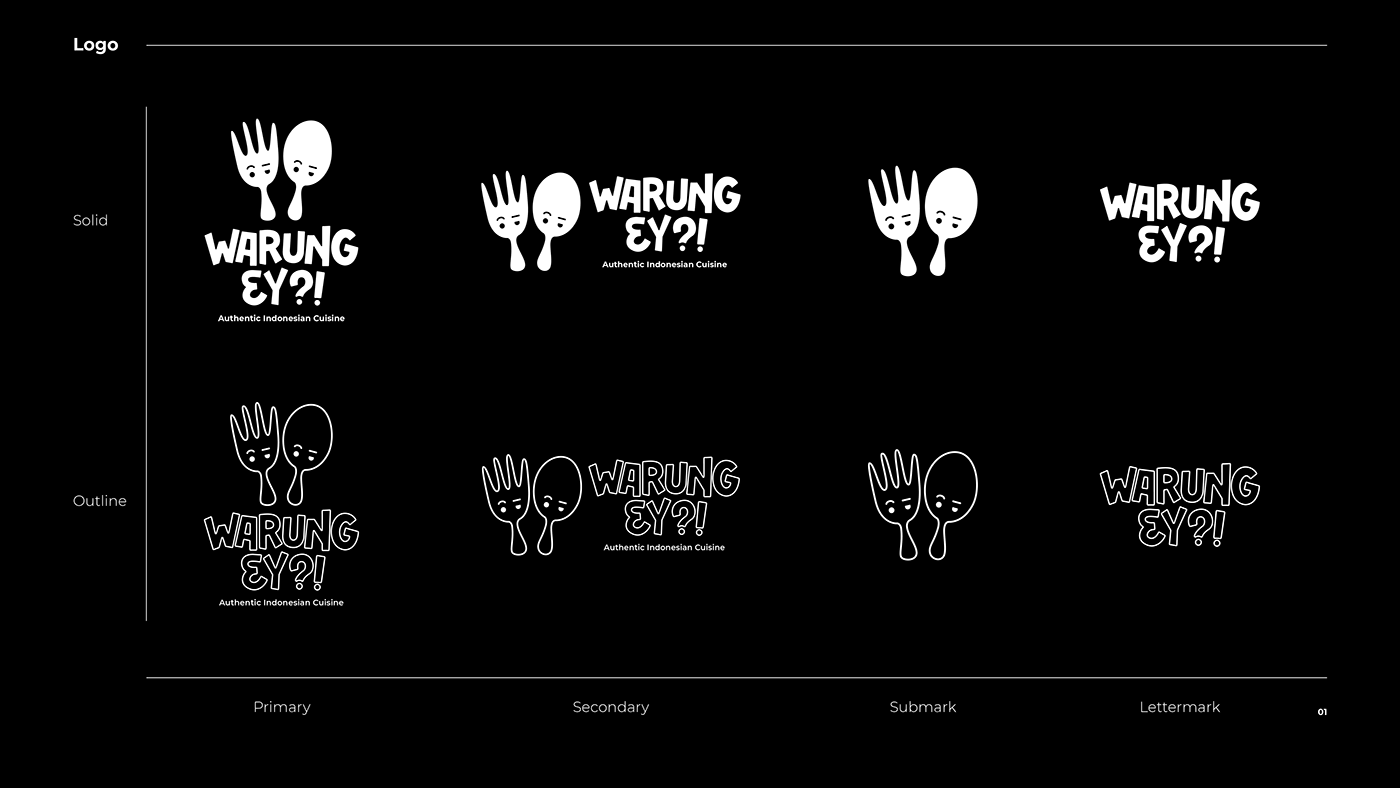
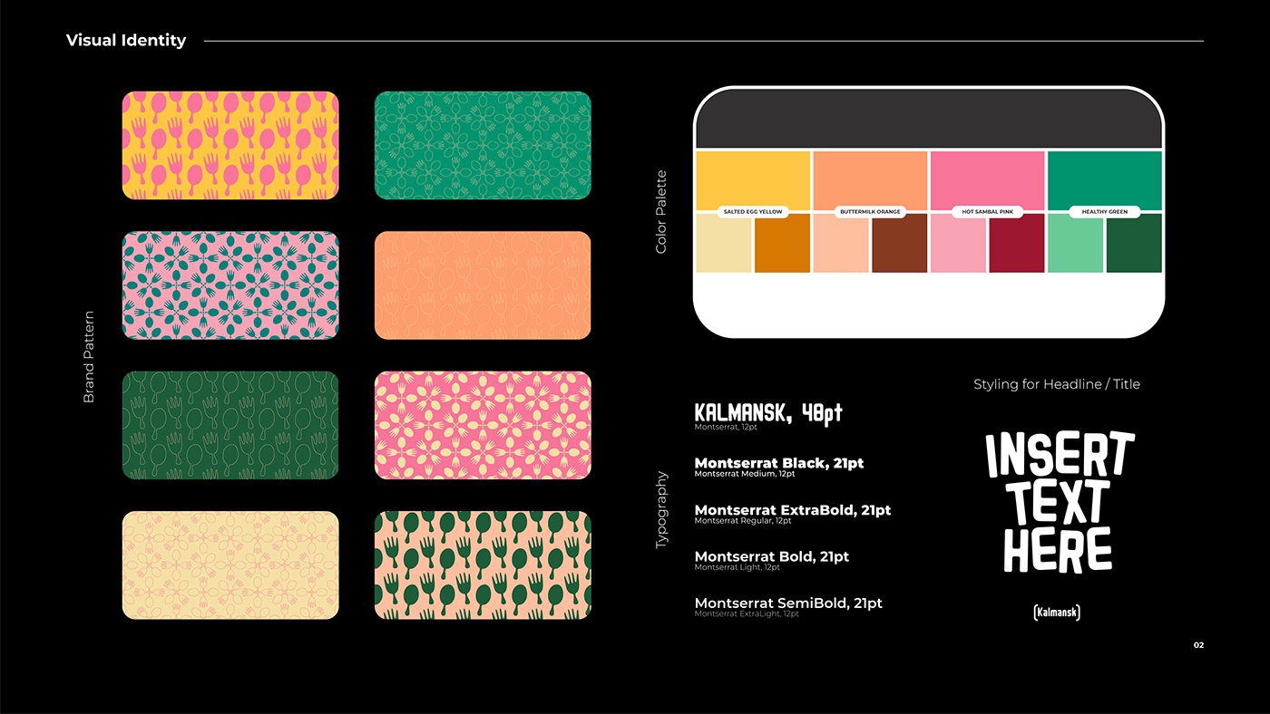
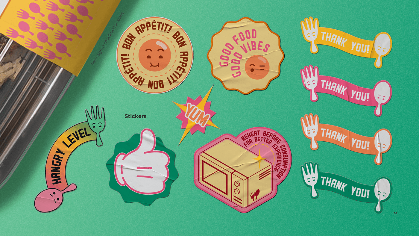
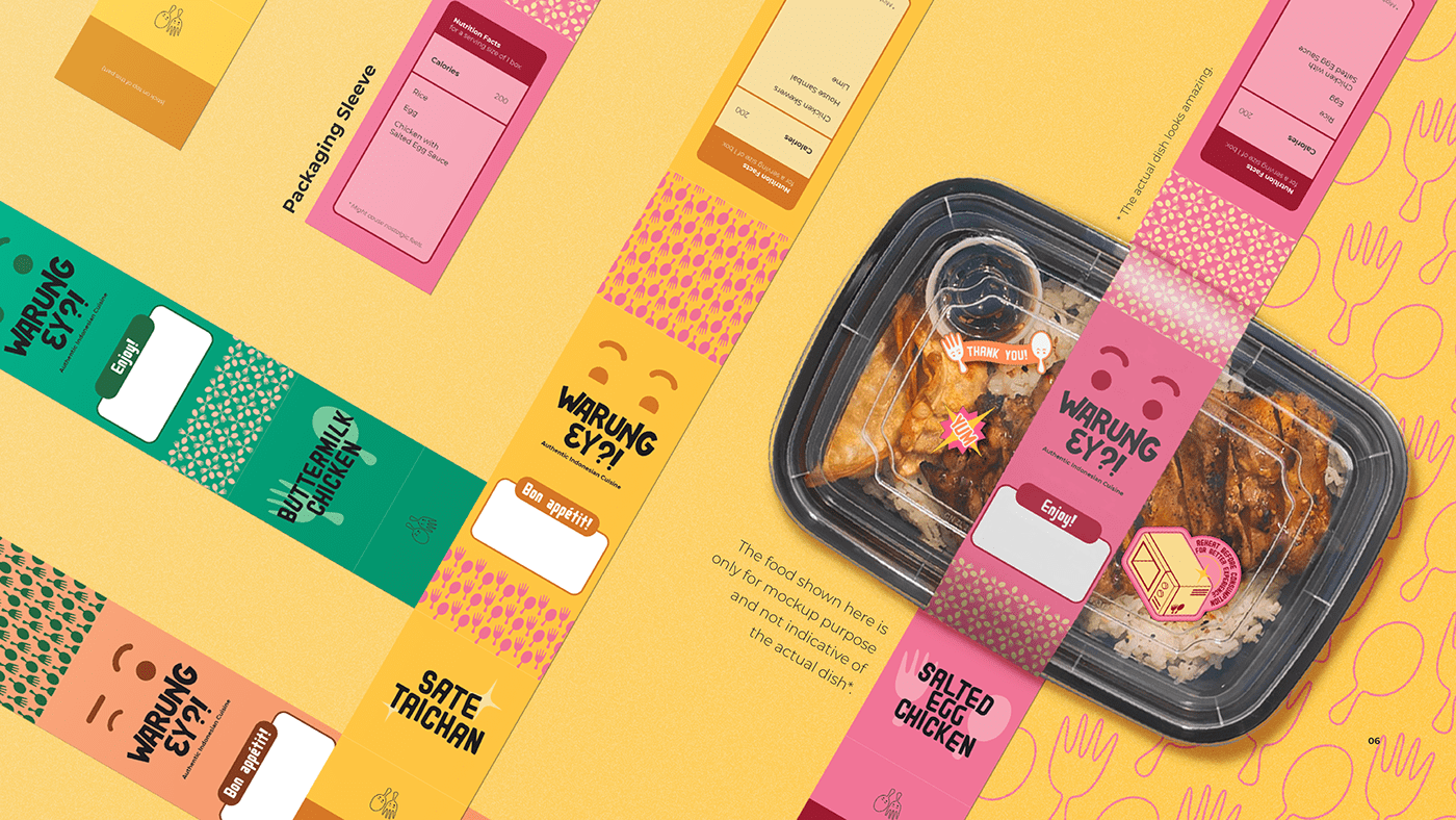
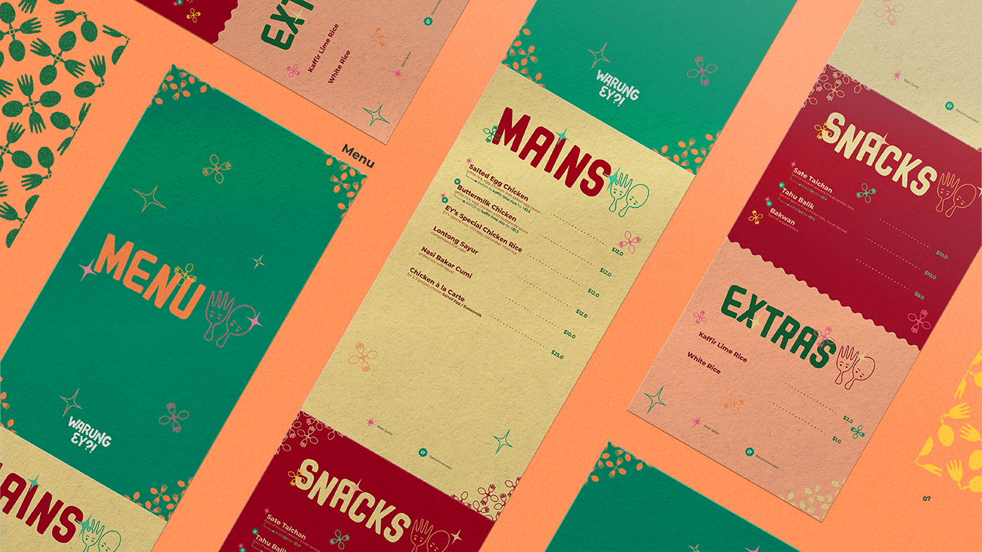
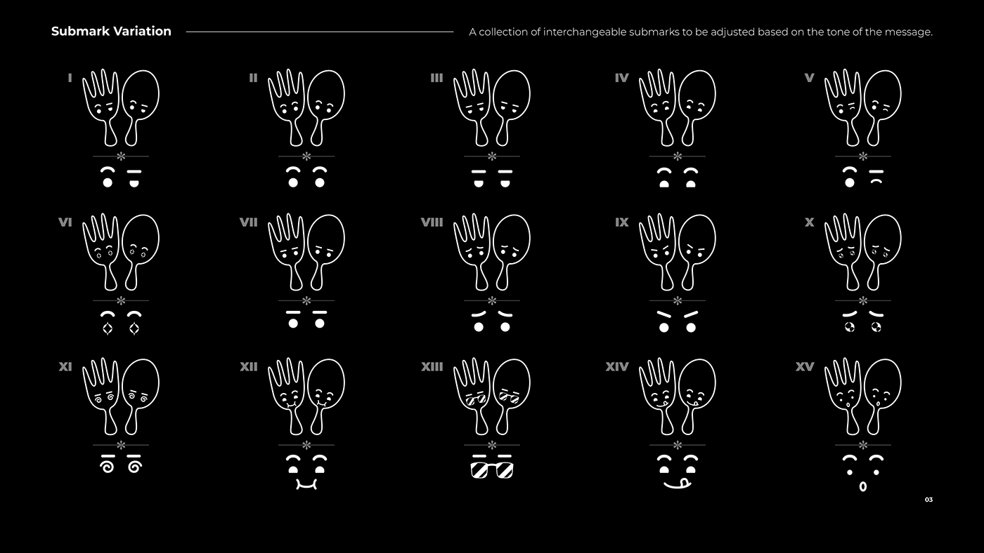
The objective of the branding project is to create a visual identity for Warung Ey?!. The youthful spirit of the founders and the richness in Indonesian cuisine becomes the main inspiration for the brand identity, which is then translated into the use of bold colors and expressive graphic elements. If you've read this far, then the inspiration behind the logo design itself is pretty self-explanatory: the fork & spoon are both of the founders. Since the logo is based on real people, it seems to be right that the logo isn't just a static mark. The submark of the logo has a collection of interchangeable variation which is meant to animate the fork & spoon characters in the logo to be more alive & flexible with the tone of message for marketing purposes.
At the time of this branding project, Warung Ey?! is still an online restaurant that only receives pre-orders via Instagram @warung.ey.
If you happen to be around the area and wanted a taste of Indonesian cuisine, go check them out.
Enjoy the rest of the project!
