ANI ICE CREAM
THE CHALLENGE
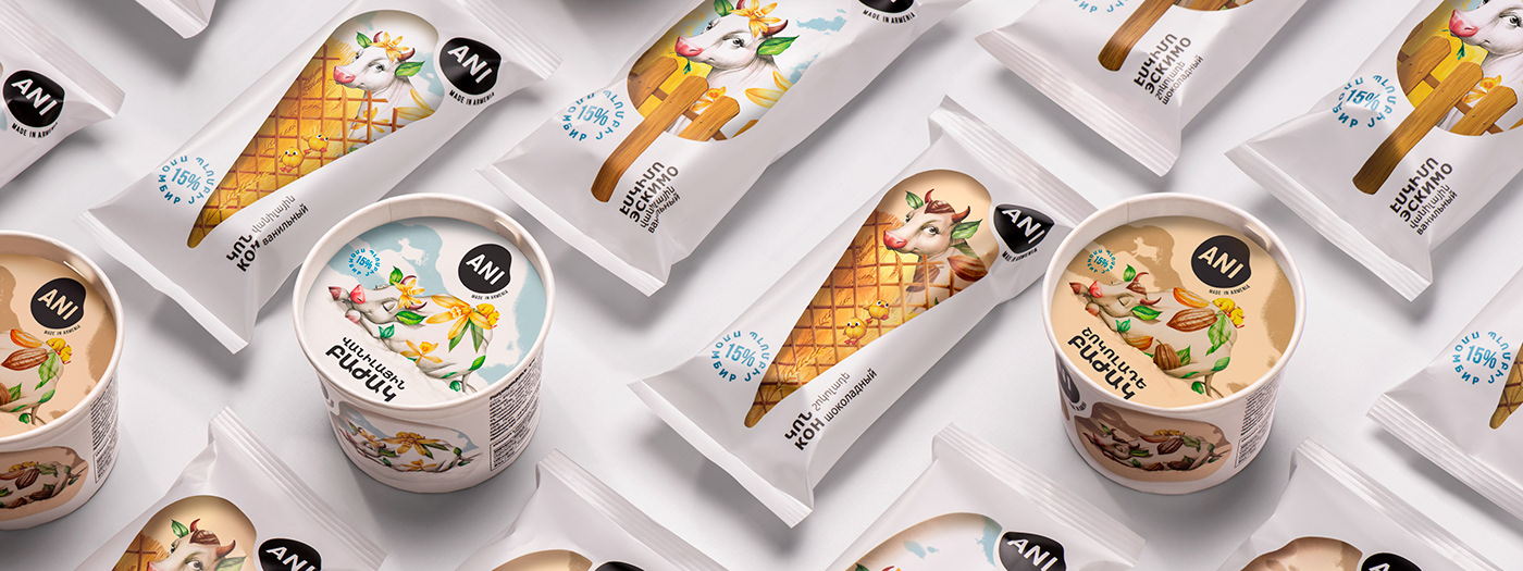
Our client – a dairy producer which gained huge success and notable sales increase in the market after rebranding 1 year ago, approached us to create a packaging for a new sub-brand of an existing dairy brand line – butter-based ice cream. We were challenged to create a packaging that would maintain the brand identity of a strongly positioned company, maintaining the strong association of already acknowledged benefits of the brand – freshness, quality, and taste through simplicity and whiteness. So basically we were challenged to associate the main character of the brand – cow with ice cream and illustrate them in one shape.
THE SOLUTION
We solved these major problems of packaging by creating a form of ice cream and illustrating it as a window to the cow’s world. Already well-known and perceived “Tzaghik Kov” (the Flower cow) invites the consumer inside the fence to discover the delicious world of vanilla and chocolate ice cream.
So whenever the consumer sees the ice cream in a supermarket refrigerator from a distance, he sees a mouth-watering ice cream strongly emphasized on a white matte background, which creates an association of freshness and palatability. By throwing a closer look they see the beloved identity of “Tzaghik Kov” in different idyllic states with its friends – adorable little chicks and a duck, with the help of which we wanted to showcase the healthy environment in which Flower cow is kept. That aimed to make the belonging visible from a distance.
The fences communicate the different types of waffle cones that hold the ice cream. The vanilla flower and cocoa beans on the cow communicate the type of ice cream inside the packaging. The time of the day is also a hint to the type of cream: the colors of sunny day are illustrated to associate the vanilla ice cream, and evening time colors point to chocolate.
The logo and the text were chosen to be black in order to clearly pop out to the eye and make it easily readable, and the blue stamp effect is a sign of quality.
Credentials:
Creative Director: Stepan Azaryan
Art Director & Illustrator: Mariam Stepanyan
Photos by: Backbone Branding & Suren Manvelyan


