

Conversion areas of the Euroconsumers main sites
Website specific pages and elements.
Website specific pages and elements.
UX/UI Design
Since the revenue of Euroconsumers comes from its subcribers, it's important to have several areas where new members can be converted.
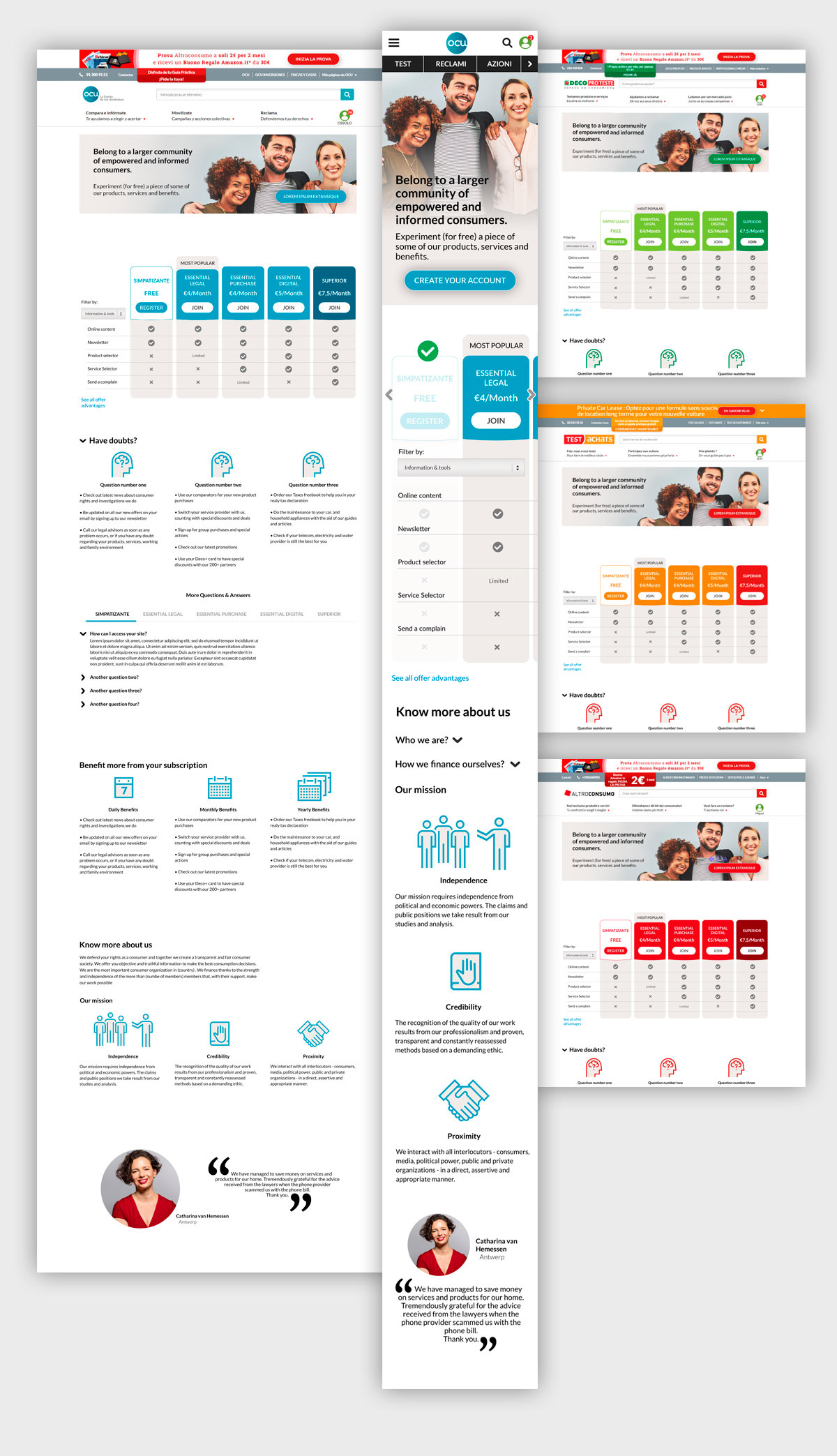
The Offer Page
1. The Design Problem
Euroconsumers sites needed to present the various subscription plans, from the free one to the premium, and also make the users subscribe or upgrade. Another request for the page was that the most common questions, that users might have, needed to be answered. Basically the initial material was a very ugly table with lots of columns and rows and questions and answers.
All this information needed to be readable, clear and engaging.
Also the users needed to feel that they become part of a group by subscribing.
All this information needed to be readable, clear and engaging.
Also the users needed to feel that they become part of a group by subscribing.
2. Users of the Product
The users can be totally anonymous who are invited to become free members, or already registered users who are invited to upgrade to a premium subscription plan.
The users can be totally anonymous who are invited to become free members, or already registered users who are invited to upgrade to a premium subscription plan.

As personas we can have Maria, 28 years old whose baby in growing and is looking for the best baby seat to buy. She is courious but never registered on the website.
Another persona is John, 54, who wants to know what the best investments are to save for when he retires. He is already a basic subscriber but considers going premium to get access to the full information.
Another persona is John, 54, who wants to know what the best investments are to save for when he retires. He is already a basic subscriber but considers going premium to get access to the full information.
3. Design Process
A benchmark was done to see how other sites presented the different subscription plans.
After some initial sketches a prototype was done to see how all the elements can fit on the page. For instance, since there is a big list of benefits, they can be sorted by groups accessible by a combo box.
Also, accordingly to what kind of user, anonymous or already registered, there are slight changes in the content.


4. Design Solution
The layout that starts with a hero image that contains a large photo and an invitation to subscribe.
Then the table was designed using colors to convey the idea of free, medium and premium plans. The rounded corners were also added to give a more friendly look.
In the questions area we have icons that help to visualize each concept like credibility and proximity.
The last element is a real user testimony with a circular photo and big quote marks that work like graphical elements.
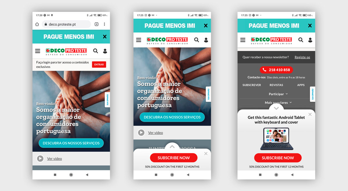
The Mobile Sticky Banner is a conversion element that expands automatically when scrolling. It also has expand/collapse and closing buttons so it can be controlled by the user.
In the Home Page there are Subscripiton Plans Cards that can be customised according to each countries needs. The colors, number of cards and positions are all configurable. They can even be used for Cross-Seling of other Products.


