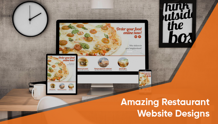
15 Best Restaurant Website Design Examples
Great restaurant websites are the ones that not just look beautiful but also work efficiently. It is very common to get carried away by the visual appeal elements, especially while dealing with food and restaurants. But, it is equally important to focus on creating an elegant and useful website that conveys information effectively.
Restaurateurs who blend both visual aspects and utility into one powerful website design always enjoy greater online traction and business. While it is not an easy task, it is not impossible either.
Use a restaurant website builder who provides various restaurant templates that are customizable (at affordable prices). Ensure that the food web constructor allows you to create a restaurant website with activating online food ordering and online payments so that your business continues to flourish during this pandemic season too.
A flawless restaurant web design will permit customers to easily locate and procure information like menus, location, open hours, contact numbers, etc. It also motivates them to make online food orders and online payments directly through the website. Through the design elements used on the restaurant website, the visitor must also get an idea about the restaurant’s atmosphere, service and quality of food.
The following is a compilation of 15 well-planned and designed restaurant websites that have successfully incorporated all the elements necessary for visual appeal and utility.
INSPIRATIONAL RESTAURANT WEBSITE DESIGN EXAMPLES
MRS. KUMAR’S
Serving authentic Indian cuisines to compete with homemade food, Mrs. Kumar’s located in Monroe in New Jersey has a single-page website that appeals to every visitor. With all the icons neatly arranged on the top right of the landing page, any visitor looking for information can easily procure it. The icons to order food online and make payments are also easily visible making the website a platform for effective online sales and marketing.
LICEAS
This website, created with WordPress, has a simple, elegant, yet unique design. Visual design elements and utility have been incorporated into their website. Large images have been used throughout the website to make people drool as they sift through their enticing menu. Key information like location, service hours and contact information have been predominantly displayed on every page.
CARAVAN
With its classic design, the website of Caravan offers every information - menu, contact, table reservation, address, events, etc. - on their homepage itself. People can gain access to this information with a single click. The website of Caravan is clean and efficient even without any fancy elements or unnecessary distractions.
JACKS BAR
This single page restaurant website design, created using WordPress, simplifies information to a great extent. Only what’s needed has been included. Customers get all the vital information on one page without any distractions. A pop-up video is also available on the website of this bar in London. It is worth a look as it has been crafted extremely well to display the bar’s atmosphere to every visitor.
TOCA
This restaurant also has a one-page website with a simple design where users can find information in seconds. This enhances user-experience. A full-screen video that showcases the expertise of Toca is also an outstanding example of how a restaurant website should be used for promotional activities.
PHO
The website of Pho adopts a unique visual approach. Created using WordPress, Pho’s website has custom icons for the menu making it very easy and pleasing for people visiting the site. They vigorously promote their brand, by providing links to their feeds on social media platforms like Instagram and Twitter, on their website.
AMERICA RESTAURANT
This restaurant’s website uses the 3 B’s to create an awesome impact - Big, Bold and Beautiful. Coincidentally, this is their tagline too. The website of this restaurant is bold, yet elegant. The visual elements used on the website conveys a clear message about the restaurant’s atmosphere to the visitor.
MAIALINO
The website of Maialino is unique because of the homepage graphic incorporated with a menu. We do not get to see such creative concepts quite often on other restaurant websites. This makes the website of Maialino stand out amidst the crowded online restaurant business space.
DESERT CHILL
This website, belonging to an ice cream business, has naturally been made with elements that make the design beautifully bright and kid-friendly. The bright and bold colors and typography actually enhances the simplicity of the entire website design.
BAR ISABEL
Bar Isabel’s website has found a place in this list, fundamentally, because they have made a dark theme look really attractive. It has a simple, straightforward and a single page design. They also add an essence of mystery to the website making visitors eager to visit the brick and mortar restaurant.
EARLS
Earl’s Kitchen and Bar has a website that is simple, but bold. They have kept the usage of text to a bare minimum that facilitates visitors to quickly find what they want while simultaneously receiving clues about the atmosphere of the restaurant and the experience they are likely to get when they visit Earls.
AMSTERDAM BREWHOUSE
This restaurant’s website has a virtual tour of the place, an online shop, event bookings and information about their kitchen and brewery. Although the content is heavy, it has been beautifully arranged in a visually appealing restaurant website layout.
EL CATRIN
It is because of its website that El Catrin has been established as one of Toronto’s best Mexican restaurants with several prestigious awards that they can boast of. While the website does lack certain aspects that could have made it flawless, one cannot complain when the information needed is secured in seconds.
GRAMERCY TAVERN
By using large and enticing images, videos and modern design elements, Gramercy Tavern makes its website instantly classic and an example of a great restaurant website design. Grabbing information from the website can be done in an effortless manner within seconds.
LE BERNARDIN
Le Bernardin has a simple one-page website. It uses full-page food images. The restaurant’s usage of the ‘hamburger button’ on its website has been widely debated. By placing the menu on the left side of the landing page, Le Bernardin has treated the website design differently and has made the output unique.
CONCLUSION
A restaurant’s website design should not be considered lightly. A strong web presence is extremely important for a restaurant, especially during these trying pandemic times. An effective restaurant website can have a great positive impact on its business and goodwill.
Restaurateurs mostly opt for a free website builder or settle for a cheap website design fearing the dollars they might have to spend if they hire a professional for this task. But, this is where restaurateurs make a mistake. They must realize that a great website is income generating and that a good restaurant website design is a long-term investment that can bring them revenue multifold.


