
Neuland has been used since its introduction in 1923 as a rugged type with more black space than almost any other BOLD font. The appeal of Neuland, however, is much more than just heavy ink coverage. It has stood the test of time because of the flexibility in it's usage and the humanistic qualities in its design.
Created at the height of the streamlined art deco twenties, it is used more often than not to project a sense of the exotic, rugged and wild. It has been used for everything from Tiki Lounge music of Martin Denny to Jurassic Park. Koch's design of Neuland was undertaken in the spirit of the early mediæval type designer. Early type designers were also the punchcutters, type casters, and even printers. This complete approach to all aspects of the type's design keeps it truly the work of one person. By the early 2oth century, each specialized step of type creation had typically been completed by individual craftsmen who may not have fully understood what the original designer had intended. Neuland's rough look was partially a reaction to the sterility of mechanical reproduction and cheap mass-production, which was also the driving factor in William Morris and the various Arts and Crafts movements of the turn of the century.

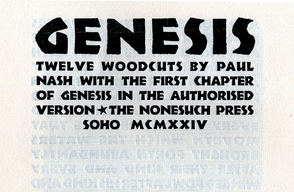
Neuland was designed as it was being cut into metal, without the aid of drawn out patterns. The edges were filed away and the inside areas (or counters) were punched with metal tools. As with most fonts made for commercial use, Neuland was cut in many point sizes (10, 12, 14, 18, 24, 30, 36, 42, 54, 60 & 72). Each size was cut with the same approach and without the aid of the pantograph. This individual approach to each point size offers much variety in individual letters at various sizes. The 10pt. A features a distinct angled crossbar, while the14 pt. Q sports a diminutive swash The AE ligature only seems to appear in the 18 pt, while 12 pt. contains no comma. These idiosyncrasies between each size are truly one of the most charming aspects to Neuland. Sadly, the conversion of Neuland to Photo-lettering and now digital has lost these individual variations.

Although there are several digital fonts which carry the Neuland name, most are very limited in their representation. One popular version called Neuland features neither the angular lobes of the B and the R nor the standard accompaniment of ASCII diacritical marks. The P22 version, named P22 Koch Nueland has attempted to approach the original with as much reverence as possible. It did not seem feasible to re-digitize each point size, but rather pick up individual characteristics of various sizes and integrate them into a scalable font. Each letter of this all-caps font could be presented twice, one in upper case and one in lower case, rather than simply duplicating the U&lc.
This Neuland project was started in 1995 by collecting various samples of Neuland. It has shown up in sign painter instruction books (perhaps explaining the rounded lobes of the B and R in some digital versions). A Dutch sample book showing 'Neuilant' first tipped off the drastic variations of the 10 pt. A. The P22 version does not claim to be the definitive digital version of this font, but rather an alternate version, which draws on many original sources for a truer sense of the first "Neuland".

Letterpress Specimen showing the various sizes of Neuland


