


Visual System for Czech Village VESELÁ (means MERRY)
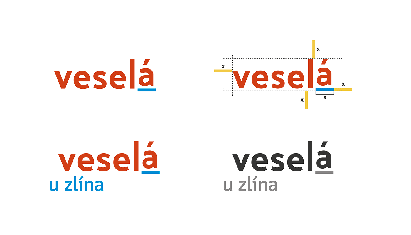
I was inspirated by itself name VESELÁ, which means in Czech language MERRY. I wanted to create happy design full of colours and make it playful. Because of the word, which I have connect among the other things with children, I decided to create a logotype and pictograms simpler and more geometric. Make it similar like kid's jigsaw. The logotype was inspirated by colours from its heraldic.
Red come from the rose and blue from a background of coat of arms. I didn't use yellow, because it could be harder to read.
The meaning of the word "merry" I am using in the whole visual identity. In the Czech language we change last letters, which change meaning of adjective. These letters can mean gender or amount of people. This change of meaning I am using in design of posters, whishing cards or others promotional materials.
Vizuální styl vesnice VESELÁ
Při tvorbě vizuálu obce jsem se nechala inspirovat samotným názvem vesnice „VESELÁ“. Chtěla jsem, aby byl design veselý − hravý a barevný. Jelikož tato slova mám spojená i s dětmi, rozhodla jsem se vytvořit logotyp a příslušné piktogramy jednodušší a více geometrické. Podobně jako jsou dětské skládačky. Logotyp je kolorovaný barvami z heraldiky vesnice.
Červená je převzatá z růže a modrá z pozadí erbu. Žlutou barvu jsem pro logotyp zamítla, jelikož by byla hůře čitelná. Tyto barvy pak využívám i v celém vizuálu jako výchozí barevnou kombinaci.
Význam slova „veselá“ využívám při logistice celého vizuálu. Mimo barevnost a geometričnost se logo může měnit podle slovního spojení. Vyjadřuje tedy i přídavné jméno. Tato hra s logem (veselá/ý/í/é) je využívaná na plakátech, přáních a v jakýchkoliv jiných propagačních materiálech.


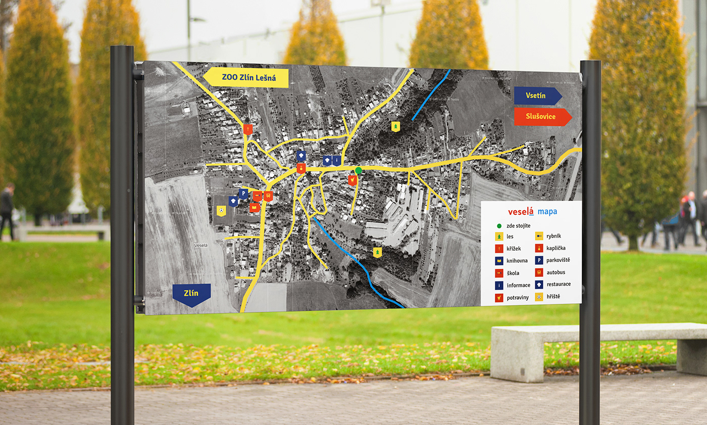
The outside orienteering system is focus on tourists. On the future square would be placed this map with pictograms of the most important objects of neighbourhood. The most expressive has to be the bus stop, which is the way, how to get to the village (instead of car or bike).
.
Venkovní orientační systém je cílen zejména na turisty. Pracuje opět s veselou barevností. Na budoucím náměstí by byla umístěná mapa vesnice s piktogramy nejvýznamnějších objektů. Zdůrazněná je i autobusová zastávka, kudy se turisti mohou dostat do vesnice.


Posters are sumplemented by photos, except of the word meaning and other important information. Because of the playfulness, photos had to stay in colors. Pictures can be cut by geometric shapes: square, rectangle, triangle or circle. These shapes support an idea of this geometric system. In order of make it more dynamic can photos transcended these shapes.
.
Plakáty jsou mimo slovní spojení a potřebných informačních údajů doplněny fotografiemi. Jelikož by měl být vizuál hravý, zůstala jsem u barevných fotografií, které jsou vyříznuty geometrickými tvary: čtverec, obdélník, trojúhelník a kruh. Tyto tvary podporují myšlenku geometričnosti vizuálu. Z důvodu, aby byl plakát dynamičtější, tak z oříznutých fotografií vystupují stěžejní prvky (ruce, hlava atd.).


