
bunch bakery"" یک نانوایی مدرن در پالادیوم تهران است که محصولاتی از قبیل نان و شیرینی هایی با کیفیت بالا را ارائه می نماید. من بسته بندی و هویت بصری و برنامه های کاربردی آن را برای برجسته سازی یک نام تجاری اقتصادی برای فروش بیشتر طراحی کردم.
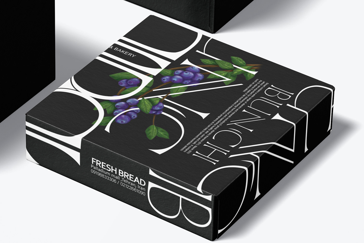
فروشگاه آنها در منطقه ای است كه تعداد زیادی مراكز خرید دارد و همگی به صورت مدرن و لوکس طراحی شده اند، با توجه به تحقیقاتی که صورت گرفت در نوع و نحوه طراحی تصمیم بر ان شد که علاوه بر حفظ هویت سازمانی قبلی این شرکت به نوعی بازسازی شود که هم مدرن و نو به نظر برسد اما باز در نگاه اول همان هویت برندینگ قبلی را نیز در ذهن بازسازی نماید، بنابراین در ابتدا با بازسازی لوگو از جنس خط هایی از خط های قبلی لوگو شروع کردم و برای ایجاد تمایز در طراحی و نیز مقرون به صرفه بودن در چاپ بنا به تعداد زیاد محصولات زمینه طراحی را به صورت تایپو گرافی برگرفته از لوگو طراحی نمودم، ایجاد یک تایپوگرافی و پترنی خاص با حروف که نگاه هر کسی را به خود جلب می نماید و چون مخاطبین ما خانواده ها بودند سعی کردم نظر والدین و کودکان را با ارائه نان ها و شیرینی هایی با پیچ و تاب مدرن در بسته هایی با تایپوگرافی خاص جذب نمایم.
در طراحی بسته بندی های این شرکت سعی شده که قابلیت پیاده سازی در هر پلت فرمی با هر رنگی را داشته باشد و با صرف کمترین هزینه در انواع بسته بندی با هر رنگی بتوان اجرا کرد.
تمامی پیترن ها و الگوها تکرار کامل اسم برند و با قسمتی از ان است و آن هم به دلیل خاطره سازی در ذهن ها می باشد.
ما عاشقانه محصولات را درست میکنیم، سالم بسته بندی میکنیم و با مقرون ترین هزینه به خانواده های عاشق تقدیم میکنیم پس عاشقانه و سالم زندگی کنیم.

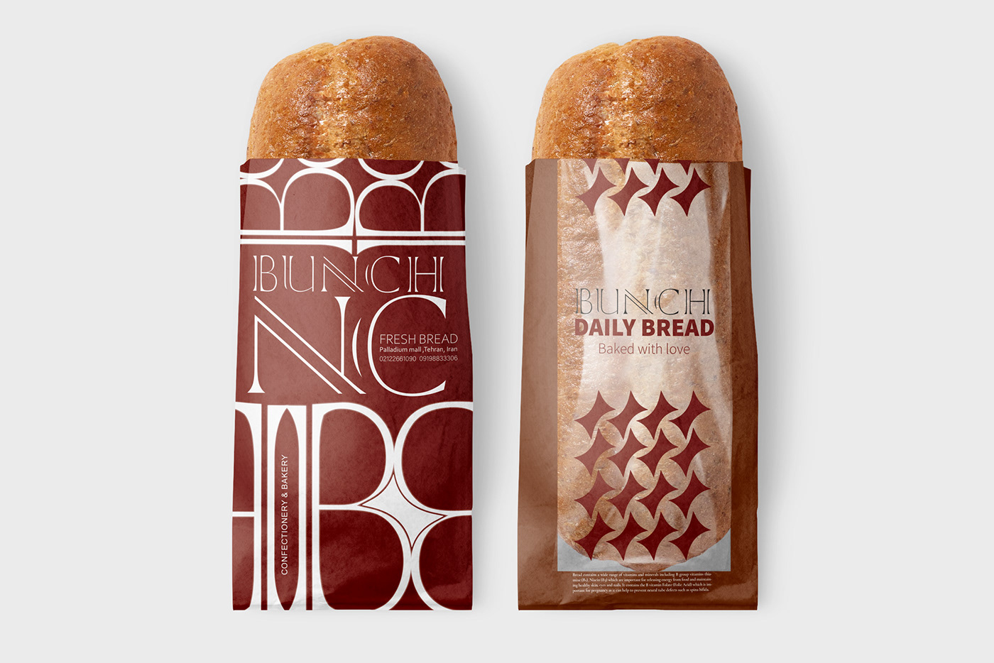
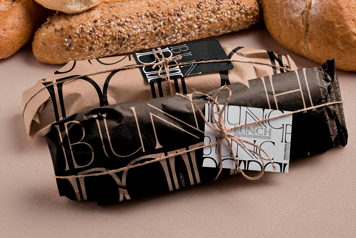

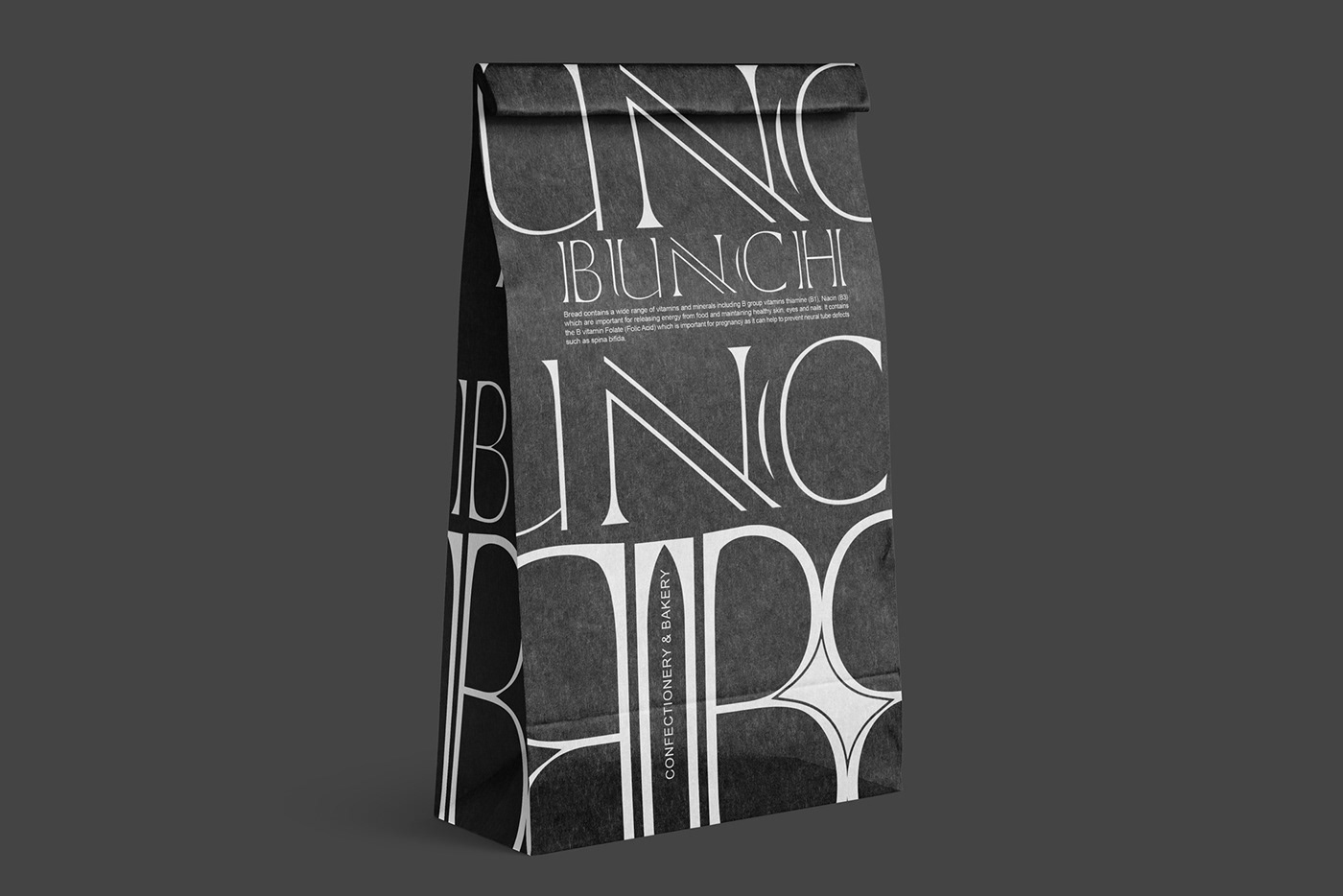
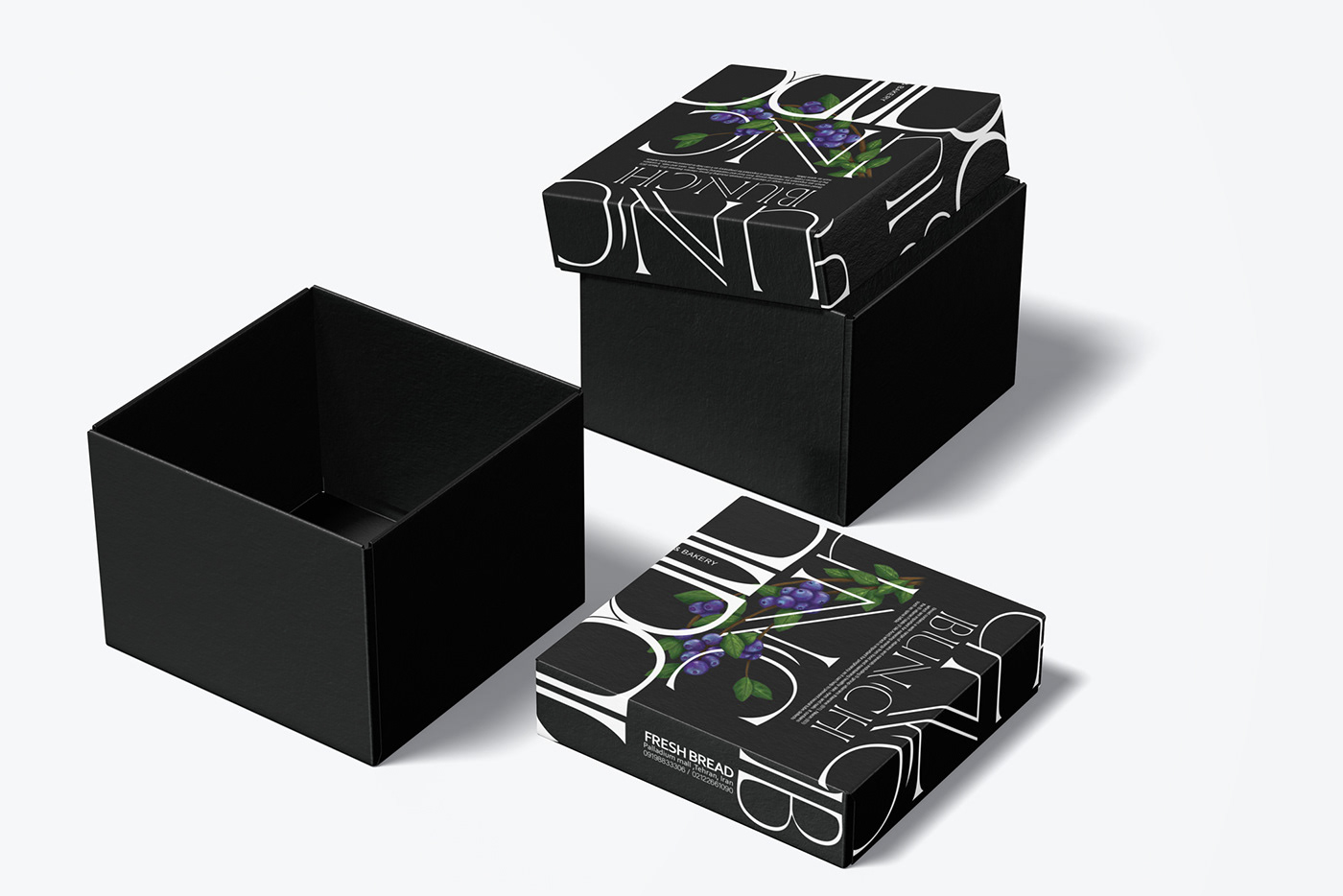

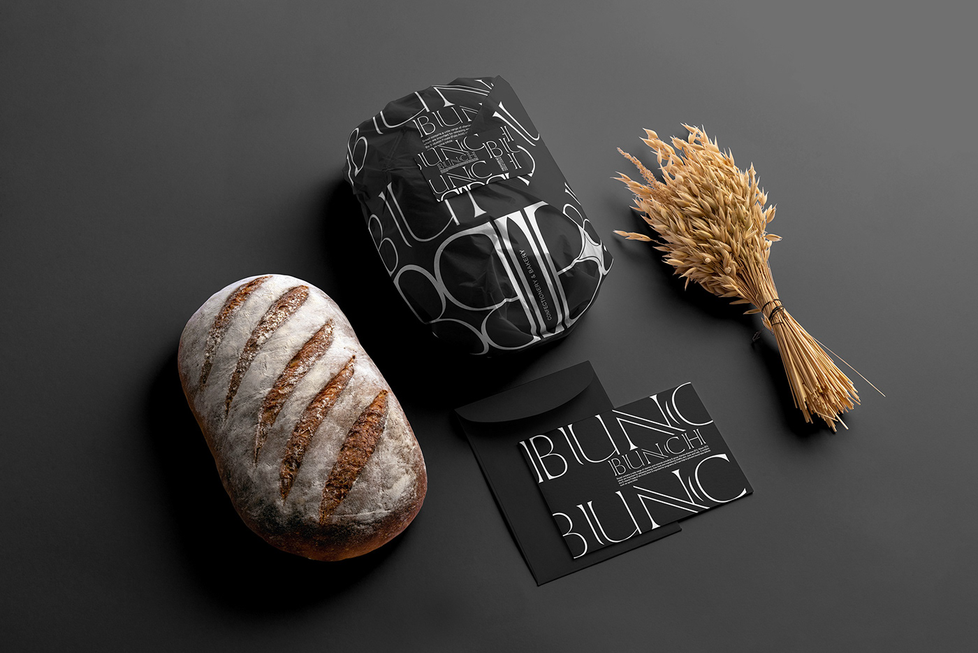
bunch bakery "" is a modern bakery in Palladium, Tehran, which offers products such as high quality bread and sweets. I designed the packaging and its visual identity and applications to highlight an economical brand for more sales.
Their store is in an area that has a large number of shopping centers and all of them are designed in a modern and luxurious way. Based on the research that was done in the type and method of design, it was decided that in addition to maintaining the previous corporate identity of the company Reconstruct it to look both modern and new, but at first glance, recreate the same branding identity in mind, so I started by recreating the logo from the lines of the previous lines of the logo and In order to differentiate the design and also to be cost-effective in printing, based on a large number of products, I designed the design field in the form of typography taken from the logo, creating a special typography and pattern with letters that attract everyone's attention, and Because our audience was families, I tried to attract the attention of parents and children by presenting breads and sweets with a modern twist in packages with special typography.
In designing the packages of this company, it has been tried to be able to be implemented in any platform with any color and to be executed with the lowest cost in different types of packages with any color.
All patterns are a complete repetition of the brand name and with a part of it, and that is because it creates memories in the minds.
We make products with love, pack them safely and give them to loving families at the most affordable cost, so we can live in love and health.

