

PT-BR
Dizem que criar a marca própria é a maior dificuldade de um designer e recriar toda minha marca pessoal foi o meu maior desafio. Nestes últimos meses tive que aturar o meu cliente mais exigente, eu mesmo!
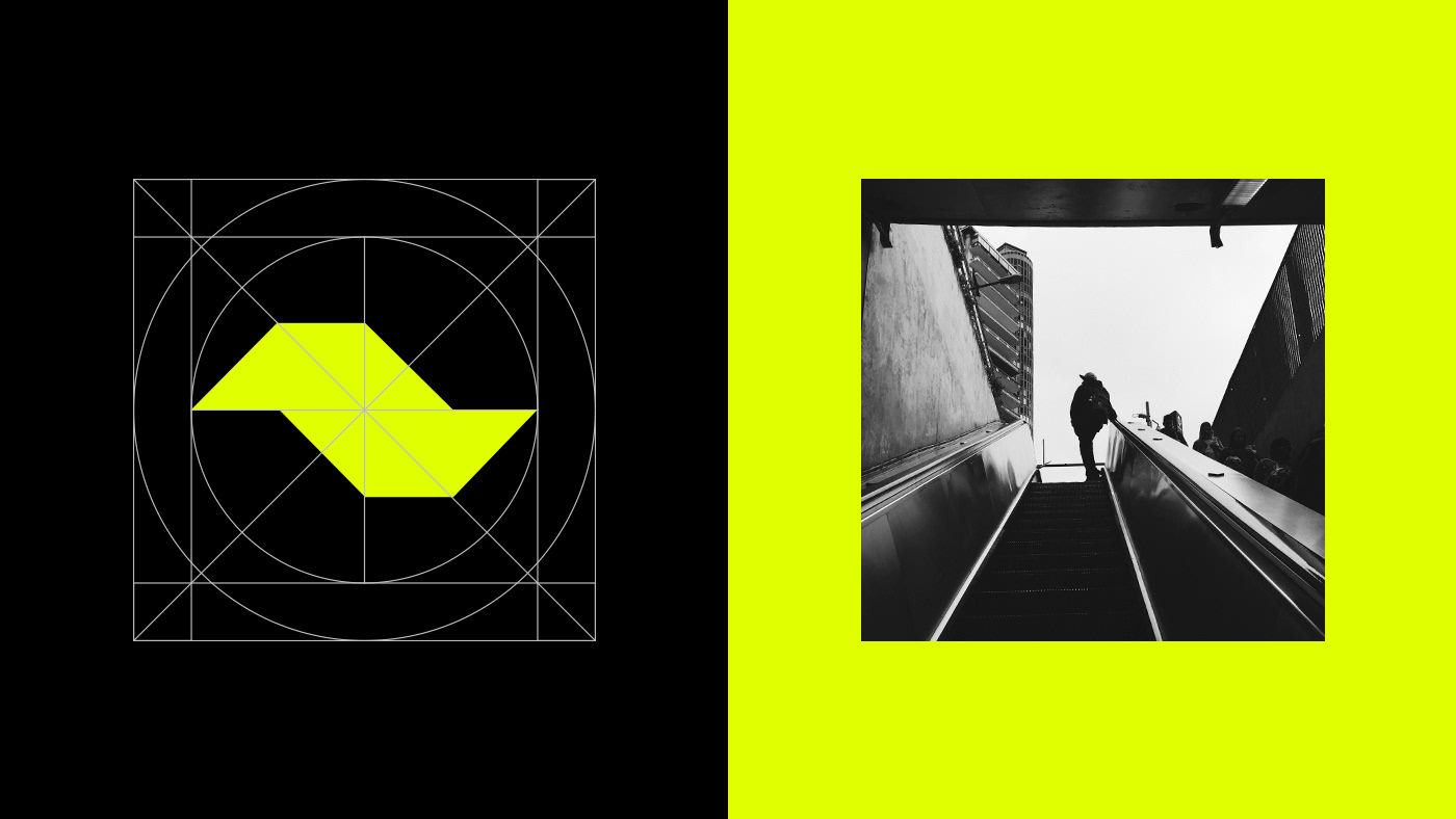
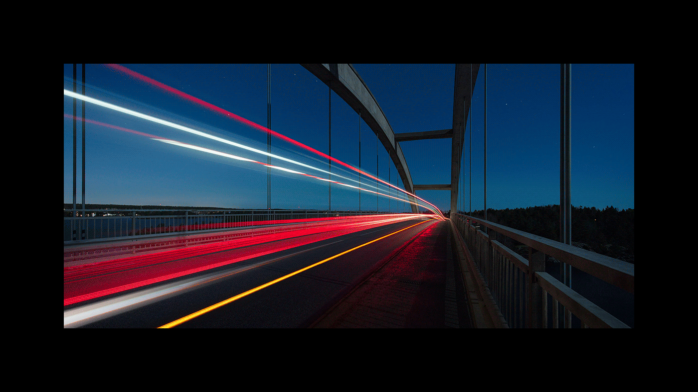
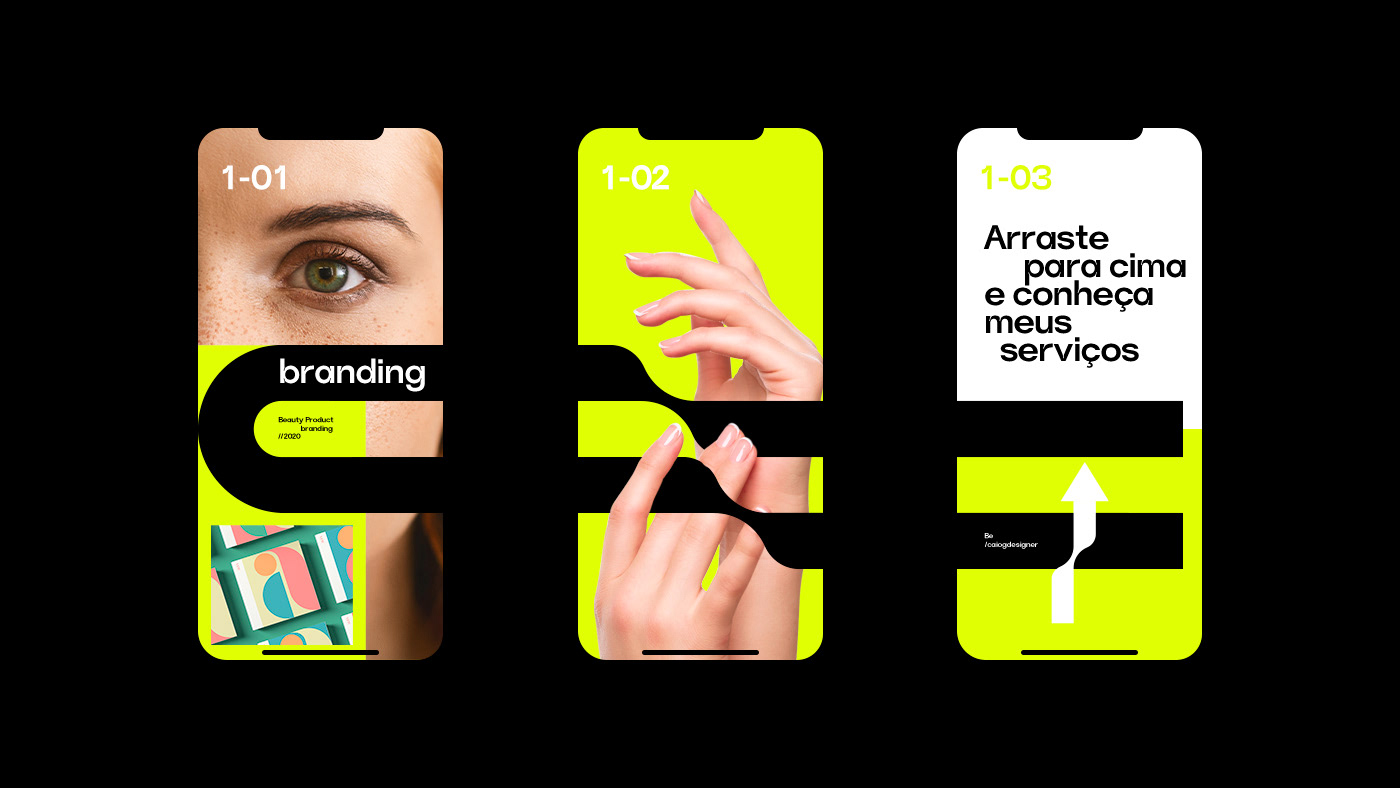
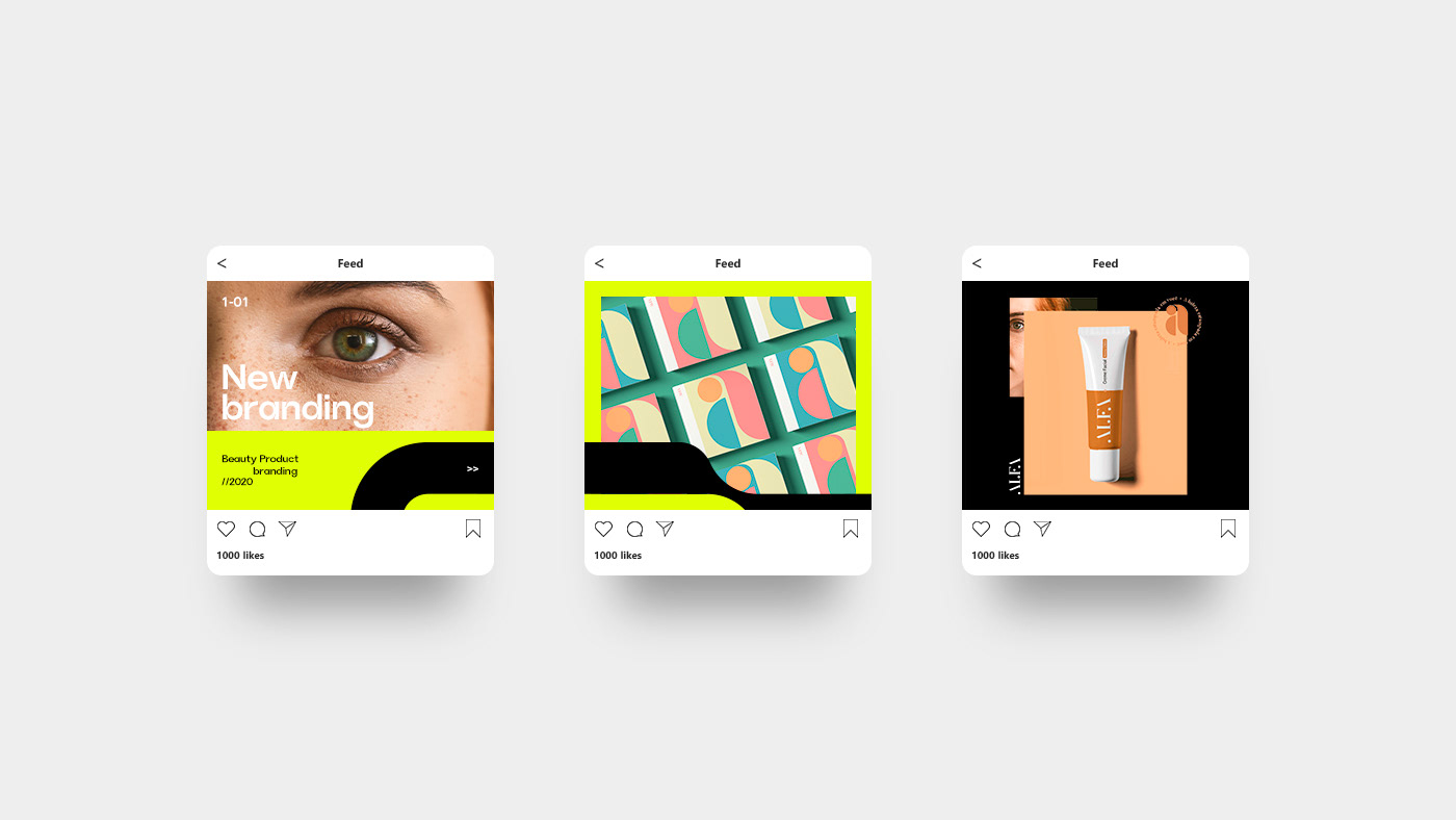
Cada dia que passa vamos nos conhecendo melhor e revendo minha marca anterior eu enxergava que ela não me representava mais. Minha nova identidade buscar representar quem sou, todas as tendências cíclicas do mercado e o movimento que fazemos durante nosso tempo de vida.
Cada dia que passa vamos nos conhecendo melhor e revendo minha marca anterior eu enxergava que ela não me representava mais. Minha nova identidade buscar representar quem sou, todas as tendências cíclicas do mercado e o movimento que fazemos durante nosso tempo de vida.
Desafio:
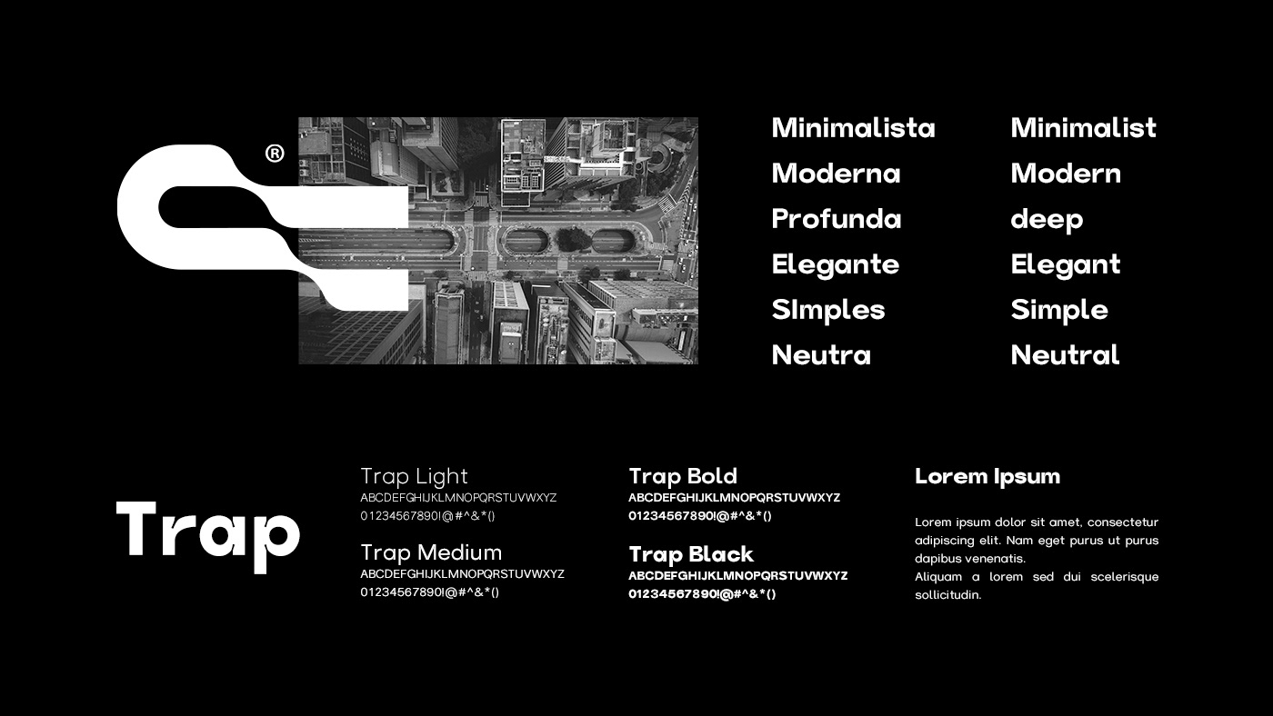
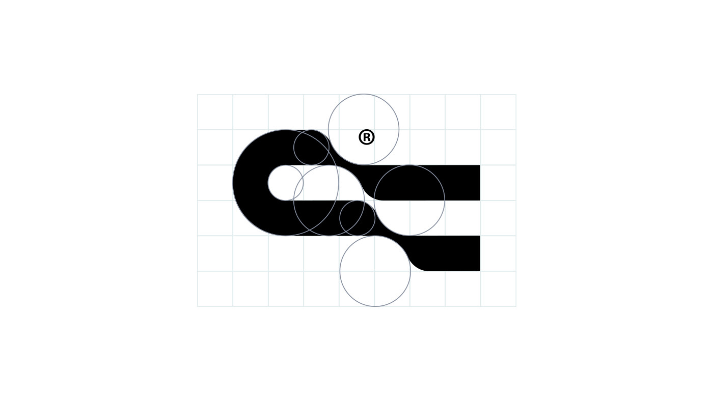
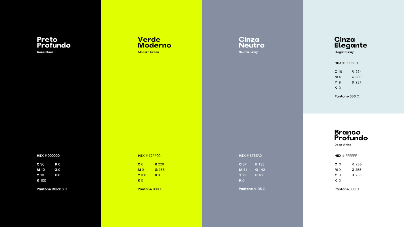
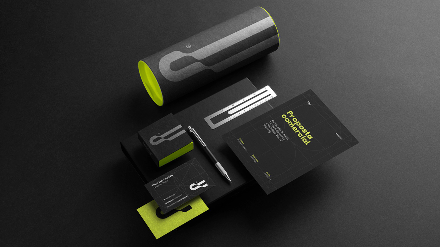
Criar uma marca forte, moderna, dinâmica e com contrastes que faz referencia a inicial do meu nome "C" e a todo movimento que o mercado da publicidade esta inserido.
Criar uma marca forte, moderna, dinâmica e com contrastes que faz referencia a inicial do meu nome "C" e a todo movimento que o mercado da publicidade esta inserido.
Solução:
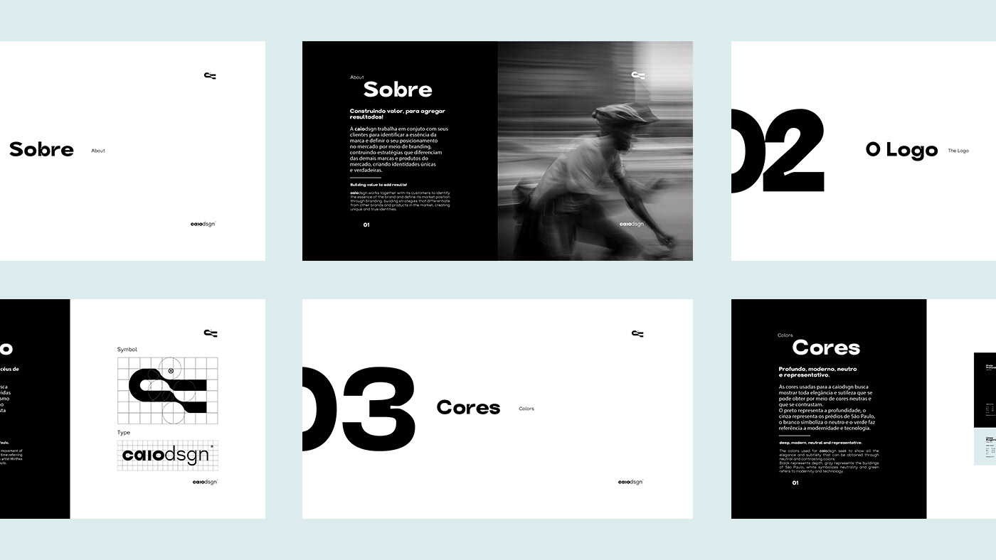
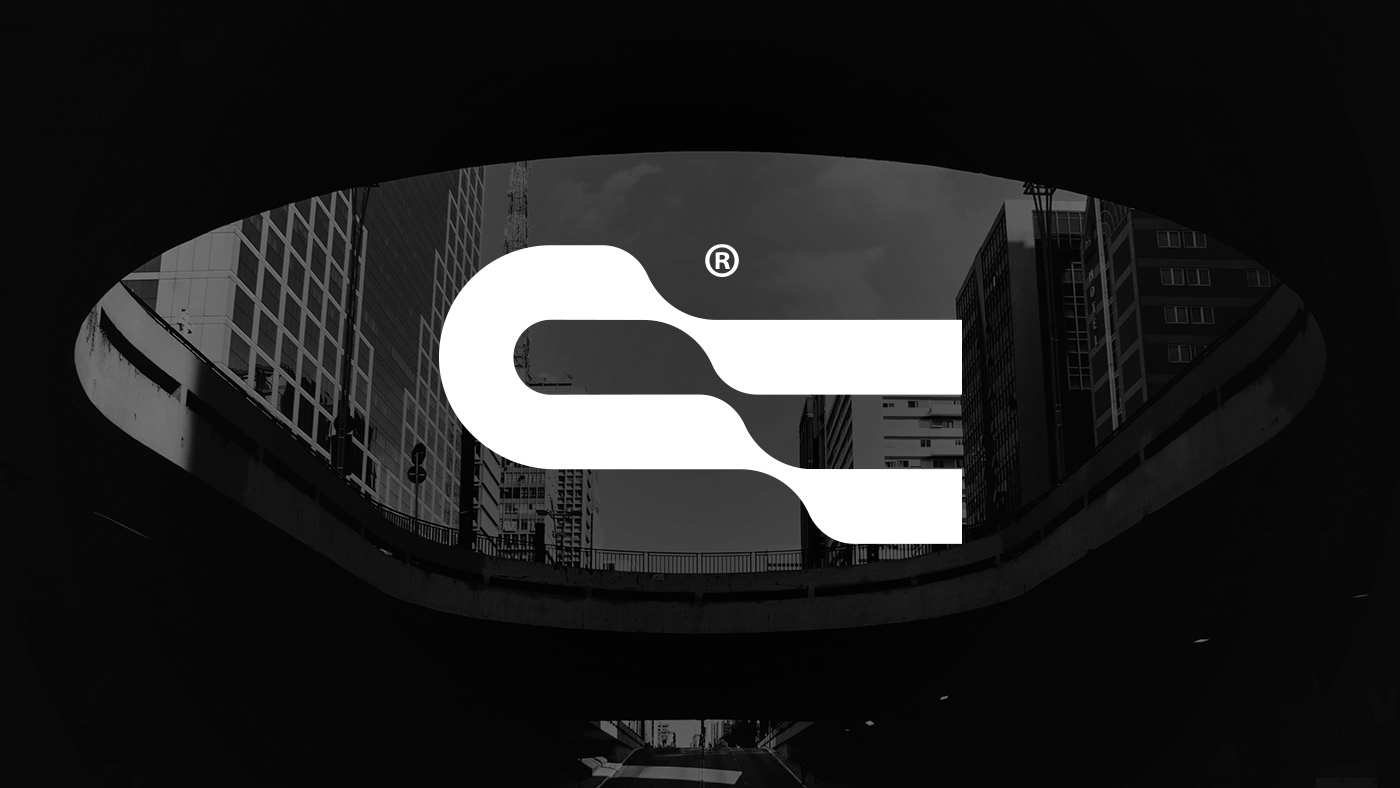
Foi criado um símbolo que busca demostrar o movimento por meio de suas linhas, que faz referência ao grafismo criado
em 1966 pela artista Mirthes dos Santos Pinto para representar o estado de São Paulo (Brasil), grande centro publicitário e estado no qual fui criado e trabalho até os dias atuais. Além de fazer referência a letra "C" do meu primeiro nome (Caio), pois onde atuo como designer as pessoas me conhecem pelo nome e tem um contato muito mais pessoal do que profissional.
EN
They say that creating your own brand is the biggest difficulty for a designer and recreating all my personal brand was my biggest challenge. In these last months I had to put up with my most demanding client, myself!
Each day that passes we get to know each other better and reviewing my previous brand I saw that it no longer represented me. My new identity seeks to represent who I am, all the cyclical trends in the market and the movement we make during our lifetime.
Challenge:
Create a strong, modern, dynamic and contrasting brand that makes reference to the initial of my name "C" and to every movement that the advertising market is inserted.
Solution:
A symbol was created that seeks to demonstrate the movement through its lines and that makes reference to the created graphics
in 1966 by artist Mirthes dos Santos Pinto to represent the state of São Paulo (Brazil), a great advertising center and the state in which I was raised and work to this day. In addition to making reference to the letter "C" of my first name (Caio), because where I work as a designer, people know me by name and have a much more personal than professional contact.