One of the common typography rules is
DON'T MIX FONTS or
DON'T USE TOO MANY FONTS in a project
Why?
Let's get to change old saying that consider the use of too may fonts
Why?
Let's get to change old saying that consider the use of too may fonts
« a jarring experience »
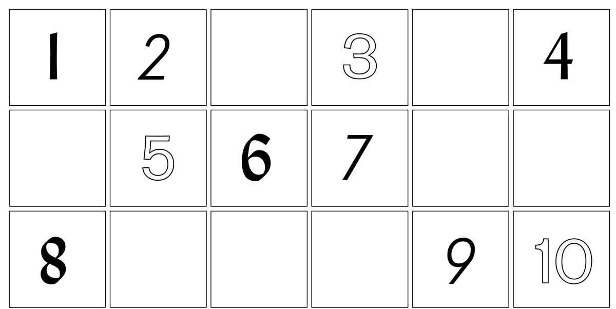
↓ Here you can see a personal / experimental project in which I have tried to combine fonts in attractive, interesting and readable ways.
I like to keep my typography simple, solid and easy to read in every designs I create.


⋙ You think I succeeded? ⋘
write your suggestion in the comment below
(: