RU
Задача: разработать логотип и фирменный стиль для мастерской Анжелы Домбровской «Dom Angela», которая специализируется на изготовлении природной лечебной косметики и свечей на травах, а также обучению по их созданию. Основное преимущество продукции — 100% натуральность и ручной труд на каждом этапе производства (и сбора сырья). Логотип должен отражать сферу деятельности и личность создательницы, а также лечебное действие продукции. Общее настроение дизайна должно транслировать некую магию, таинство и крафтовое производство.
EN
Objective: to develop a logo and corporate identity for the studio of Angela Dombrovskaya "Dom Angela", which specializes in the manufacture of natural medicinal cosmetics and herbal candles, as well as training in their creation. The main advantage of the products is 100% naturalness and manual labor at every stage of production (and collection of raw materials). The logo should reflect the field of activity and personality of the creator, as well as the therapeutic effect of the product. The overall mood of the design should convey some kind of magic, mystery and craft production.

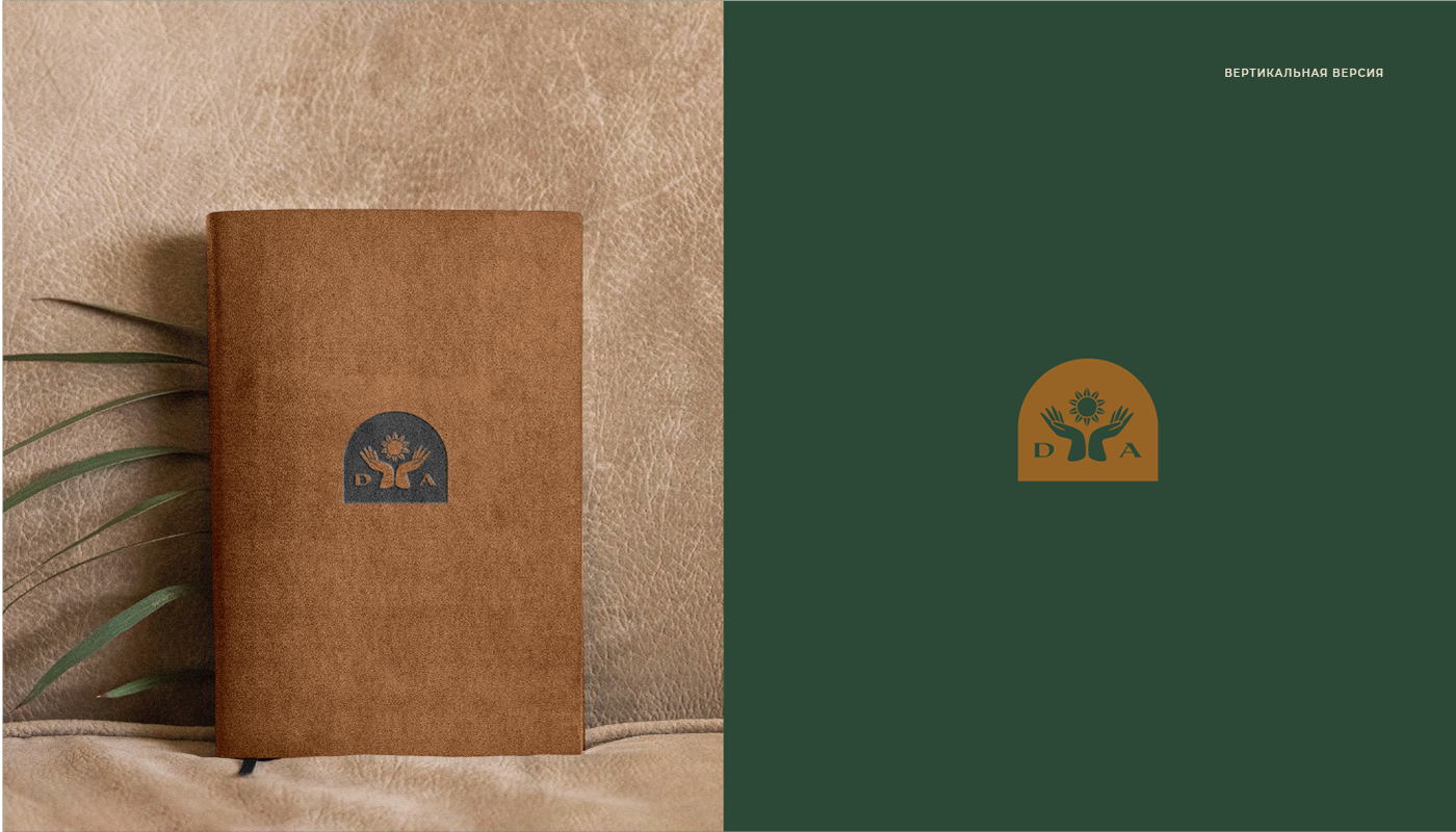
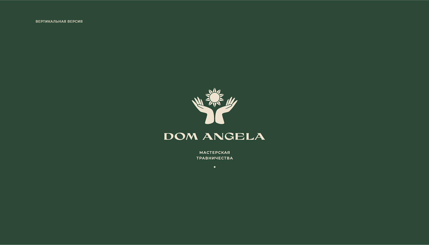
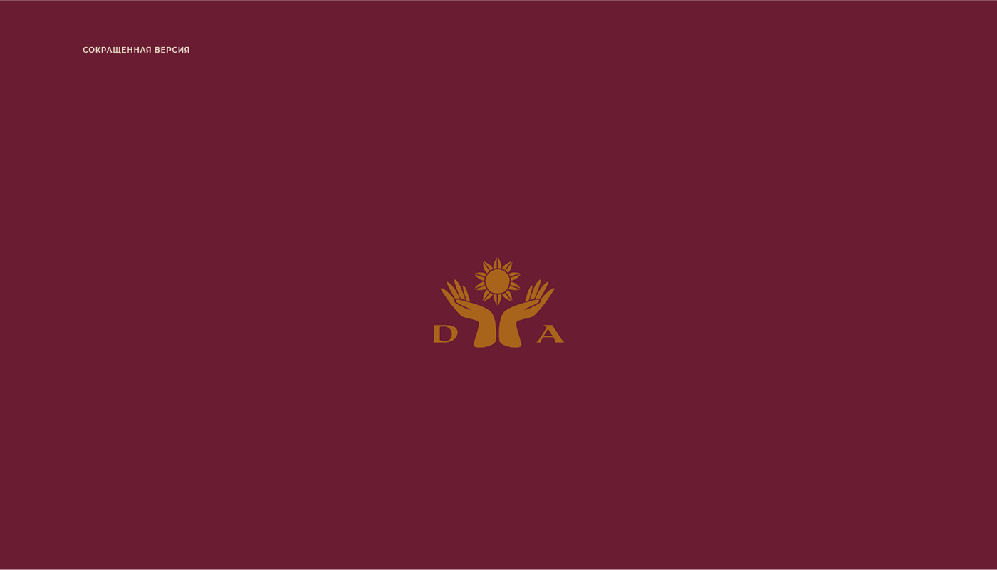
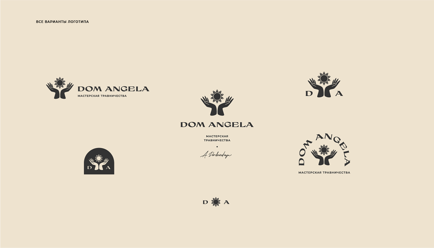
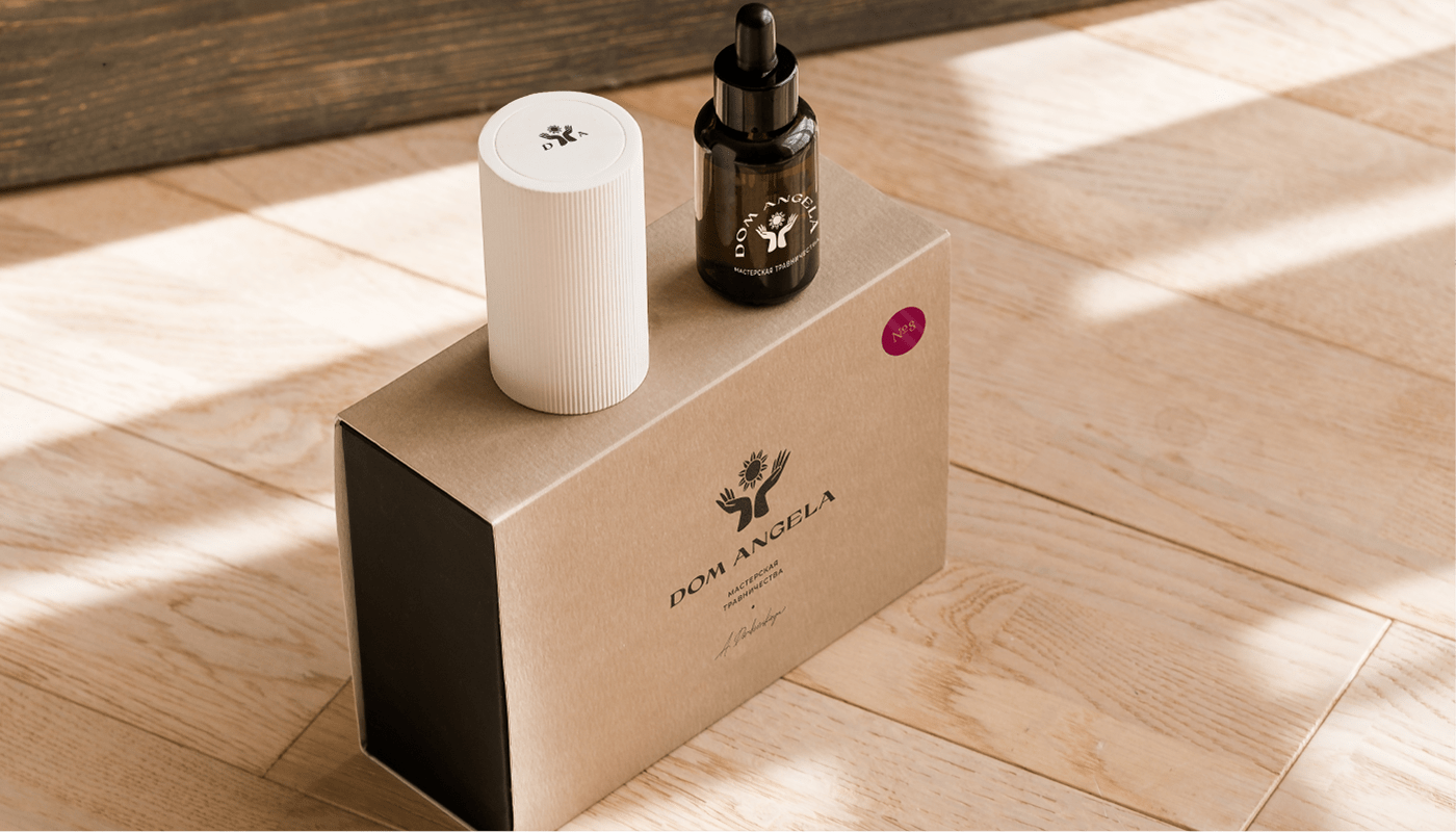
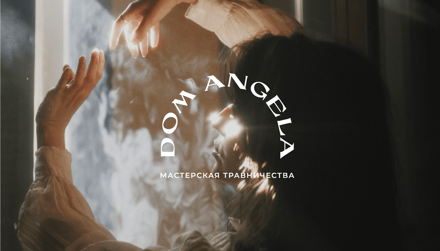
Решение: в качестве фирменного символа выступает комбинация изображений рук и цветка-солнца. Руки здесь символизируют ручной труд и заботу, самого мастера. Поскольку второй символ имеет две трактовки, то и метафоры получилось две. С одной стороны, это руки, держащие цветок, т.е. непосредственно травник, с другой стороны, это руки, держащие в руках само солнце, тепло, свет, руки, которые согревают и лечат, позволяют взойти внутреннему солнцу. Некоторые версии логотипа также имеют форму свода, напоминающую дверь. Вход в дом, Дом Ангела.
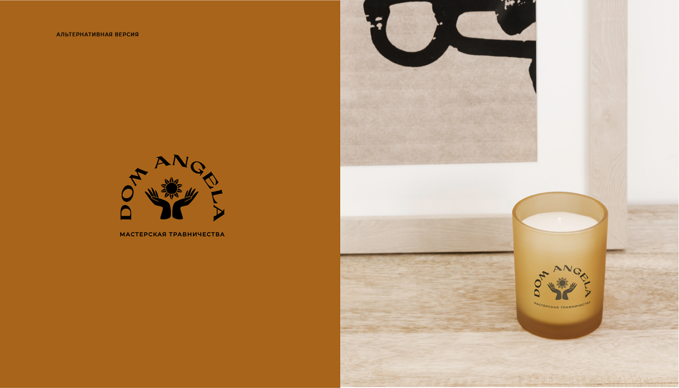
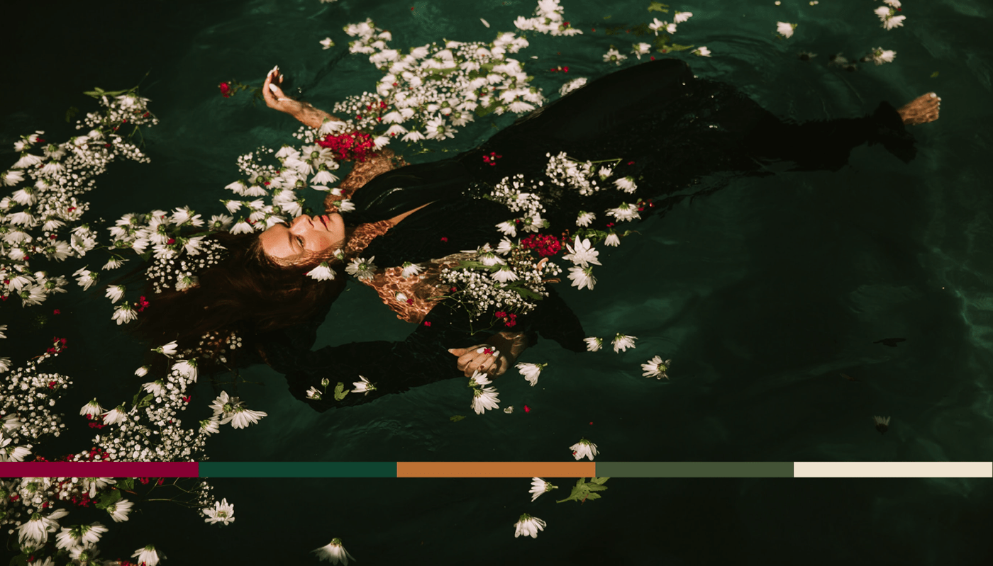
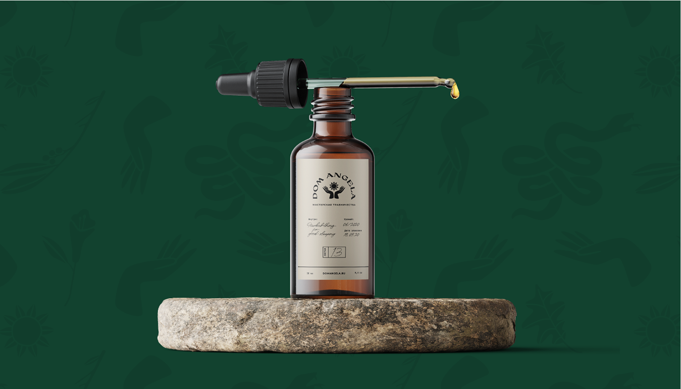
Графика знака напоминает линогравюру, что также отсылает нас с ручному производству, творчеству, созиданию. присутствие аналогичных рисунков в фирменном стиле формирует эклектичный и несколько фольклорный образ бренда с ноткой мистики. Фирменная палитры — лес, молодая зелень, ягоды и цветы. Медово-горчичный цвет также символизирует солнце.
Графика знака напоминает линогравюру, что также отсылает нас с ручному производству, творчеству, созиданию. присутствие аналогичных рисунков в фирменном стиле формирует эклектичный и несколько фольклорный образ бренда с ноткой мистики. Фирменная палитры — лес, молодая зелень, ягоды и цветы. Медово-горчичный цвет также символизирует солнце.
Solution: a combination of images of hands and a flower-sun acts as a corporate symbol. Hands here symbolize manual labor and care, the master himself. Since the second symbol has two interpretations, there are two metaphors. On the one hand, these are the hands holding the flower, i.e. the herbalist himself, on the other hand, is the hands holding the sun itself, warmth, light, hands that warm and heal, allow the inner sun to rise. Some versions of the logo also have a door-like vault. Entrance to the house. house of an angel. The graphics of the sign resemble linocut, which also sends us back to manual production, creativity, creation. the presence of similar designs in the corporate style forms an eclectic and somewhat folkloric image of the brand with a touch of mysticism. The signature palette is forest, young greenery, berries and flowers. The honey-mustard color also symbolizes the sun.