


Client and Challenge
The Private Banking division of Bank Saint Petersburg offers a service for high-income clients. Routine tasks are handled by a personal manager, information and assistance is provided by the in-house concierge service, and investments are managed by the bank’s investment professionals. Our challenge was to develop a new brand identity for the Private Banking division, to shift the focus onto investment expertise and support the interests and ambitions of young investors.
Positioning
On the one hand, the bank has a range of established pluses — its sound reputation, its crisis-resistance, and its specialist expertise in complex services. And on the other hand, the bank is also oriented towards a technological future and a shift in product focus, from savings accounts towards investments. The bank’s next step in growing Private Banking lies in becoming a profitable and high-tech bank focused on growing capital. Together with the bank’s team we formulated the new positioning. Private Banking: Knowledge in motion.
Communication Strategy
The communication strategy for Private Banking was built around the bank’s expertise in wealth management. Two in-house platforms are used: a blog and Telegram channel. The blog acquaints the reader with the bank’s expertise, as well as enabling us to get a feel for topics of interest, whilst the Telegram channel earns the trust of a forward-thinking audience.
Visual Identity Concept
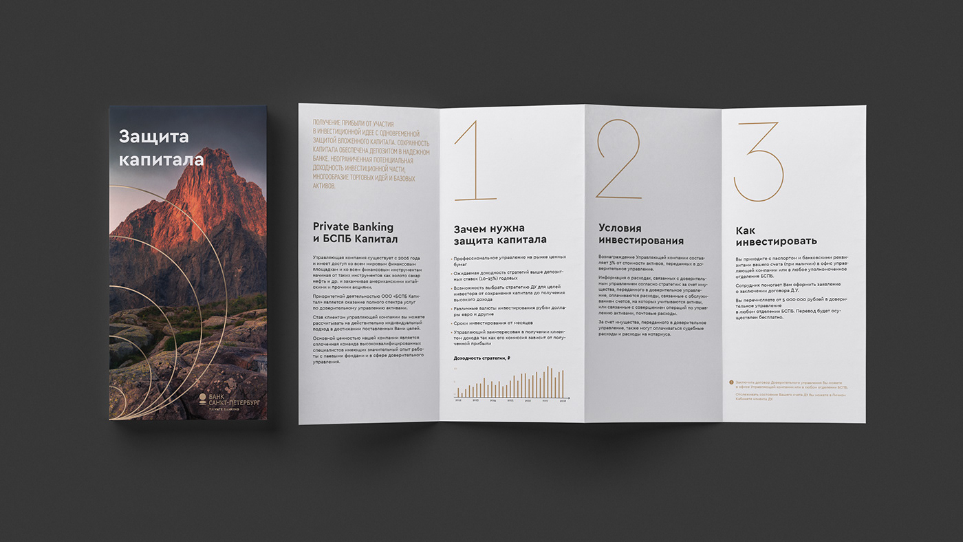
The visual concept follows on directly from the positioning. It was important for us to show that the bank’s expertise is neither a fundamental science, nor a vault of static accumulated knowledge. It is a living system, one whose primary values lie in benefiting the client.
Show Service
This is why the key graphic identifier is dynamic. At a basic level, it is composed of rings of a uniform thickness, aligned at the bottom edge. The ring reminds us of the Bank Saint Petersburg logo, while its shape and golden colour create associations with money and capital. The movement of the rings symbolises growth and a readiness to act.
Logo
The Private Banking logo is based on the Bank Saint Petersburg logo, but coloured gold and with an additional descriptor in the Cera Bold typeface.
The digits in the typeface were born of the rings’ linear alignment, a key characteristic being that their thickness doesn’t change even when the digit is enlarged.


Project Participants
Art Director: Pavel Konyukov
Designers: Anastasia Bazylnikova, Kirill Zharkoy
Curator: Elena Ogorodnikova
Strategists: Ulyana Kozhevnikova, Katya Rudenko
Producer: Alexandra Yukhina


