


Branding and website for architectural bureau LUCH
The design firm LUCH specializes in designing public buildings and public spaces. The firm's mission is to create noteworthy urban projects, combine architectural aesthetics with thoughtful and technological engineering solutions, and be a brand that people believe in. Our task was to help the firm create a brand from scratch: to establish clear positioning and develop a brand name, a visual identity, and a website.
Positioning
We started by working on the firm's positioning for two audiences: clients and local residents. The company offers clients technological and cost-effective solutions, without forgetting about aesthetics or the need to create a comfortable environment for residents. Another of the firm's distinctive features is the use of applied solutions. LUCH is part of the N-Systems group, which operates in general contracting, and as such the firm's projects are not only well designed, but also well built.
Brand Name
When choosing a name, we settled on LUCH, which is Russian for “beam of light.” This imagery reflects the process the firm uses in its projects: a beam of light illuminates the correct path to take and highlights the final results. The name also refers to the best practices of domestic design while being concise and projecting confidence.
Concept
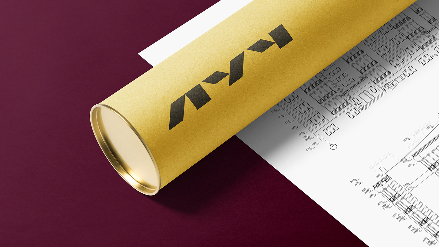
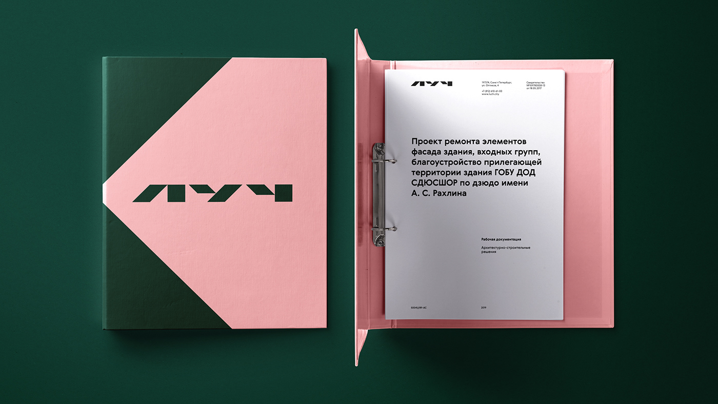
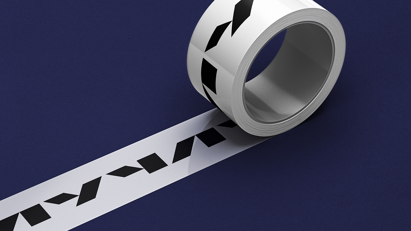
We continued to develop the metaphor in our visual identification system. An abstract beam of light became a key identifier. Its task is to highlight the most important things on the screen. The beam consists of two containers connected to each other. We fill the containers with the required content.
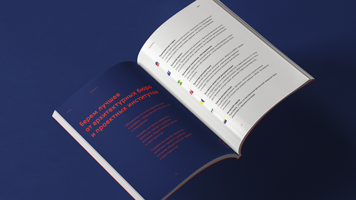
For our visual solutions, we weren't afraid to use bright colors and emphasize their contrast with the brand name. We used three warm colors for the beam: bold red, sunny yellow and delicate pink. We added dark colors to pair with them. This resulted in a wide variety of color combinations.
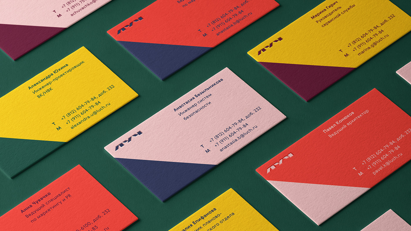
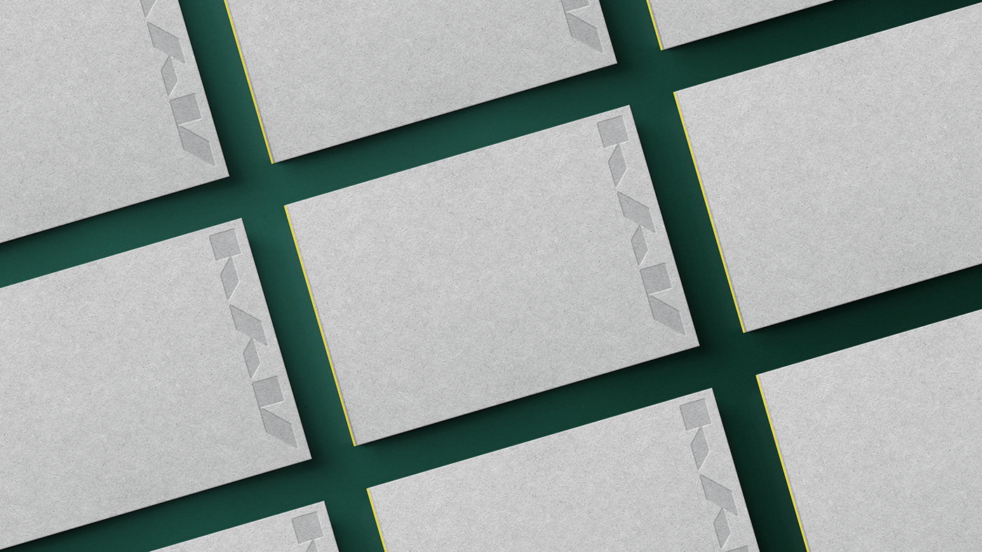
We developed a standout logo with unusual geometry and features. The modularity of the logo is a reference to architecture and design, and its plasticity paired with the company graphics make for a winning combination. We used one of the company colors for this, and, depending on the media, we arranged it either vertically or horizontally.
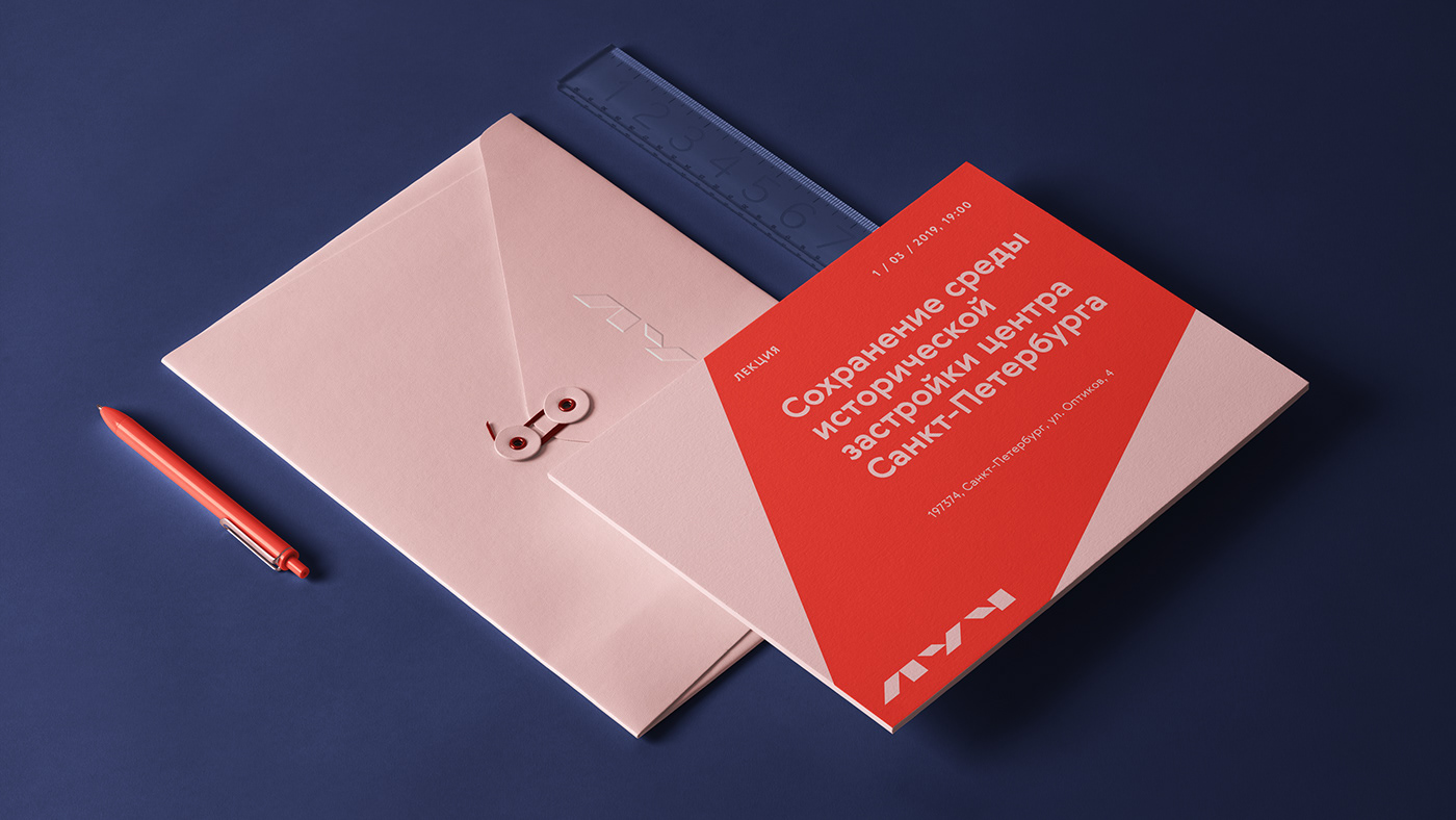
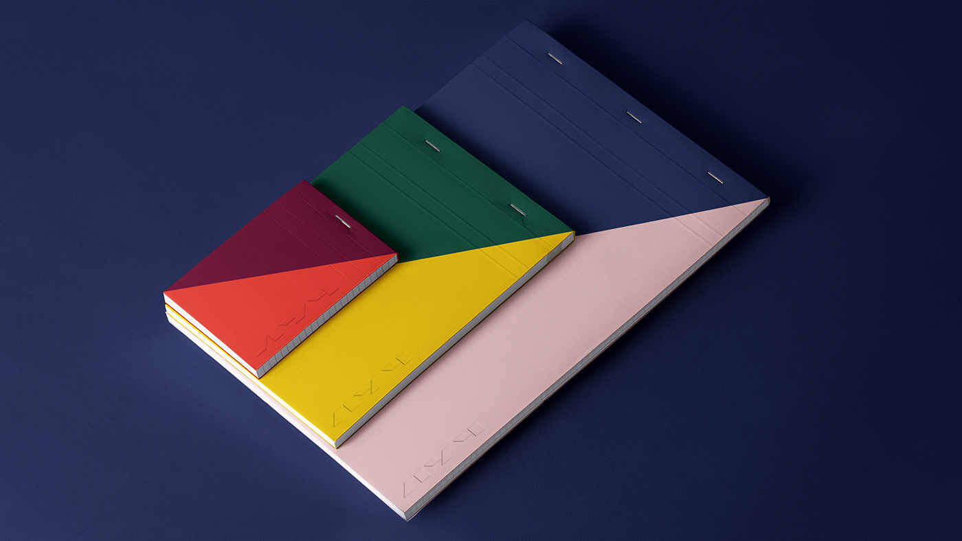
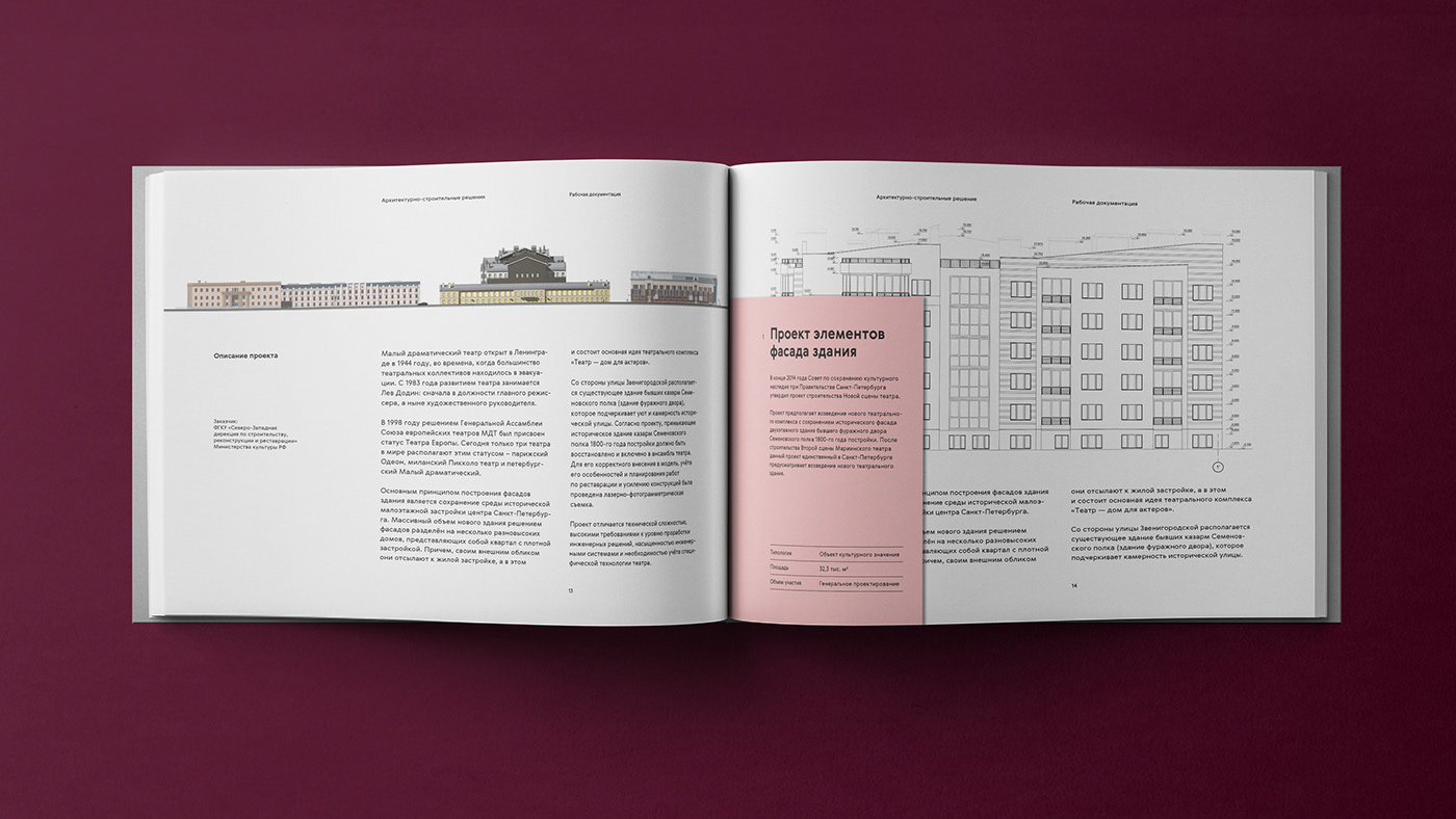
When a firm creates a project, a large volume of documentation always follows, so it was important that it looked nice and tidy.

Website
The visual concept was developed further on the firm's website, which we created using the Tilda Website Builder.
In the illustrations on the website, we played with the beam metaphor in the lighting for buildings, interiors, and environments.
Project Participants
Pavel Konyukov — Art Director
Anastasia Bazylnikova — Web Designer
Polina Shershneva — Web Designer
Alexandra Yukhina — Account and Producer
Marina Girich — Producer


