


SPACE PRINT MAGAZINE VOLUME O1
I have always admired the images of Astronauts, the Universe, the Planets, the Galaxies, and things that beyond our knowledge. Therefore, in this project, coming up with an idea to add the retro, futuristic vibe to the project and bringing the mysterious Universe closer to the readers, please kindly note that this is a personal project and non-profit gaining work. Thank you so much for your attention, I hope you enjoy it.
This is the sketches that I drew from the very beginning.

So I decided to use Baron Neue Black for the logo of my magazine (the font is free for personal use and non-profit gaining projects only as I know) due to its geometric and beautiful retro vibe. Besides, I used Josefin Sans Bold for the title and Josefin Sans Light for the body text because their geometric shape do represent the futuristic feel.

The magazine's logo


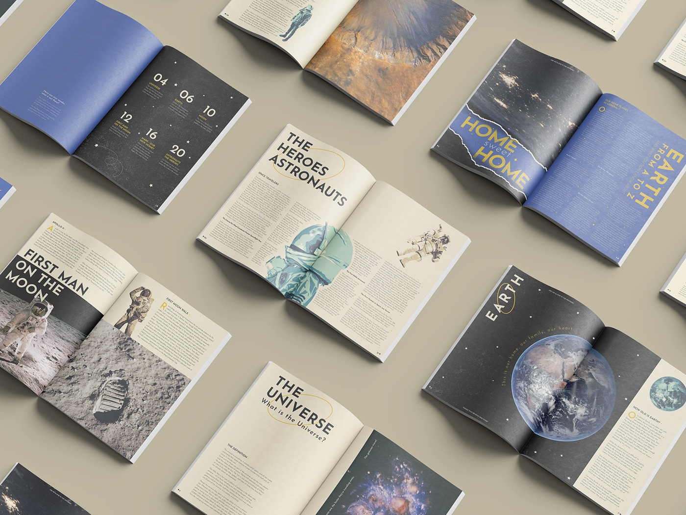
For the non-mockup version please kindly check out the following below:
v
v
v


Disclaimer: This magazine is a non-profit gaining project.
The including content is sourced from NASA and Wikipedia,
the following images are sourced from Unsplash,
some of them were adjusted to have the “oil paint effect” by me.


