

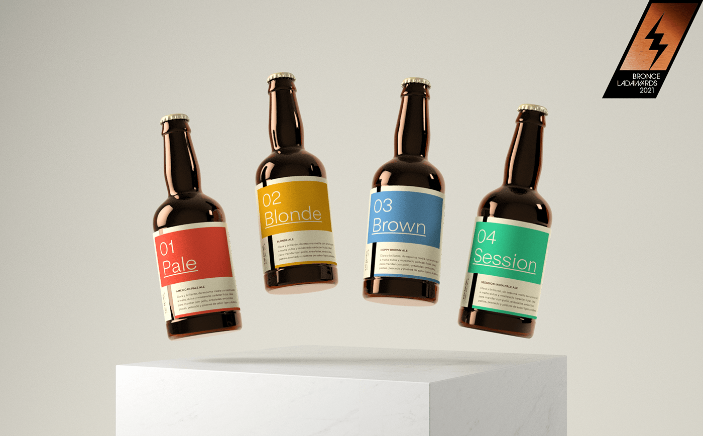
Jimena is a brand based in the municipality of Cadereyta Jiménez, Nuevo León, México. A craft beer with four American Ales, and after some years of being on the market, they wanted to continue growing. The brand asked for a redesign of the labels, wanting to improve display on the shelves and hopefully boost sales, already nationwide at that time.
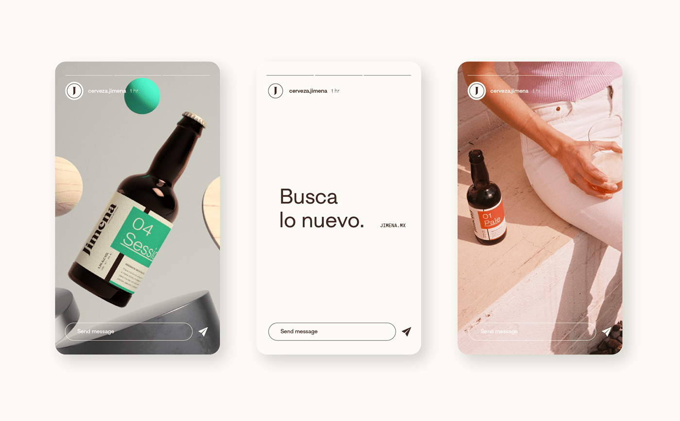
We rethink the brand, nurturing its brand concept under an idea of duality (Traditional Inspiration, Modern Origin) that allowed us to celebrate the folklore of the state of Nuevo León and at the same time, an attitude towards searching for new things. #buscalonuevo
We created a visual identity with a balance between the most traditional elements of the brand and the search for a modern context.
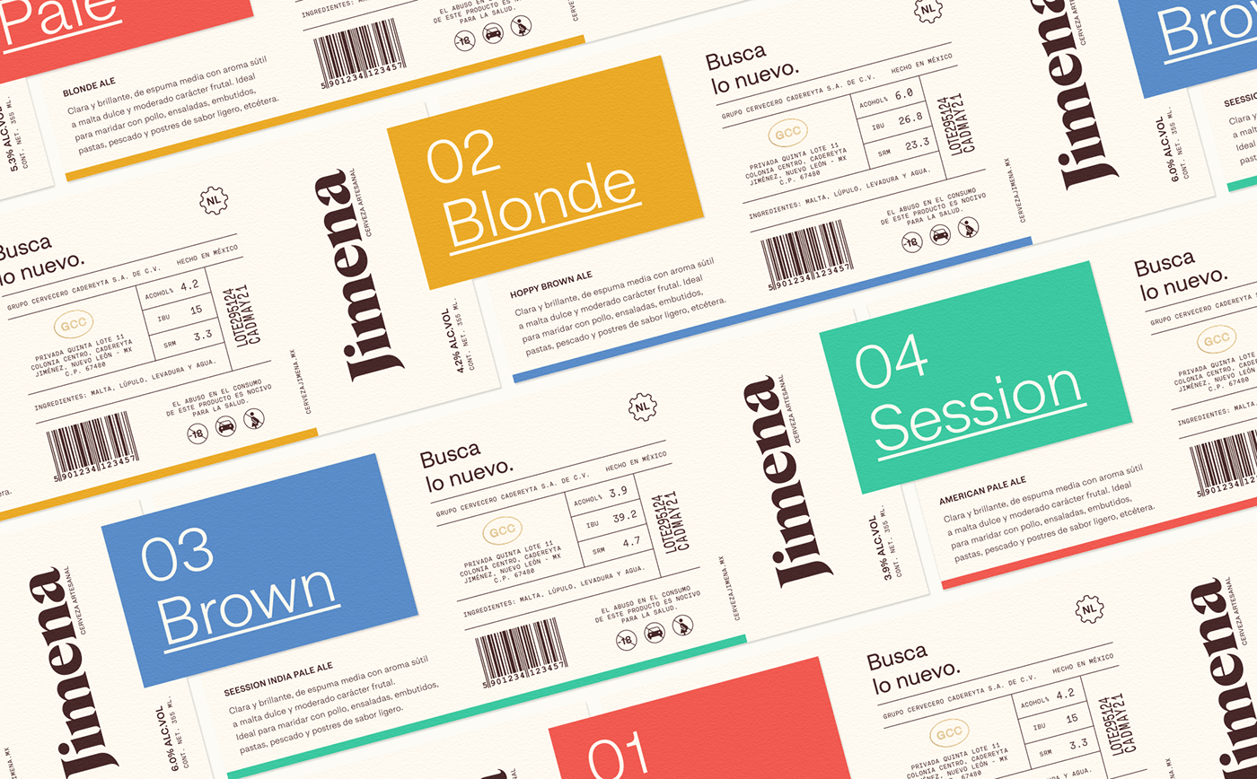
We used two fonts from Nodo Type Foundry to solve two areas, data; displayed with a monospaced (Stardust) that reminded us of our industrial roots, and titles; using a Neogrotesque (Dapper) that speaks of modernity.
We used two fonts from Nodo Type Foundry to solve two areas, data; displayed with a monospaced (Stardust) that reminded us of our industrial roots, and titles; using a Neogrotesque (Dapper) that speaks of modernity.
The logotype was designed using Albra (Ultra Kuhl), a Serif that helped us translate the more traditional part of the brand and get a clean balance between all these elements.


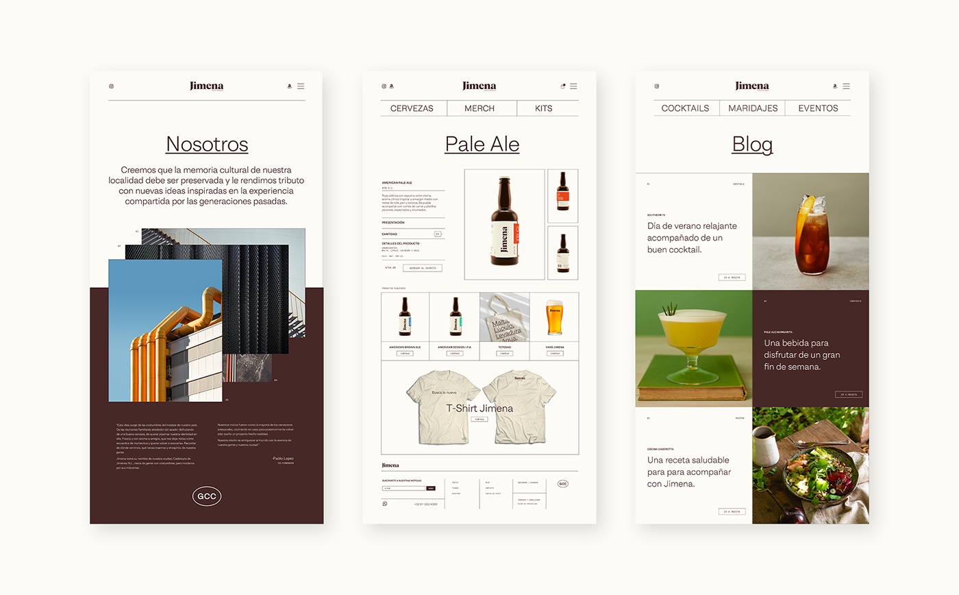
We designed a graphical system that was friendly to craft beer beginners and interesting enough for more advanced consumers.
We created a color code, simple names, and organoleptic descriptions with pairings for the front of the label, and for the reverse, we added relevant technical data such as bitterness, alcohol percentage, and color.
We created a color code, simple names, and organoleptic descriptions with pairings for the front of the label, and for the reverse, we added relevant technical data such as bitterness, alcohol percentage, and color.
The label was printed on smooth textured heavyweight paper. A custom die was created to get the splicing on the bottle, details that help to position the product in a premium category.


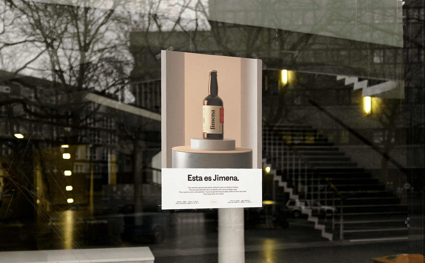
The new communication includes several 3D artworks that gave us great possibilities to continue telling the story of this project that was born in a small city but wants to be a great brand.


We worked on a communication strategy inspired by the tone and graphic behaviors of classic ads from the times between the 60s and 90s, where the center of attention was still focused on the product and its virtues. We produce analog photographs to complement social content and balance the overall look of the communication.


For the big finale, we worked on a video piece where we created an environment inspired by the industrial warehouses of our state and the Jimena brewery. We composed original music inspired by the "Tamborileros", a representative element of the folklore from Nuevo León that had much of its origin in Cadereyta Jiménez.
We firmly believe in a future where brands and organizations are given depth under their cultural context, celebrating their location and seeking community among creators.
Jimena is the result of great work between a community of creators and entrepreneurs.
With this project we obtained 2 nominations and a bronze award at the 2021 LAD Awards.
A project by Future for Brands®
Project: Concept, Identity, Branding & Strategy
Brand: Jimena
Location: Cadereyta Jimenez, N.L, México
Team
Alejandro Soto
Mario Almaraz
Montserrat Sandoval
3D Animation
Hugo Banda
Photography
Almendra Isabel
Special Thanks
Raidho and Friends
talk@futureforbrands.com


