The Client
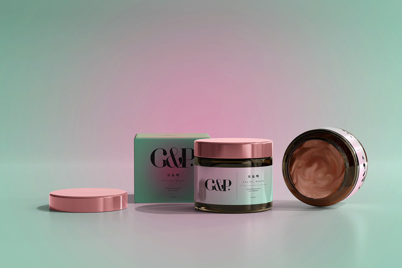
Geonganghan Pibu or better known as G&P is a skincare product that prioritizes healthier skin results after use. By using natural ingredients and prioritizing zero waste as its motto.
By providing packaging that can be reused and recycled, making G&P one of the skincare products that everyone is looking for.
You can even exchange empty packaging that has been used up for various other G&P products.
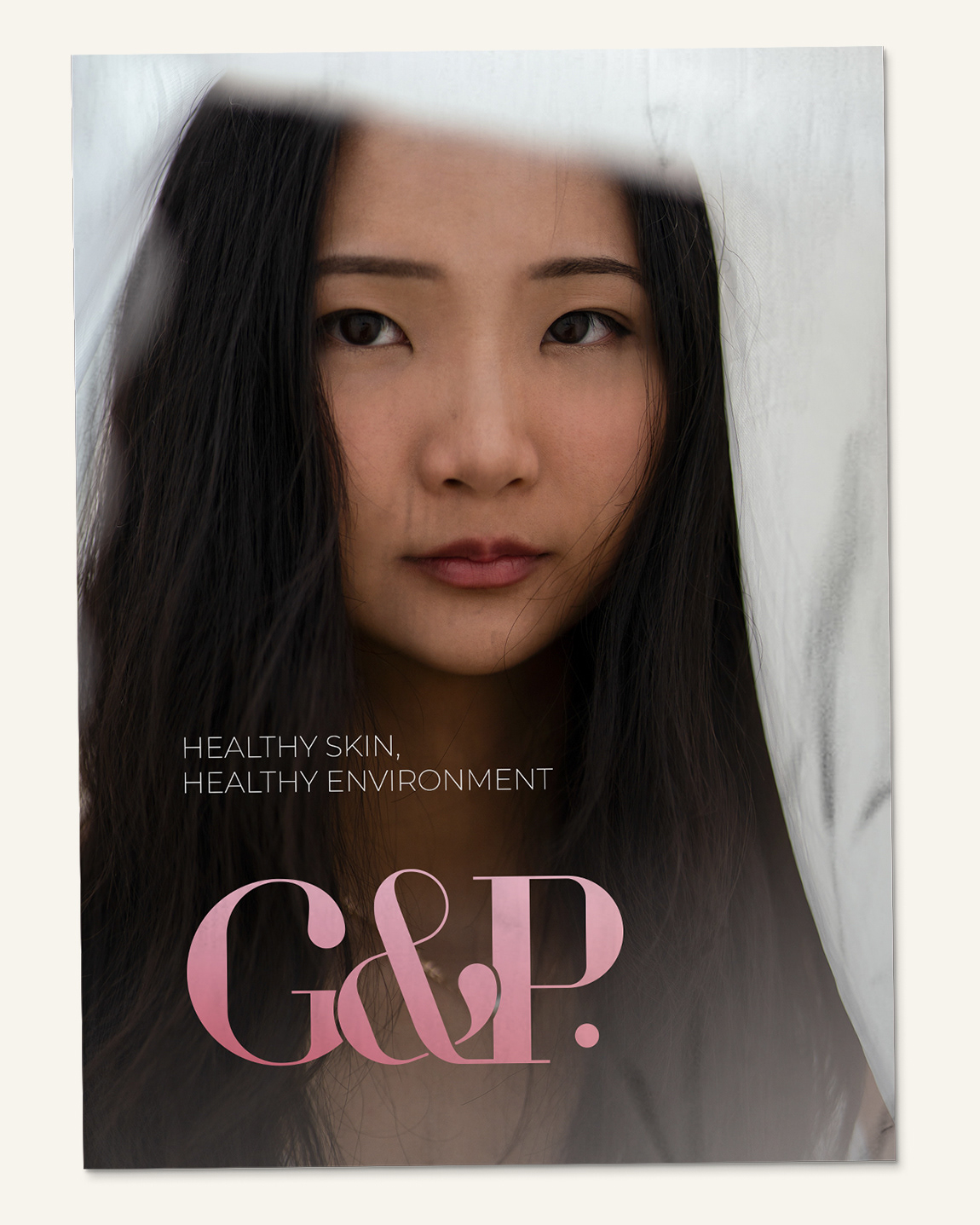
Healthy skin, healthy environment.
The Objective
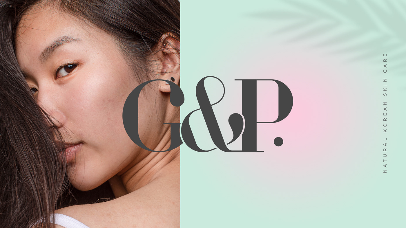
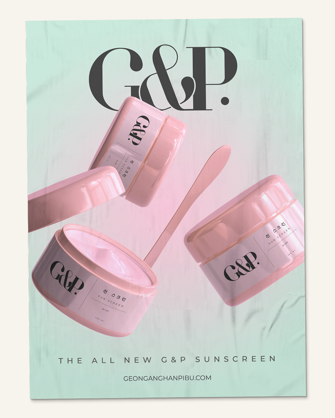
G&P wants to create a new logo and packaging with cute pastel colors to show the side of girls who like cute things too.
Considering that this product is for all ages (which is certainly safe because of its natural ingredients) G&P is eager to show a "youthful" side so that every consumer feels a feeling of being young again with supple and healthy skin.
The Solution
We tried to create a logo that looks "young" considering this product is safe for all ages.
Along with the packaging, which is of course pastel! We tried to keep the girly side of the brand and also wanted to highlight that G&P is an eco-friendly product.
We try our best to always make our clients happy and satisfied. Because, who doesn't want to have healthy skin and do good to the earth?