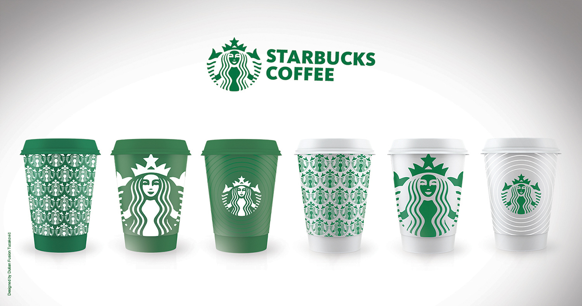
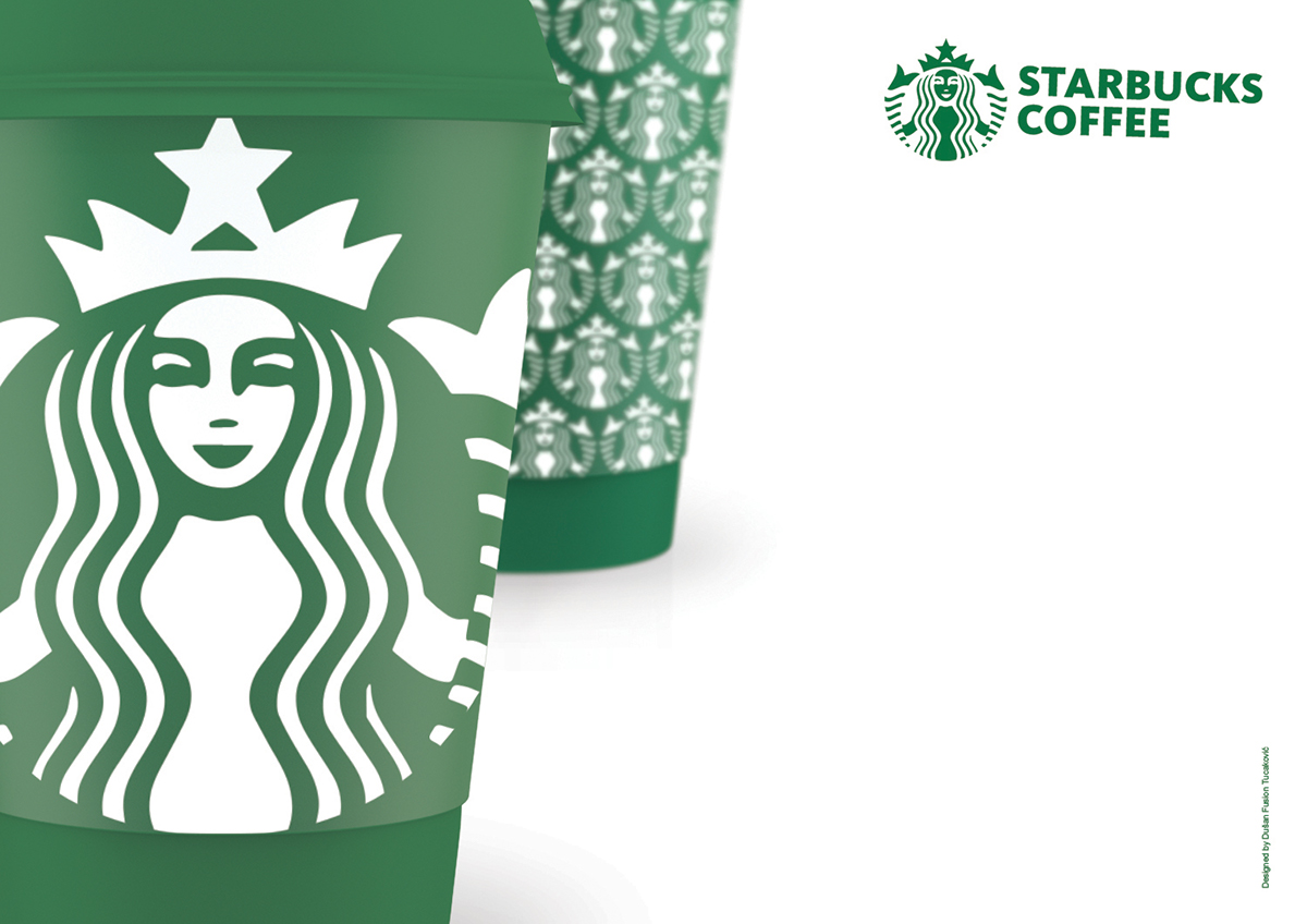

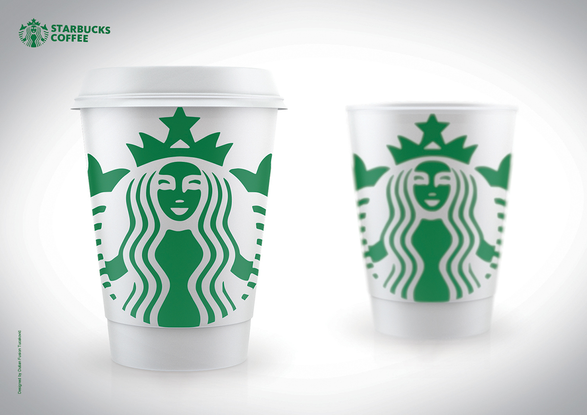


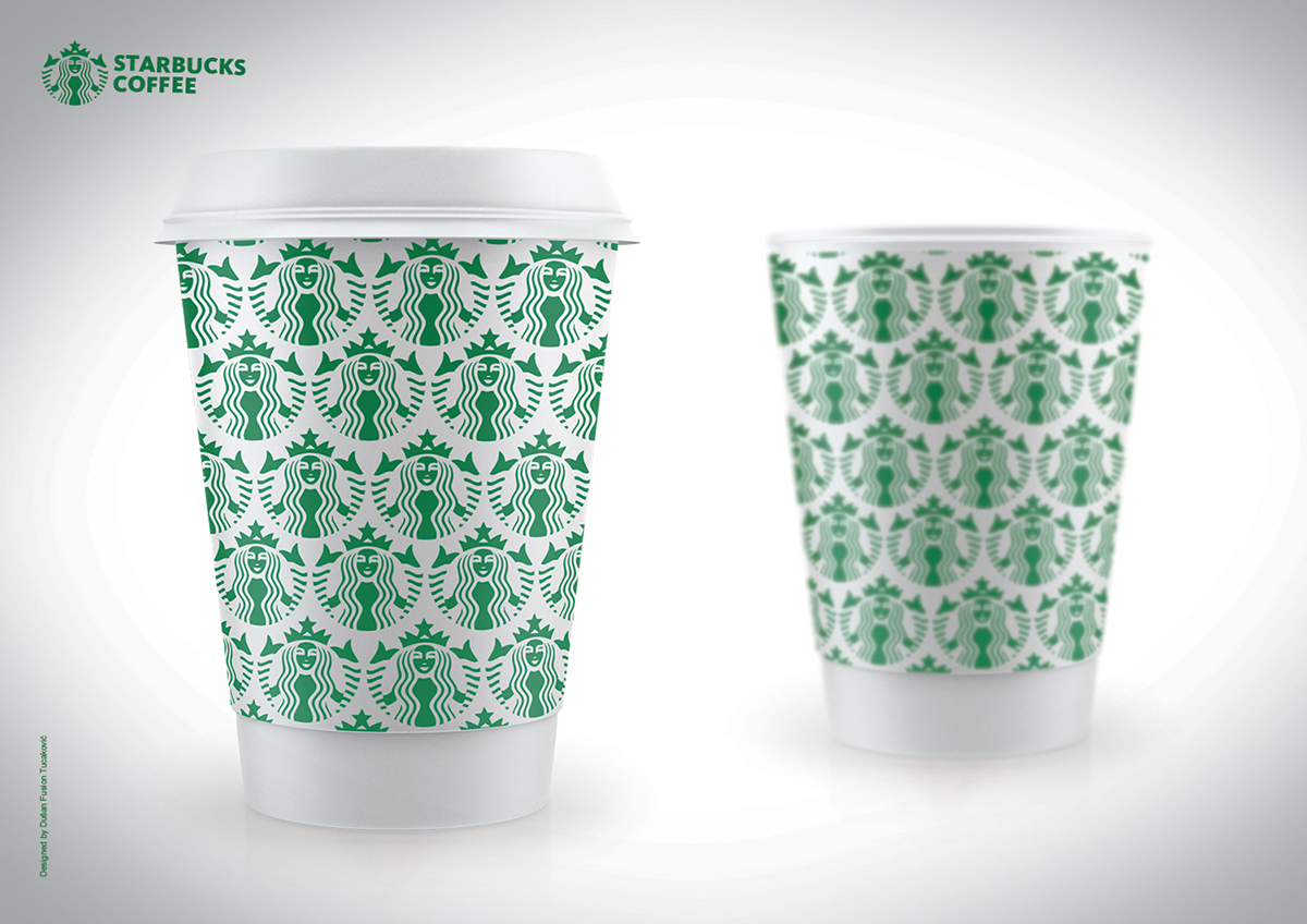
Looking at the brand, "Starbucks", I felt the need to freshen up his current look with some small changes, reducing the existing design. I thought that the base color of packaging in which the coffee is, should be green, not white, because green just gives recognition to this brand . I also threw out the existing logo circle, because I think there is no need for that since the girl who is the main part of the logo is in the circular form herself.


