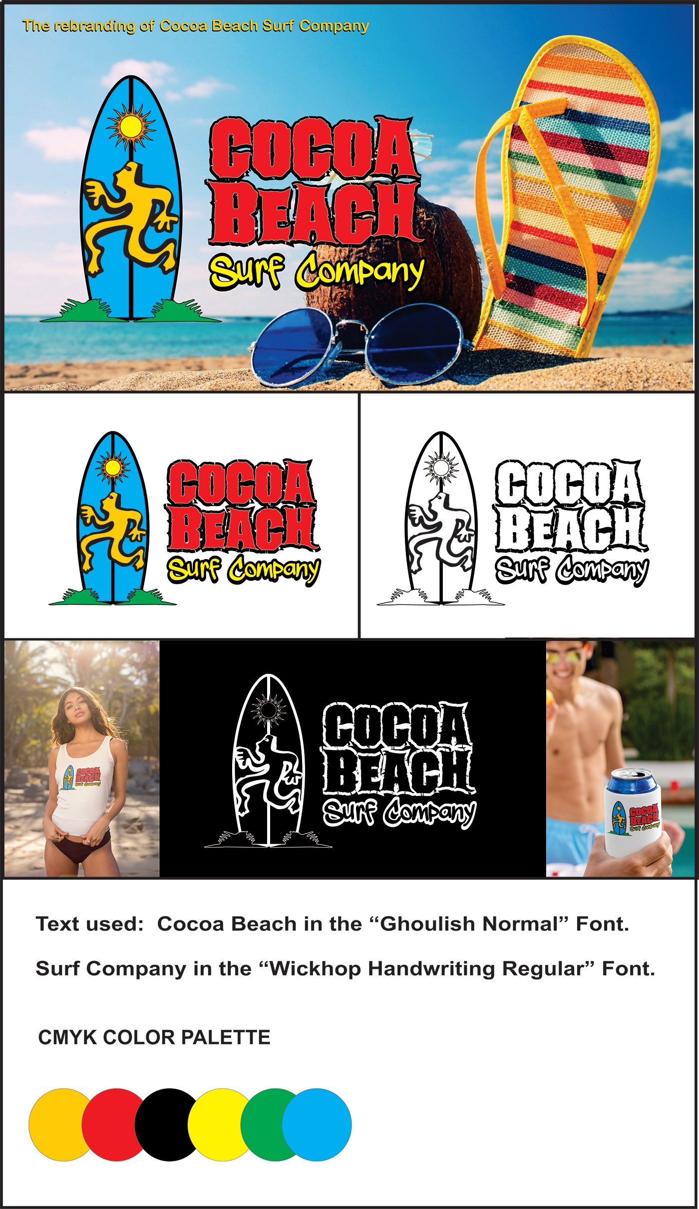
My strategy is to increase the brand recognition and brand value of Cocoa Beach Surf Company by creating a new visual identity.
One of the unique selling features that the company offers is that it is located on the beach in Cocoa Beach, Florida, and is accessible from the street or directly from the sandy beach. The Cocoa Beach Surf Company as a very attractive and fun looking location that caters to tourists and families on vacation. The Cocoa Beach Surf Company sells a variety of souvenirs and beachwear, and it also rents a ton of fun equipment for tourists to use at the beach such as umbrellas, beach chairs, bikes, kayaks and surf and body boards. I thought it was important to think about both physical locations from a customer’s perspective and how the competition markets to customers in both their brick-and-mortar locations and through their websites and social media. My plan is to revamp their logo that will work and stand out in a positive way in both markets and bring them into a modern era. I also want to take their social media marketing to a higher level across all social media platforms such as Facebook, YouTube, Pinterest, Twitter, and Instagram and make sure the company knows how important it is to engage their audience and utilize digital marketing to their advantage. I want the client to show their audience that they matter by addressing them whether their comments are positive or negative.
I also considered the company’s customer base. This included characteristics such as demographics, lifestyle, and behavioral attitudes toward products and services the customers currently have. This particular real estate firm targets a younger hipper demographic, whether they be single, a young couple or a young family. The customer base s on vacation so we must make the client appear to be the happening spot to attract customers and to make sure it is a target base that have a moderate disposable income that they can spend within the Cocoa Beach Surf Company. Most of the demographic come in groups and with the lower prices my client offers we must be able to attract to heard mentality whereas if one buys something the others have to buy it too. I would also like to work on cross promotion and work with other local companies to make sure our logo and presence is felt everywhere. Go to the local tourists’ centers and restaurants as well as gas stations and put out savings coupons.
After thinking about the brands that my customers are familiar with, I saw some graphical common patterns between these brands. Most of them use a simple iconic beach scenery in their logo. They also tend to use sans serif-style font typefaces such as Arial Black to give their logos a bold easy to read look. I think these brands communicate the idea of fun and a free-spirited vacation environment. I also noticed that many of these brands use colors with a cool background and warmer colors for their fonts in their branding.
When I first analyzed Cocoa Beach Surf Company’s existing logo, two of the obvious design problems were that the logo appeared dated, and the art could be revamped in a way to keep their tradition but bring it into a more modern era.
I intend to present a new logo to the client that is readable in a variety of sizes and that will work well in a wide range of touchpoints. I plan to show the client a variety of mockups featuring the proposed new logo, including a company website, social media platform, mobile devices, apparel, marketing materials (such as stationery), and signage and that will be proudly displayed on surfboards, and bumper stickers.