


Dankira Rebranding Pitch
We were approached by Awash wine to propose a rebranding of Dankira, which is a popular drink that took over Addis Ababa soon after it was launched. Dankira is an Amharic word that means "dancing". The Dankira team spent a significant amount of time filtering and determining what would work for the market. More than 20 flavors were up for selection, but only two were selected for final production.
The inconsistent brand identity has become a challenge for the marketing team, hindering the exploration of different flavors in the future. The dark logo also did not speak to Dankira's values. We were greatly aware of the distinct colors and visuals, so we kept the overall feel of the brand, including the flavor theme. We also developed campaign visuals that represent movement and fun.
However, with the COVID-19 pandemic, the project was halted at the time. But it was exciting to work on the project and envision an alternative rebrand for Dankira.
First Direction ________________
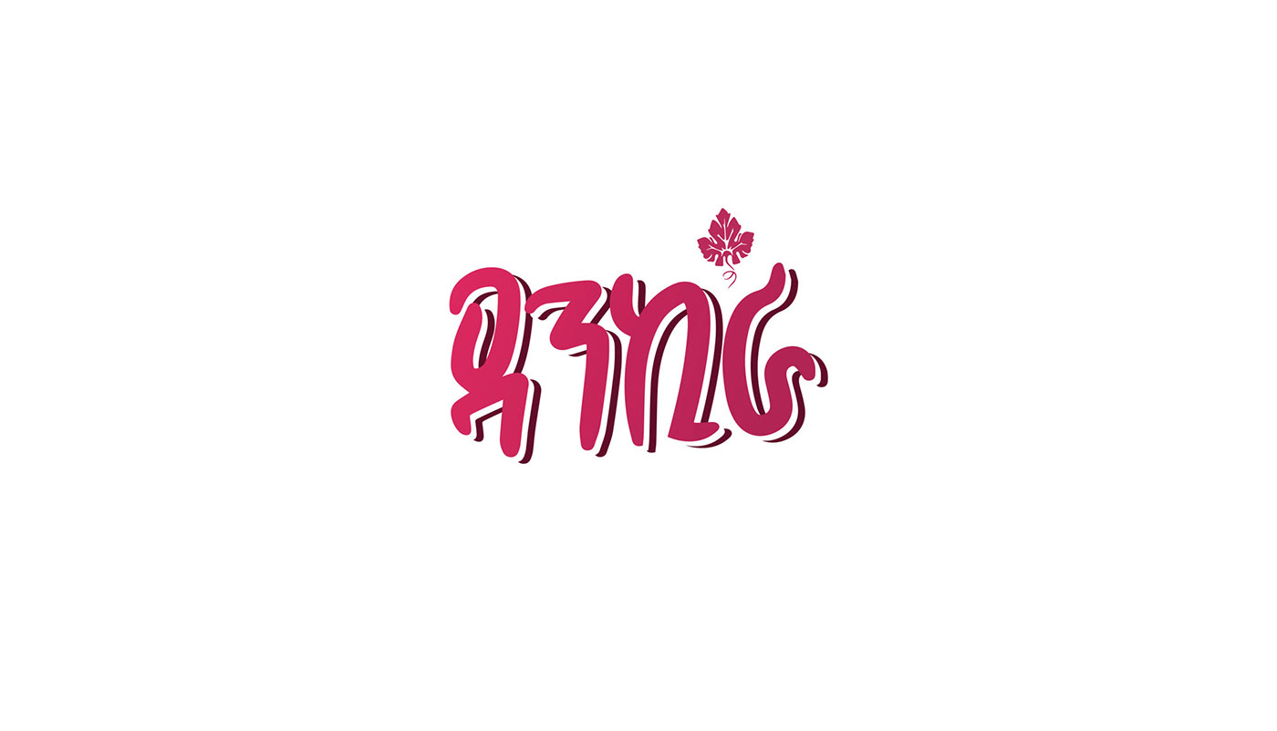
The first direction we worked on was based on refining the cool typography and leaving out the black circle. The black circle made the logo unreadable and small when used, especially for posters. We created the Dankira logo, which is flexible for any print while keeping it simple.

Above: Existing promotional visuals used on social media.

Above: before and after of Dankira logo.

Above: We modeled the bottle which we used for the campaign posters. We added patterns that represent movement and fun.


Second Direction ______________________
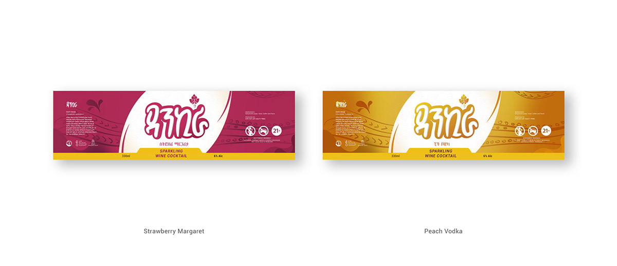
We created a second direction for the logo while keeping the existing typography. The additional layer behind the logo gave it options to switch out colors for different flavors. The results can be seen below.


Credits
Agency: ARMA
Client: Awash Wine


